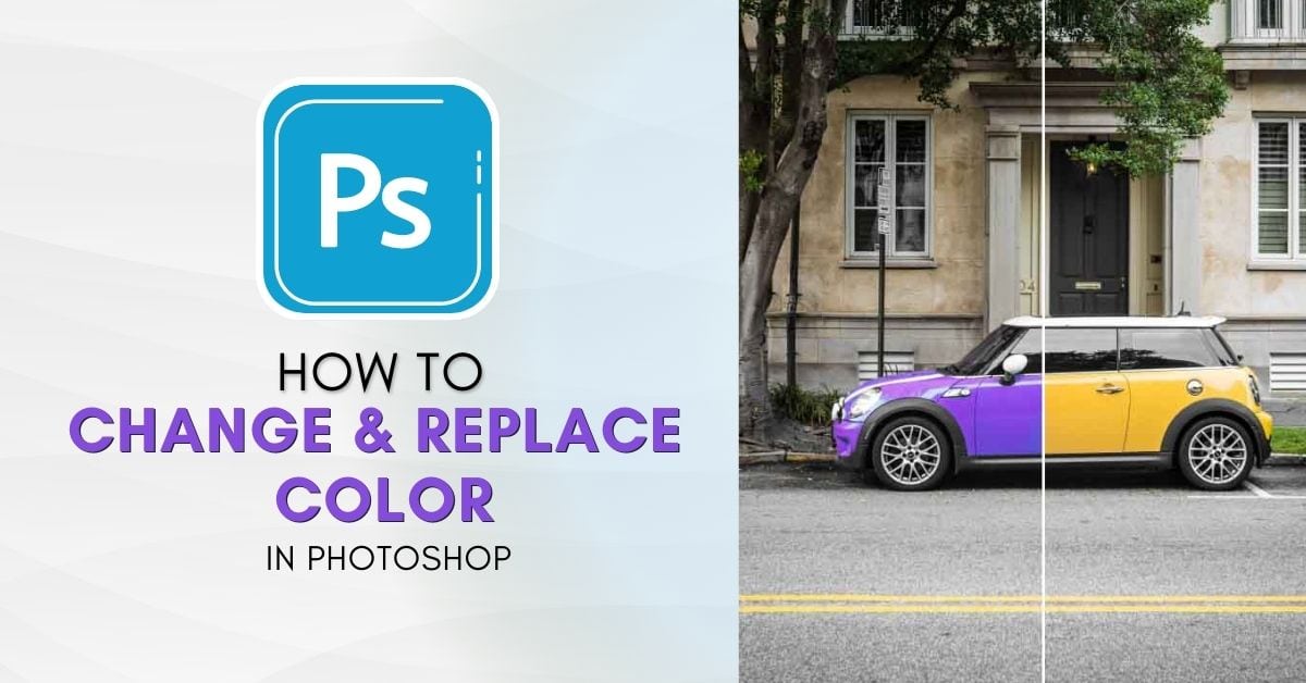

Changing and replacing color in Photoshop offers more editing capabilities and allows you to create mock-ups and creative images. When I first began editing my photos in Photoshop, I had no idea how to replace colors on specific objects in the images. Fast forward to now, and there are five go-to methods that I use for changing colors in Photoshop that I’m going to break down for you in this tutorial.
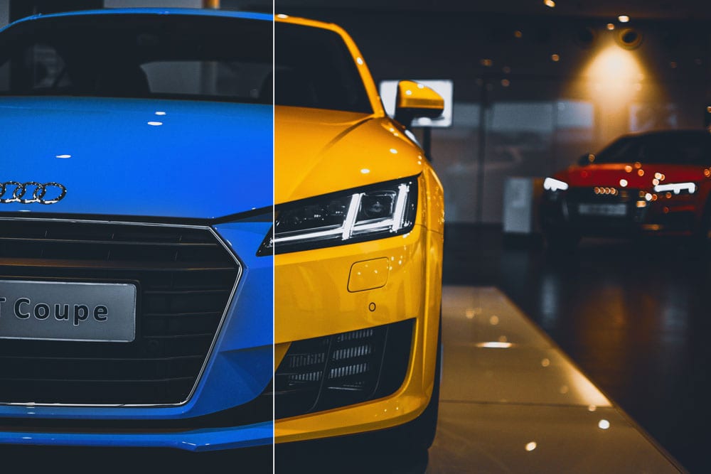
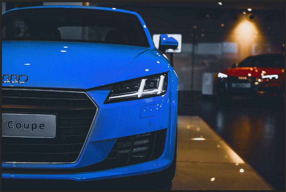
With these tools, there is no need to be frustrated when an image has a person with a red shirt when you need a green one for example. Another example is that you can also manipulate car photos by changing the color of the car to show the different options without needing to photograph every car.
The list of use cases for changing colors is really endless.
Depending on how you need to edit your image, you can find an effective and easy way to change the color of certain objects in your image using one of the five methods below!
How To Change & Replace Color In Photoshop
It’s important to choose the method of changing colors based on how you need to edit your image since each method has its pros and cons. You will also notice certain methods are better suited for different objects, whether it is a background, a car, or clothing on a person.
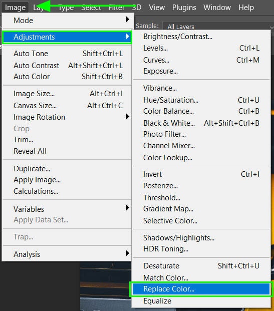
Option 1: The Replace Color Tool
The first option is to use the replace color tool. This tool works well when you want to change the color of objects that are not a specific shape or a solid color. The replace color tool allows you to select different shades of the color you want to replace, to ‘color in’ all the areas of the object.
The replace color tool doesn’t work well when it comes to changing black, white, and grays on the image. This tool allows you to select specific hues to change the color to. Since hues are pure pigments, you cannot choose black or white from this spectrum.
Another downfall of using this tool is once the color has been changed and you have saved the changes, you can’t go back to re-adjust the colors. If you have used a new layer, you will only be able to delete the color adjustment and start again.
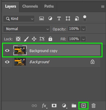
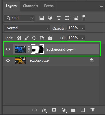
To change the color of an object using replace color, open your image in Photoshop and duplicate the background layer. This allows you to edit non-destructively and delete the new color if you change your mind later.
Step 1: Duplicate The Layer
To duplicate the layer, drag the background layer to the Create a new layer icon at the bottom of the Layers panel. You can also press Control + J (Win) or Command + J (Mac).
Step 2: Add The Adjustment Layer
With the new layer selected navigate to Image > Adjustments > Replace Color.
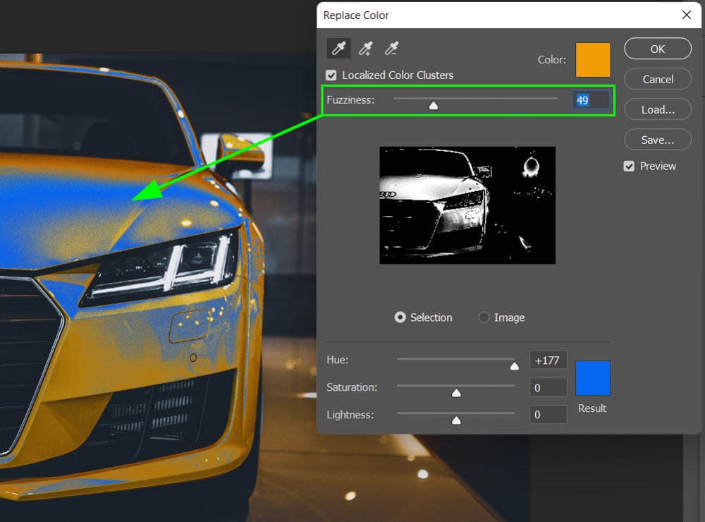
When the Replace Color window opens, use the eyedropper to select the color you want to change on your image. If your image contains various shades of a specific color, select the purest form of the color. The preview in the window will show you the areas that contain the selected color.
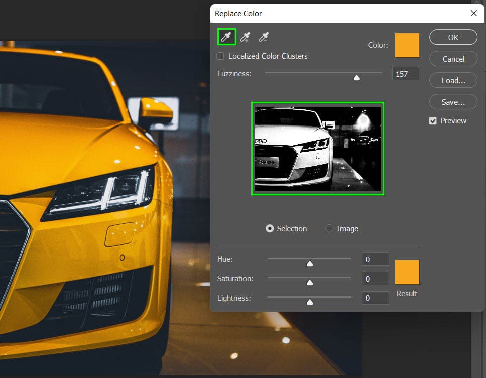
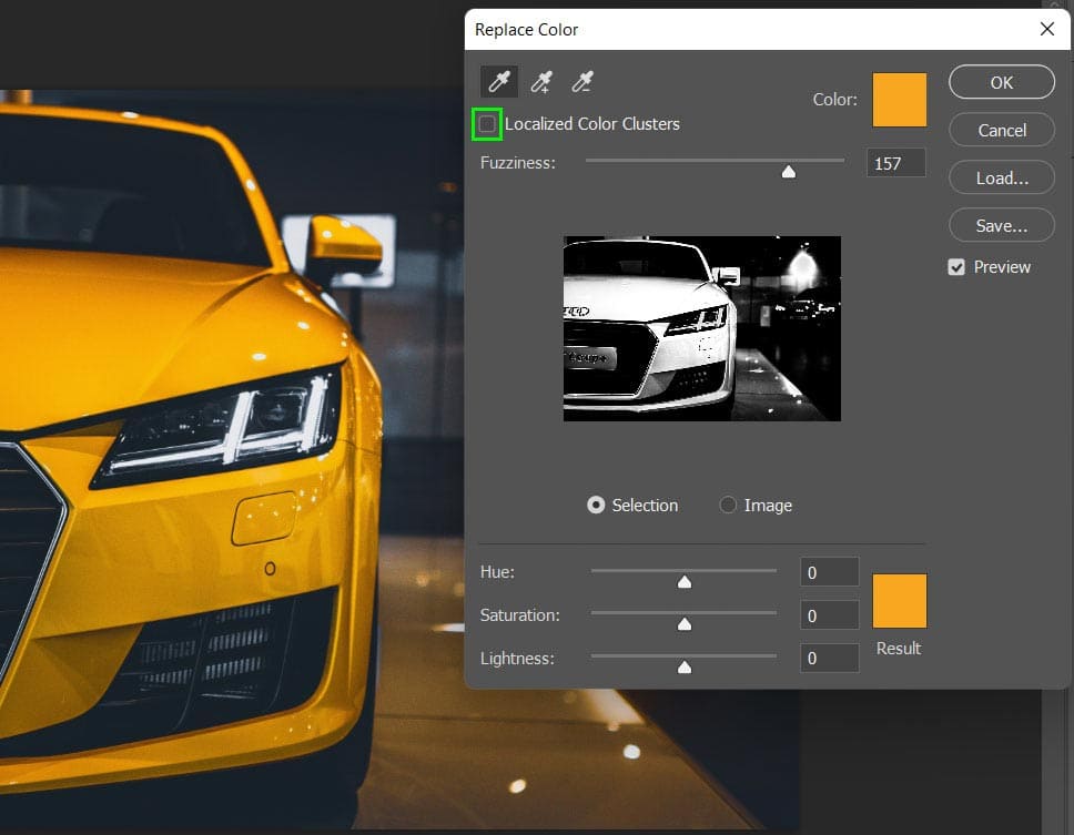
If you want the color change to only affect similar colors bordering the area you have selected, check the box next to Localized Color Clusters.
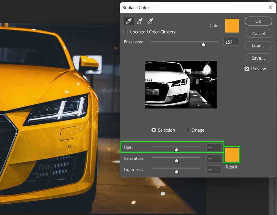
Step 3: Select The New Color
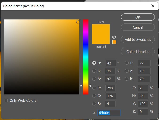
At the bottom of the window, move the hue slider to pick the new color you want the object to be. You can also click on the color block above Result to open the color picker and select a specific color.
Once your color is selected, adjust the Fuzziness slider as needed. The fuzziness determines how specific the range of color should be. A low fuzziness will only select colors very similar to your initial sample.
A high fuzziness will include more similar shades of the color you selected. That way you can select an entire color range despite being slightly different hues.
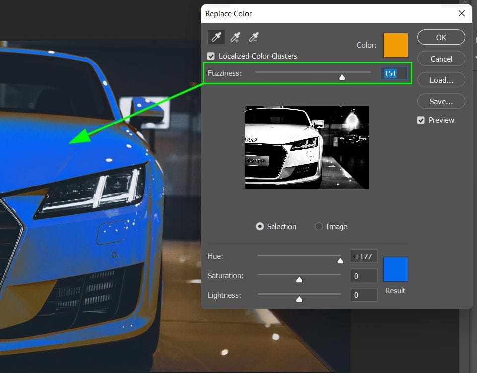
Even a high fuzziness won’t change all the shades of the color especially if there are very dark or light shades in the image. To complete the color change, select the eyedropper with the plus sign at the top of the window and click on the areas of the image that still need changing.
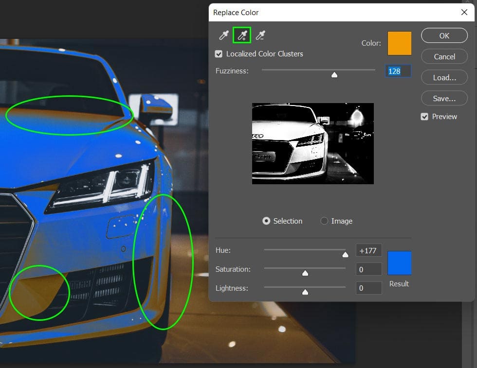
The eyedropper with the minus sign will return areas of the image to their original color.
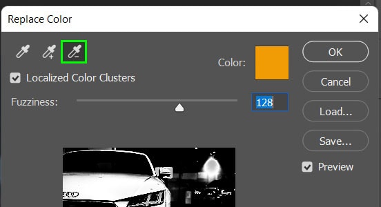
Once you have selected all the areas of the image where you want the color replaced, select OK.

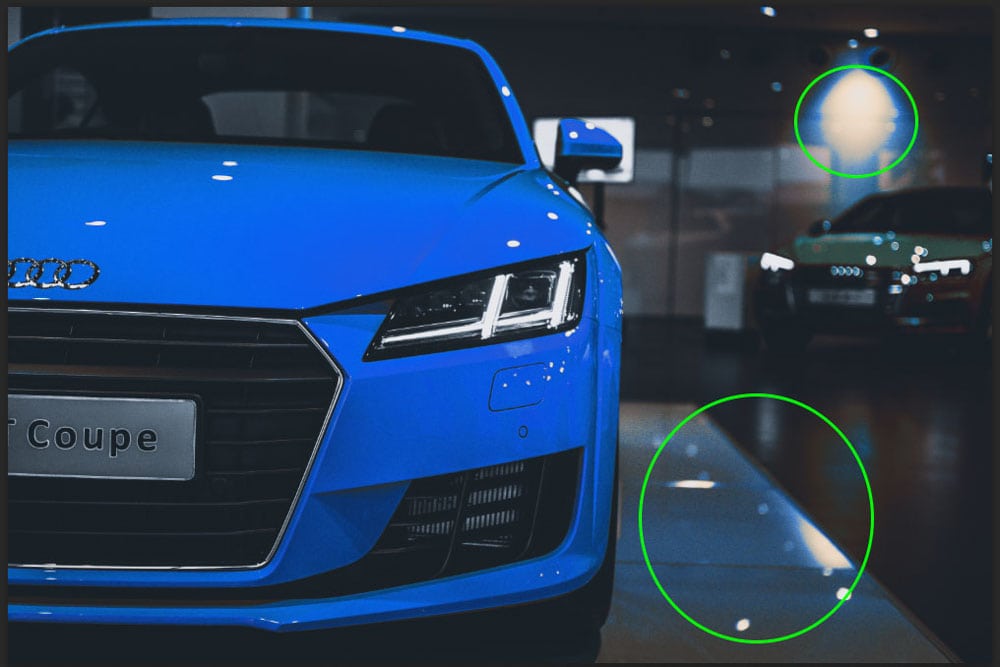
Step 4: Remove Unwanted Color Changes
When using the replace color tool, areas of your image that contain the target color will also change, even if you didn’t select those areas. You can undo the changes in these specific areas using a layer mask.
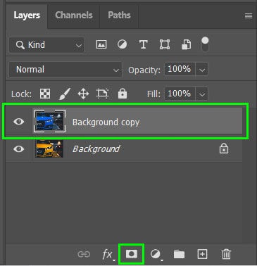
To add a layer mask, make sure the correct layer is selected and click on the Layer Mask icon at the bottom of the Layers panel.
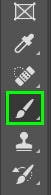
Once the layer mask is added to the layer, select the brush tool from the toolbar or press B and make sure the foreground color is set to black.
Using the brush, paint over the areas of the image where you want to undo the color changes. The painted areas will reveal the original image and will be shown on the layer mask thumbnail.
If you make a mistake and paint over areas you didn’t want to undo, change the foreground color to white and paint over the area since white will “hide” the original image again.
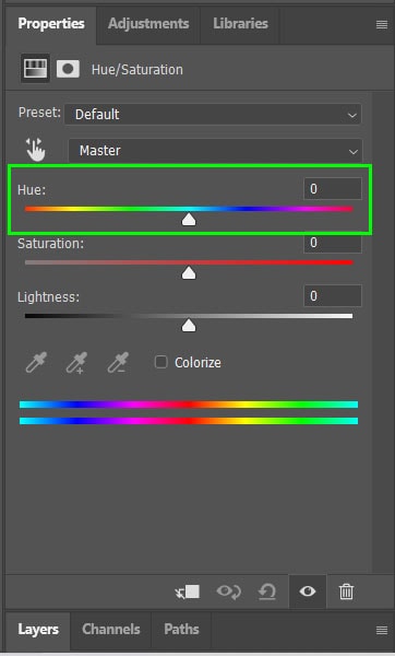
Option 2: The Hue/Saturation Adjustment Layer
Another way to change color in Photoshop is to use the hue/saturation adjustment layer. This method allows you to non-destructively edit the image using sliders. You can easily adjust changes later on in the project without affecting the rest of your edits.
The hue/saturation adjustment layer is not a good option if you want to change the colors to black or white. The hue adjustment only works with pure pigments meaning the scope of change is limited.
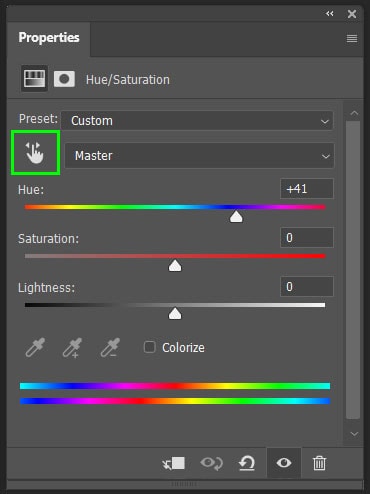
Step 1: Add The Hue/Saturation Adjustment Layer
To change color using the hue/adjustment layer, create a new layer by selecting the hue/adjustment icon from the adjustments panel. Navigate to Window > Adjustments if it is not visible.
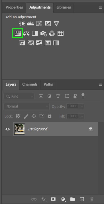
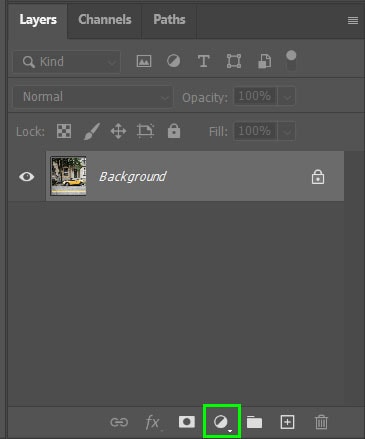
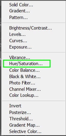
You could also add the layer by selecting the icon at the bottom of the Layers panel and choosing Hue/Saturation from the menu.
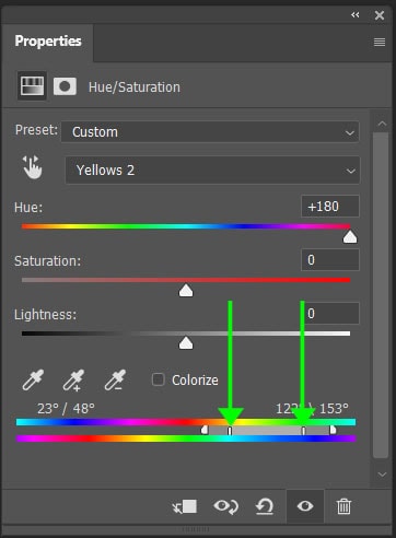
Step 2: Select The New Color
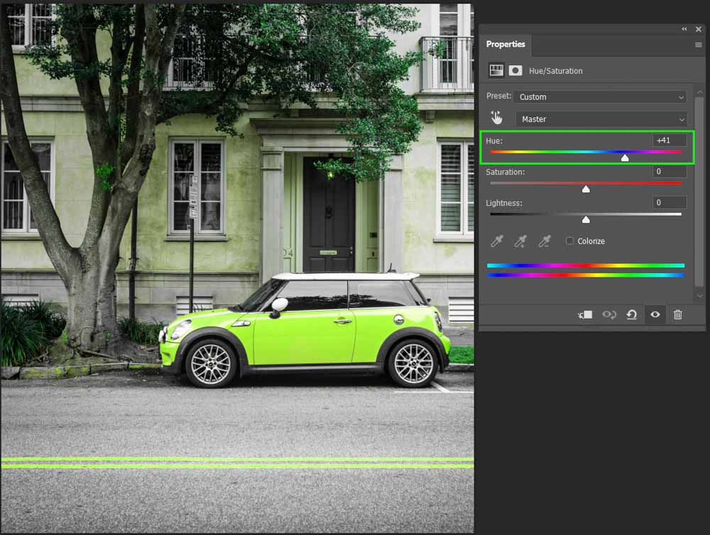
If you adjust the Hue slider in the panel, you will notice that all the hues in the image begin to change color.
You can also select the slider icon in the window to change the saturation levels by clicking and dragging on the color in the image. Hold in Control (Win) or Command (Mac) while clicking and dragging on the image to adjust the hue on the image.
If you want to change colors this way, increase the Saturation slider to +100 to easily see which colors are being targeted.
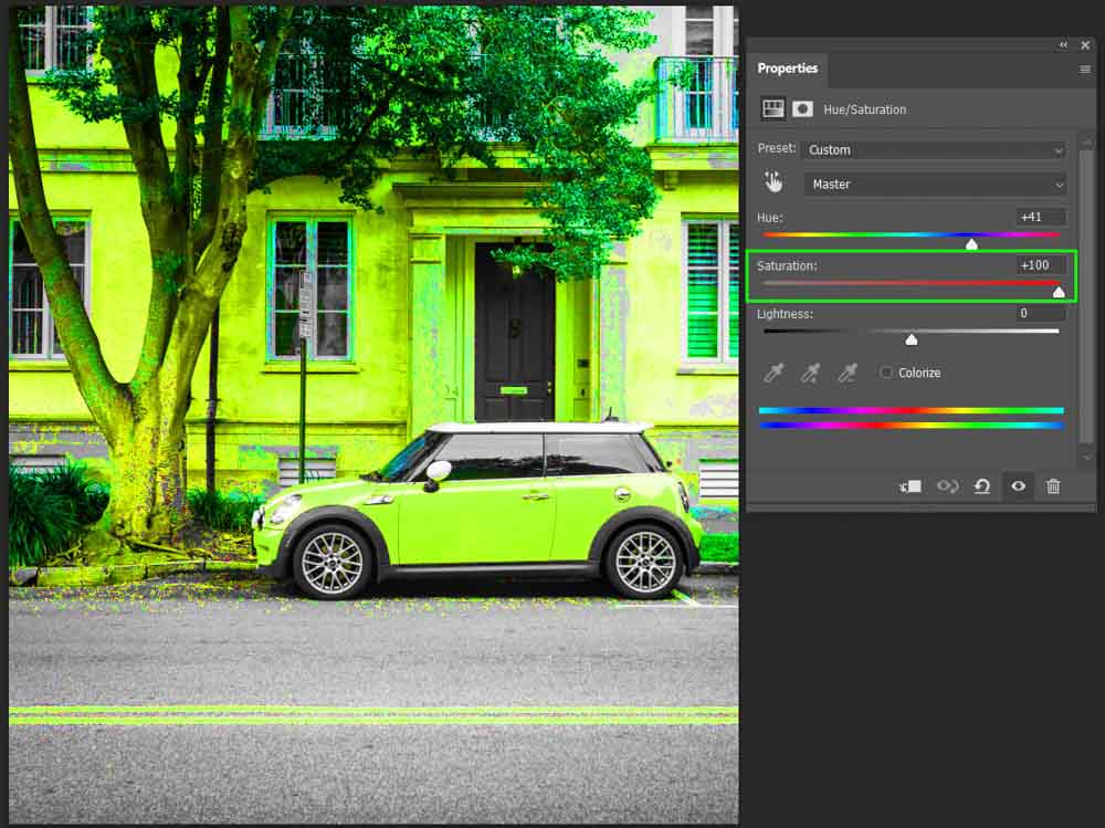
Then adjust the hue to change the image color as you would like and set the Saturation slider back to 0.
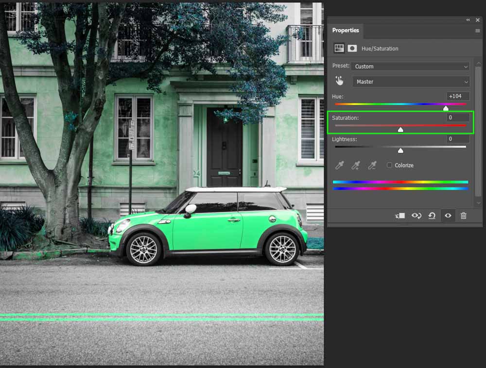
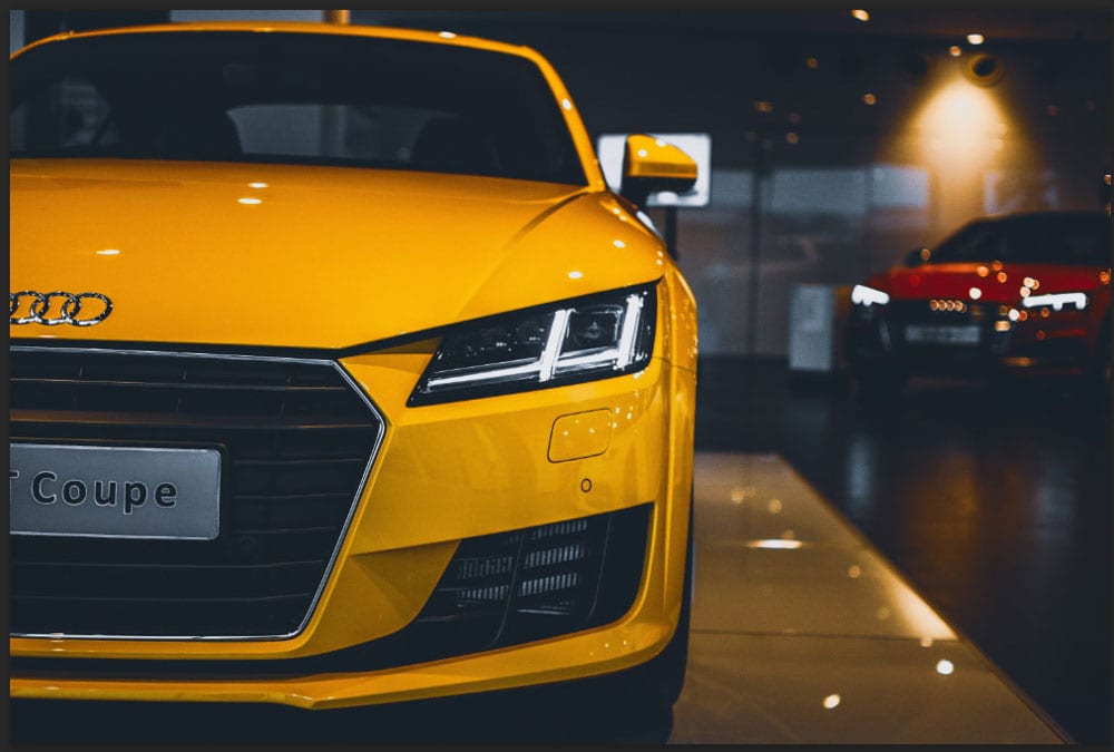
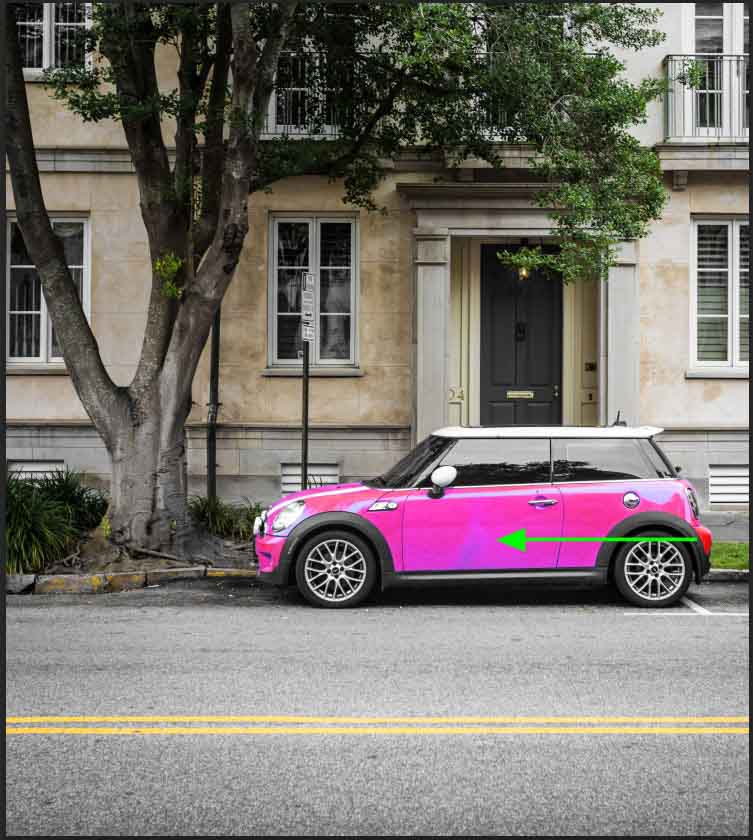
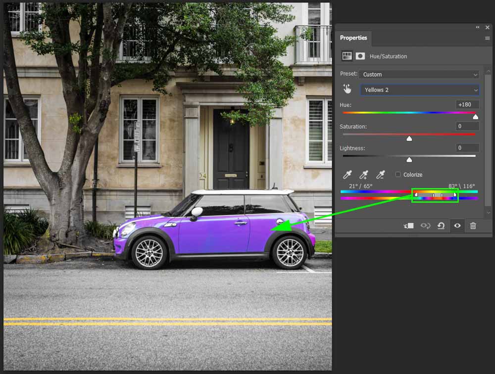
Since the colors around the car have also been altered, you can undo the color changes in those areas using the built-in layer mask on the adjustment layer.
Step 3: Remove Unwanted Color Changes
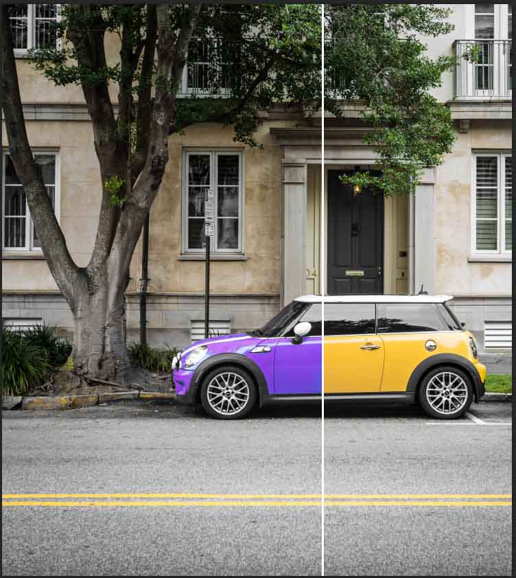
In this example, I’ll select the car using the object selection tool and hit Control + Shift + I (Win) or Command + Shift + I (Mac) to invert the selection and only select the area surrounding the car.
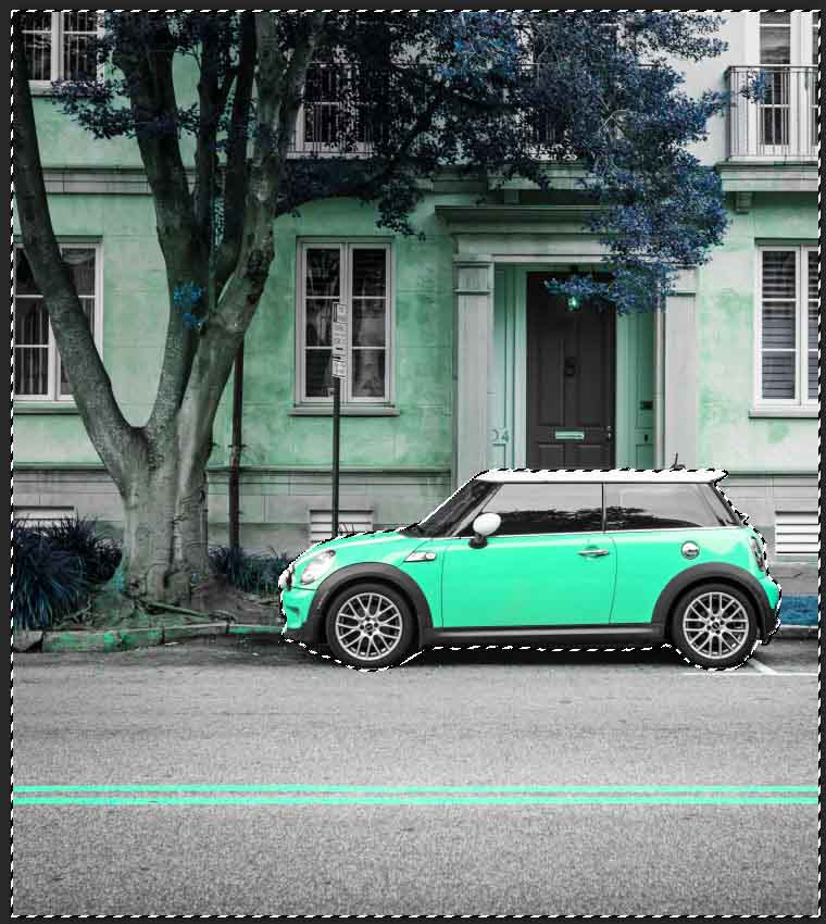
Selecting the brush tool, make sure the foreground color is set to black before painting over the image to set the colors around the car back to normal.
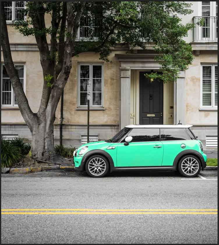
Once you have painted the areas back to the original color via the hue/saturation layer mask, press Control + D (Win) or Command + D (Mac) to deselect the image. Now the car will be a new color while the other areas remain untouched.
Step 4: Finalize The Color Range
If you want to have more control over specific colors, select the drop-down menu in the adjustment layer window and select the color channel you want to adjust. You can also use the eyedropper tool at the bottom to select the color on the image. Once a color is selected, you can adjust the bottom sliders to alter the color range.
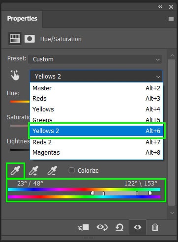
Adjusting the sliders on the outside will change where the color will “fall off” or begin to feather on the image.
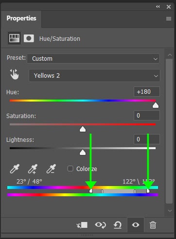
Adjusting the inner sliders will define the color range. The closer the inner slider is to the outer slider, the less the fall-off will be.
Working with individual color channels can result in uneven color change in some instances. Luckily, the color range sliders can add a creative effect or you may need to adjust the slider for a smoother transition.
Option 3: Using Selections & The Colorize Adjustment
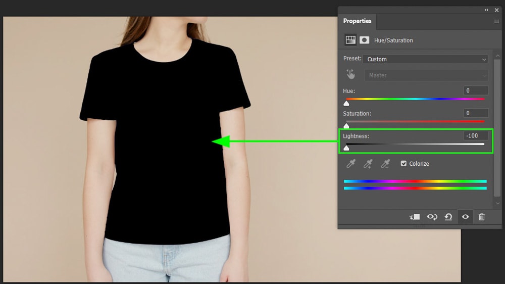
The colorize adjustment method works well to change colors on clothing and when you want to change a color to black or white. For the best results when colorizing an image, first select the area of the image where you want the colors changed.
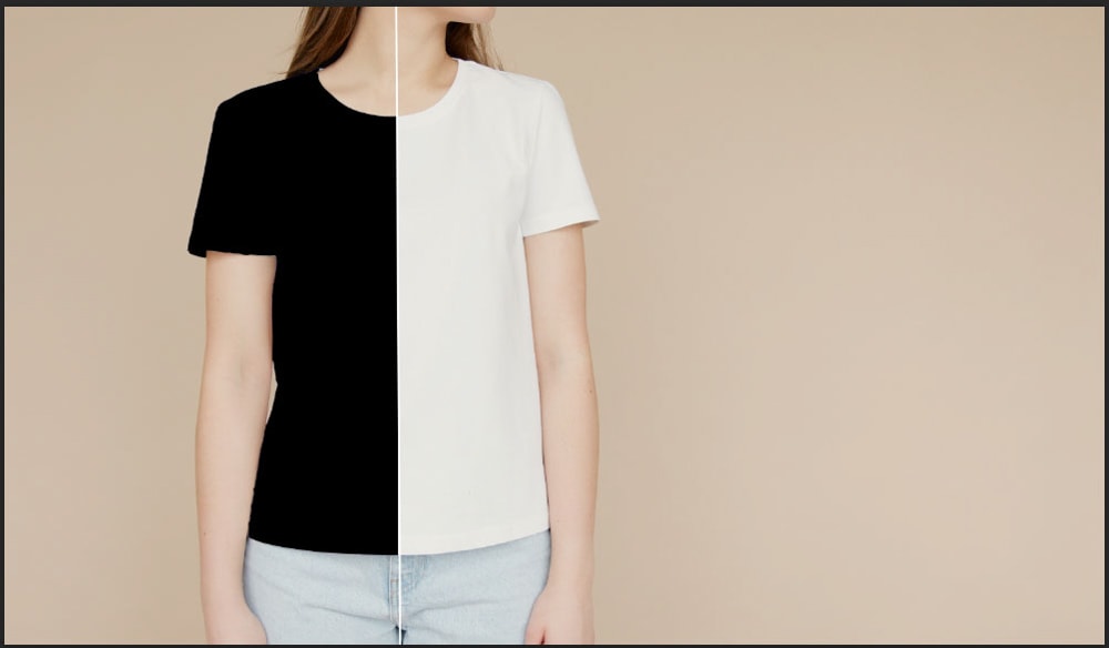
Using the colorize adjustment feature you can also add color to a grayscale image or create a monotone effect. This method does not work well when there are various shades and tones of a color.
Step 1: Make A Selection
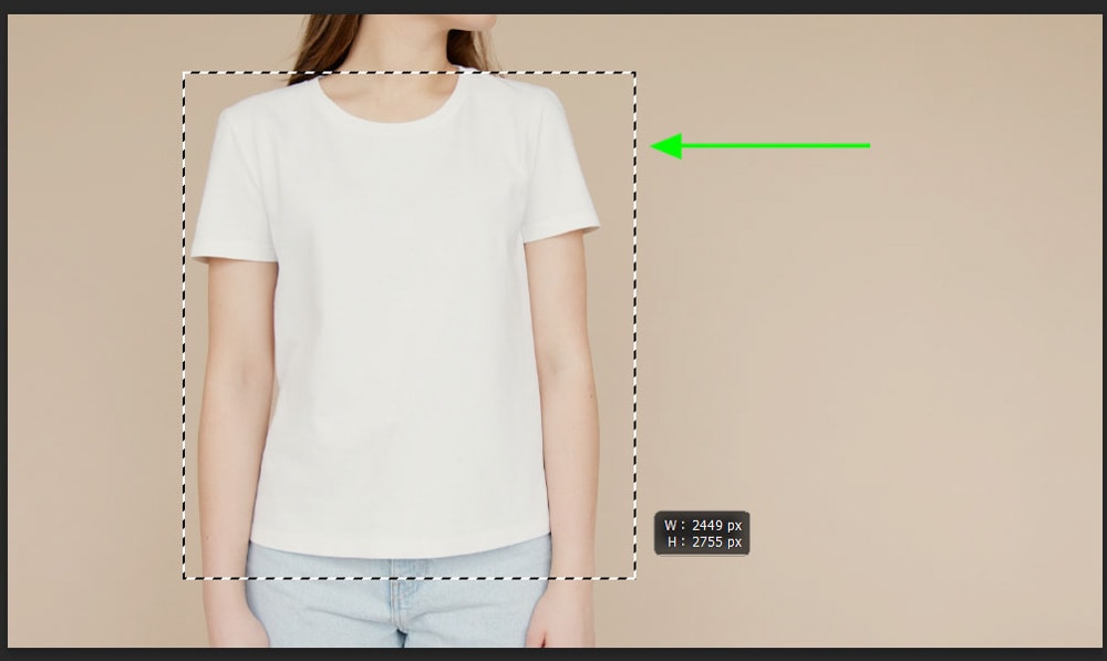
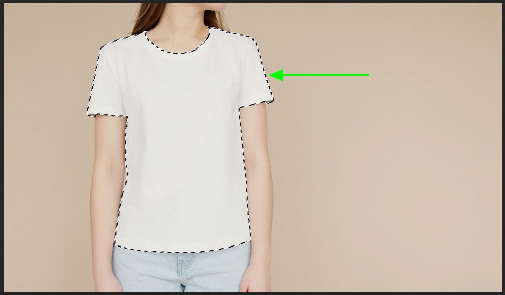
To change color with the colorize feature, select an area of the image with the Object Selection tool by selecting it from the toolbar or pressing W.
Once the tool is selected, click and drag around the object you want to change the color of. Let go to create the selection around the object.
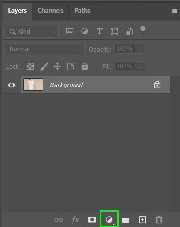
Step 2: Add The Adjustment Layer
Once the selection is made, create a new adjustment layer by selecting the icon at the bottom of the Layers panel and choosing Hue/Saturation from the menu.
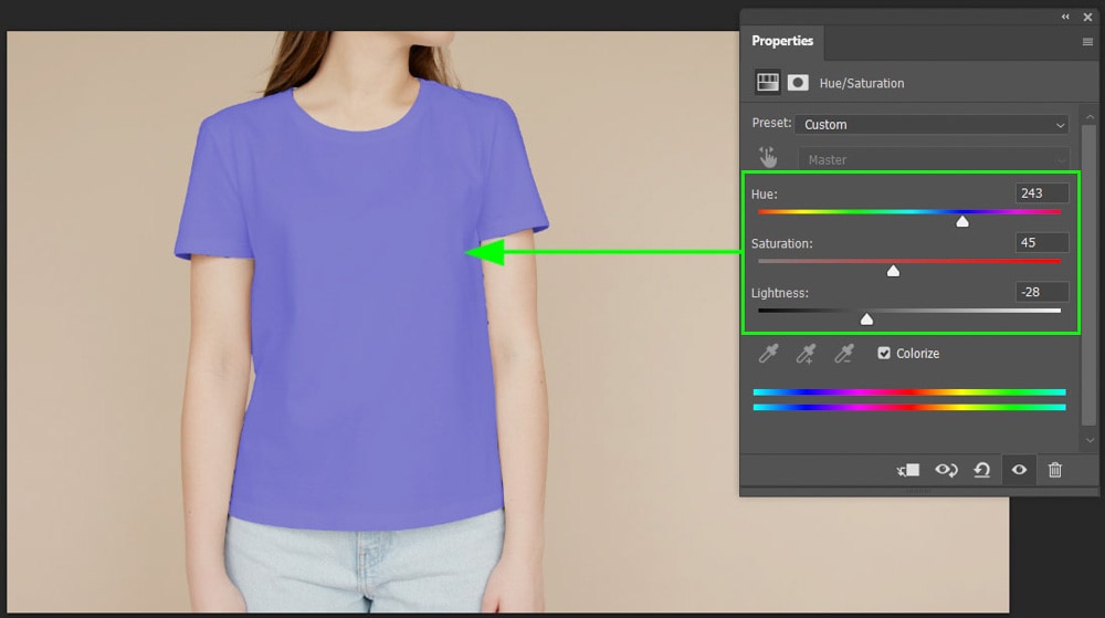
Check the box next to Colorize to enable the effect. Then use the sliders to adjust the hue, saturation, and lightness. Setting the lightness slider to -100 will turn the t-shirt black.
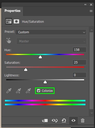
You can adjust the sliders as needed to change the shirt color to any color you like.
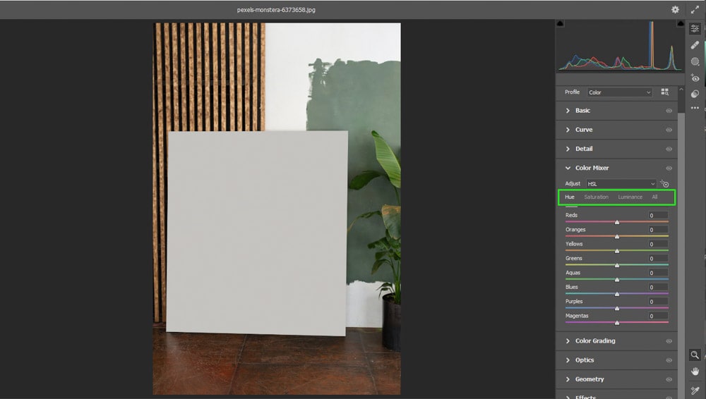
Option 4: The HSL Adjustment Within Camera Raw
Altering color using the HSL adjustment within Camera Raw gives you a lot more control over the colors in the image. You can use this method to make certain colors pop on an image.
The HSL sliders can be used to target specific colors, such as grass or water. They can also be used to correct colors such as skin tones. The three groups of sliders are:
Hue – The actual color
Saturation – The richness of a color in an image
Luminance – The lightness or darkness of the color
To use the HSL sliders, you can use any file type since you can add a Camera Raw filter to it. The Camera Raw filter allows you to edit non-destructively as you can navigate back to the filter to re-adjust edits later on.
To use the Camera Raw filter to adjust colors on a non-raw image, such as jpeg, start by duplicating the image layer and converting it to a smart object. If you are working with a RAW file, Camera Raw will open automatically.
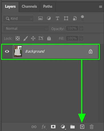
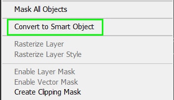
Step 1: Duplicate The Layer And Create A Smart Object
To duplicate the layer, drag the image layer to the new layer icon at the bottom of the Layers panel. You can also press Control + J (Win) or Command + J (Mac) while the layer is selected.
Right-click on the new layer and select Convert to Smart Object.
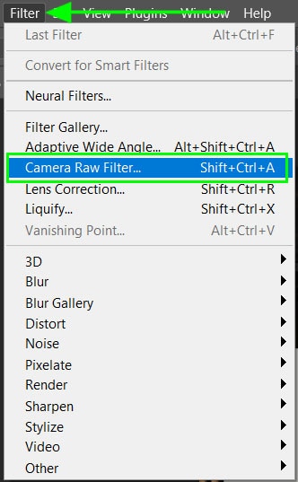
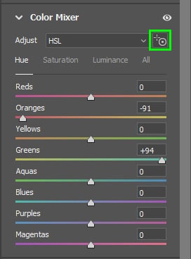
Step 2: Open Camera Raw And Color Mixer
Once the layer is converted to a smart object, open the Camera Raw filter by selecting Filter > Camera Raw Filter. You can also press Shift + Control + A (Win) or Shift + Command + A (Mac).
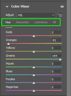
Once the Camera Raw window appears, make sure the edit tab is open and click on the arrow next to Color Mixer.
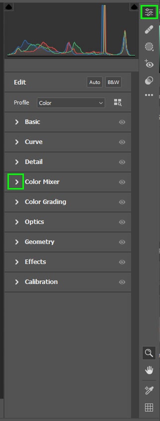
Navigate between the Hue, Saturation, and Luminance tabs in the Color Mixer menu. Selecting the hue tab lets you alter the different colors in the image.
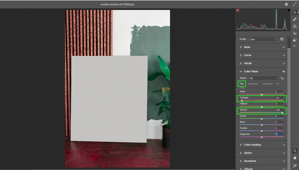
Step 3: Adjust The Colors
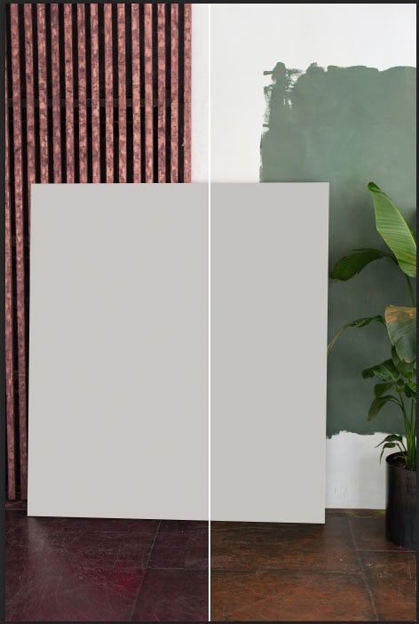
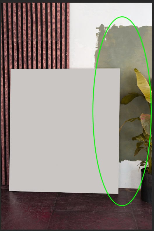
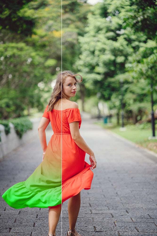
In the Hue tab, move the oranges slider to the left to change the wood background and the color on the floor. Then move the green slider to the right to change the color of the green plant and background area.
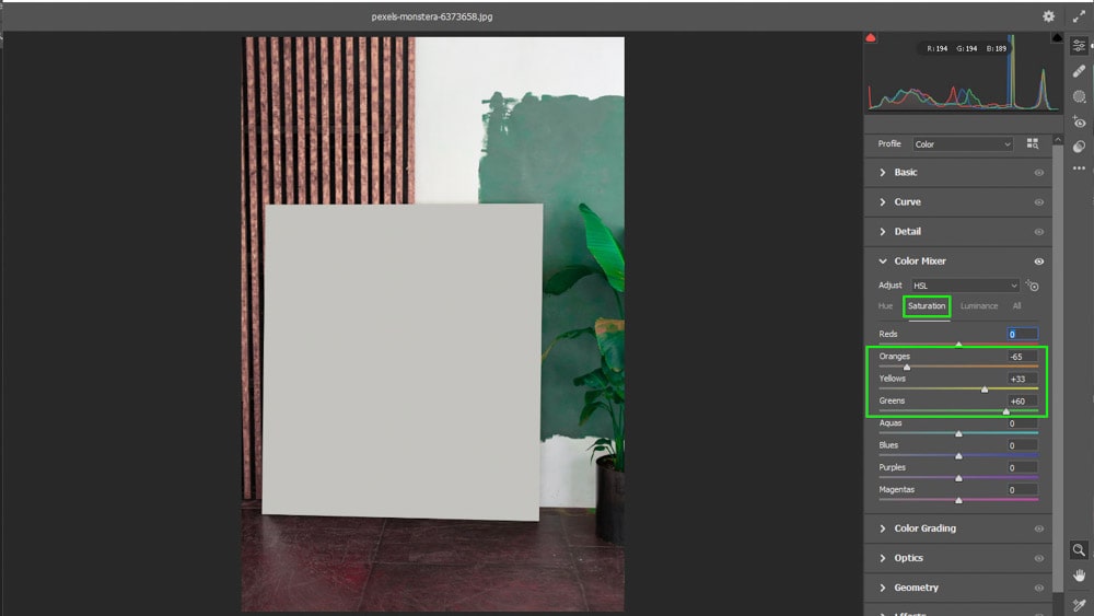
Switching to the Saturation tab, alter the same sliders, in the same way, to make the green features pop and the orange colors fade slightly. You can also add saturation in the yellows slider to bring out areas of the plant.
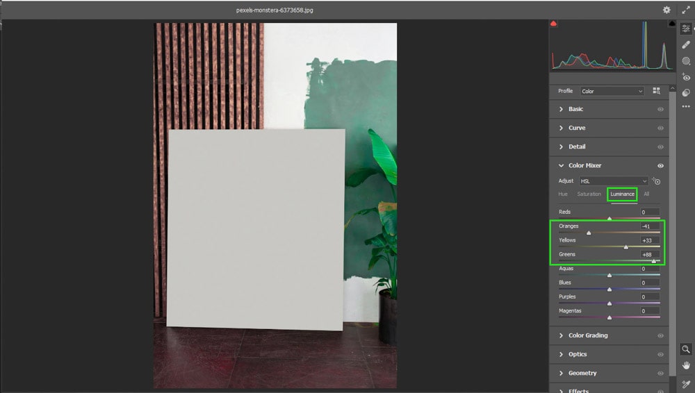
Lastly, move to the Luminance tab and adjust the sliders as needed to bring out specific colors. You will notice that the sliders will only alter the colors actually in the image. If you adjust the purples slider, this image won’t change since there are no purple colors in it.
Step 4: Use The Targeted Adjustment Tool
You can also use the Targeted Adjustment tool to change specific areas of the image. Select the adjustment icon at the top of the mixer or press Control + Alt + Shift + [H/S/L] (Win) or Command + Option + Shift + [H/S/L] (Mac). Use the letter based on whether you want to adjust the hue, saturation, or luminance of the color.
Once the adjustment tool is selected, click on the color in the image that you want to adjust and drag to the right or left. This will adjust as many color sliders as are selected in the sampled area. You will notice two circles appear to show the different hues you can change the area to.
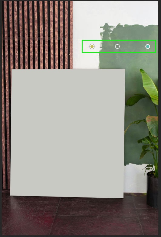
By using the adjustment tool, you only alter the colors from the area you sampled.
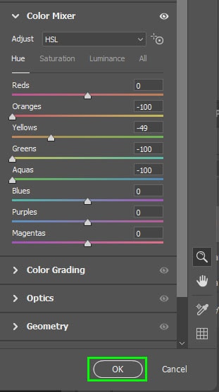
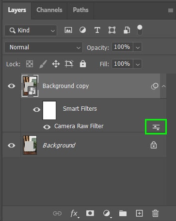
Once you have adjusted the colors, select OK. A new filter will be applied to the layer underneath smart filters. You can double-click on the icon to the right of the filter layer to re-open the Camera Raw window and adjust your edits at a later stage.
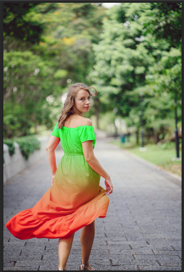
Option 5: Partial Color Replacement With Layer Masks
By using layer masks, you can partially change the color of certain objects to create a stylized color edit. This method works best for backgrounds and objects. However, it won’t work to change colors to black or white because it uses the hue/saturation adjustment.
Step 1: Duplicate The Layer And Create A Selection
Once you have your image open, duplicate the background layer by clicking and dragging it to the new layer icon at the bottom of the Layers panel. You can also press Control + J (Win) or Command + J (Mac) while the layer is selected.
With the new layer selected, create a selection around the object you want to add a color gradient to. You can use any of the selection tools, for example, the quick selection tool.
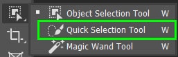
With the quick selection tool, drag over the object you want to select. If you select too much around the object, hold in Alt (Win) or Option (Mac) while clicking on areas to remove the selection.
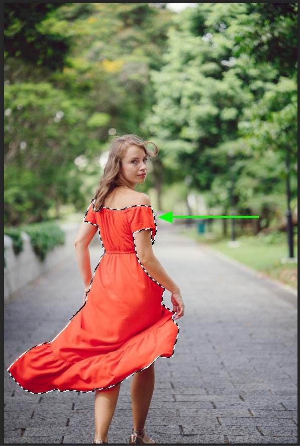
Step 2: Add The Adjustment Layer
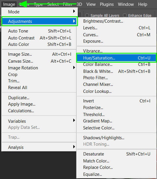
To add a hue/saturation adjustment directly to your new layer and onto the selection you have made, navigate to Image > Adjustments > Hue/Saturation or press Control + U (Win) or Command + U (Mac).
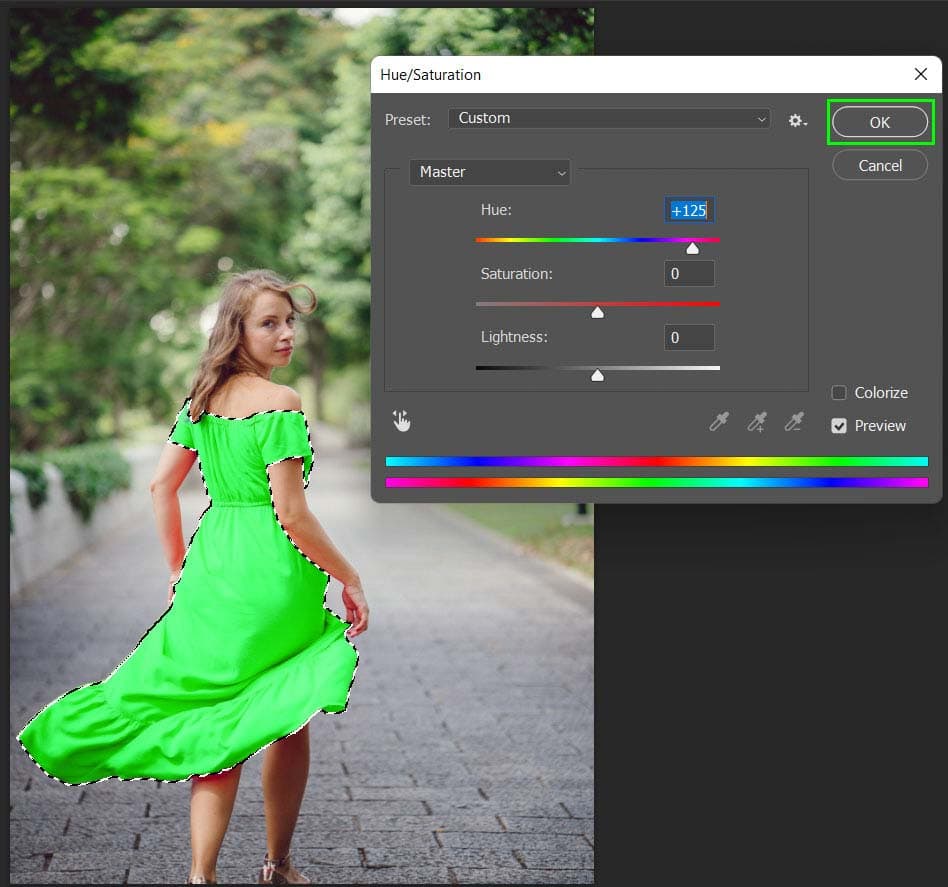
In the adjustment window, move the hue slider by dragging the triangle to the right or left to select the new color you would like to use.
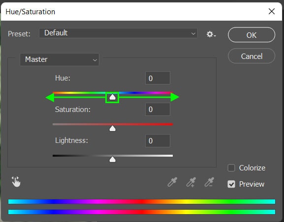
Once you are happy with the new color, select OK to add the adjustment to your layer.
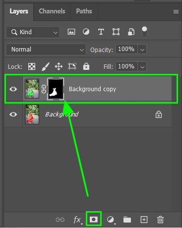
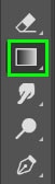
Step 3: Add A Layer Mask
Add a layer mask for the layer by clicking on the layer mask icon at the bottom of the Layers panel. You will see the mask appear next to the layer thumbnail, indicating the area where the new color was added. Make sure the mask is selected, which is indicated by the white border around the thumbnail.
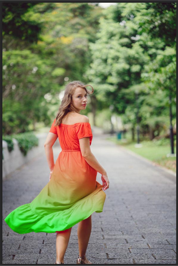
Step 4: Add The Gradient
Select the gradient tool from the toolbar or press G. Then, adjust the tool settings on the options bar. Make sure the opacity is at 100%, the gradient is set to a linear gradient, and the blend mode should be set to normal.

Click and drag across your image in the direction you want the gradient to be made. You can draw the line at the angle that works for your image.
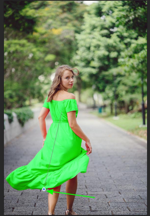
If you want the gradient to work the opposite way, in this case, to make the dress orange at the top and green at the bottom, switch the background and foreground colors around before adding the gradient.
Drag the line across your image and your gradient will be created across the dress.
Using any of these five color-changing methods makes manipulating the colors of clothing, objects, or backgrounds super simple in Photoshop. Now that you have these color-changing tips, let’s dive into some more advanced ways to change black into color in our projects!