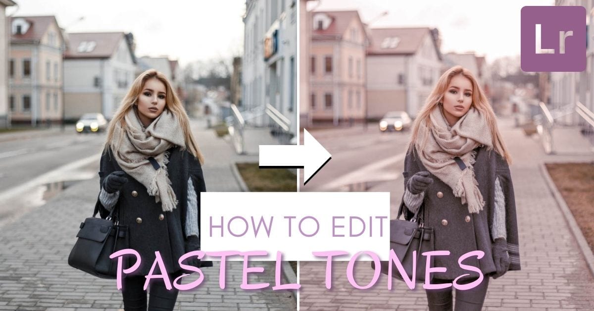

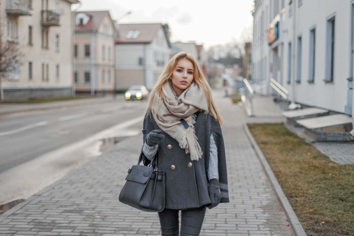
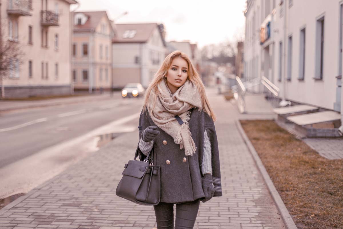
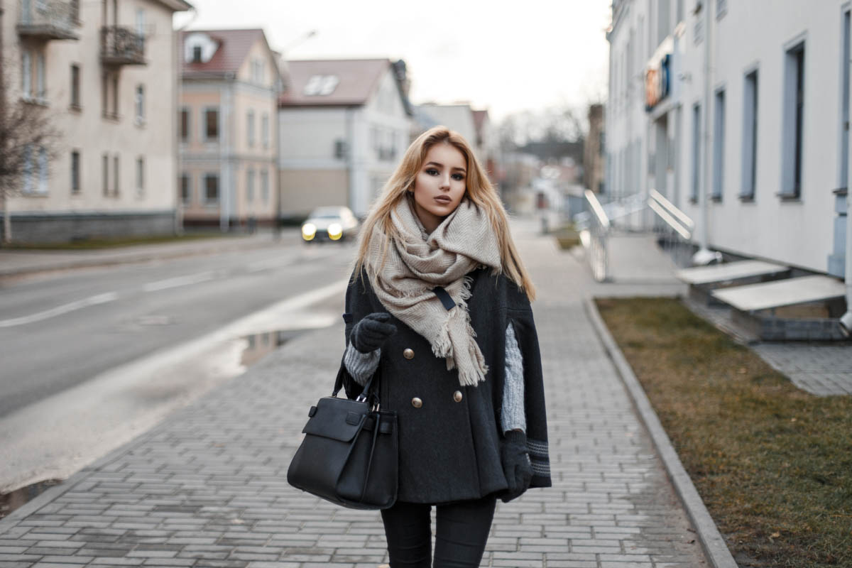
Adding a soft pastel look to your photos in Lightroom is a great way to stylize your social media feed. Better yet, this editing style looks fantastic with portraits, weddings, family photos, as well as newborn images! To create a soft pastel look in your photos, you need to soften contrast, boost color luminance, and add some pastel tones with color grading. If you’re new to Lightroom, this might seem a bit daunting, but you can create this look in minutes with these simple steps!
To add a pastel look to your photos in Lightroom, follow these steps:
- Lift the shadows and decrease the highlights
- Adjust the white balance to favor yellow and magenta.
- Add blue and red to the shadows via the Tone Curve
- Use HSL to desaturate any dominant colors
- Add pink to the mid-tones using Color Grading
- Add green to the shadows using Color Grading
Throughout this tutorial, you’ll learn the process behind each of these steps more in-depth. If you are a Lightroom Mobile user, I’ll cover how to create this effect in the app later in the post! For now, let’s begin with creating a pastel editing style in Lightroom Classic!
How To Edit A Pastel Look In Lightroom
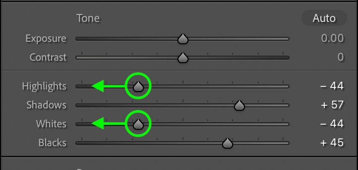
Step 1: Lift The Shadows & Bring Down The Highlights
The first step in this effect is to soften the contrast and create a more HDR look in the photo. By lifting the shadows and darkening the highlights, you can quickly soften your entire image.
Within the Develop Module, open the Basic Panel. Inside you will see the highlights, shadows, whites, and blacks sliders. Start by increasing the shadows and blacks. Be careful not to go overboard with this, or your image may look washed out.
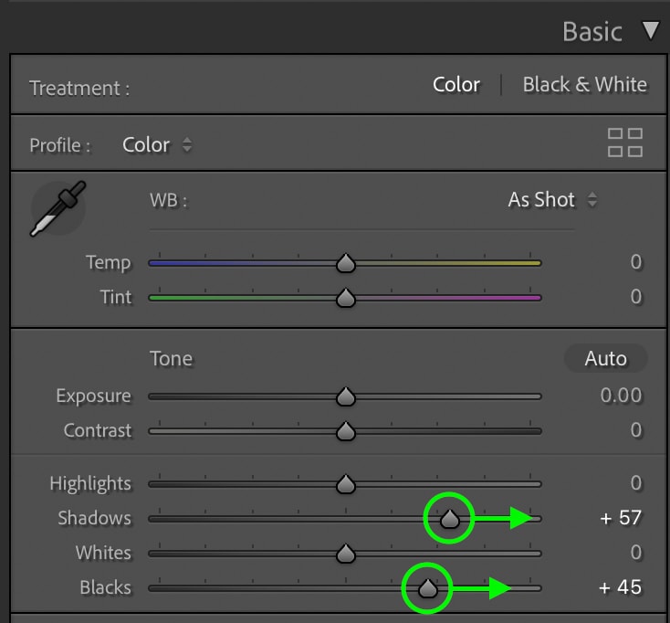
Next, bring down the highlights and whites sliders. This will bring back more detail in the brightest parts of your photo and help with the soft look of your edit.
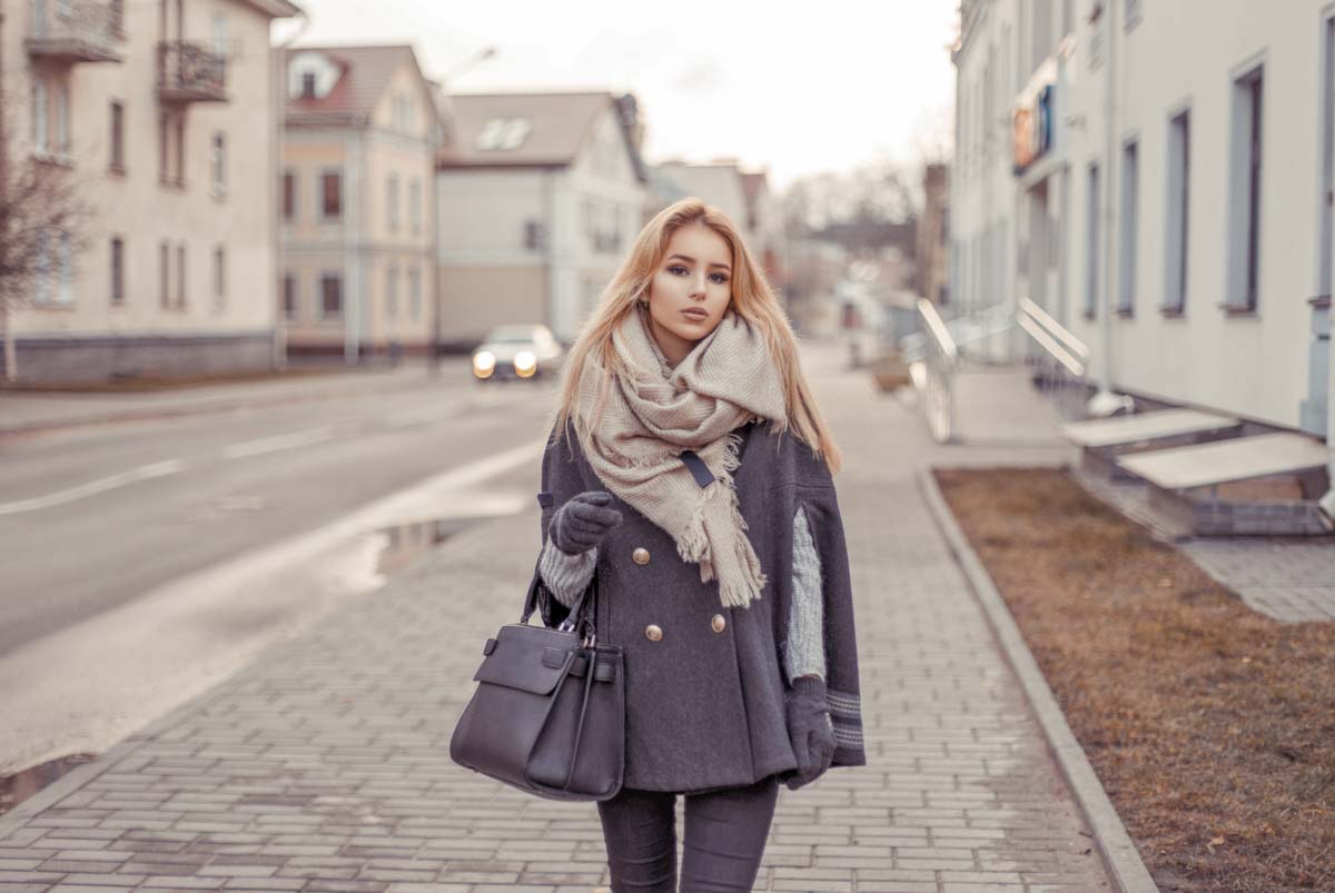
Here’s how my photo looks after applying these exposure effects:
Step 2: Adjust The White Balance To Favor Yellow And Magenta
Still within the Basic Panel, go to the white balance adjustment. With the Temp slider, move it right to add more yellow hues to your photo.
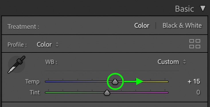
Then with the Tint slider, move it right as well to add some magenta hues.
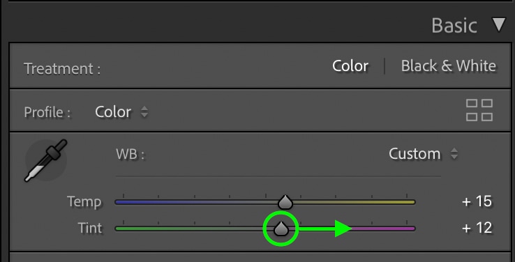
Together these white balance adjustments will create a good starting point for these pastel tones. Here’s how my edit looks now:
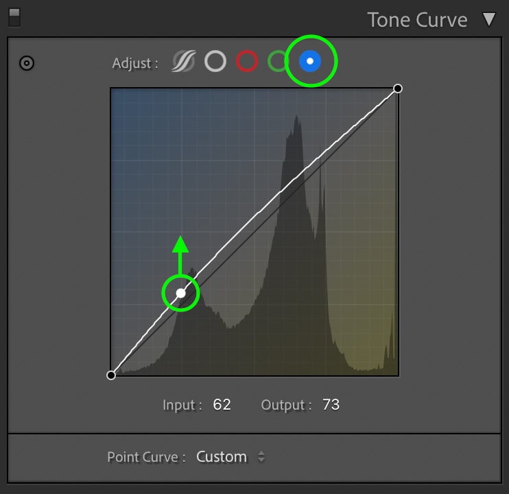
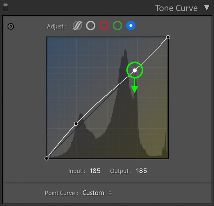
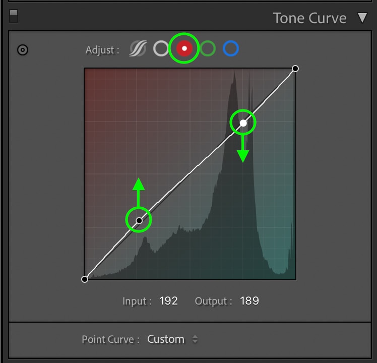
Step 3: Add Blue & Red To The Shadows Using The Tone Curve
The next tool you need to use is the Tone Curve. This is an excellent tool for controlling contrast and adding slight color hues to different exposures in your photo. You can learn more about it here. For this soft pastel edit, you want to add blue and red to the shadows of your photo.
Clicking on the blue channel of the Tone Curve, click in the shadows region, and drag up slightly to add blue. To counter this color in the highlights, add a second point in the highlights region and drag it down. Now, this blue hue will only affect the shadows and some of the mid-tones.
You’ll then do a similar process with the red channel. Click on the red color channel, add an anchor point in the shadows region and drag up. Then add a second anchor point in the highlights to counter this adjustment and keep it localized to the shadows.
Here’s how my image looks after this step:
Step 4: Adjust The HSL
Now for the fun part, editing the colors! The HSL tool is one of the best tools for this since you can target every color range in your image to change the hue, saturation, or luminance. For this pastel edit, you will need to make some adjustments within all of these settings.
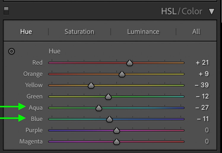
Starting in the Hue adjustment, you need to make the reds, oranges, yellows, and greens favor a more yellow-orange hue. With that in mind, adjust your sliders accordingly to create that look. Here’s how I adjusted mine.
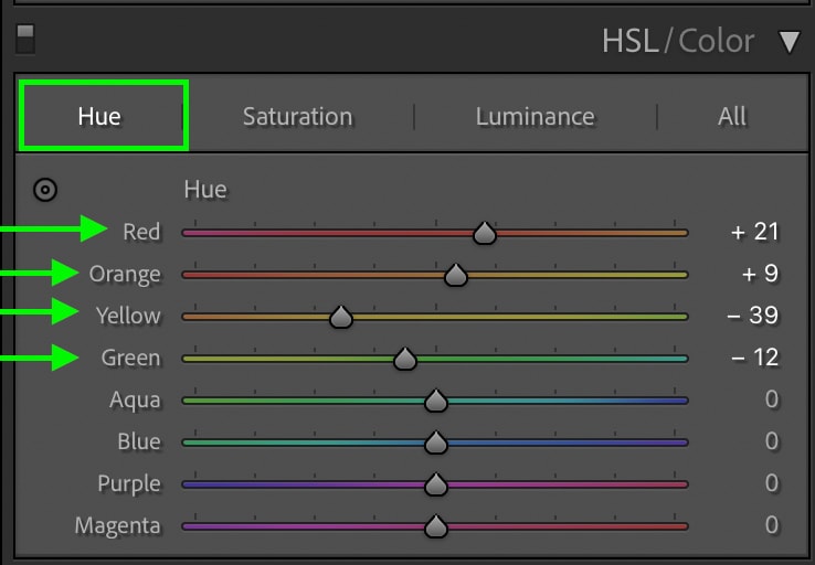
As for the aqua and blue color channels, adjust these to favor a more cyan teal color. This will complement the other pink tones nicely.
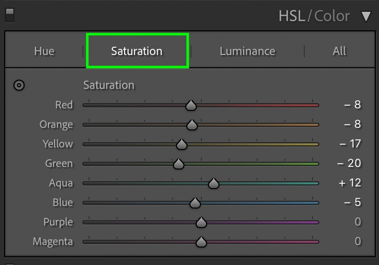
Now click on the saturation adjustment and desaturate any of the most dominant colors in your image. For example, if you see a lot of yellow in your photo, desaturating the red, orange, and yellow sliders would be ideal. That’s because all of these color ranges are closely related. The goal here is to mute any overly saturated colors in your photo.
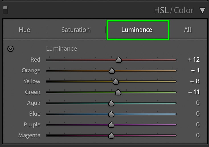
Lastly, click on the luminance adjustment to adjust the brightness of your colors. Increase the luminance of the red, orange, yellow and green color channels slightly. Then decrease the luminance of the aqua and blue channels slightly.
With the HSL adjustments complete, here’s how my image looks.
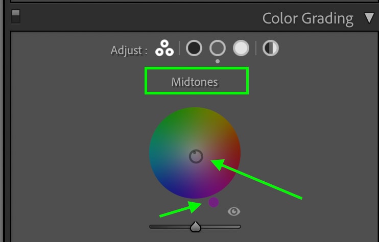
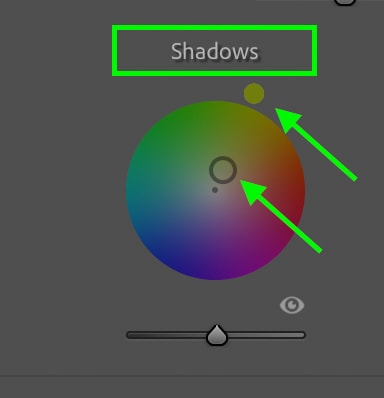
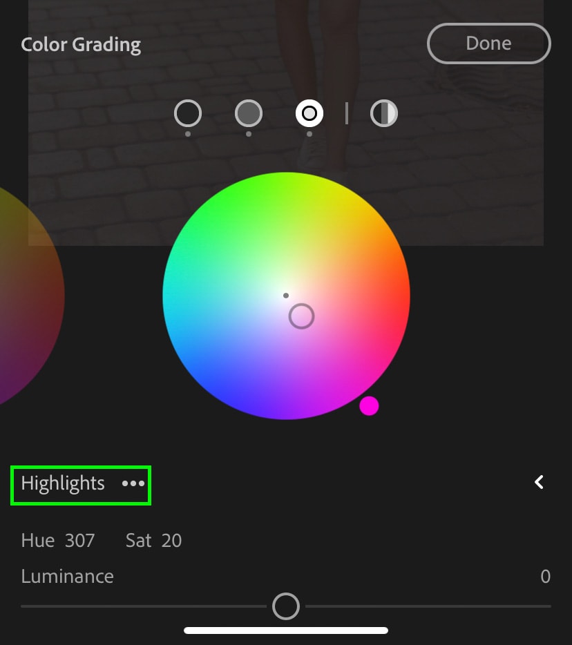
Step 5: Add Pastel Tones With Color Grading
It’s now time to use the Color Grading adjustment to add pink pastel hues to the entire image. With this tool you can selectively add color hues to the shadows, mid-tones, and highlights.
Starting in the mid-tones, add a desaturated purple color.
Then in the shadows add a desaturated green-yellow color.
And lastly in the highlights add a light pink color.
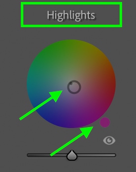
These three color tones combined will give your image a pink pastel feel and enhance all the edits you previously made! Here’s how my image looks after those adjustments.
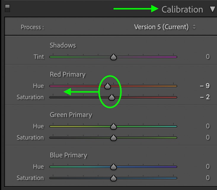
Step 6: Adjust The Calibration Sliders
For the final step in this effect, go to the Calibration panel at the bottom of your adjustment bar. You can experiment with this, but if you aren’t sure, the recommendations below are a great starting point.
With the Red Primary adjustment, move the hue and saturation sliders to the left slightly.
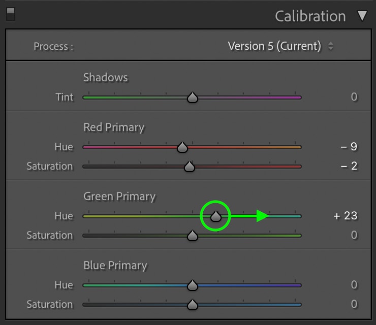
In the Green Primary, move the hue slider to the right and leave the saturation slider untouched.
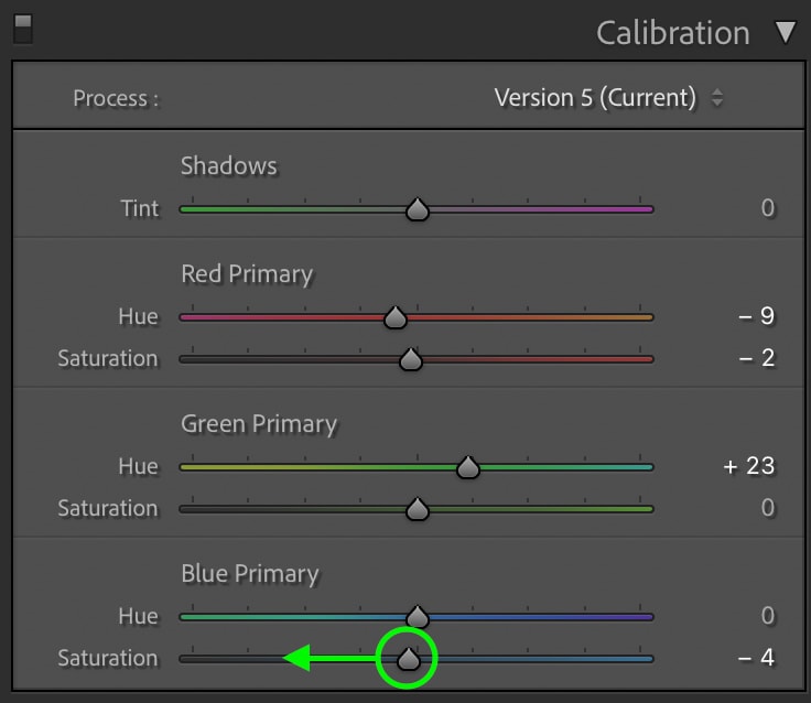
Then for the Blue Primary, leave the hue slider untouched but decrease the saturation slider by moving it left.
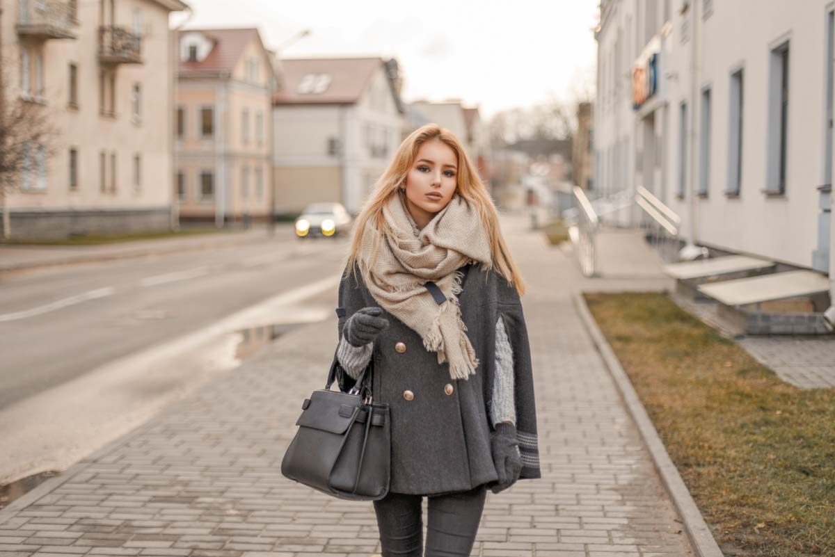
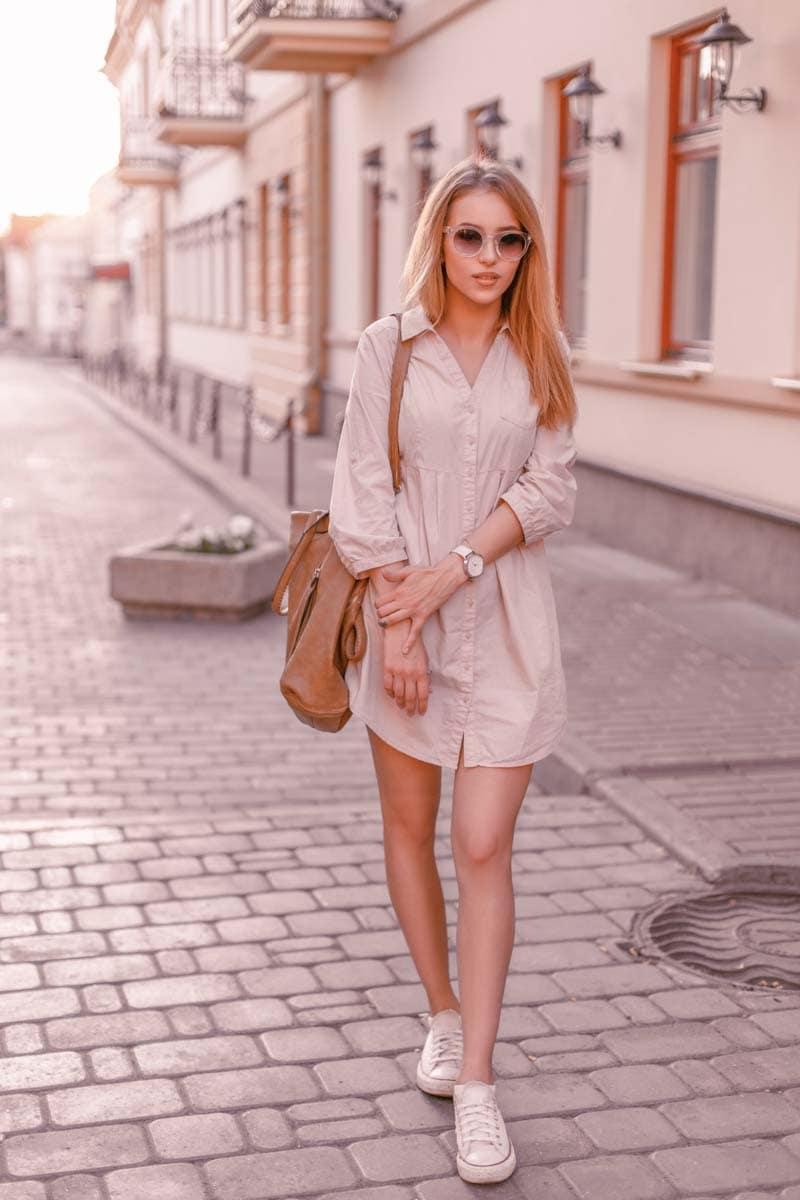
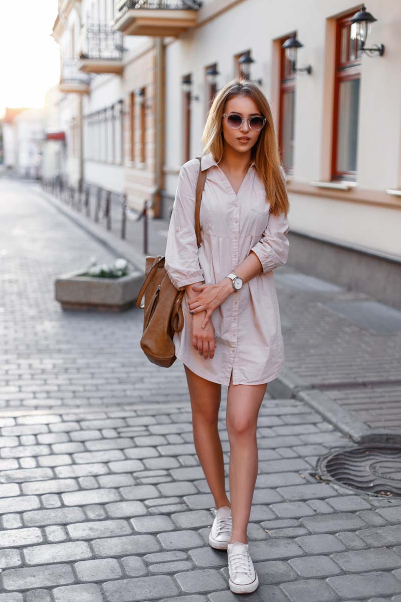
The Result


Before After
After these six easy steps you are left with a soft pastel look to your photo in Lightroom! By softening the contrast, warming up the white balance, desaturating some colors, and adding pastel color grading, you can nail this effect in minutes. Now that you have the process down in Ligthtroom Desktop, let’s discuss how to create this effect in the free Lightroom Mobile App!
How To Edit Pastel Tones In Lightroom Mobile
This process follows a similar set of steps as in Lightroom Desktop. The difference, however, is where you access the adjustments and in which order. Don’t worry, it’s still very easy to do and beginner-friendly! If you are new to using Lightroom Mobile, this guide will get you up to speed.
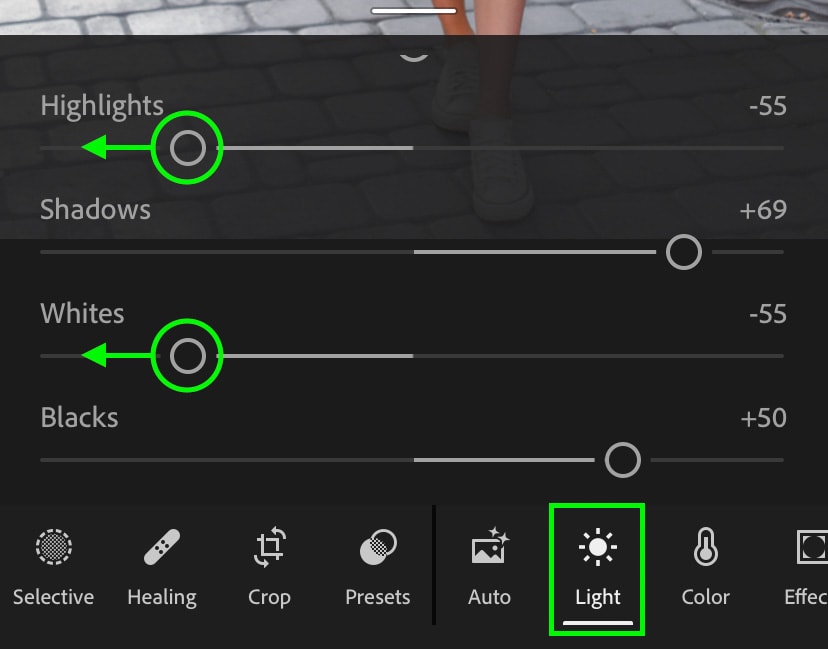
Step 1: Soften The Contrast In The “Light” Adjustment
Start by clicking on the Light Adjustment to access all of your exposure and contrast adjustments. Lift the shadows and blacks sliders to soften the darkest areas of your photo.
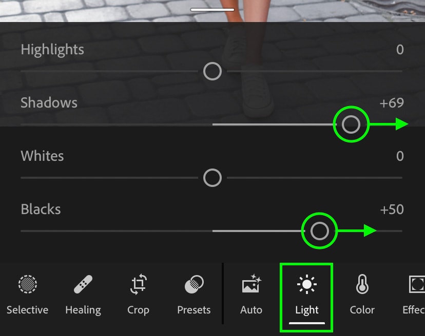
Then bring down the highlights and whites sliders to bring back details and balance your exposure. Now you’ll have a soft contrast look in your photo.
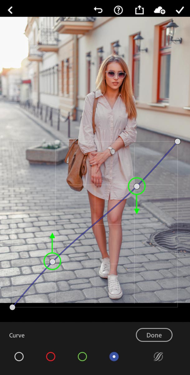
Step 2: Edit The Curves Adjustment
Within the Light adjustment, click on the Curve option found at the top of the panel.
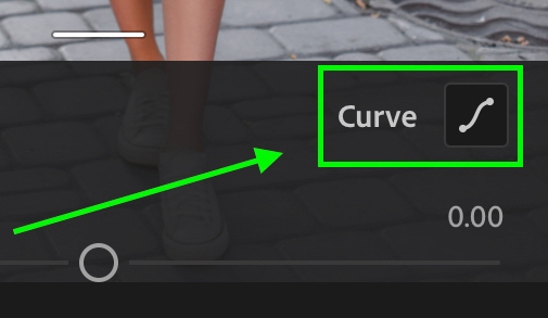
Now click on the blue tone curve color channel. Adding an anchor point in the shadows, drag up to add blue to your photo. Then add an anchor point in the highlights and drag down. This will ensure the blue color is isolated in the shadows and mid-tones only.
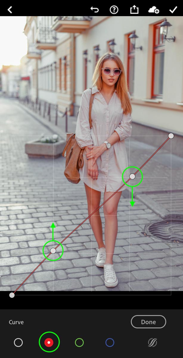
Next click on the red color channel and repeat a similar process. Dragging up the shadows to add red, then dragging down the highlights to isolate the color effect in the shadows and mid-tones.
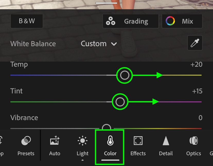
Step 3: Adjust The White Balance
Now moving to the Color Adjustment, it’s time to edit the white balance. Start by moving the Temp slider right to add more yellow tones. Then move the Tint slider to the right to add more magenta.
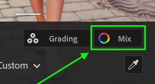
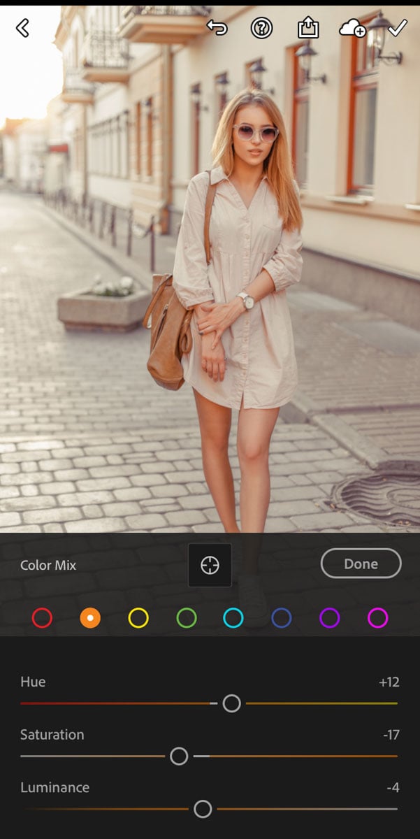
Step 4: Edit The Mix Adjustment
In Lightroom Mobile, the Mix adjustment is the equivalent of the HSL adjustment in Lightroom desktop. It allows you to change colors via hue, saturation, and luminance adjustments. To access it, click the “Mix” icon at the top of the Color adjustment panel.
Starting with the hue adjustments, adjust the red, orange, yellow, and green color ranges to favor a more yellow-orange hue. Then adjust the aqua and blue color ranges to favor a more cyan-teal color.
Then with the saturation adjustment, desaturate the red, orange, yellow, and green color channels slightly. You may want to do this with the blue as well if there is a lot of this color in your photo.
As for the luminace, play around with this until you find a look you are happy with. If you aren’t sure, try increasing the luminance of the reds, oranges, yellows, and greens.
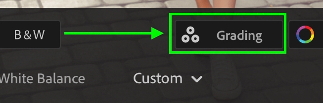
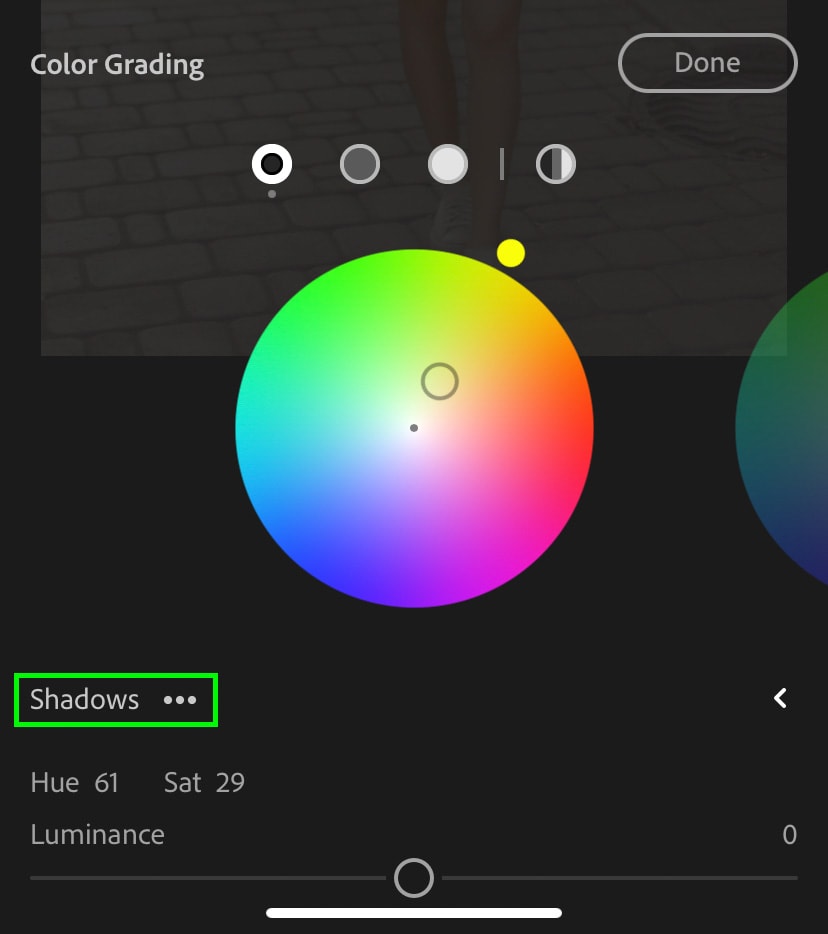
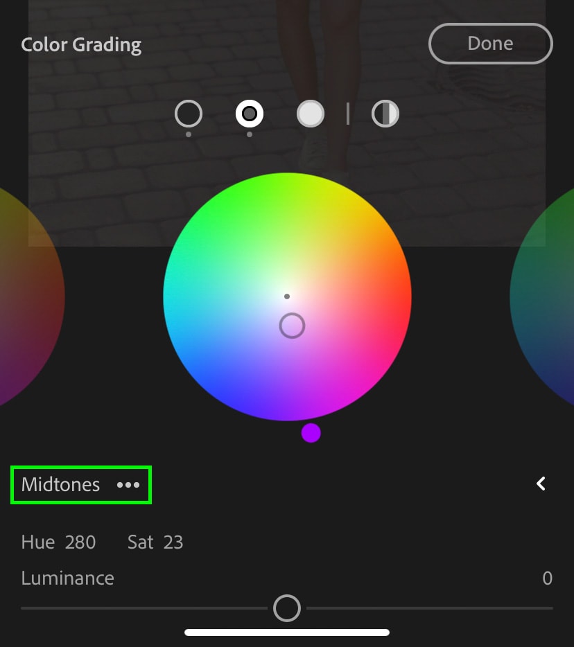
Step 5: Add Pastel Tones With Color Grading
Back within the main Color adjustment panel, click on the “Grading” adjustment.
Starting with the shadows, add a desaturated greeny yellow color by placing the color picker close to the center.
Moving to the mid-tones, add a light purple tone by once again keeping the color picker close to center.
Then in the highlights add a soft pink color to finalize the pastel look in Lightroom mobile.
The Result

Before After
This time in five steps you have create another soft pastel edit in Lightroom! Since Lightroom Mobile doesn’t have a calibration adjustment, you will have to skip that step. Luckily you can still get some beautiful pastel tones without this adjustment.
Now that you’ve nailed this soft pastel editing style in Lightroom, try learning to create soft brown tones with Lightroom!
Happy Editing,
Brendan 🙂