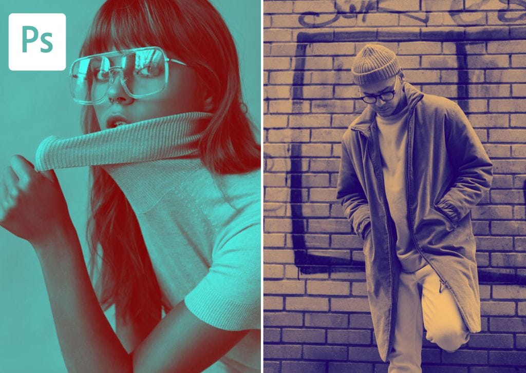

Creating a duotone image in Photoshop is an impressive way to make your photo pop. This design technique converts your image to only two colors of your choice. The result is a bold, striking picture highlighting the photo’s contrast.
There are two main methods to achieve the duotone effect when using Photoshop, and your method of choice should depend on your strengths. If you are comfortable using selections and masking techniques, choose option one. If you are more confident using gradients, then the second option is best for you.
When creating the duotone effect, a top tip is to use a high-contrast photo with a relatively simple background, as these images will produce the best result.
How To Create Duotone Colors In Photoshop
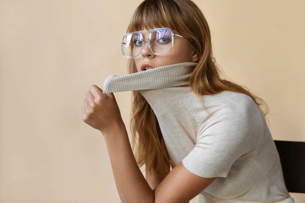
When adding a duotone effect to an image, you essentially add one color to the highlights and a second color to the shadows. Once you have selected your image and opened it in Photoshop, think about the colors you want to add and get started.
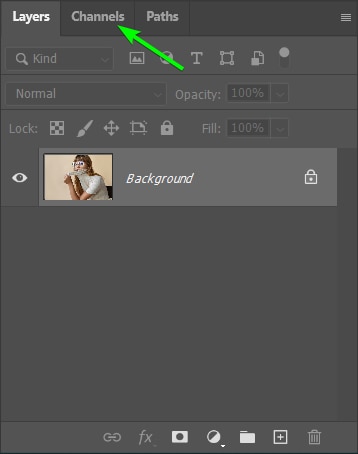
Step 1: Select The Highlights In The Image Using Channels
The first step is to isolate the highlights in the photo to add one color to those areas only. Using channels is a quick and super easy way to select the highlights (or shadows) in an image.
Open the Channels panel, which should be located in a panel tab next to the Layers panel.
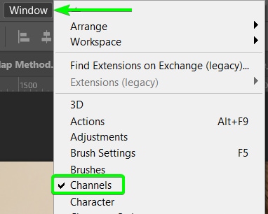
If you don’t see the Channels panel, add it to the workspace by going to Window > Channels. The panel will be visible in the workspace when there is a checkmark next to the name.
When using the RGB color mode, you will see four color channels: one with all the colors, then separate ones, each showing one color channel, Red, Green, and Blue. You must go through the individual color channels and decide which looks the best.
Click on a color channel to see how the image looks.
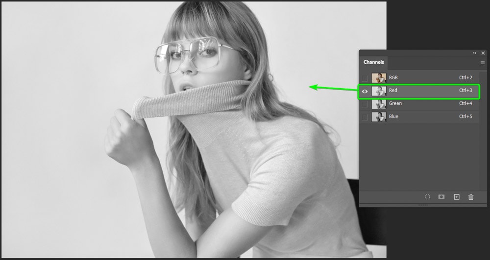
Your final duotone image will look like the color channel you select, with your two colors added to the shadows and highlights. So choose a channel that matches how you want the final result to look, which will be different for every image.
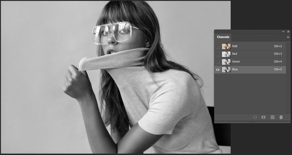
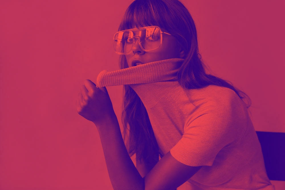
I like the Blue channel because it offers the most contrast for my picture, and I want a bold final result.
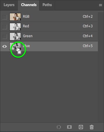
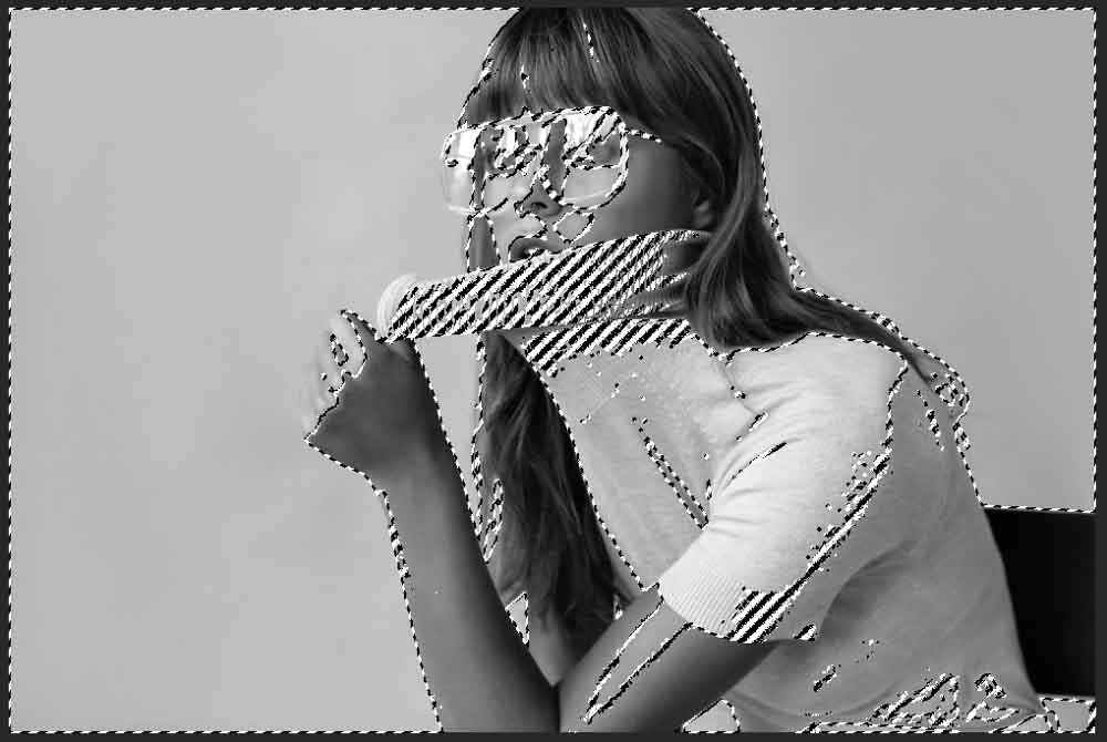
Now, to only select the highlights in the photo, click on the Load Channel as a Selection icon at the bottom of the panel while you have your chosen channel selected.
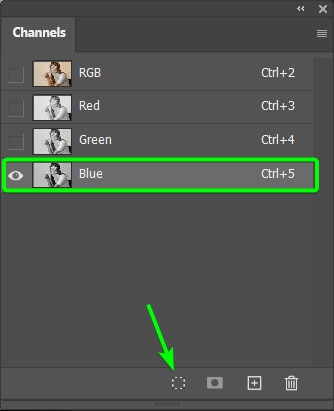
You can also use the shortcut by holding in Control (Win) or Command (Mac) on your keyboard and clicking inside the channel thumbnail to make the selection.
Once you’ve made the selection, you will see that the marching ants select only the highlights on the canvas.
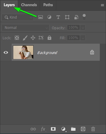
Step 2: Add A Solid Fill Color To The Highlights
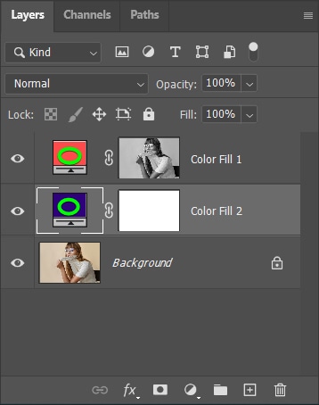
You can now add a solid color fill to the highlight areas to add your first duotone color. You must open the Layers panel again by clicking on the Layers tab.
Then, add a Solid Color fill layer by clicking on the circle icon at the bottom of the panel and selecting Solid Color.
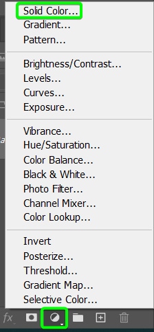
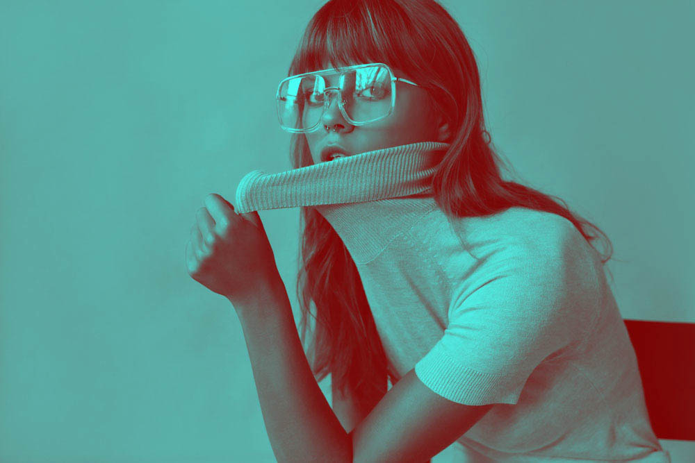
After clicking on solid color, the Color Picker opens, and a color is immediately added to the highlights on the canvas.
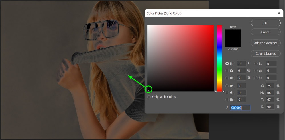
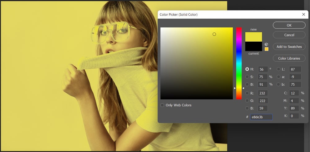
Now, you can use any method in the Color Picker to add your chosen color. You can add a HEX code, the RGB or CMYK values, or move the cursor around the color panel to find a color that works best. Since you are working with the highlights, you should choose a light color unless you want an inverted effect.
Move the color around to see a few different results.
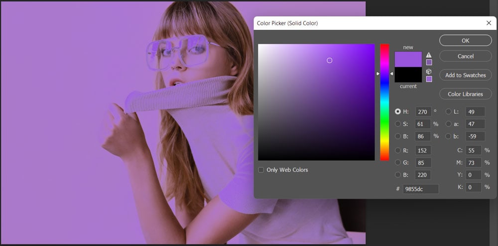
Once you’ve selected your color, press OK to confirm your choice and close the Color Picker.
You have now added the color of your highlights to the photo.
Step 3: Add A Solid Fill Color To The Shadows
Adding a solid color to the shadows in the image is even easier since you have already isolated the highlights. Now you just need to add a color that only covers the shadows in the picture. To do this, select the background or image layer in the Layers panel.
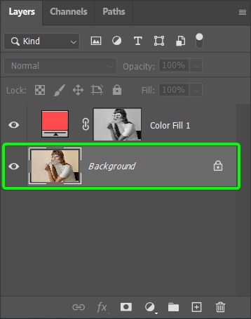
Then add a new Solid Color fill layer by clicking on the same icon at the bottom of the panel and selecting Solid Color.
The new fill layer will appear above the background layer but below the highlights layer. This ensures that the fill color only affects the shadows since the layer mask above has isolated the highlights.
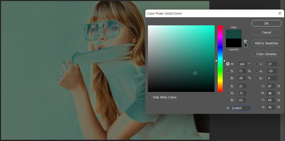
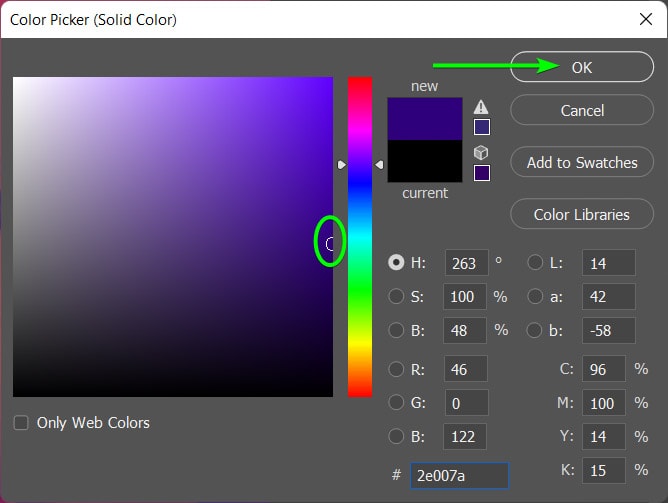
You can now choose a color for the shadows in the Color Picker. Remember, a darker color works best since you are adding to the shadows.
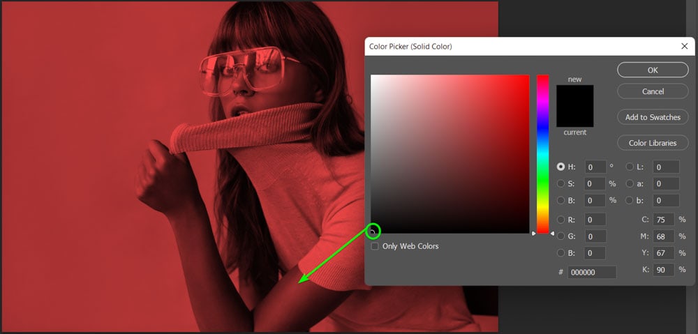
Select your color (I selected a blue color) and click OK to confirm the new color.
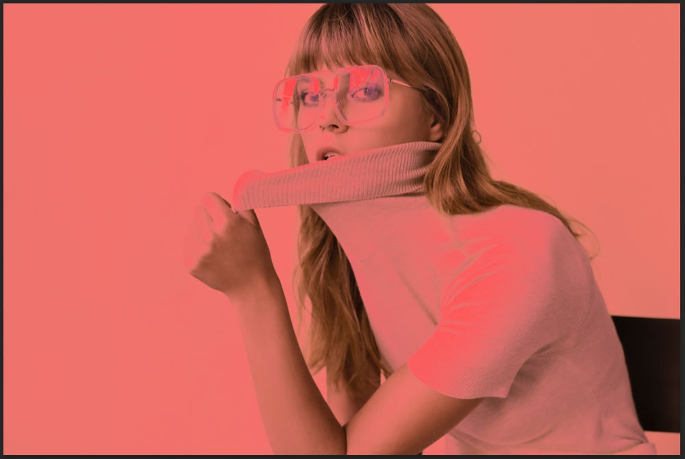
You have now successfully created a duotone effect on your photo.
Step 4: Adjust The Colors As Needed
Since the process is entirely non-destructive, and your background layer is still intact, you can add any other edits you need and change the colors at any time.
To change the colors, double-click on one of the fill layer color blocks to re-open the Color Picker and choose your new color. Then repeat with the next color block.
You can do this as many times as you need to find the perfect color combination for your image.
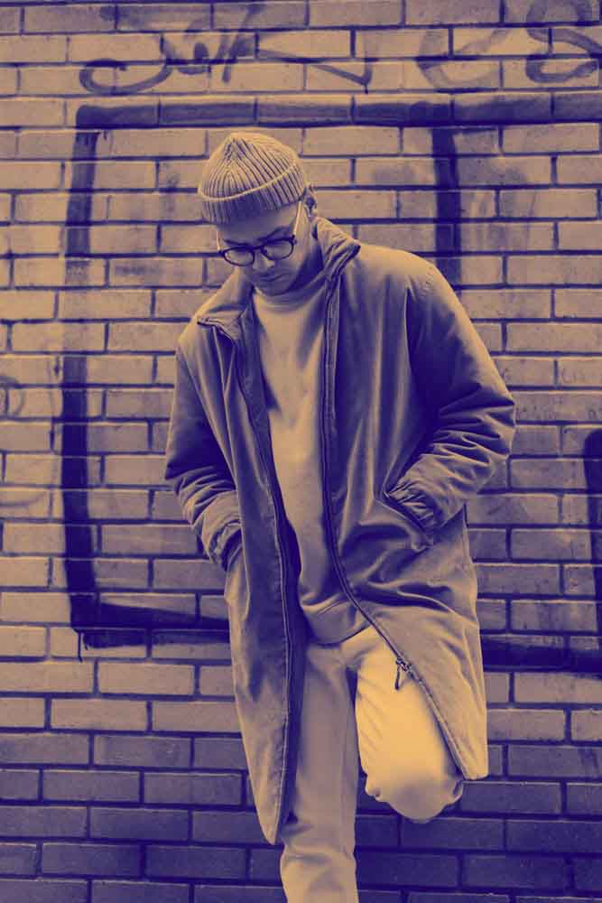
Using Gradient Maps To Create The Duotone Effect
The second method to create a duotone effect on a photo is using a Gradient Map adjustment layer. This method is even simpler than the previous method and offers a similar amount of control over the final result.
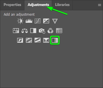
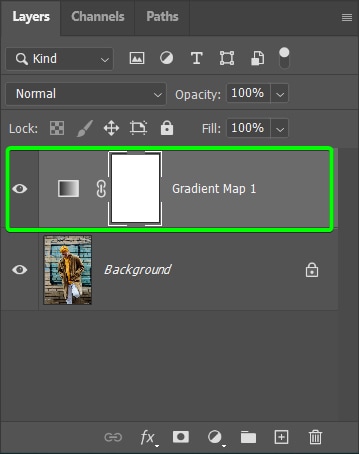
Step 1: Add A Gradient Map Adjustment Layer
Once your image is open in Photoshop, add a Gradient Map adjustment layer by opening the Adjustments panel and selecting the Gradient Map icon, which is the last icon in the list.
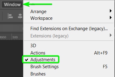
If you can’t see the Adjustments panel, go to Window > Adjustments.
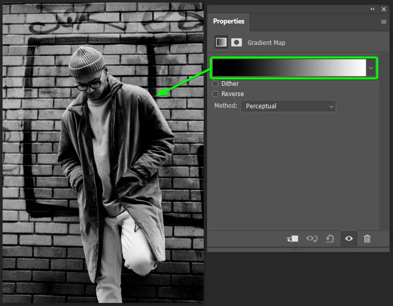
Once the Gradient Map is added to the image, the colors on the canvas become the two gradient colors. The colors and gradients added depend on the previous settings used when adding gradients to your projects. You can see the gradient settings in the Properties panel.
In my case, a black-to-white gradient was added to the image. This shows how the duotone will look, and all that’s left is for me to change the colors. If you don’t have a black-to-white gradient yet, that’s fine. You can change it in the next step.
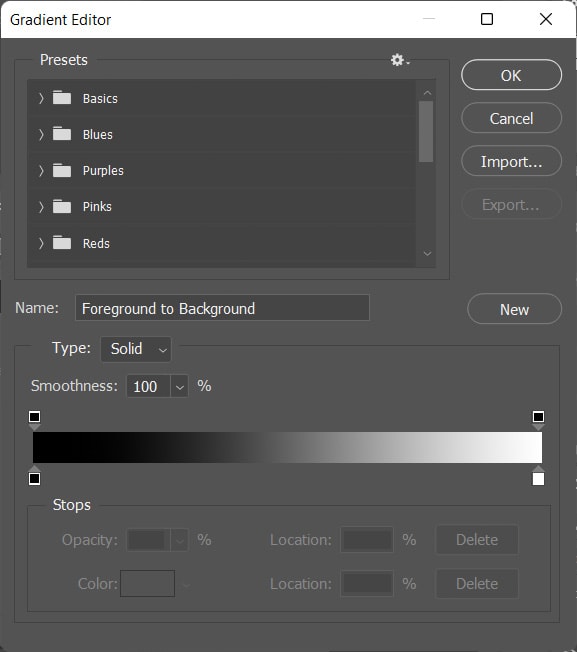
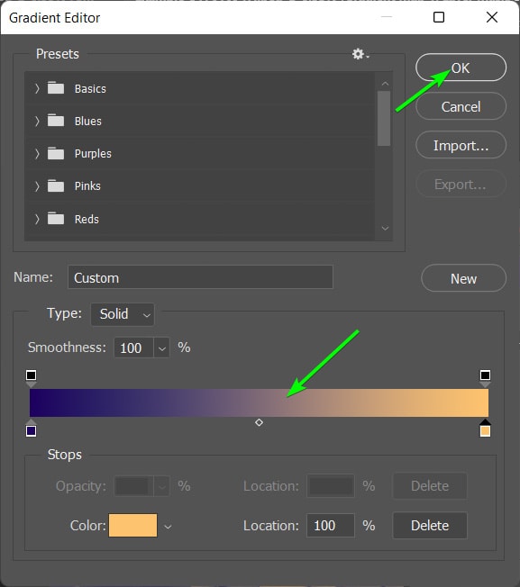
Step 2: Open The Gradient Editor
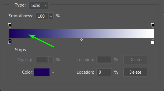
To change the gradient colors, you need to open the gradient editor. To open this window, click once on the gradient bar in the Properties panel.
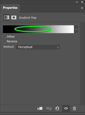
The Gradient Editor window opens, allowing you to change all the gradient settings.
First, if your gradient doesn’t have two colors, you can change this to make selecting the two new colors easier. To change the gradient type, open the Basics tab in the gradient presets section and select the black-to-white gradient.
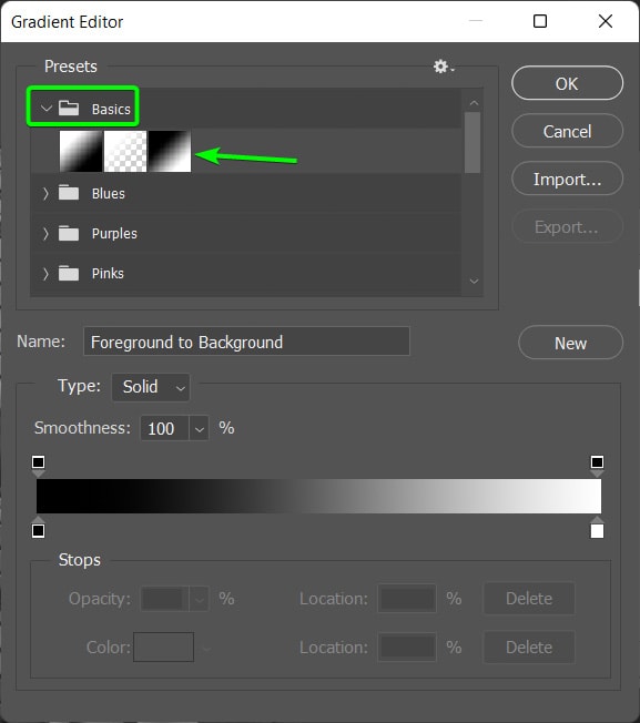
Now, you can move on to change the shadows and highlights colors.
Step 3: Select A Color For The Shadows
To select a color for the shadows, you need to change the black color in the gradient, or if you don’t have a black-to-white gradient, you will change whatever color is on the left of the gradient bar.
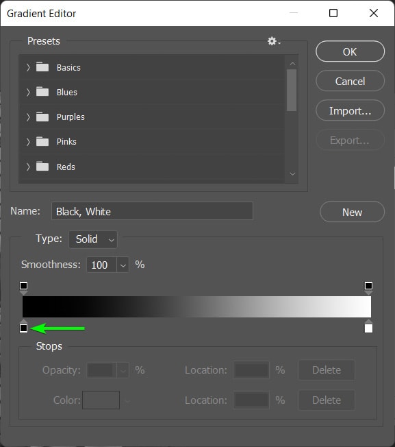
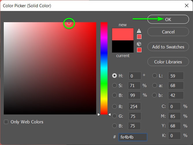
To change the color of the shadows, click on the color stop, which is the small color block beneath the gradient bar. Once you select the color stop, a few more options appear at the bottom of the window. Click on the color block to open the Color Picker.
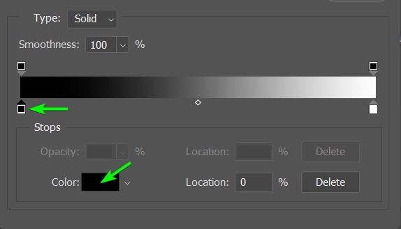
Select your color in the Color Picker and then click OK to confirm the color.
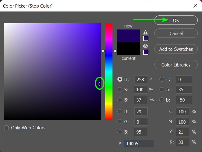
Your gradient has the new color for the shadows added to the bar.
Step 4: Select A Color For The Highlights
You can now add the highlights color by repeating the above step using the color stop on the far right of the gradient bar.
Click on the far right color stop, and then click on the color block at the bottom of the window.
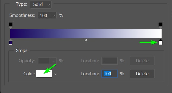
Next, select the color for your highlights in the Color Picker and click OK to confirm the color.
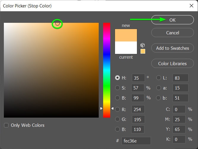
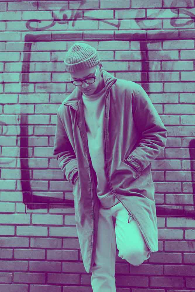
You can now see your two colors on the gradient bar. If you are happy with them, click OK at the top of the window to accept the new gradient colors.
You have successfully created a duotone color effect using a Gradient map on your image.
This process is also non-destructive, as the gradient map is automatically added to a separate layer in the Layers panel.
You can change the colors anytime by selecting the Gradient map layer and opening the Gradient Editor in the Properties panel. Play around with the colors until you find the right combination for your photo.
With each of these methods, you can create the duotone effect in a way that suits your workflow. I personally prefer the simplicity of the Gradient Maps, but if you aren’t comfortable working with gradients, the first option using channels, will be right up your alley!