
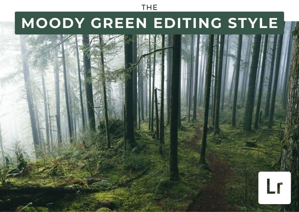

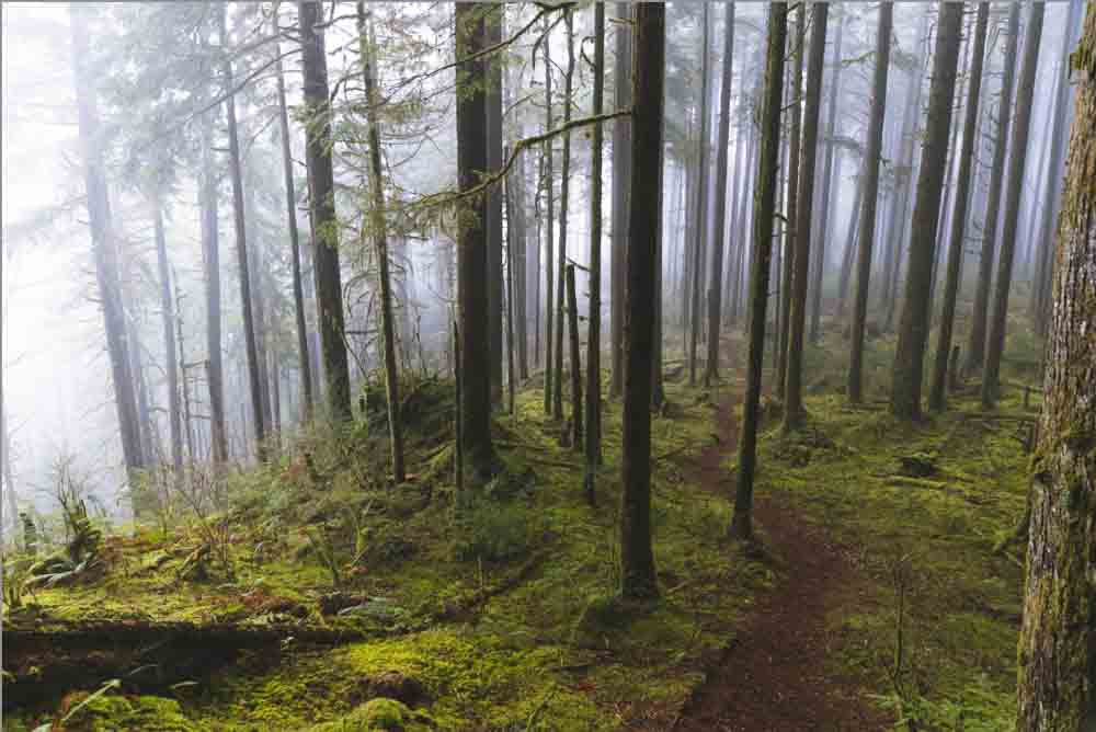
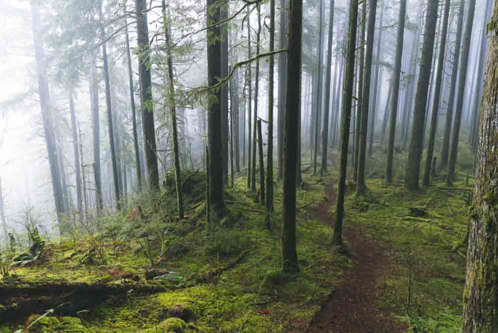
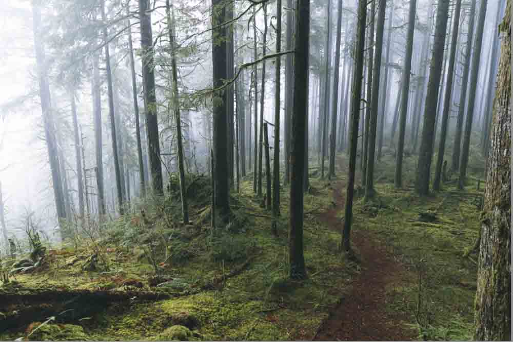
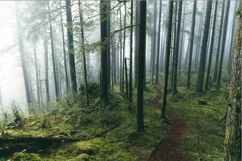
The moody green editing style in Lightroom is one of my favorites for images with foliage or heavy blues and greens. This surprisingly simple effect relies mostly on the HSL adjustments to tie it all together, along with a few key contrast adjustments that you’ll learn here. By the end of this tutorial, you’ll know how to create this editing style for yourself and save it as a preset for later use in other photos!
How To Get A Moody Green Look In Lightroom
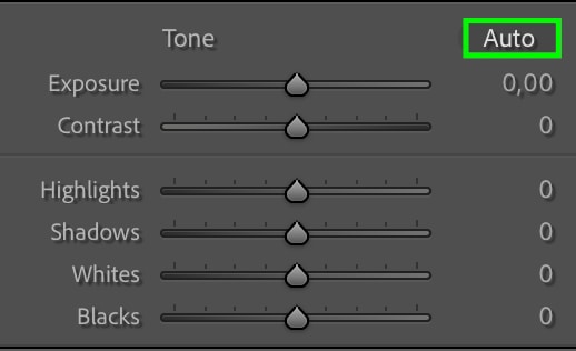
Step 1: Correct The Exposure
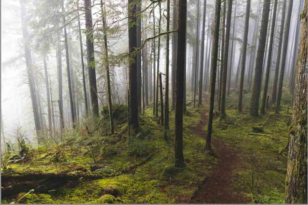
The first step is correcting the image to its most natural exposure, giving you a base to work from when editing the photo further.
Starting with the image open in Lightroom’s Develop module, head to the Basic tab at the panel on the right. Here, you can adjust the Exposure, Contrast, Highlights, Shadows, Whites, and Blacks.
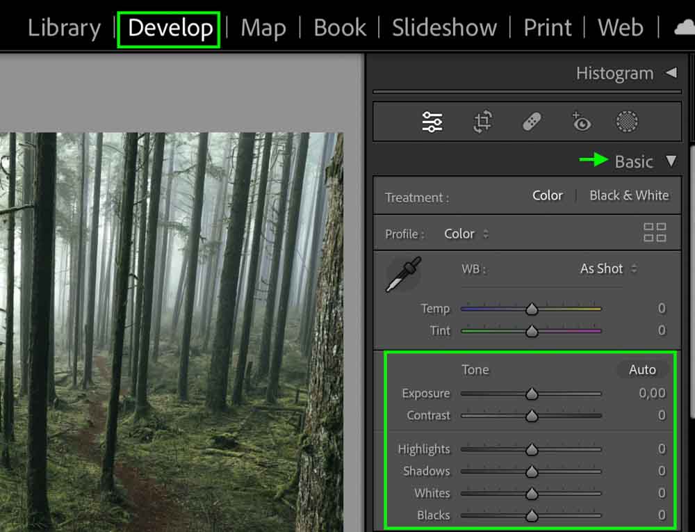
Each photo will have different needs, so make any adjustments that will bring the image to a balanced, natural exposure. For the example I’m working with, I’ll increase the exposure, highlights, and shadows slightly. I’ll also bring up the contrast a bit.
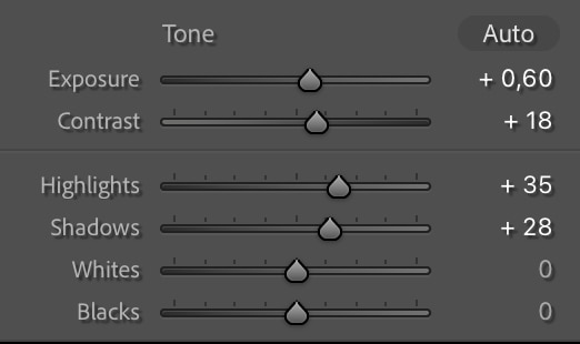
You can also press the Auto button to allow Lightroom to automatically adjust the exposure and then make further adjustments to the exposure settings as needed.
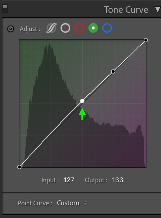
Step 2: Edit The Tone Curve
The moody effect will come mainly from adjusting the Tone Curve, another way of setting the exposure, shadows, and highlights. Head to the Tone Curve tab, just beneath the Basic tab.
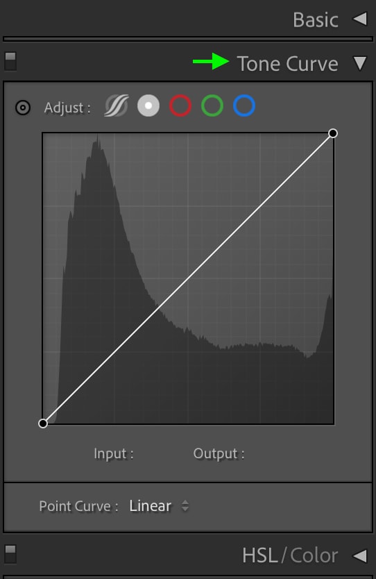
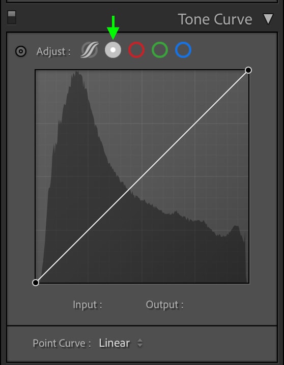
You can choose from a few icons above the tone curve to view the different versions of the tone curve. For now, I will work with the Point Curve, the second icon from the left. Click, and you’ll see the point curve.
First, we’ll click the black point, which is the point all the way on the left, and drag it up along the edge of the graph.
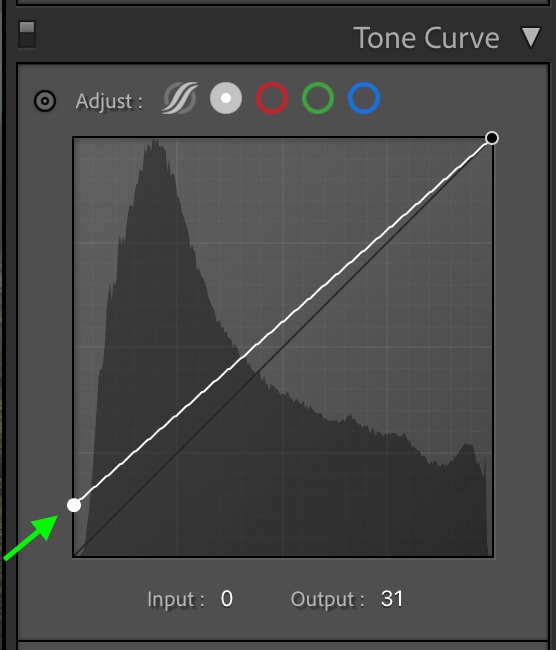
This will lift the black base point in the image, creating a more matte look.
You can then add back some contrast by adding another point in the shadows region of the tone curve, which will sit to the right of the first point, and dragging it down slightly.
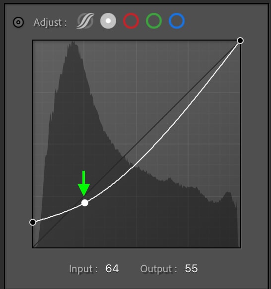
This will bring down the shadows in the image, adding back a bit of the contrast you lost when mattifying the blacks.
Finally, you can add another point on the midpoint of the curve, which sits at the center. Drag the point up slightly to brighten up the midtones so that the image isn’t too dark overall. This just adds a nice touch of contrast without washing out the photo.
You can continue to play with the tone curve, adding or altering points until you like the look of the image, but these few points give you a good base to work from for that dark, moody look.
Step 3: Adjust The Temperature Using The Blue Tone Curve
The tone curve can also be used to edit the different colors in the shadows, highlights, and midtones. This is one way we will adjust the colors to make the dramatic green effect. From the options above the Tone Curve, select the blue icon to view the Blue Tone Curve.
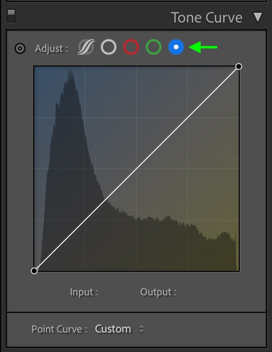
You’ll notice the top of the square is blue while the bottom is yellow, meaning that dragging an anchor point up adds blue, and pulling it down adds yellow. First, add an anchor point at the highlights area, which is near the top right of the horizontal line, and drag it up slightly above the line.
This will add a hint of blue to the highlights, helping to contribute to the moody look.
Add another anchor point in the middle-left section of the horizontal line, which represents the midtone shadows, and drag down.
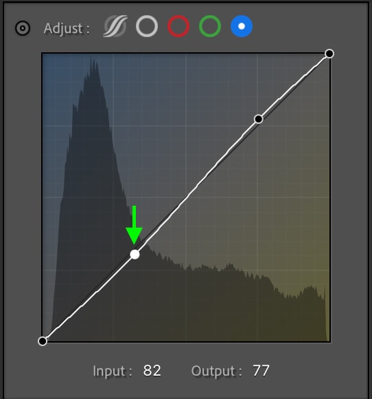
This will warm up the mid-tone shadows and balance out the cool tones we added to the highlights.
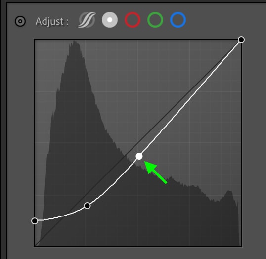
Step 4: Add Color Using The Green Tone Curve
Next, click the green icon above the curve to view the Green Tone Curve.
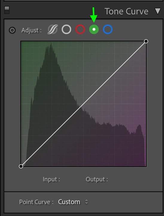
Here you’ll see green at the top and purple towards the bottom, as these are the two tones that this curve will affect.
Start by adding an anchor point to the highlights region, and drag it up slightly to add a green tint.
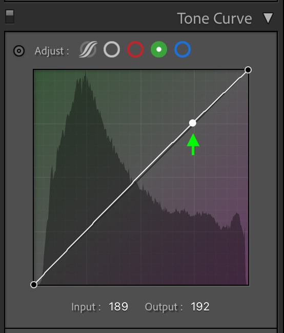
You can add a point at the midpoint and drag it up slightly.
The green tint and the blue we added to the highlights before will help create the deep forest green color that makes this edit unique.
So far, the image may look too saturated – but don’t worry. We can adjust the saturation in the next step.
Step 5: Adjust The HSL
The HSL refers to an image’s Hue, Saturation, and Luminance of colors. Adjust the HSL of a few colors, and you’ll see the moody green effect come to life.
The HSL is located between the Tone Curve and the Color Grading tabs. You’ll see a list of colors and, at the top, options to view Hue, Saturation, Luminance, or All.
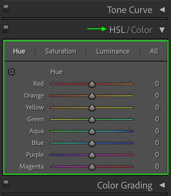
The most useful way to utilize the HSL is to sample the specific color you want to adjust. Click the icon at the top left of the HSL tab and then hover over the color in your image.
As you hover over your image, you’ll see the color light up in the HSL panel. You’ll then know which color (or colors) to edit. Otherwise, you can simply work with the green slider, which is the color we’ll focus on today. With the sample option enabled, you can click and drag your cursor up or down to edit the selected color’s hue, saturation, or luminance. Otherwise, you can just manually drag the sliders if you prefer for the same result.
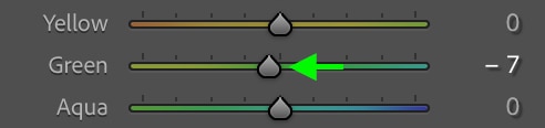
To begin this adjustment, click Hue at the top to open the Hue tab.
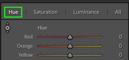
Drag the toggle on the Green slider slightly towards yellow to add warmth to the green tones in the image, which will further help build that moody green color.
Now you can head to the Saturation tab by clicking Saturation at the top of the panel.
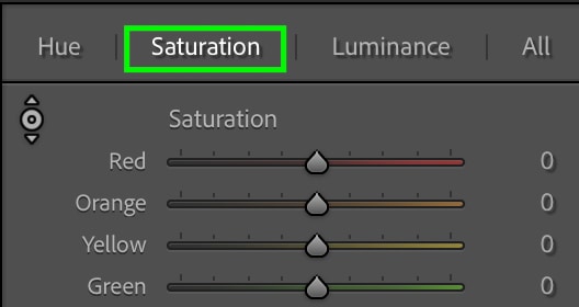
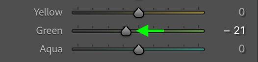
You can then drag the toggle on the sliders to change the Saturation of the colors that show up. For this example, we’ll mainly be working with green. To achieve the muted, moody effect, you can bring down the Saturation.
Drag the Green slider to the left, as this will reduce the Saturation of the green.
As you can see, the image is much less saturated now than it was before.
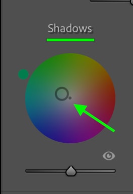
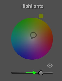
Step 6: Adjust The Color Grading
Next, move on to the Color Grading tab below the HSL, where you’ll find tools to add color to the Highlights, Shadows, and Midtones.
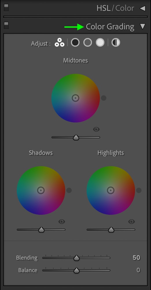
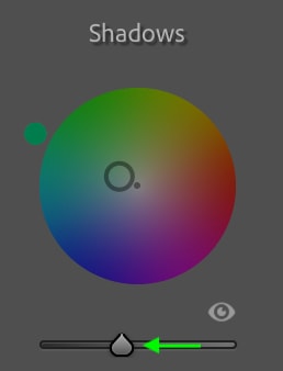
Click the toggle in the center of the circle under Shadows and drag it towards a blue-green color. Keep the saturation low by keeping the toggle closer to the center than the outside of the circle.
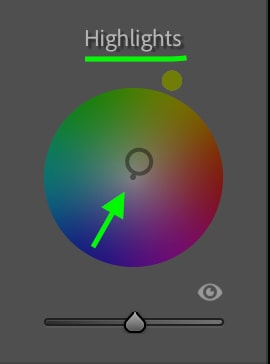
Then, drag the toggle for the Highlights over towards a yellowish green to add a bit of warmth to the highlights.
Step 7: Adjust The Luminance
If you’d like, you can also adjust the luminance of the shadows, highlights, or midtones. You can do this from the Color Grading tab using the sliders below the circles.
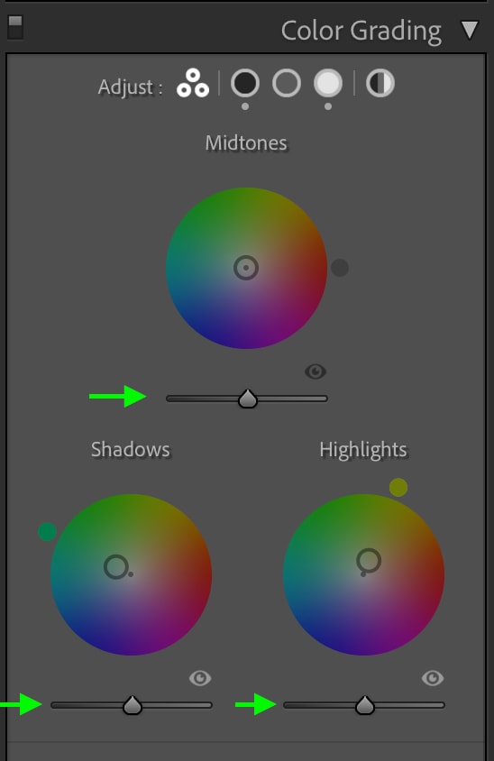
For this example, I’ll bring down the Luminance of the Shadows and then increase the Luminance of the Highlights.
This will add a final bit of contrast to the image and help with the moody effect.
Step 8: Add A Vignette Blur
The final adjustment you can make to get the moody green effect is adding a vignette blur to the photo’s edges. You can find the Vignette settings under the Effects tab.
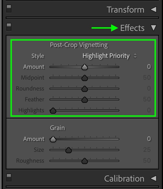
To darken the edges, drag the toggle on the Amount slider to the left (dragging it to the right will lighten the edges).
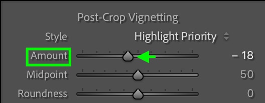
You’ll notice the edges of your image darken.
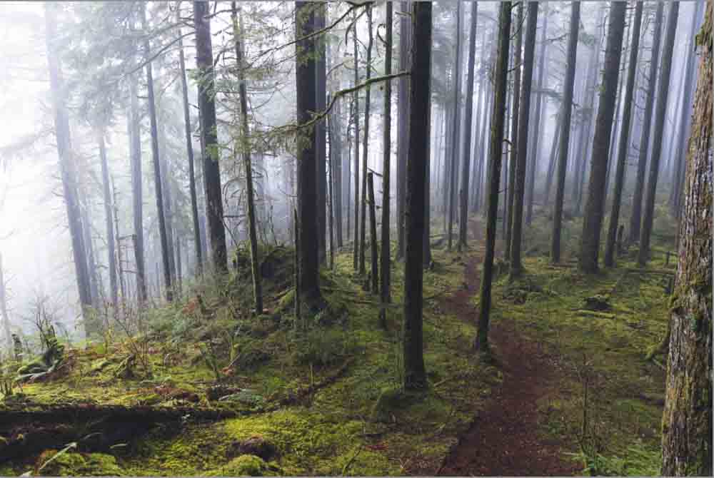
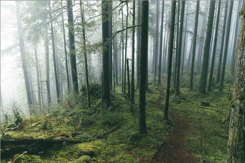
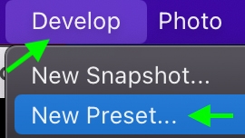
You’ve now created a moody green effect. If you’d like, you can save these adjustments as a preset to apply to other images later on by heading to Develop > New Preset.
In the window that appears, you can name your preset and select the adjustments you’d like to keep in the preset – make sure all the adjustments you made in the above steps are checked.
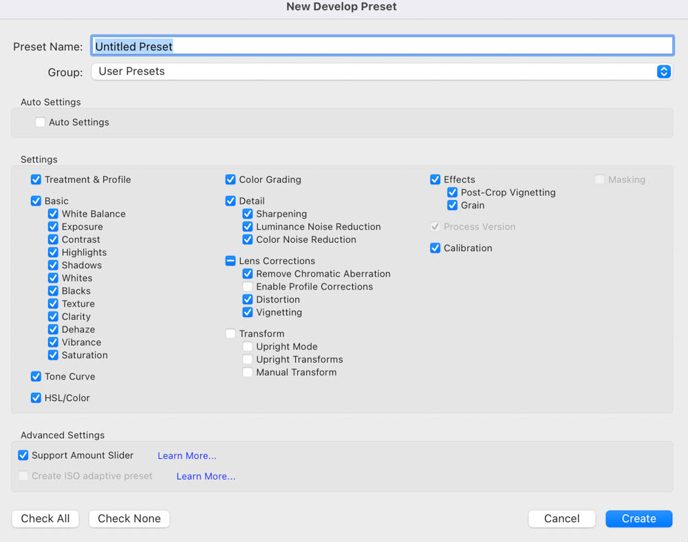
Click Create, and you can recreate the moody green effect whenever you’d like by applying the dark and moody green preset.
