
Typography is an essential element of graphic design and is often used in photo editing, especially when creating collages or other image layouts. Using the best fonts for Photoshop in your projects will help you create stunning visuals no matter what project you are working on.
However, finding the right font for your design can be tricky, especially when trying to scroll through the several fonts in Photoshop. You may also want to explore other fonts that aren’t located in the program by default.
I have compiled a complete list of the most popular fonts built into Photoshop and found through Adobe fonts. If you have a subscription through Adobe with any program installed, you will have access to Adobe Fonts, where you can download new font families from the extensive list.
When it comes to fonts and other design elements, there are usually strict licenses determining how you can use the element. You can use Adobe Fonts for free and commercial purposes as long as you own a Creative Cloud subscription. You can read the full font licensing information on the Adobe website.
The Best Built-In Fonts To Use In Photoshop
The following fonts are automatically available in Photoshop as soon as you install the program. You won’t need to download or activate these fonts before using them, and they are saved on your system and not in the cloud.
1. Times New Roman
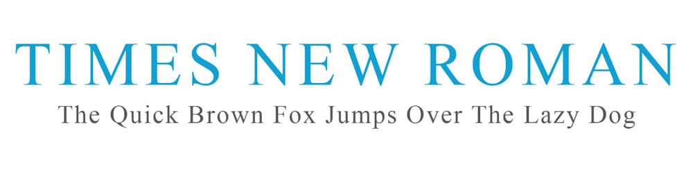
Created in the 1920s, Times New Roman is both popular and available almost everywhere, which makes it a prominent feature as a built-in font in Photoshop. While some may say the serif font is boring and overused, there is no debate that the clean and straightforward typeface is highly readable and perfect for body text, whether it’s on printed adverts, books, magazines, or digital screens and websites.
If you are looking for a timeless and trusted font that won’t let you down and will display seamlessly across all types of displays and digital software, then look no further than Times New Roman.
Pair Times New Roman with Georgia or Avenir for best results.
2. Century Gothic
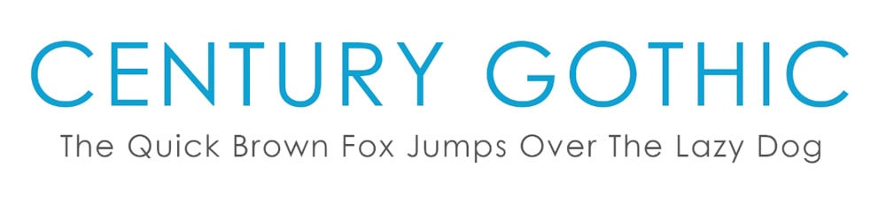
Century Gothic is an elegant sans-serif typeface popular in the advertising industry. Designed by Monotype Imaging in 1991, the clean font is based on 20th-century typefaces but modernized with a larger x-height and structured better for digital screens.
The light-looking line weight is versatile and suitable for headings and larger text. You can use Century Gothic in body text if the text is short and large in size since the spaces between letters in the Century Gothic style may take up too much space when used for long paragraphs of text.
3. Arial
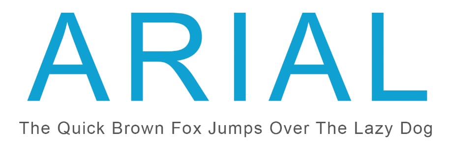
Arial is a popular sans-serif font created for IBM in 1982 and has become a default font on many digital programs and software. Since Arial is pre-programmed into most word processors and design programs, it’s a popular font for logo design, and you can use it in headings and body text.
The neat and straightforward font is excellent for reports and presentations and is a go-to for resume design. The professional yet classy font is well-suited for everyday use in design.
You can pair Arial with Oswald or Georgia for a stylish and clean look.
4. Arial Rounded
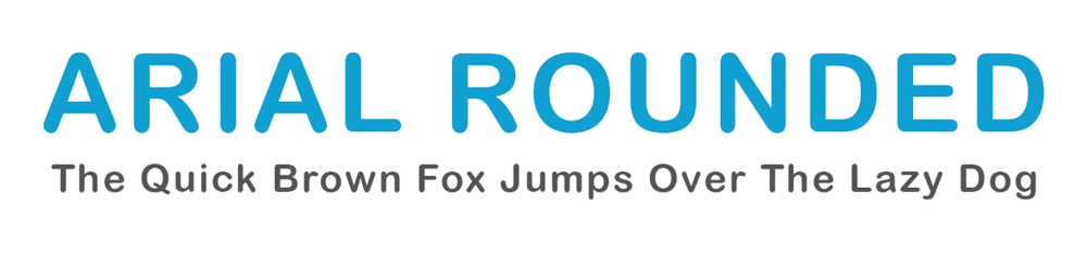
Arial Rounded is a variation based on the Arial family and consists of the same typeface as Arial, with rounded corners instead of sharp corners. The round edges are more prominent when using the bold variation of the font.
Arial Rounded creates a more informal look on documents and can be used as a heading or body text for causal designs such as social media posts, blog feature images, or content designed for children.
5. Bauhaus 93
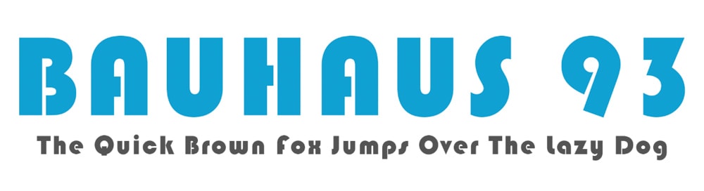
Bauhaus 93 is a decorative sans-serif font suited for a quirky design, such as on posters or brochures, due to the bold and bubbly font style. You can use this font for large sub-titles or pull quotes, but the text won’t work well for body text as the large letters are hard to read and will become illegible at small sizes.
Pair Bauhaus 93 with a font such as Proxima Nova or Arial for the best results.
6. Brush Script
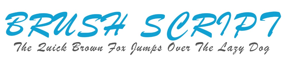
Brush Script is a decorative font designed by Robert R. Smith in 1942. The brush style creates a similar look and feel to cursive handwriting. The font is suited for informal designs where a more casual font is needed, such as on posters or social media content.
The elegant font is best suited for headings and large titles to keep the font legible. I don’t recommend using Brush Script for long lines of text or body text, as the handwritten look becomes unreadable quickly when scaled down or used on long sentences.
7. Myriad Pro
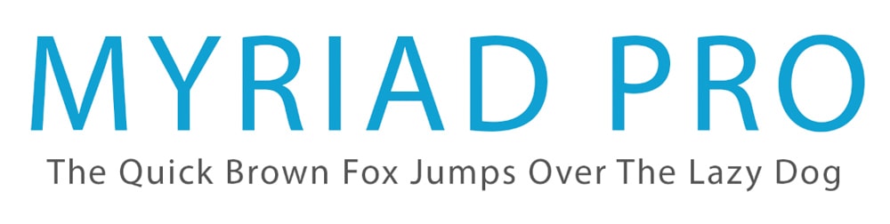
Myriad pro is an Adobe Originals design that was released in 1992. The elegant sans-serif font was created as a timeless font that pairs well with various other fonts, such as Garamond or Museo Slab.
Myriad Pro is well suited for use on screens and works well with big and small text, meaning you can use it for your headings or body text. The Myriad Pro font family contains over 30 different styles, including italics, bold, condensed, light, and more. The versatility of the font family means that it will fit into almost any type of design.
8. Adobe Garamond Pro
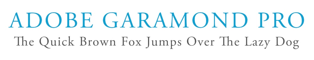
Adobe Garamond Pro is an update of the Adobe Garamond typeface, designed by Adobe as a historical revival of the popular roman types from Claude Garamond. You may have seen the standard Garamond font used widely, such as in the American editions of the Harry Potter series and Hunger Games trilogy books.
The Adobe version is a serif font with six styles to choose from and can be used on a wide variety of print and digital design projects. The font has kept the balance and elegance of the original Garamond typeface while adding a contemporary style suited better for screen use and print.
9. Cooper Black
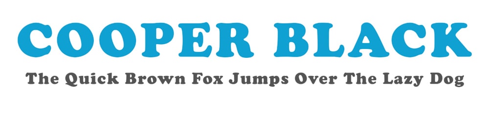
Cooper Black was designed by Oswald Bruce Cooper and released in 1922 as an ultra-bold weight for the Cooper Old Style font family. The thick lettering is used as a stand-alone font because of its demanding presence that catches the reader’s eye when used in the heading or title text.
Due to the thick lettering, Cooper Black isn’t suitable for large blocks of body text or small text. However, the font complements a design when used conservatively to draw attention to certain headings or to break up blocks of text.
10. Franklin Gothic Book
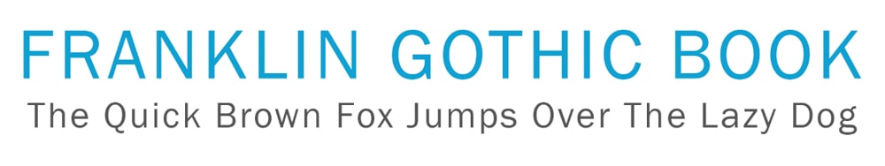
Franklin Gothic Book refers to a large family of fonts with multiple variations designed by various foundries. The sans-serif typeface is loaded as Franklin Gothic Book in Photoshop as a built-in font. The typeface has a modern look with clean lines that work well as a header, title, or body text.
You can use Franklin Gothic Book for magazines, newspapers, and posters. It’s also suitable for digital screens on websites and social media content.
11. Courier
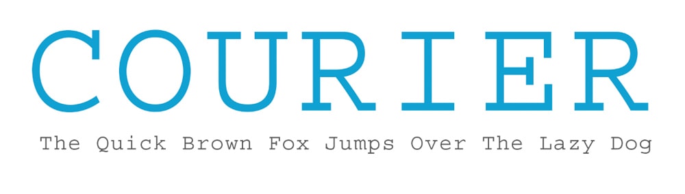
Courier is a slab serif monospaced typeface designed by Howard Kettler that works well on digital screens. The font isn’t suitable for all designs and lends itself more to niche designs such as technology-centered posters or adverts.
Programmers often work with Courier or similar fonts when adding blocks of code, and the font is also commonly used in screenplays and technical documents. Use Courier for specialized design rather than as a go-to font for everyday design work.
12. Lucida Handwriting
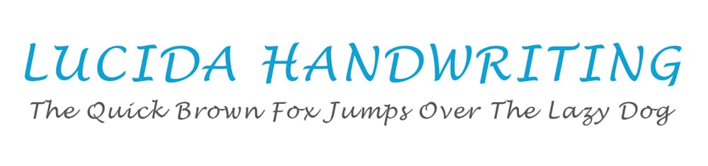
Lucida Handwriting is a decorative font created as a modern variation of the cursive style used for printing in the 15th and 16th centuries. The looping font connects most of the letters, with a few offering small gaps in between.
As with most decorative and cursive-styled fonts, Lucida Handwriting is best for niche design used as a heading or title text and isn’t suitable for body text to the lack of readability.
13. Calibri
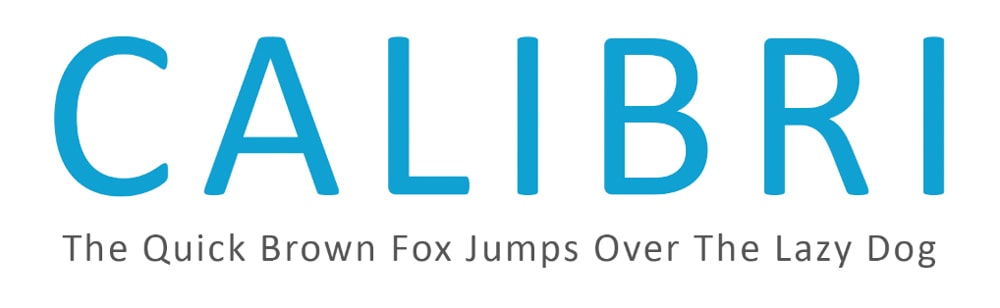
Calibri is a modern digital font from the sans-serif typeface family and was designed by Luc de Groot between 2002 and 2004. The font was launched in 2007 through Microsoft office. The subtle roundings found on the corners and stems of the font create a modern and professional font that is widely used by designers and other professionals.
The font includes italics and small caps and has several numeral sets for users to explore. The neat font is suitable for large and small text, meaning you can use this font almost anywhere. This font is commonly used on resumes because of its tight form and professional feel.
14. Verdana
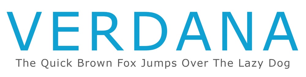
Verdana is a sans-serif typeface designed for the Microsoft Corporation by Matthew Carter, with improvements added by Thomas Rickner. The font is creatively designed to be highly readable even when used to type small text on digital screens. However, the large spaces between the letters may take up too much space in large bodies of text.
I recommend you use Verdana for headings or if you want to create readable text in small sizes for screens. Adobe Fonts has a slight variation called Verdana Pro, which you can activate for Adobe products. You can pair Verdana with Arial or Futura PT.
15. Georgia
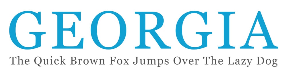
Georgia is another typeface that was designed by Matthew Carter and Thomas Rickner for Microsoft Corporation, but this one is a serif typeface. As with Verdana, Georgia was also created as a readable font that is legible when used to type small text on screens and when printing small text.
You can use the elegant typeface in everyday designs for body text, headings, and titles. Georgia works on digital projects and written text, such as the body copy in books and newspapers.
16. Baskerville
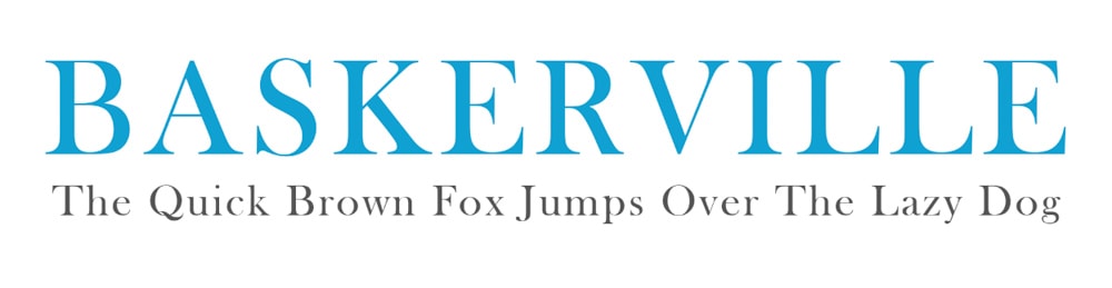
Baskerville is a serif typeface designed by John Baskerville in the 1750s to move away from old-style typefaces at the time. The font has a stronger contrast between the thick and thin strokes to produce a more tapered serif.
Baskerville is a suitable alternative to Times New Roman with its sleeker look while keeping the font simple and tight enough not to waste space on a page. You can use the font for body text due to its readability and popularity in book design. You can even use it as a header text because of its bold and clean look.
The Best Adobe Fonts To Use In Photoshop
Adobe Fonts is an excellent resource for finding new fonts for your projects if you have an Adobe Creative Cloud subscription. Once you have signed up to use an Adobe program, you can go to the Adobe Fonts website and sign in with your Adobe login details.
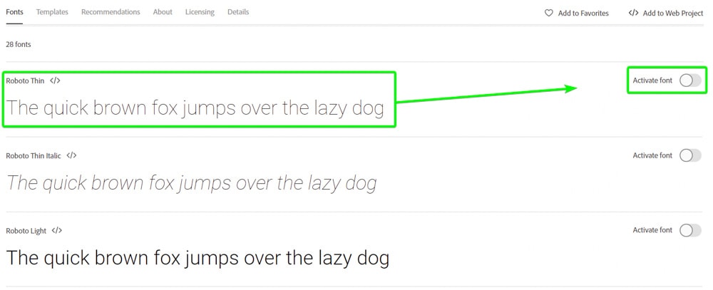
To add a font to Photoshop, InDesign, or any other Adobe program, you need to activate it before it appears in the fonts list. To activate a font, locate the font page on the site. Then you can activate the entire font family by clicking the option near the top.
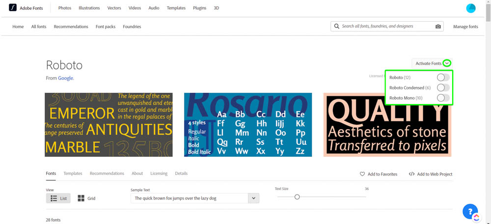
If you don’t want to activate the entire font family, scroll down until you see the different font variations and only activate the ones you want by clicking the switch on the right.
17. Neue Haas Grotesk
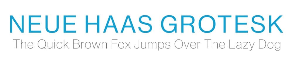
Neue Haas Grotesk is an elegant sans-serif font that has now been updated into the popular Helvetica typeface, known and loved by many designers. The font offers over 20 variations to give users the choice of feather-light text or bold and striking text.
While the original Neue Haas Grotesk wasn’t translated to digital devices, Christian Schwartz was commissioned to restore the typeface in 2004. The font is highly readable and ideal for copy of all sizes, depending on which variation you use for your project.
When using Neue Haas Grotesk as the body copy, a great font to use for the heading is Albiona ExtraLight.
18. Futura
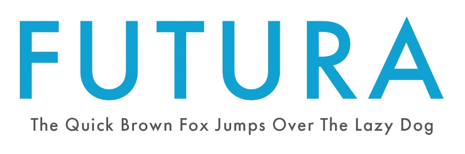
Futura is a trendy sans-serif typeface that was designed by Paul Renner. The minimalistic, versatile, and highly readable font is ideal for everyday use in design and for documents, including resumes and presentations. The clean typeface doesn’t distract from other elements on the page and can be used on packaging, posters, and branding elements.
The geometric shapes within the font are a tribute to the Bauhaus design style of the period when Futura was designed in the 1920s.
19. ITC Avant Garde Gothic
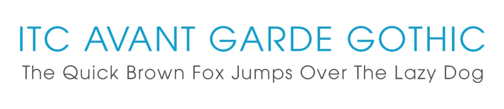
ITC Avant Garde Gothic was designed by Herb Lubalin and Tom Carnase as a condensed sans-serif font. The geometric typeface is made up of basic shapes that the creators made using a T-square and compass. The laid-back font is similar in style to the Bauhaus movement designs.
ITC Avant Garde Gothic is ideal for short body copy, pull quotes, and headlines. The font will work well to highlight bold shorter texts that you want to stand out from the rest of the design.
An excellent pairing for this font is Museo Slab 300.
20. Roboto
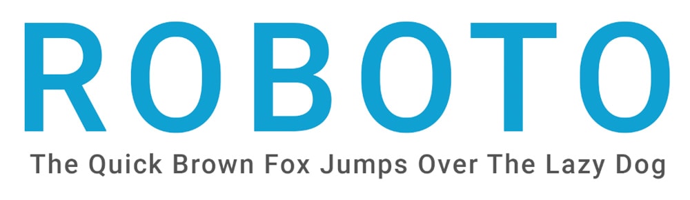
Roboto is a highly popular sans-serif web font used on various professional and casual projects due to its modern and classy look that creates highly readable text, whether large or small. The font was designed in 2011 as the default font for Android operating systems and is now commonly used on Google services, including Google Maps, Play, and Images.
Roboto consists of over 10 weights readily available on Adobe Fonts. The typeface works well as a brand font due to the variety and professional yet friendly look. However, due to the font’s versatility, you can use it just about anywhere.
Roboto pairs well with several fonts, especially Lato or Open Sans.
21. Mrs Eaves
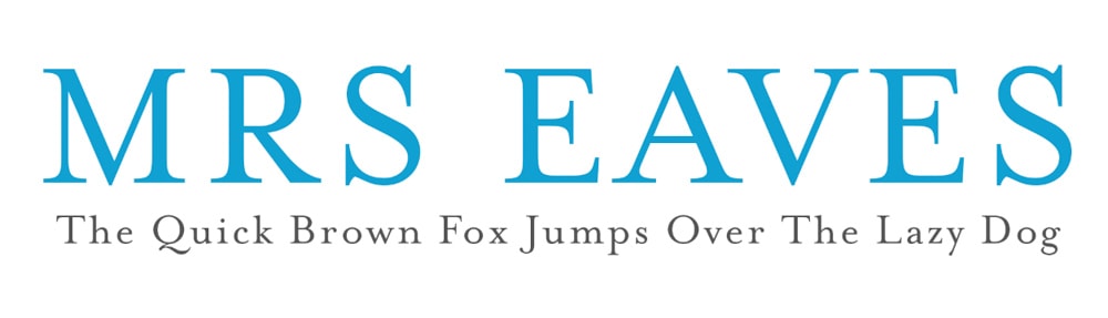
Mrs Eaves is a highly elegant serif font designed by Zuzana Licko and named after Sarah Eaves, who became the wife of John Baskerville (the creator of the Baskerville typeface). Mrs Eaves is based on the Baskerville font and offers a high level of sophistication to any design.
Mrs Eeaves is an ideal font choice for wedding invitations, magazines, and business cards. Overall the font adds class and professionalism to your designs.
22. Soleil
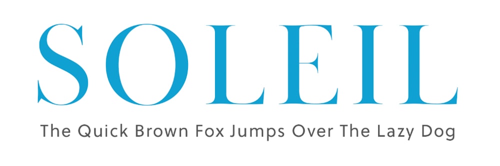
Soleil is a geometric sans-serif font designed by Wolfgang Homola, offering designers a fresh and dynamic font for headlines and body copy. The design of the font is based on the idea of bringing simplicity, fluidity, and clarity into the space of geometric font creation.
Soleil has a large x-height, making it ideal for large-scale designs such as billboards or posters. The font is also legible at smaller sizes so that it can be used in body text for magazines and books and more extensive projects like branding and signage.
23. Merriweather
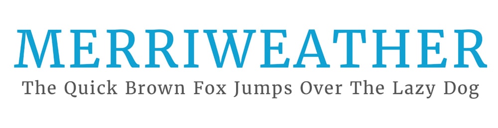
Merriweather is a bold and well-structured serif font designed by Sorkin Type. The font is versatile and can be used basically anyway, but it is highly readable on screens and works exceptionally well as header text or to make pull quotes stand out on the page.
The uniform vertical strokes make the font stand out from other serif fonts that vary the weighting along the vertical strokes. Merriweather, on the other hand, varies the stroke weight on the diagonal points to create a stand-out font type. This unique design thinking is futuristic and has led to a long-lasting font.
Try pairing Merriweather with Open Sans or Merriweather Sans.
24. Oswald
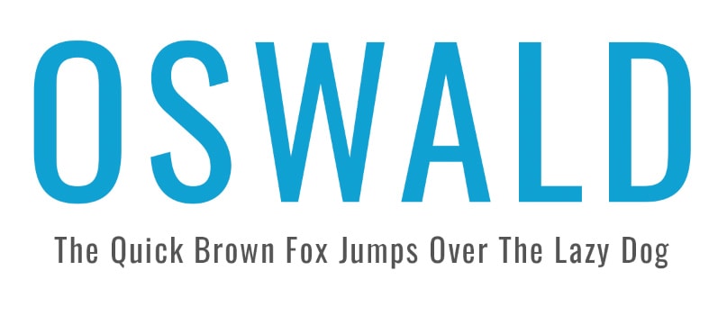
Oswald is a san-serif font created in 2011 by Vernon Adams, with an update in 2019 that includes more variety in the font weights. The typeface is well-suited to grab the reader’s attention, meaning you can use it as header text or to highlight stand-out body text, such as lists, pros and cons, or main features.
The typeface has narrow letters with long vertical strokes that create a striking look on the screen or page. The bold font is perfect for highlighting important text without being too flashy.
Suitable pairing for Oswald includes more subtle san-serif fonts like Lato or Roboto.
25. Alegreya
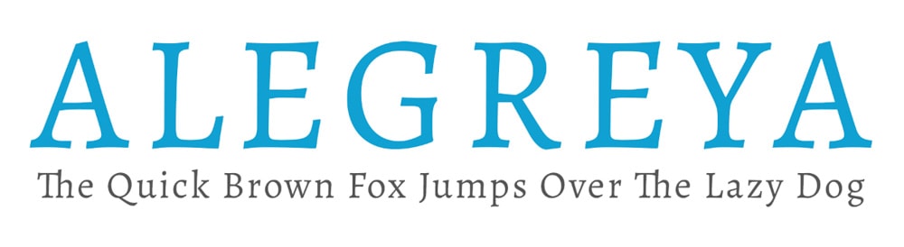
Alegreya was created by an Argentinian designer named Juan Pablo del Peral, specifically for literature because the clean and simple design is highly readable and creates a rhythm that helps readers absorb long texts.
The font has won awards due to its elevation of the calligraphic style of font creation. This font type is perfect for book design for both the cover design and the body text found within the book. You can also use Alegreya for long-body texts, as it is a comfortable font to read.
An excellent pairing for Alegreya, if you use it as an elegant heading, is Forma DJR Micro.
26. Proxima Nova
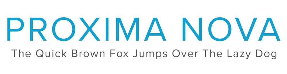
Proxima Nova is the complete sans-serif font family with over 40 variations and was the updated version of the designer Mark Simpson’s previous font family called Proxima Sans. The classic look of Proxima Nova offers designers a versatile font that can be used on presentations, reports, headlines, or even cover pages for proposals and other documents. The font family finds a balance between being too plain and too overwhelming.
27. Playfair Display
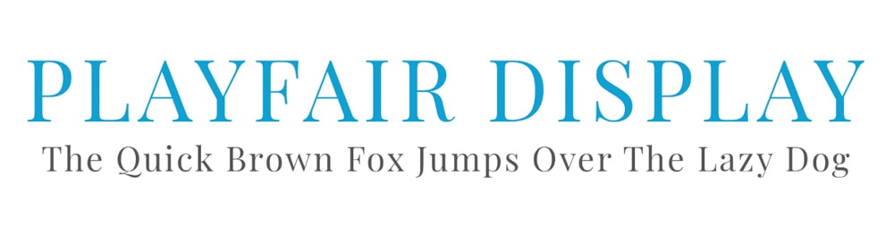
This serif font is a classic and was inspired by the 18th-century serif font design and font types such as Baskerville. The font contains bold letterforms with thinner hairline strokes, which mimic the steel-pointed pens and portray the move away from quills that couldn’t create such letterforms.
This font also gained popularity as printers improved and could print a broader range of thick and thin strokes on one letter. Playfair Display is best used in headers and large text because the more delicate strokes will disappear when scaled down to body text size. I recommend using the font for both print and web on logos or fashion blogs and magazines.
Try pairing Playfair Display with Roboto or Lato for a clean look.
28. Kepler
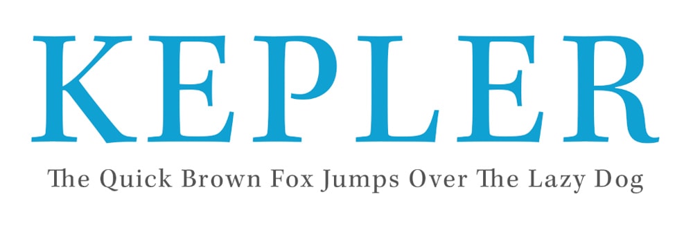
Kepler is a large contemporary serif font family designed by Robert Slimbach under the Adobe brand. The modern typeface aimed to blend the elegance of modern font design and the old-style calligraphic detailing to create an energetic font for everyday use.
Kepler has over 160 variations that you can use on branding material, advertising, logos, and magazine and book cover design.
29. Museo Slab
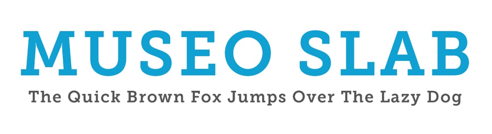
Museo Slab is a slab serif variation of the popular Museo font family. The typeface is robust but welcoming, with a modern feel and clarity that allows the font to be readable at decent sizes. The font offers 12 variations and is an ideal option for logo design, packaging, posters, and other designs that require a bold and warm font.
Museo Slab pairs well with ITC Avant Garde Gothic Pro Book.
30. Adobe Text
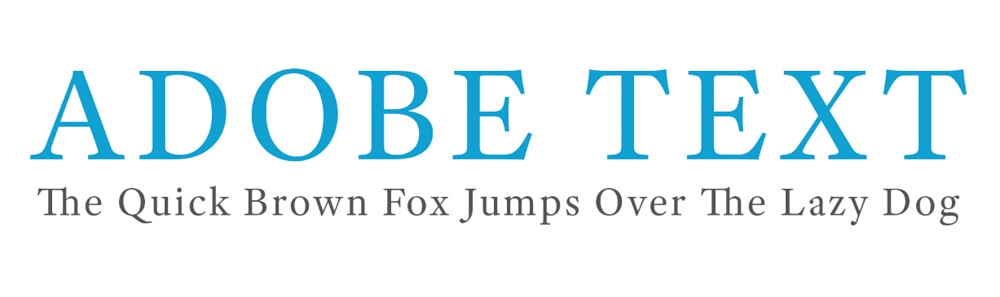
Adobe Text was designed by Robert Slimbach as an addition to the Adobe Originals foundry. The sophisticated and elegant serif font comes in six variations, allowing users to get the most out of this font family on any design. Adobe Text is perfect for body copy as the font is highly readable even when used in long sentences and passages.
The contemporary font can be used in print and digital projects and is a great font to use in everyday designs. An ideal pairing for Adobe Text is Kyrial Display Pro Black.
31. Montserrat
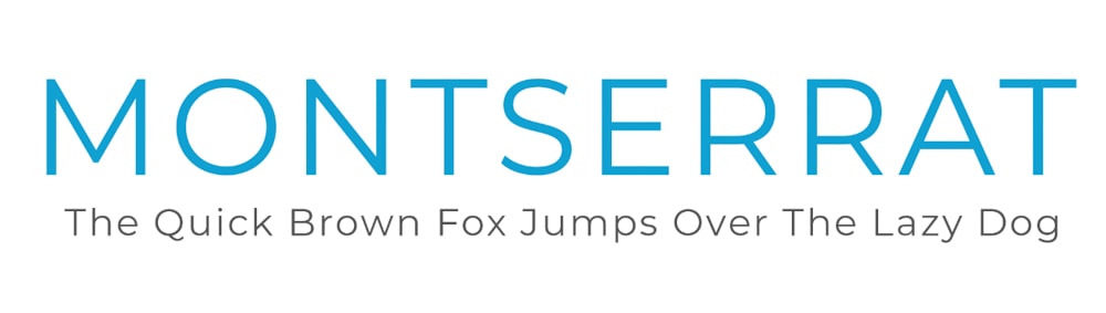
Montserrat is a sans-serif font created in the early 20th century by Julieta Ulanovsky, who lived in the historic Montserrat neighborhood. The creator took inspiration from the neighborhood in the form of the cafe, shop, and street signs.
Montserrat is a web-friendly font that works well on social media, websites, mobile devices, and infographics. The broad lettering takes up a lot of space which works well for headings and stand-out text but is not advised for body text as it will take up too much space.
You can pair this with Mortise X-Light or Roboto.
Where To Find Font Pairings For Your Photoshop Projects
When adding fonts to your designs, there are a lot of best practices to follow to ensure your design looks clean and portrays the intended message. Using more than one font to create a dynamic and appealing design is always a good idea. However, you shouldn’t add more than three different font families to one design.
Now, when adding more than one font to a project, you want to choose fonts that work well together and create a seamless design rather than an incomplete or mismatched-looking design.
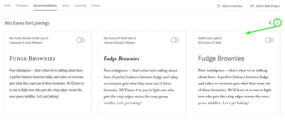
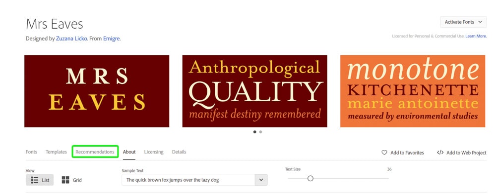
Finding font pairings for your projects is easy, and you can use Adobe Fonts. To find a font pairing on Adobe Fonts, you must search for the first font you chose. For instance, if you use the Mrs Eaves Roman Petite Caps font as the header text, you may want to find a suitable font for the body copy.
To find suitable options for the body copy, head to the Mrs Eaves page on Adobe Fonts. Now, either scroll down or click on the Recommendations tab.
Under recommendations, you will find a section labeled Mrs Eaves font pairings. This section has a few different suitable font pairings for the Mrs Eaves font. You can then use the linked text to find the new font page and activate it in your programs.
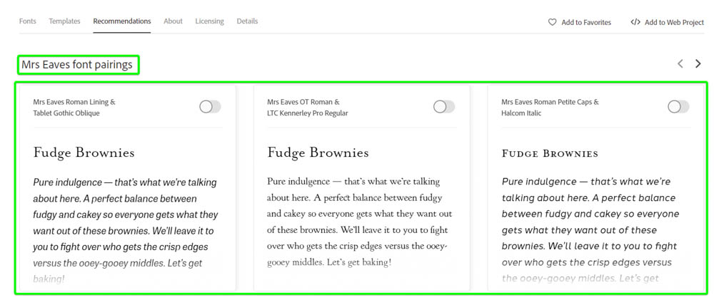
You can use the arrow to scroll to the right and find more pairing options, which in this case, includes a heading font if you are using Mrs Eaves as the font for the body copy.