

Color is one of the most important aspects of photography. Color tones can make or break an image. Once you’ve taken a photo, you may notice that the colors didn’t turn out how you saw them in person. This is where you can color-correct in Lightroom to enhance colors in an image to get a specific mood or simply to make the colors pop.
How To Color Correct In Lightroom
Color correction comes in handy when you have an image with colors that look distorted from when you originally shot the photo. This is common in low-lighting situations, as the pictures tend to come out with a warm yellow tint, or, when using flash, you may get too much cool blue or even green tones. In these cases, you’ll want to color-correct the image before enhancing any existing colors. Here are the two best methods to do just that.
Option 1: The White Balance Selector
While you can easily adjust the white balance of the entire photo, there is a simple way to get a more accurate correction using the white balance selector.
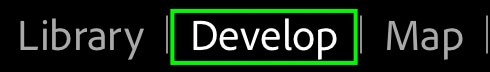
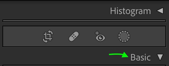
To do this, head to the Develop module and then the Basic tab.
At the top of the Basic tab, you’ll see the white balance bars (WB) made up of the Temp and Tint sliders. Rather than clicking the toggles to change the white balance, click the eyedropper icon to the left.
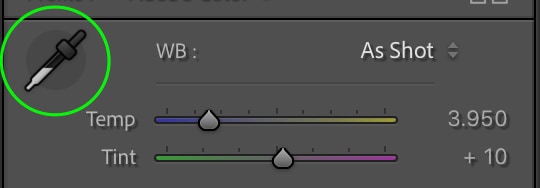
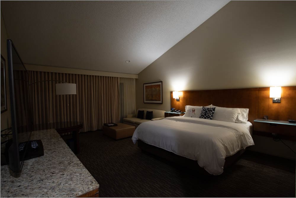
Now, click an area on your image that should be white. For the example below, I’ll click the wall, as the wall was white when I shot the photo. A box will appear, allowing you to pick a target neutral from the area you’ve clicked for the most accurate selection.
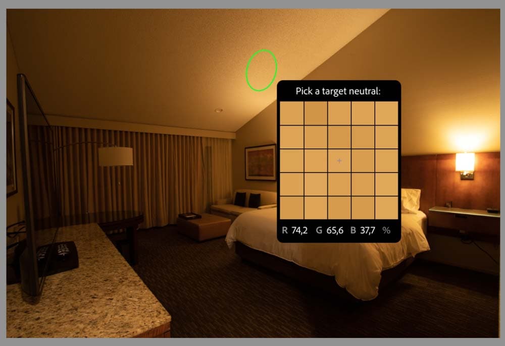
Choose the area that should be pure white, as once you click, Lightroom will automatically adjust the rest of the image based on your selection.
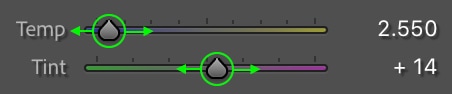
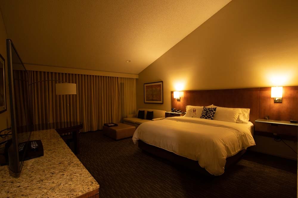
You can further adjust the white balance if you’d like by dragging the Temp toggle along the bar. Drag to the left to cool the image (adding more of a blue hue) and to the right to add warmth (more of a yellow hue). You can also adjust the Tint toggle to add more purple or green hues.
To re-do your selection, click the eyedropper icon again and choose another area of the image to base your white balance adjustment. The change will occur immediately.
Option 2: The Tone Curve
The other method to adjust the white balance in an image is to use the Tone Curve. The tone curve allows you to adjust the different tones of a picture — from the exposure settings (highlights, shadows, whites, and blacks) to the specific color tones in an image. You can find the tone curve under the Tone Curve tab.
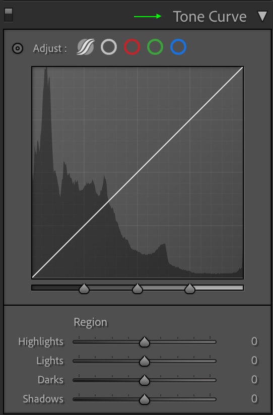
To use the tone curve to edit the image’s white balance, first, you’ll need to look at the area of your image that seems to have the most unnatural color tone. Figure out which color is most prominent in this area. Is it yellow? Blue? A different color?
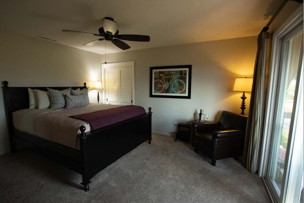
In the below image, some areas have a yellow hue (likely because the photo was taken with low lighting coming from lamps).
Once you identify the color, you’ll need to use the tone curve to add more of this color’s opposite. As the opposite of yellow is blue, we will work on the blue channel for the above image. Click the channel with the colors you’d like to correct: the red channel has red and teal, the green channel has green and purple, and the blue channel has blue and yellow. I’ll go with the blue channel.
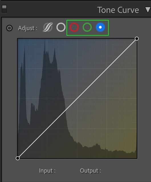
Then, for the most precise results, click the color selector icon next to the channels above the tone curve.

Then, click an area on your image that has too much of one of the colors on the curve. In the picture below, I’ve selected the following area:
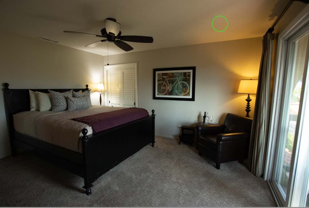
From where you clicked, drag your cursor up to add more of the channel’s color (in this case, blue) and down for the color’s opposite (yellow) and thus correct the image’s tone. Remember that you may only need to move your cursor up or down slightly to correct the color.
To correct the image, you can see my curve only moved a small amount from the straight diagonal.
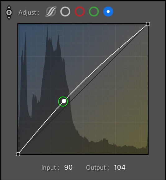
Yet, the resulting color correction is enough.
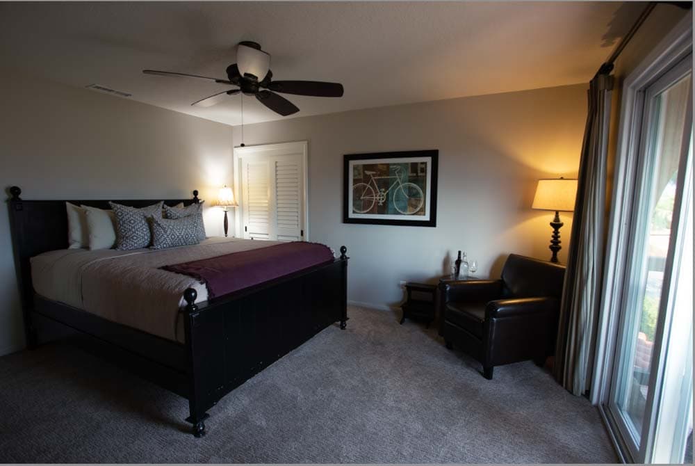
You can do this as often as you’d like, with as many areas that seem to have an uneven color balance. For instance, in the above image, the yellow is toned down, but there is a purple hue. I can correct this by heading to the green channel, clicking an area of the image with a purple tint, and dragging the cursor up slightly to make the following change.
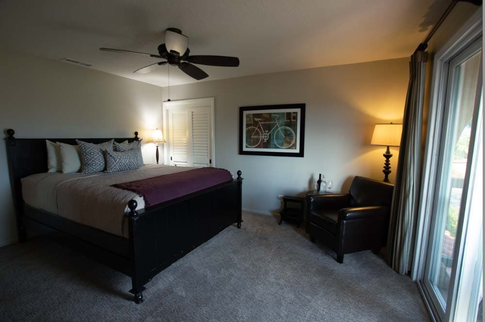
This is probably the closest we can get to how the scene looked in real life. Still, I suggest only using a few different sample areas of your image so that you don’t confuse the system and alter the colors more than necessary.
How To Enhance Colors In Lightroom
Once your image’s colors are as accurate as possible, you can enhance them using a few tools available in Lightroom. This is different from color correction, as you’re not changing the temperature of the image as much as the saturation, tone, and hue of specific colors in the picture. The goal is to enhance whichever colors you want your image to feature.
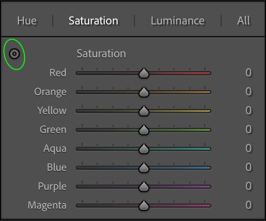
Option 1: Using HSL
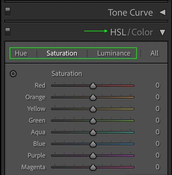
In the Develop module, scroll until you see the HSL tab and open it. You’ll see all the primary colors and three ways to edit them: based on their hue, saturation, and luminance (brightness).
Now, this is where you can get creative. Maybe you’d like to highlight specific colors in an image, so you might head to the Saturation tab to increase their saturation or even decrease the saturation of their opposites. You can make a specific color appear lighter or darker in the Luminance tab or even change the hue (color) of particular colors in the Hue tab.
The best way to do this is to identify specific areas that you’d like to enhance or adjust. Head to one of the tabs and click the adjust icon.
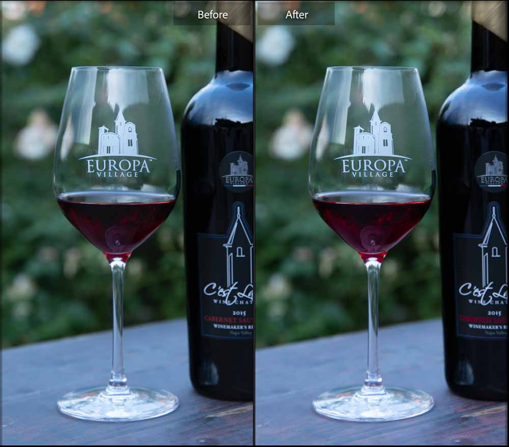
Then, click the part of your image you’d like to adjust. For instance, I’d like to make the reds in the glass of wine below a bit more vibrant.
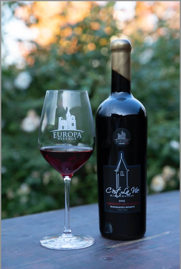
So, I’ll click the wine and drag the scrubbing cursor that appears upward to increase the saturation in that area. I’ll repeat this for the lightness and hues to make the wine appear more red than purple.
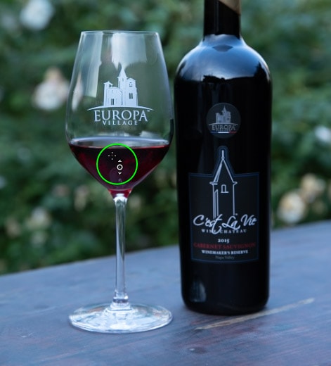
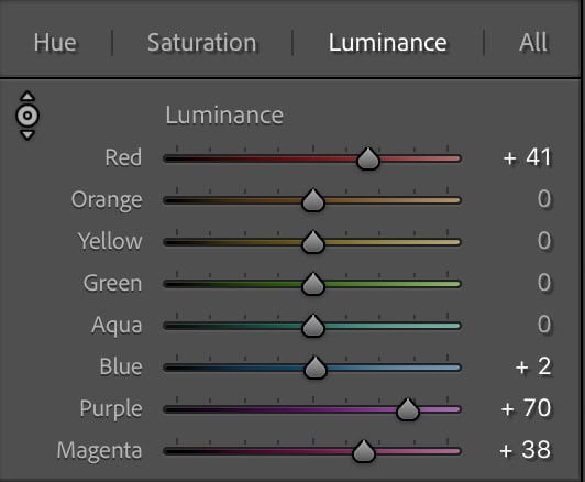
As an example, the Luminance panel looks like this once I’ve clicked and dragged upwards:
You can see the difference in the wine from the original image.
Together, these can set the mood of your images and create a specific style.
Option 2: Using Color Grading
The color grading wheels allow you to add a hue to specific exposure ranges. Head to the Color Grading tab, where three color wheels represent the image’s shadows, highlights, and midtones.
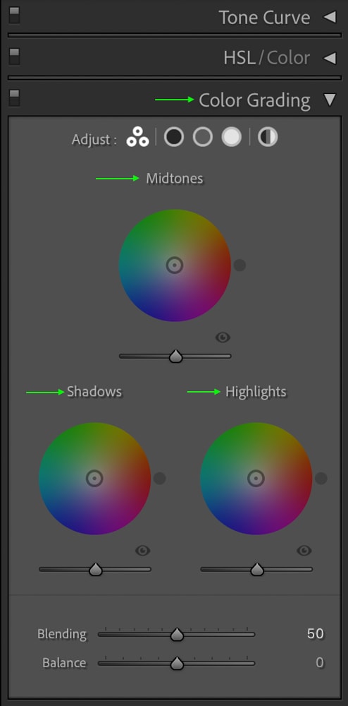
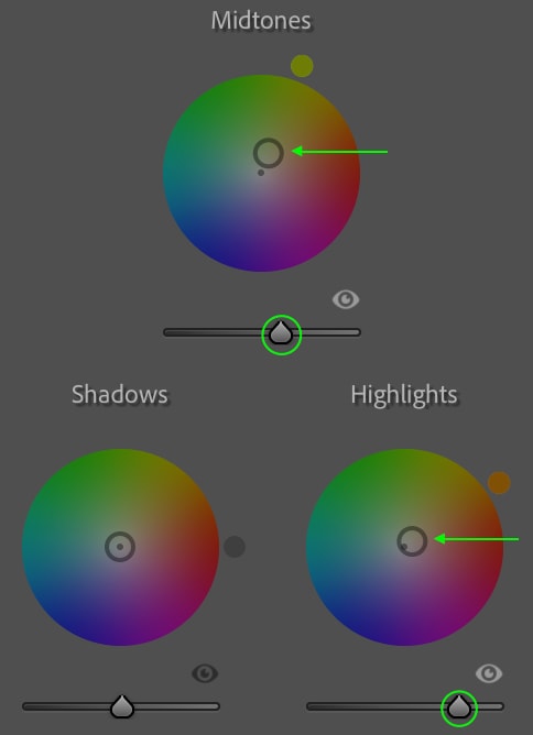
You can play around with these by clicking and dragging along the wheel to see what colors look good, tinting the different exposure ranges in your image. This is another excellent way to add a specific mood or effect to your pictures. For instance, in the image below, I’ve moved the center toggle on the Highlights and Midtones wheels slightly towards a warmer yellow-orange and increased the Luminance (the bar below each wheel) on each.
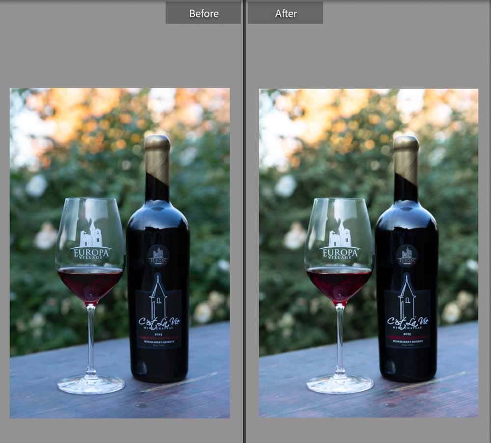
The result is a warmer, brighter image.
You can also hold the Shift key while working with the wheels to change the saturation as you go. If you’d like to keep the saturation but adjust the hue, hold Control (Win) or Command (Mac).
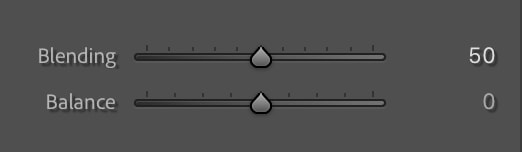
Once you have a color you like, you can drag the sliders below the wheels to see how the image looks with different Blending and Balance adjustments.
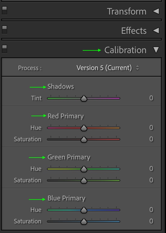
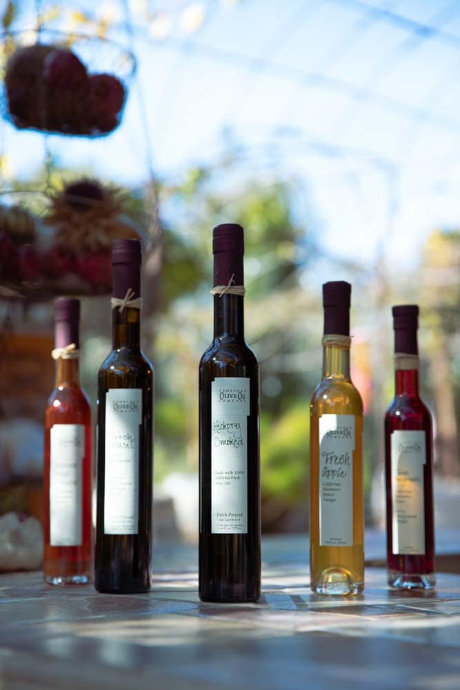
Option 3: Using The Calibration Panel
You can use the calibration for color enhancement to change the hues and saturations of colors. In the Calibration panel, you can adjust the Tint of the Shadows and the Hue and Saturation of the Red, Green, and Blue color channels.
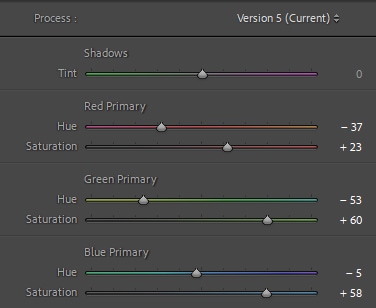
Editing the color channels will modify the colors in your image uniquely. While calibrating color channels isn’t the best way to color correct, it is a great method to stylize your photo and give it a unique look.
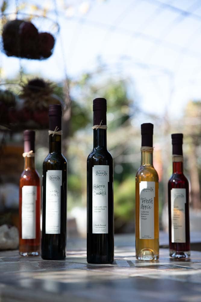
For instance, if I calibrate the color channels to make reds slightly less orange, greens more yellow and increase the saturation of both while decreasing the hue of the blues but increasing the saturation, the bottles, the sky, and the green foliage surrounding them appear more vivid.
Happy Editing!
