
Let’s face it, there are a ton of camera settings to remember. As you progress your photography, you start to get into a groove, and choosing camera settings becomes easy. However, when most photographers think of camera settings, they think of things like shutter speed, aperture, or ISO. Many people overlook white balance and aren’t sure how to use white balance in their photography. This important setting is crucial to accurately display the colors in your photos, especially if you’re shooting in Jpeg.
In this article, I’ll break down how to use white balance in photography and why this camera setting is essential in the photos you take. It’s a commonly overlooked setting that can make a significant impact in your photography when you get it right. Let’s dive in and discover the ways you can use white balance in your photography.
What Is White Balance
White balance, also known as color temperature, is in charge of making sure that white looks the same in-camera as it does to your eyes. Depending on the environment you are in, the color of light around you will change. For example, if you’re sitting beside a lamp in your house, it likely has a yellow or ‘warm’ hue to it. If you were to go outside in the shade, the light has a more blue or ‘cool’ hue to it compared to the lamp. This variance in color can make a dramatic difference in how the colors in your photo appear. That’s where white balance comes into play.
White balance adjusts the amount of blue or yellow in your photo to counter the ‘color temperature’ of light in different environments. If your white balance is set correctly, a white sheet of paper will look the same to your eyes as it does in the camera. If your whites look truly white, all the other colors in your image will also display more accurately.
Why Does White Balance Matter To Beginners
White balance is a setting that you can change in your camera, but also with post-processing. Many photographers will use their auto white balance setting and then adjust for more creative looks when they edit their photos. They can do this because they are shooting RAW images. Most beginners tend to shoot in Jpeg since this file type is ready to be shared or printed the second you import to your computer. However, RAW photos must be edited and re-exported to Jpeg before anything can be done with them. The difference between RAW and Jpeg files is that Jpeg files are compressed and cannot be edited very well compared to RAW. This means that beginners shooting in Jpeg, don’t have the same luxury to adjust their white balance in post.
When you’re shooting in Jpeg, it becomes even more essential to get your camera settings correct in-camera, especially your white balance. That’s why it becomes increasingly valuable for beginners to understand how to use white balance in photography and utilize it in creative ways.
Kelvin In Photography – Understanding Color Temperature
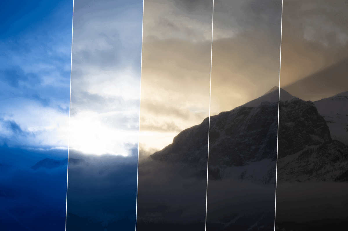
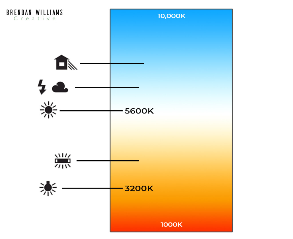
White balance is measured in degrees Kelvin. This is a way to measure the color of a light source ranging from blue to red. Kelvin in photography will be displayed as something like 5600K, for example. The 5600 telling you the color temperature, and the K representing the Kelvin measurement.
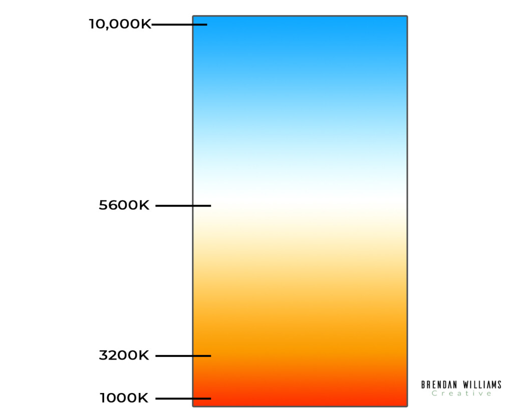
This can all seem quite complicated at first, but there is a way to make remembering color temperature easy. Let’s forget photography for a minute and only focus on the color of a light source. With a tungsten light bulb in your home, notice how the light it gives off has a yellow hue to it. Now see how the sunlight coming through your window appears more blue compared to the yellow of the light bulb. This difference in hue is color temperature, and Kelvin is the way you can quantify this change in color.
The yellow of the tungsten light bulb is considered to be 3200K, while the sunlight through your window is considered to be 5600K. By remembering these two color temperatures, you’ll be able to know whether a color temperature is warm(yellow) or cool(blue).
As the Degrees Kelvin decreases, the light becomes warmer, as they increase, the light becomes cooler.
How White Balance Works In-Camera
When it comes to your photography, you’ll notice the opposite effects discussed above. With a custom white balance setting of 6000K on your camera (which you now know is a cooler light source), the photo would appear warmer. This is because your camera adds the opposite color to counter the effects of the lights hue.
With white balance in photography, the higher the degrees Kelvin, the warmer the picture will appear. The lower the degrees Kelvin, the cooler your photo will appear. This is because your camera adds the opposite hue to balance out your colors and make white appear the same to your eye as it does to the camera.
How To Change Your White Balance
All cameras will have a slightly different method to change the color temperature. The one thing all cameras have in common is the preset white balance options. Just keep an eye out for any of the icons below in your camera settings, and that’s where your white balance will be. By selecting any of these options, you’ll be able to accurately set your color temperature for your situation.
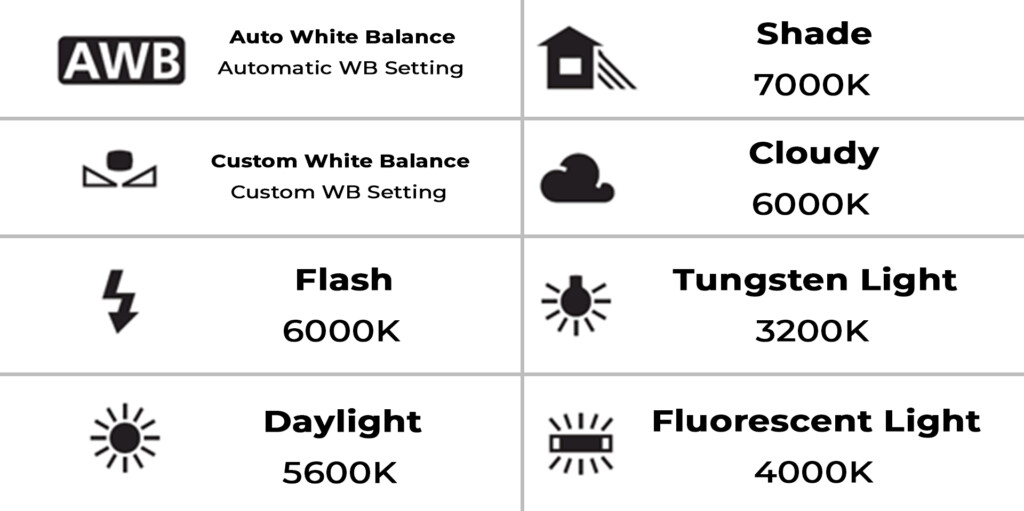
Types Of White Balance Settings On Your Camera
Auto: Ambience Priority (AWB) – Chooses the best color temperature based on the scene and lighting conditions. Best used for accurate colors without much brain-power.
Daylight- This white balance is preset to around 5600K. It’s best used for sunny days or when you are shooting outside.
Shade- This white balance is preset to around 7000K. It adds more of a warm hue to your photos to counter the blue of shade. It’s best used in the shade outside.
Cloudy- This white balance is preset to around 6000K. It’s a little warmer than daylight to counter the blue hues coming from the overcast sky. It’s best used for gloomy days.
Tungsten Light- This white balance is preset to around 3200K. It adds more blue to your pictures to counter the yellow of tungsten. This setting is best used indoors around warm interior lights.
Fluorescent Light- This white balance is preset to around 4000K. It’s a bit warmer than daylight to counter the effects of fluorescent lighting. Best use indoors under whiter lights.
Flash- This white balance is preset to around 6000K. It adds more warmth to the photo to counter the blue of the flash. This is best used when using your cameras flash, and you don’t want to wash out your subject.
Custom Color Temp- You can choose any color temperature you wish. This is fantastic for boosting the natural warmth or coolness of hues already found in your picture.
Using White Balance For Creative Effects In Your Photography
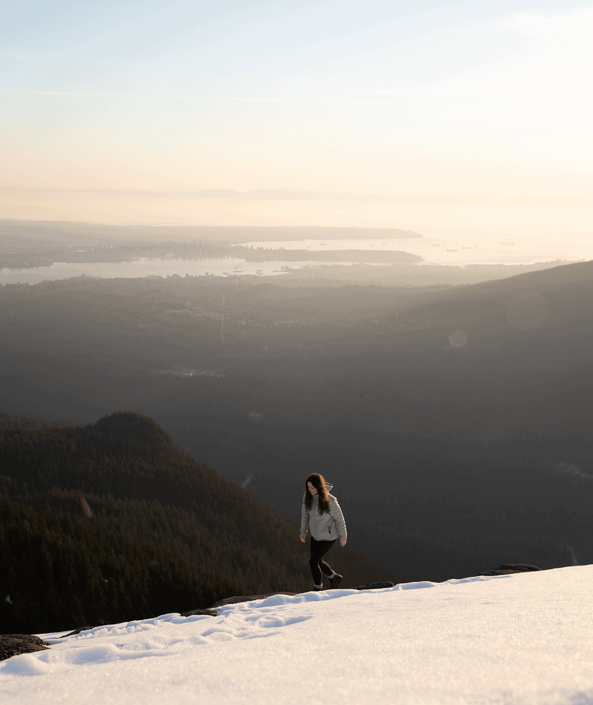
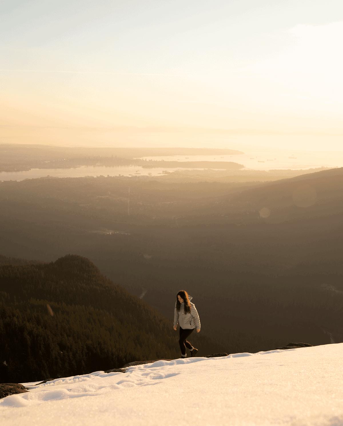
White balance not only helps to accurately display your colors, but it can also be used to accentuate the hues that already exist. Things like making a sunset look more vibrant, or a winter scene appear more frigid; these are some easy in-camera effects your white balance can help you achieve.
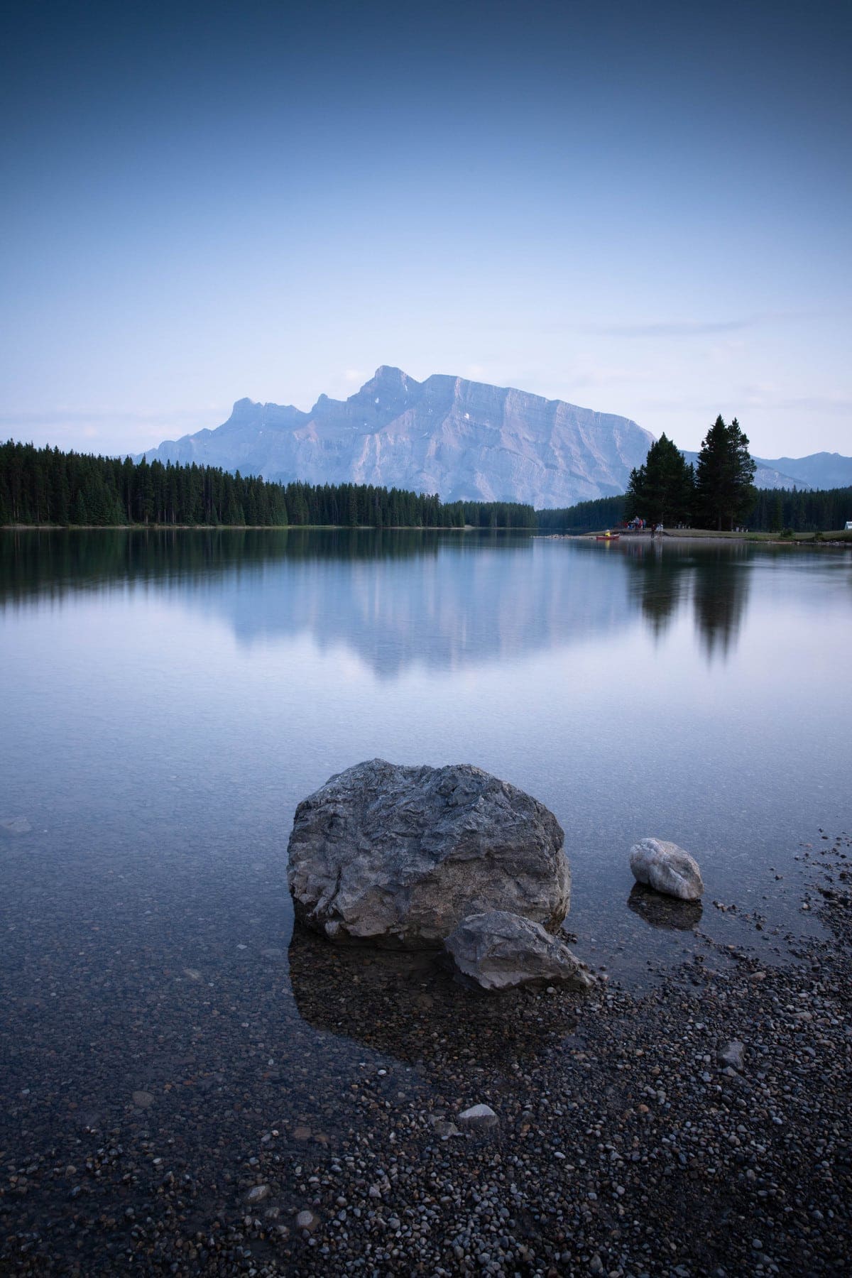
When I am shooting photos during golden hour, I always use a custom white balance to make my photos look warmer. By adding this extra yellow hue to my pictures, it makes the sunset appear more vibrant and colorful. The white balance setting I love to use for sunsets is around 6400K. I find that this is the perfect setting to add warm hues, without making it look unnatural.
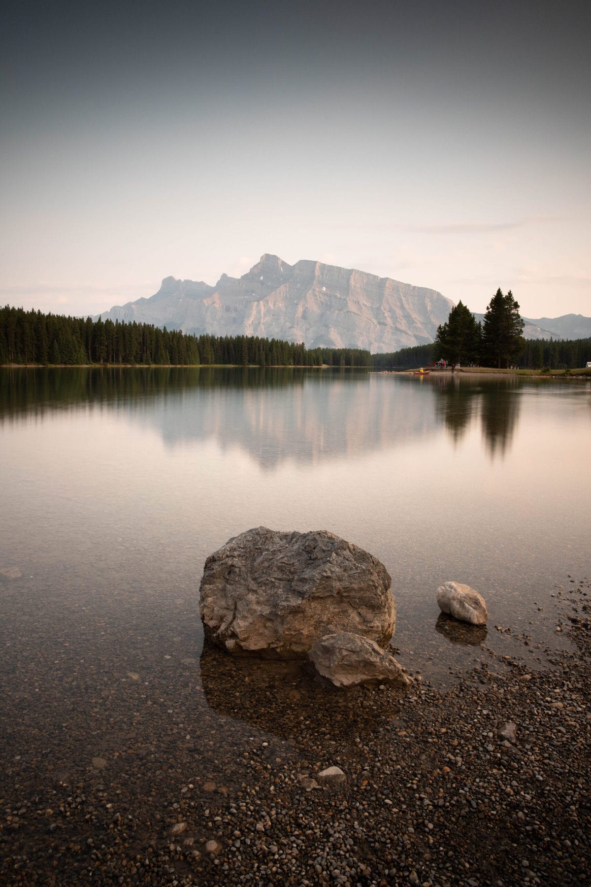
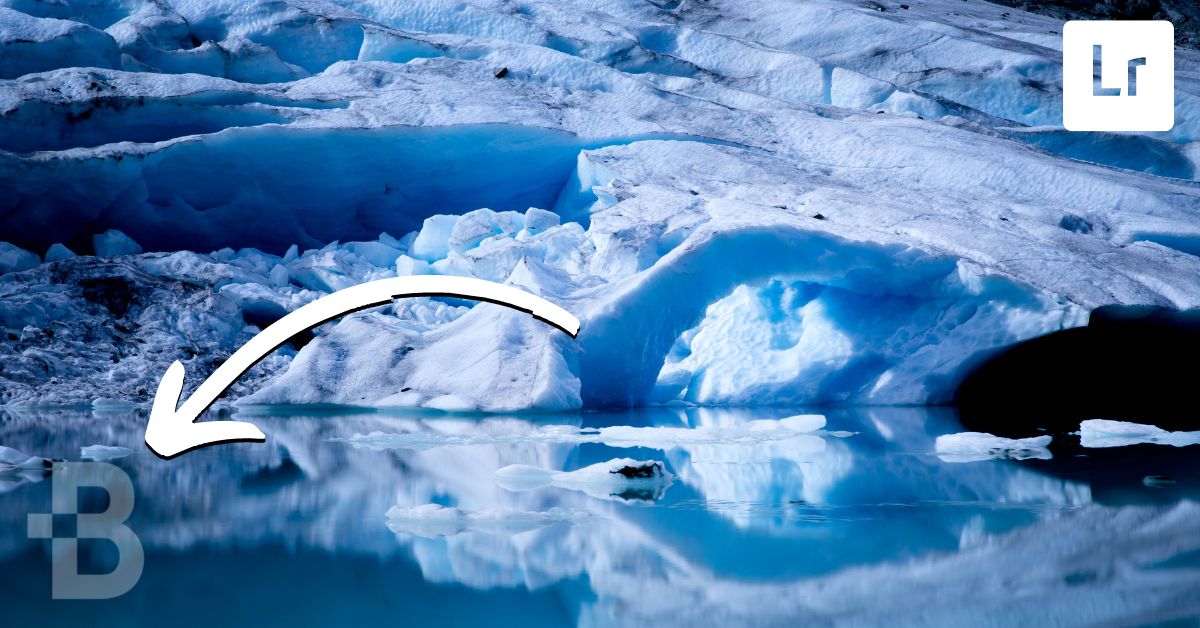
A totally different situation is shooting in winter scenes or during a stormy day. In these scenarios, I opt for a cooler white balance to make things appear moody. A custom white balance around 4000K works well for me and really helps to elevate the mood of the photo.
Other examples are using a warmer color temperature on a stormy day to shoot portrait photos. This way, your model’s skin has more color, and they don’t appear as washed out. You could use a cooler color temperature to shoot a waterfall to make the water have a slightly blue hue to it. There are countless creative ways to use white balance in photography, but it will take a bit of experimentation!
Conclusion
Learning how to use white balance in photography is an essential part of making your photos look more professional. Nothing will scream ‘amateur’ more than a picture that’s incredibly blue or yellow because the white balance wasn’t set correctly. This camera setting is one that is commonly overlooked but can make a massive difference in the pictures you take.
If you feel overwhelmed by choosing a custom white balance or remembering Kelvin in photography, there’s no shame in choosing a preset white balance. Many professional photographers I know always shoot using auto white balance and make their creative adjustments in post-processing. This is an excellent option if you’re shooting in RAW, but if you’re someone who shoots in Jpeg, it’s essential to get your white balance right in camera.
Discovering new ways to get creative with white balance in photography is a fun part of any photo you take. Try to experiment with white balance as much as you can, and you’ll soon discover how valuable of a tool it can be!
If you enjoyed this article, make sure to subscribe to my weekly newsletter and receive photography and photo editing tips straight to your inbox, for free!


[…] The only thing you need to keep aware of is that slow shutters can throw off your auto white balance setting. […]