
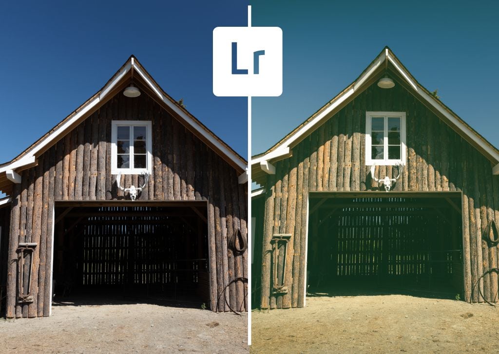

Images with a vintage style and mood have become quite popular recently. While it’s hard with digital to go back to when pictures naturally looked the way we now consider “vintage,” you can easily recreate a vintage look in Lightroom – no filters or expensive camera equipment required. Here’s how to give your photos a vintage look in a few simple steps.
How To Create A Vintage Look In Lightroom
The vintage look comes about primarily by editing settings related to color, such as the tone curve. Images with a vintage style generally have lower contrast, muted colors, and slight tints to the shadows and/or highlights. Here’s how to recreate this style in your images, step by step.
Step 1: Correct Your Exposure
First, you want to ensure your image has the correct exposure. You want to start with the most basic image to build on the vintage effects, so you don’t want the image to be over or under-exposed.
With the image already open in the Develop module, you can adjust the exposure manually by heading to the Basic tab. Here you’ll find the Exposure adjustment and the adjustments for the Shadows, Highlights, Whites, and Blacks. These are the adjustments you can use to correct the exposure.
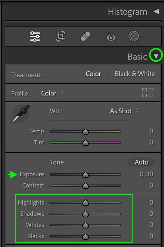
To adjust one of these, click and drag the toggle left or right.
You can also let Lightroom correct the exposure automatically by clicking the Auto button if you’d like.
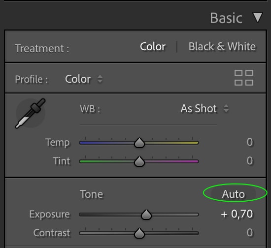
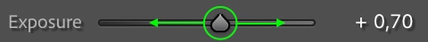
Remember that the Auto setting may not give you the exposure you desire, so you can make further adjustments by dragging the toggles. You don’t want to make any big stylistic adjustments with the exposure at this point. The vintage adjustments work best on a photo with a well-balanced exposure.
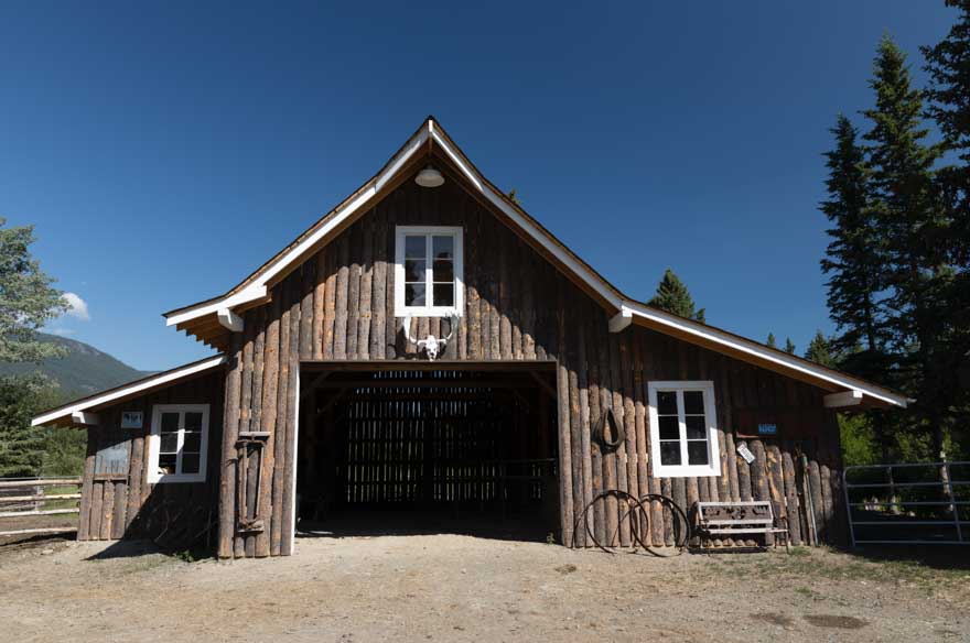
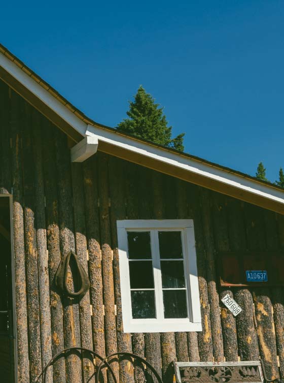
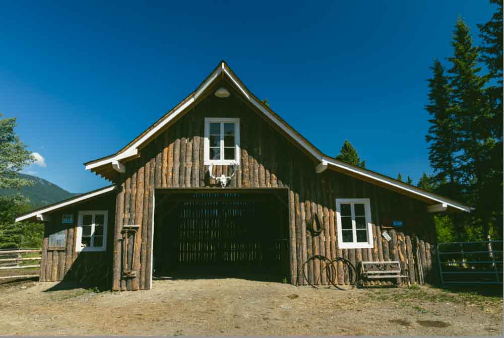
Here in my image after some basic exposure corrections:
Step 2: Add Matte Contrast With The Tone Curve
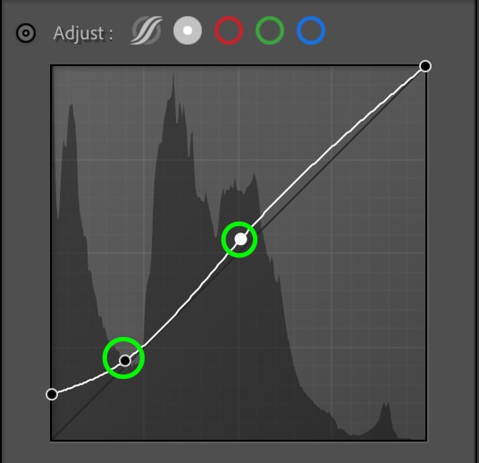
The first adjustment that will give your images a vintage feel is to matte the contrast. The best way to do this is to use the Tone Curve.
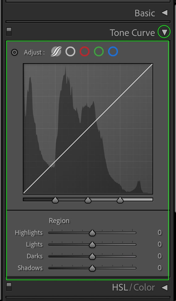
There are several versions of the Tone Curve that deal with the different channels in the image. For now, the one you’ll want to work with is the Point Curve, represented by the round gray icon at the top of the curve.
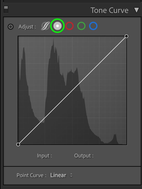
This ensures you can click and drag to add and move points along the curve, which will, in turn, adjust the shadows and highlights of your image. The effect we’re going for here is matted contrast, meaning that the blacks won’t appear fully ink-black but rather a slightly matte gray.
To do this, click the darkest point of the curve in the bottom left corner and drag it straight up. This will set the base for the darkest point in the image. You want your Tone Curve to look similar to the screenshot below.
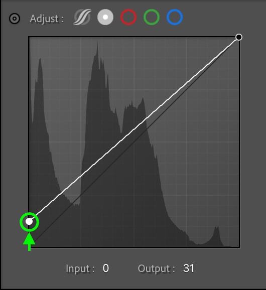
This results in an image with washed-out blacks, so you can add back some of the contrast by clicking slightly to the right of the first point to add a new one and then dragging it down a bit.
Click the center of the line to create a toggle at the midpoint of the image, and drag the toggle up to add some contrast.
The resulting image has a more aged, film-like appearance than the original.
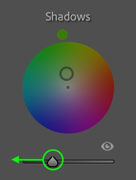
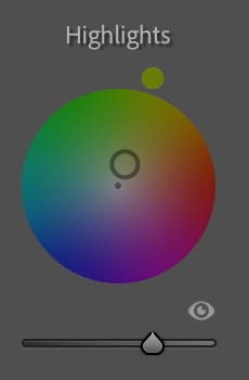
Step 3: Color Grade The Shadows & Highlights
Next, you can head to the Color Grading tab, where color grading tools can add a tint of color to the shadows and highlights.
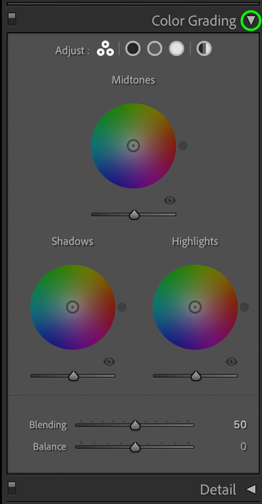
The color tints often most prominent in antique and vintage-styled photos are brown, yellow, green, and blue. You’ll want to add hints of these colors to the image’s Shadows and Highlights. Colors added to the Midtones will apply evenly over the image and won’t really help with the vintage effect, so don’t worry about the Midtones.
Starting with the Shadows, you can add a tint by clicking the point in the center of the circle and dragging it slightly towards the color you want to tint the shadows.
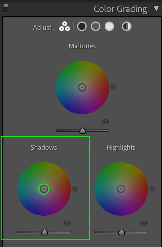
The farther toward the edge of the circle you drag the toggle, the more saturated the color will appear, so for the best results, I suggest keeping the circle close to the center.
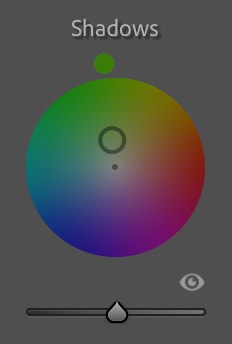
As mentioned, green is always a good go-to option, but feel free to play around with the different colors until you get a vintage feel. You’ll be able to see the tinted shadows when you compare the before and after.
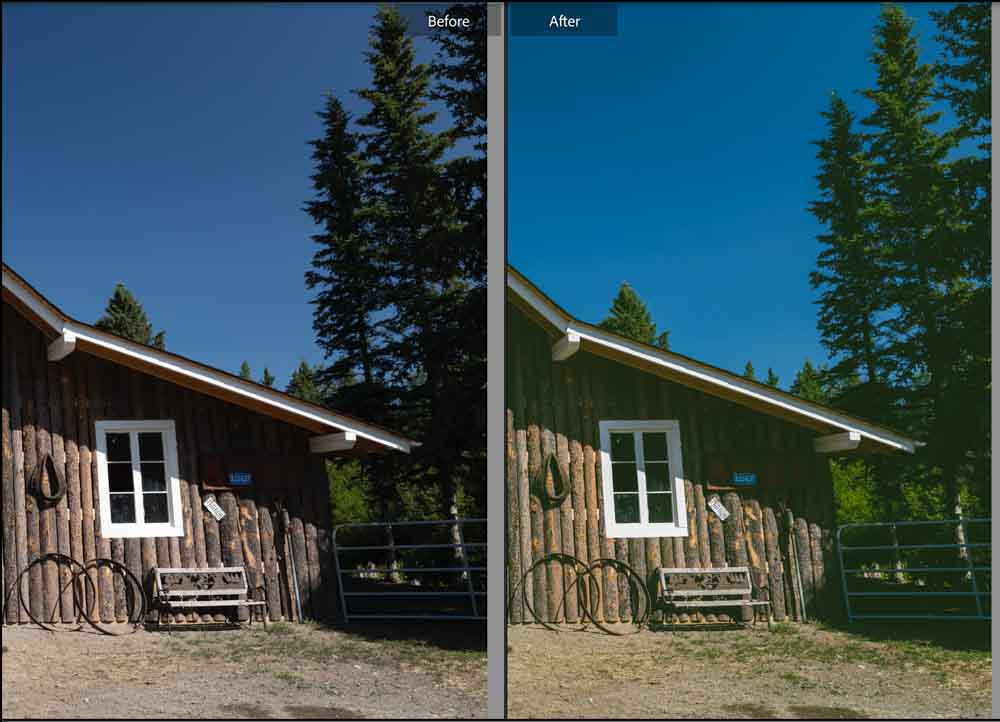
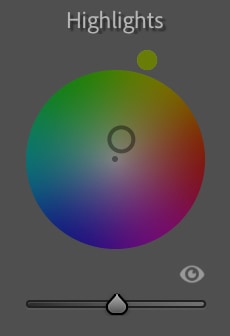
Next, you can add a tint to the Highlights the same way. Click and drag the center toggle of the Highlights circle toward the color you’d like. Again, I’ll go with a yellowish green here, but feel free to play with other colors.
Step 4: Edit The Luminance Of The Color Grading Ranges
Once you’ve added a tint of color to the shadows and highlights in the picture, you can make further adjustments to the color grading ranges using the Luminance slider, which sits below each of the Color Grading Ranges and controls the brightness of the color tints in the shadows and highlights.
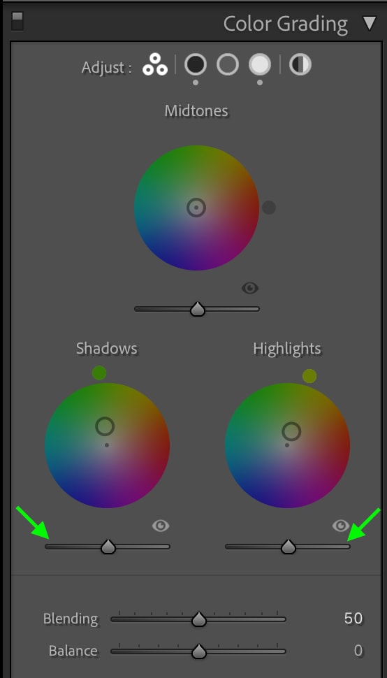
For instance, if you drag down the Luminance slider for the Shadows, the shadows will darken.
You can see the adjustment in action when comparing a section of the image before and after you changed the luminance of the shadows.
I prefer the darker shadows for this image as it creates a more dramatic look. You can repeat this process for the Highlights, dragging the toggle up (or down) until you like how they look. This is a good chance to add some last-minute contrast to your image.
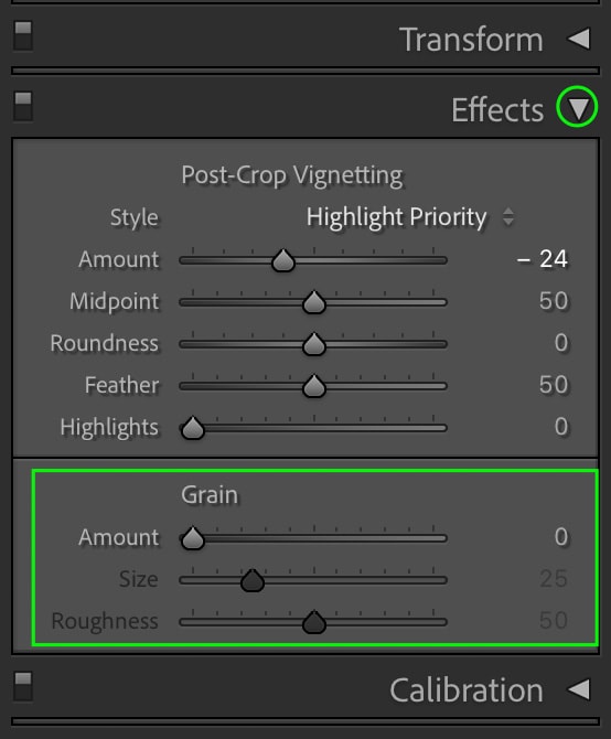
(Optional) Step 5: Add A Vignette
You may notice that older images are often slightly darkened around the edges, either due to fading with age or due to the cameras used to take the picture. If you’d like, you can add this effect to your image by adding a vignette.
You can find the Vignette adjustments by heading to the Effects tab.
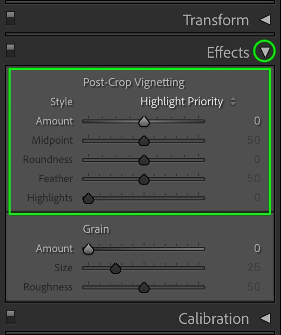
You’ll want to drag the Amount toggle to the left to darken the edges.
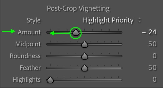
This will create a vignette effect around the edges of the photo.

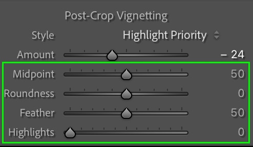
You can make other adjustments to the vignette if you’d like. You can edit the size of the Midpoint, the Roundness of the vignette, and the amount of Feather by dragging the toggles for these adjustments left or right.
You can adjust the Highlights slider to increase or decrease the highlights shown through the vignette. But again, the additional adjustments are optional, and the vignette will still look great if you leave them as they are.
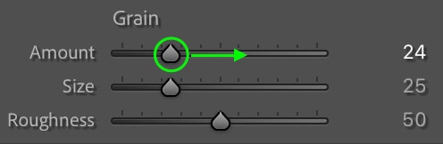
(Optional) Step 6: Add Film Grain
To some, grain in an image is considered a flaw, and too much pixelation can make a picture look low-quality. However, grainy photos have become a trend in the last few years and can help you obtain a vintage look.
You can find the grain slider in the Effects tab under the Vignette adjustments.
Drag the Amount slider to increase the amount of grain in your picture. Experiment with different amounts of grain to find what you like best.
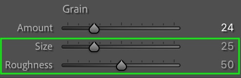
If you’d like, you can adjust the Size and Roughness sliders to alter the appearance of the grain further, but this is optional.
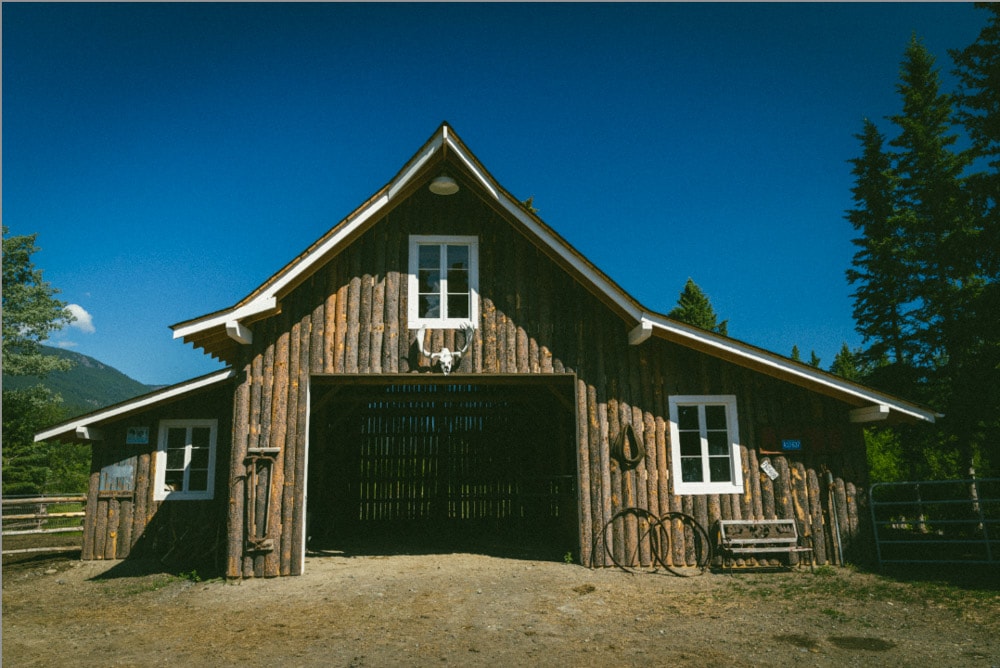
Once you’re done with the adjustments, you can see grain in your picture.
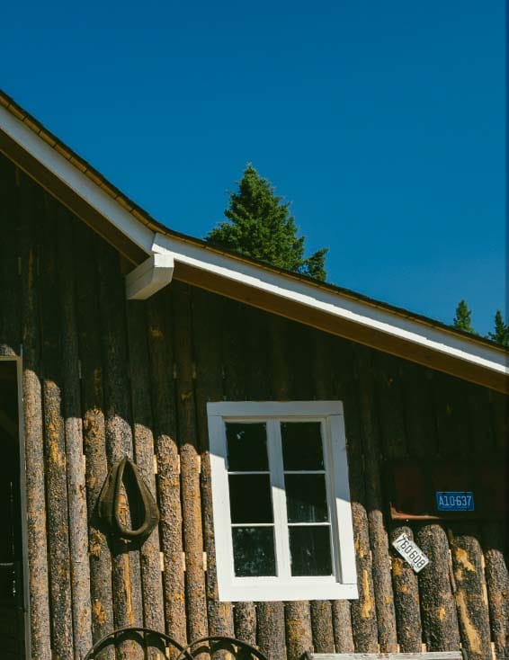
Comparing the final photo with the original, you can see how these adjustments have helped contribute to a vintage look.
Next, save these adjustments as a preset by heading Develop > New Preset if you’d like.
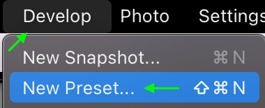
Name your preset and select which settings you’d like the preset to save – I recommend at least checking the Tone Curve, Color Grading, and Effects to recreate the same vintage look quickly.
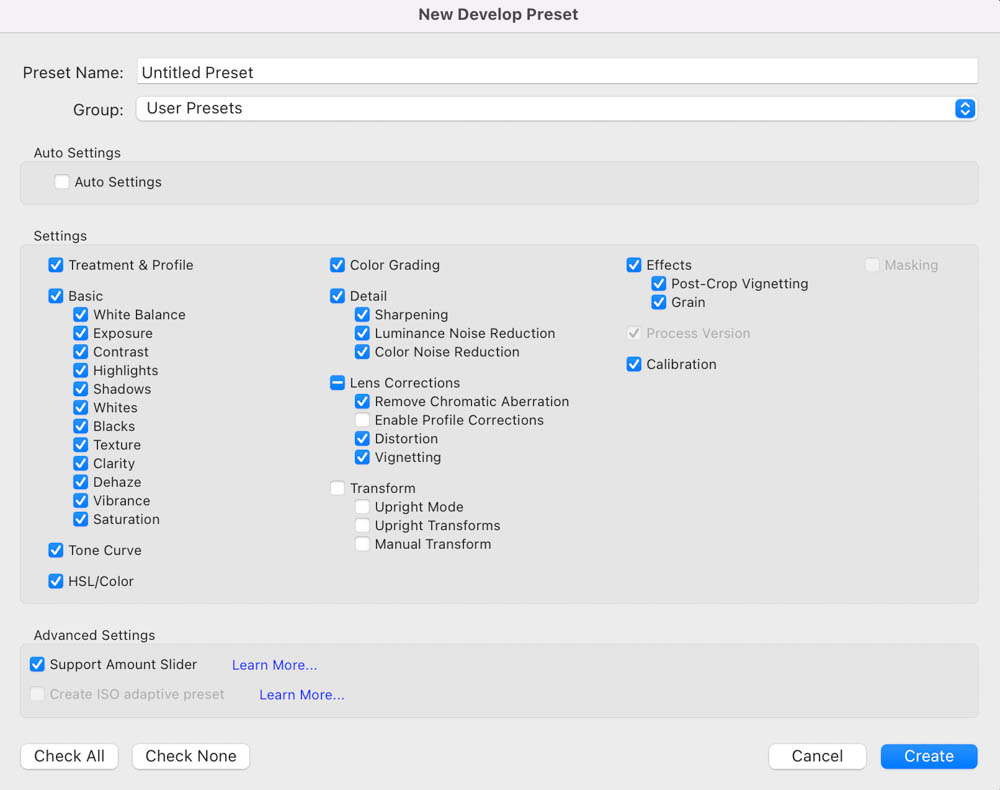
Click Create when you’re finished, and the effects will save as a new preset you can apply to your photos whenever you’d like!
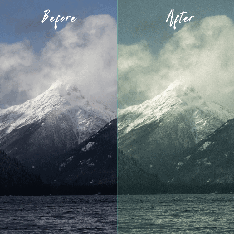
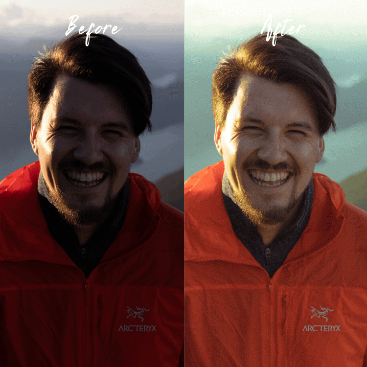
Get Vintage Looking Photos With One Click In Lightroom
Learning to create this effect is a lot of fun, but if you just want to get on with it, I created a set of Vintage Lightroom Presets that allow you to complete this effect with one click. Below are a couple of examples of these presets in action:
You can get learn more and download all 25 of these Vintage Film Lightroom presets by clicking here.
