

When working on an image or graphic project, you have the choice to set it to 8-bit, 16-bit, or 32-bit. However, if you’re like me when I first began digital editing, these settings may confuse you.
Put simply, bit depth is the range of colors and luminance that can be displayed in a photo. In other words, the tonal variations of an image.
A higher bit depth is better for heavy or creative editing as it protects the colors from banding. However, in most cases, even if you edit an image set to 16-bit, you will reduce it to 8-bit before exporting the image.
This means it’s not always practical to use a higher bit depth, so before you change this setting, let me show you when you should use the various bit depths.
The Difference Between 8 Bit, 16 Bit, and 32 Bit Images
The difference between 8 bit, 16 bit, and 32 bit is the number of color values that can be displayed. An 8 bit image can display 16.7 million colors between the Red, Green, and Blue color channels. Meanwhile, a 16 bit image can display 281 trillion colors. The higher the bit depth, the more an image can be adjusted without losing quality.
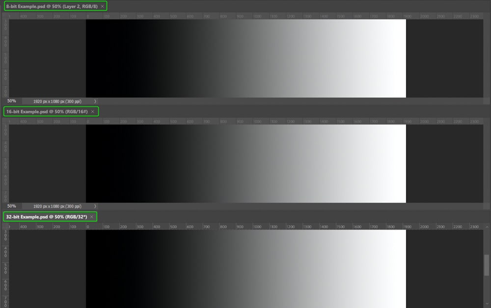
The easiest way to demonstrate the differences between bit depths is to create and edit a simple black-to-white gradient.
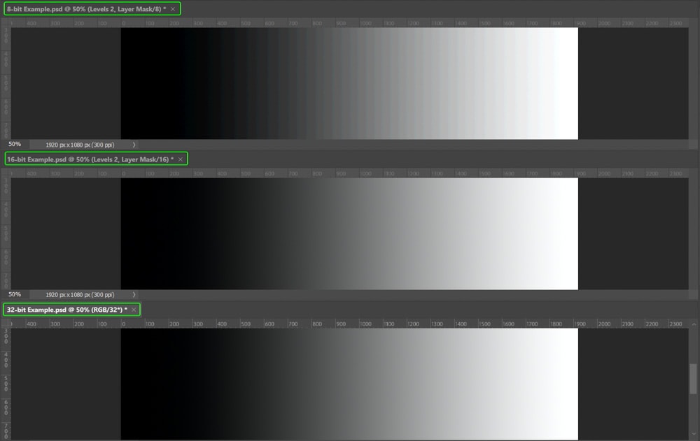
For example, in Photoshop, I have filled three separate canvases with a simple gradient and set the different bit depths for each document. You can see the bit depth in the document tab.


Looking at each gradient together, you can’t notice the difference. This lack of difference shows why bit depth doesn’t matter too much to the human eye at first.
However, once I edit the images, the difference is noticeable. To demonstrate this, I added a Levels Adjustment Layer to each gradient and changed the Output Levels to 110 and 148. This adjustment turns the gradient to a solid gray.
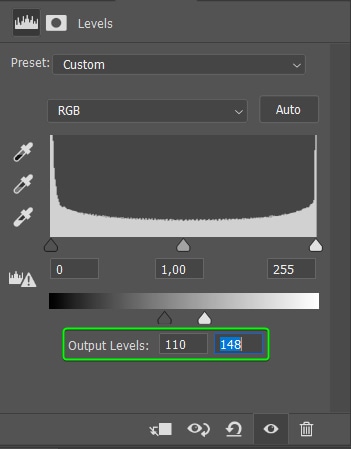

The 8-bit and 16-bit images look the same, but you can already notice a difference on the 32-bit canvas.
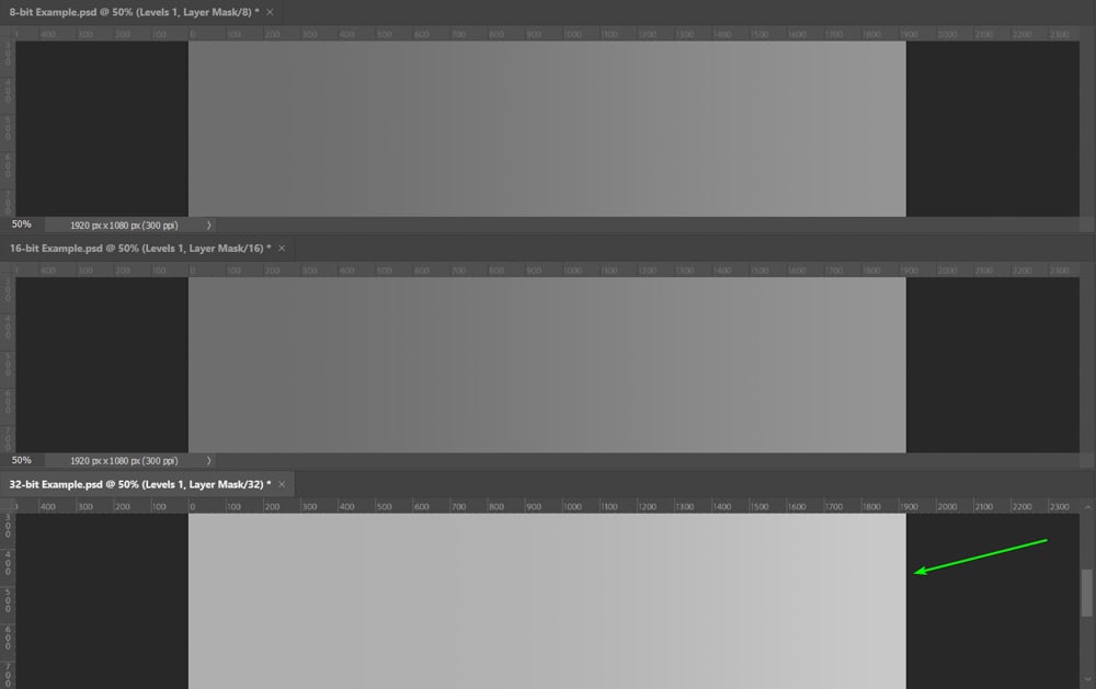
Now, to see the actual difference between the bit depths, I need to change the gradient back to the original black-to-white. To do this, I added a new Levels Adjustment Layer and set the shadow input to 110 and the highlight input to 148.
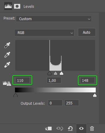
Now, when you look at the three documents, you notice an obvious difference between the 8-bit and 16-bit canvases. The 32-bit isn’t much different from the 16-bit. You need to conduct much heavier edits to see the difference between those two.
The 8-bit image produces evident banding because the original levels of the gradient were lost, and the document didn’t contain enough color information to keep it smooth.

The 16-bit and 32-bit had more information to keep the gradient smooth.

Should You Use 8 Bit, 16 Bit, or 32 Bit Documents?
Now that you know a 16-bit photo contains more colors than an 8-bit, you may automatically think that increasing the bit depth leads to a better-quality image. Unfortunately, a higher bit depth doesn’t mean better quality.
The truth is that most pictures don’t contain enough colors for 16-bit to make any difference. However, there are times when a higher bit depth is necessary.
Using 8-bit
You don’t need anything higher than an 8-bit setting for standard image editing to produce quality photos and edits. If you are new to editing and only making minor edits, set the mode to 8-bit because it keeps the file size down and won’t slow your computer down.
Using 16-bit
A 16-bit setting is beneficial when you are applying more complicated edits to an image and need the advantages of more tonal variation.
I also recommend using a 16-bit setting when you plan to make several edits to your images that may break down the colors in the photo at some point. Using a higher setting allows you to prevent banding, as I showed you in the gradient example.
When editing at 16-bit, you should convert it back to 8-bit in most cases before exporting, especially when you plan to use the image on the web or send it to a printer. Most printers can only process 8-bit photos, although there are a few that print images at 16-bit.
Using 32-bit
The 32-bit setting is the least used because this mode increases the file size, slows down processes, and isn’t needed for most editing processes. However, there are a few times when you need to set the image to 32-bit.
When creating HDR images, you may need to switch to 32-bit because you are gathering color information from three different photos and merging them into one.
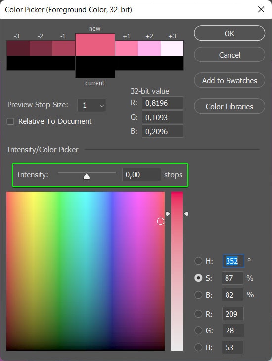
Editing at 32-bit is also helpful to access other benefits, such as changing the Intensity of a color. When you open the Color Picker at 32-bit, there is an extra setting that adjusts the intensity of a color without affecting the color values.
When using a 32-bit image, you also have more opportunities to manipulate colors using the Levels Adjustment and Exposure, as the picture contains far more colors. Use a 32-bit image when you plan on adding severe adjustments that affect the colors in an image.
How To Change Bit Depth In Photoshop
You can change the bit depth in Photoshop when you create a new document or even during your editing process. These methods are helpful if you want to start by editing a photo with a high bit depth, such as 16, and then reduce it before you export it.
Option 1: When Creating A New Document
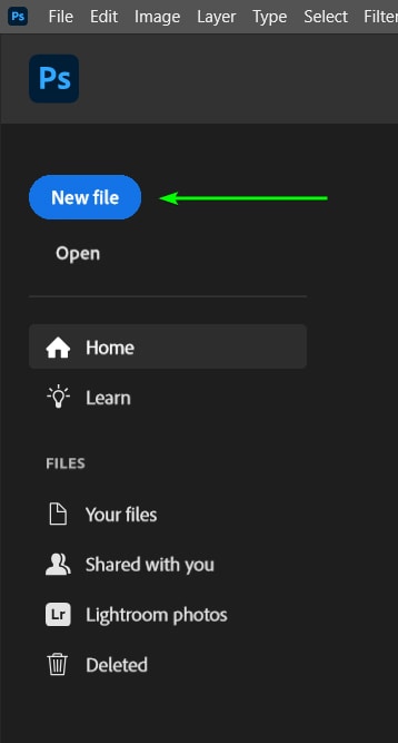
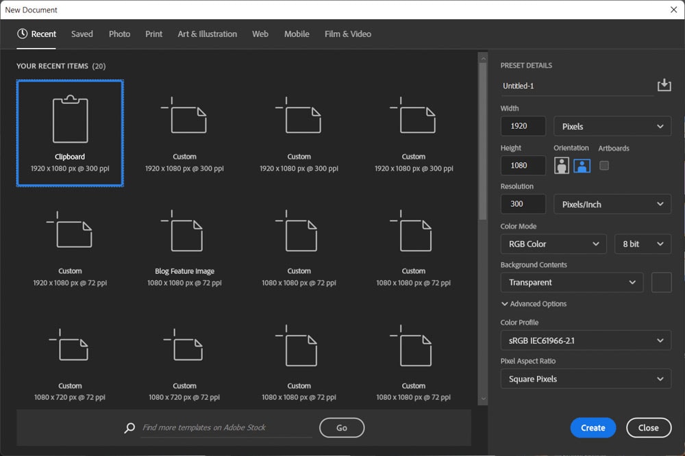
The first method to change the bit depth is when you create a new document. Once Photoshop is open, click on New File in the left-hand panel.
The New Document window opens, where you can choose a template document, input your own document size, set the color mode, and more.
You change the bit depth in the right-hand side panel by selecting the drop-down menu next to the color mode options. You can choose from three options: 8-bit, 16-bit, or 32-bit.
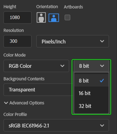
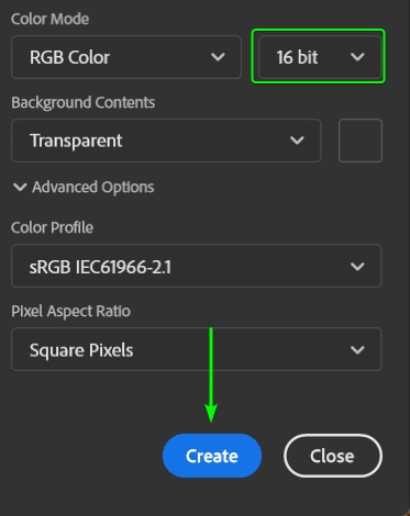
Once you have chosen the bit depth and changed the rest of the settings as needed, click on Create.
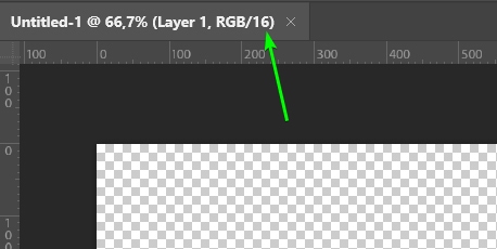
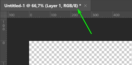
In the Photoshop workspace, ensure that the bit depth is correctly set by looking at the value in the document tab.
Option 2: Changing An Existing Documents Bit Depth
Once your document is open in the workspace and you’ve edited it as needed, you can easily change the bit depth. It doesn’t matter whether you are working on a document you created or an image you opened in Photoshop.
To change the bit depth, navigate to Image > Mode. You will see the bit depth options at the bottom of the mode menu. The bit depth with the checkmark shows what you set your document to.
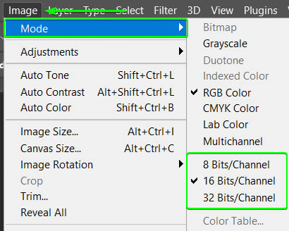
Click on the new bit depth you want, and your document automatically changes. You can see the change by checking the document tab.
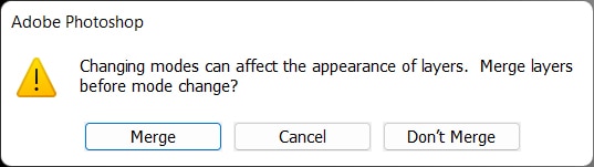
In some cases, when you have specific edits on your image or canvas, Photoshop warns you about the possibility of changes in the appearance of your layers. The message recommends that you merge your layers before changing the bit depth. It’s entirely up to you if you merge the layers or not, as you may still need to edit them separately.
Happy Editing!
