
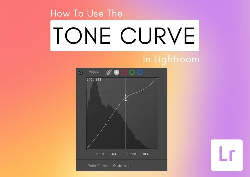

The Tone Curve is one of the most powerful tools for enhancing contrast, exposure, and color in your photos. But unlike simpler-to-understand tools, it tends to confuse many photographers, especially beginners.
This tool isolates aspects of an image based on tone and color. It allows you to adjust these with areas of a photo with great precision, helping achieve anything from the trendy matte look to the timeless high contrast of fashion editorials.
From basic editing uses to creative tricks, this post will have you mastering the tone curve in no time. So let’s dive in.
Video Tutorial
What Does The Tone Curve Do In Lightroom?
In simple terms, the Tone Curve in Lightroom helps editors target specific exposure ranges in a photo, add more color, and create interesting creative looks.
Located in the Develop module on the right-hand side of the screen (under Basic and above HSL), the tool also grants precise control over the shadows, highlights, and midtones of an image.
These components can be made brighter or darker by pulling on the diagonal line up or down. When the line is pulled up and down, it begins to curve – hence the name Tone Curve!
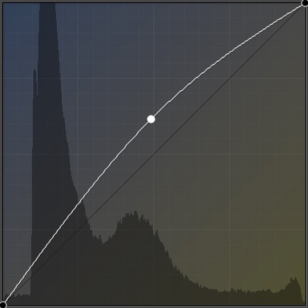
Photographers may find the look of the Tone Curve graph rather familiar: it is similar to a Histogram. The “mountains” on the left side of the image indicate the shadows in your photo, the middle corresponds with the midtones, and the right side is the highlights.
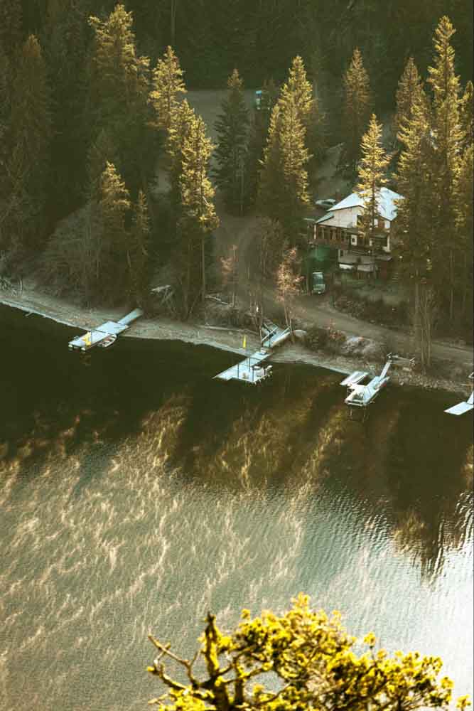
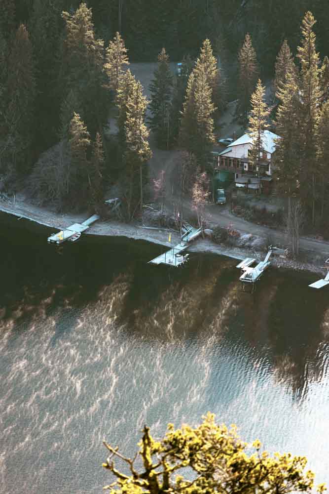
Essentially, the Tone Curve graph (behind the diagonal line) is the histogram of the original image that can be used as a reference for correcting exposure. You can adjust the exposure or contrast of a photo by clicking and dragging on the tone curve. Pulling the diagonal line up brightens, and pulling the line down darkens.
For example, if you grab the line at the shadow point of the tone curve and pull it up, the shadows will be brightened.
On the other hand, if you grab the line at the highlight point of the graph and pull it down, your highlights will be darkened. The graph behind the tone curve will not change, but the edits will apply to your image. This graph only represents the histogram of your original image and does not change as you adjust it as the actual histogram in Lightroom found above the Basic Panel.
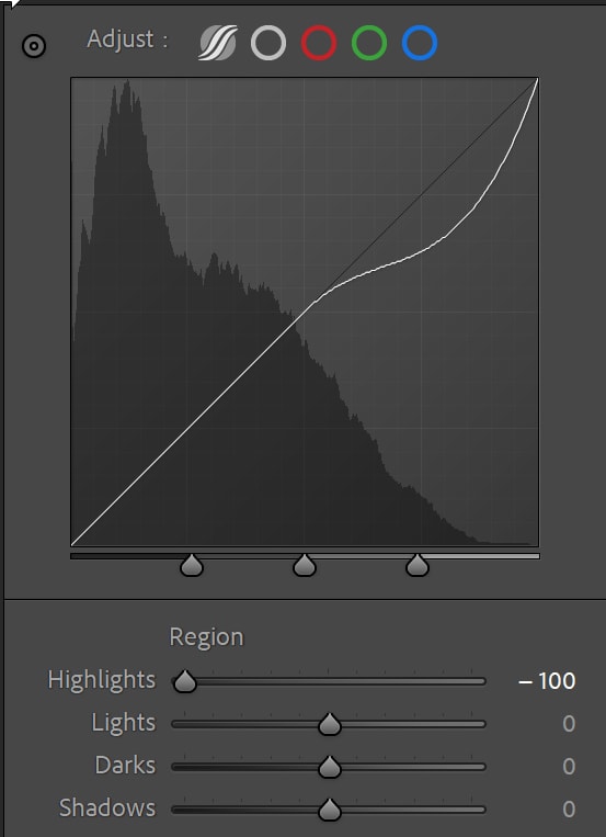
The above is why the Tone Curve is such a valuable tool for photo editing. You can adjust your shadows, highlights, and midtones independently of one another with great detail and accuracy. This gives you the ability to further correct your exposure and contrast beyond what you can do inside the Basic Panel with the shadows and highlights sliders.
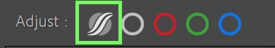
At the top of the Tone Curve, you have five different options to choose from. These settings will dictate not only how the Tone Curve can be edited but also which color channels your adjustments will target.
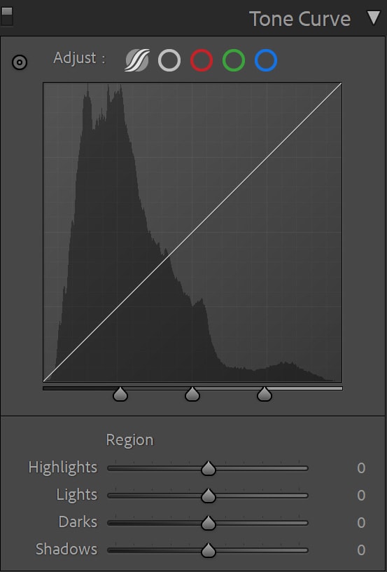
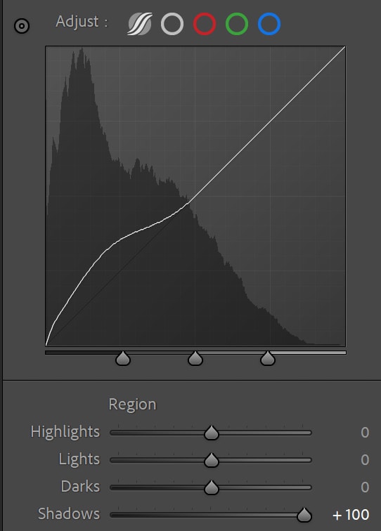
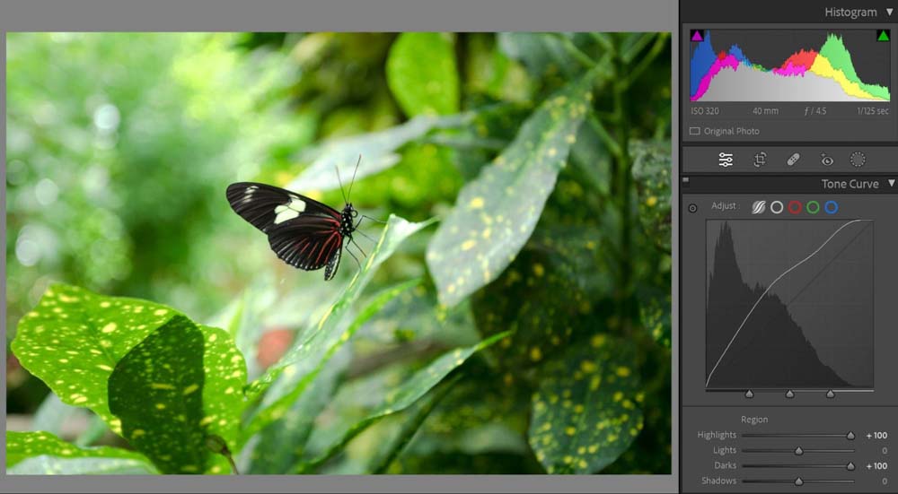
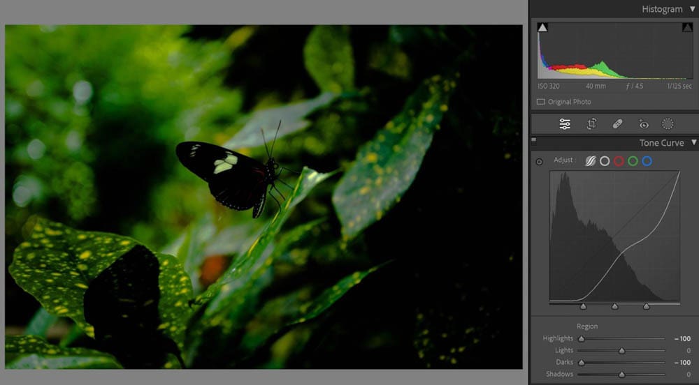
The first is the Parametric Curve (also referred to as the Region Curve). This allows you to target the Shadows, Darks, Lights, and Highlights of your photograph and use sliders to adjust them. This is the best setting to use for beginners just getting started with the Tone Curve.
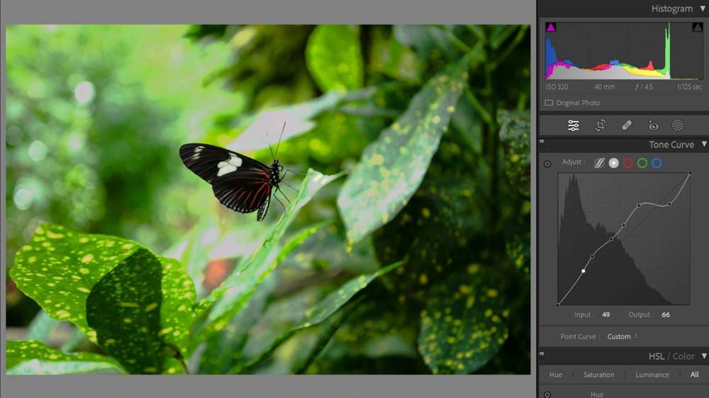
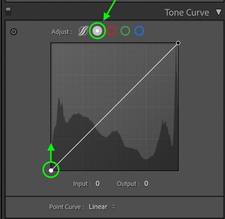
The second is the Point Curve. This removes the exposure range sliders and allows you to add anchor points to your diagonal line to change specific areas.
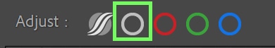
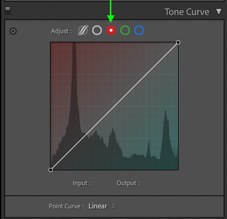
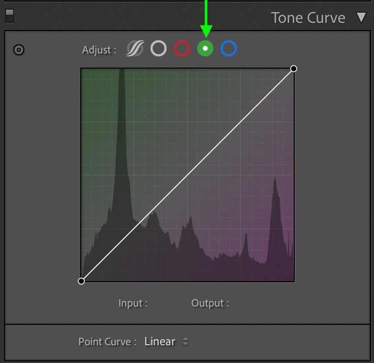
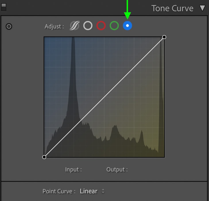
The next three, in order, are the Red, Green, and Blue Curves. This allows you to adjust the tones of these specific color channels. These are useful for correcting unwanted colors in an image or even adding subtle color grading effects to the shadows or highlights.
When To Use The Tone Curve In Lightroom
The Tone Curve is best used as a complementary tool to the blacks, whites, shadows, and highlights sliders in the Basic Panel of Lightroom. After making base adjustments inside the Basic Panel, you can use the Tone Curve to refine and enhance your exposure and contrast adjustments in ways not possible with the Basic Panel sliders.
For example, if you wanted to increase the contrast in the highlights and the mid-tones without affecting the shadows, it would be difficult with your standard sliders. Instead, you can use the Tone Curve with multiple anchor points to target the exact exposure ranges you want an edit to take place.
Another example might be that your shadows feel a bit too yellow. In that case, you could use the Blue color channel within the Tone Curve to add blue to only the shadows exposure range without affecting the mid-tones or the highlights.
With the help of the Tone Curve, you can easily correct color cast by using any of the color channels and adding the opposite color to that of what you want to remove. If the shadows of your image are tinted with an odd green, you can add a bit of magenta (the opposite color to green) to them to balance the color out. This could all be done within the Green color channel of the Tone Curve.
You can also use the colors to add creative edits, such as to get a moody green look on your landscape photos.
Region Curve VS Point Curve
As mentioned above, you can switch your Tone Curve into five different curves: Parametric (Region), Point, Red, Green, and Blue. The Region Curve is found when switching to Parametric Curve (the first option).
Region Curve
In the Region Curve view, the Tone Curve editing panel is divided into two sections: the top being the histogram chart with the diagonal line and the second being a section of four sliders underneath with the word Region at the top of them. These sliders can be used to edit your Tone Curve without using anchor points.
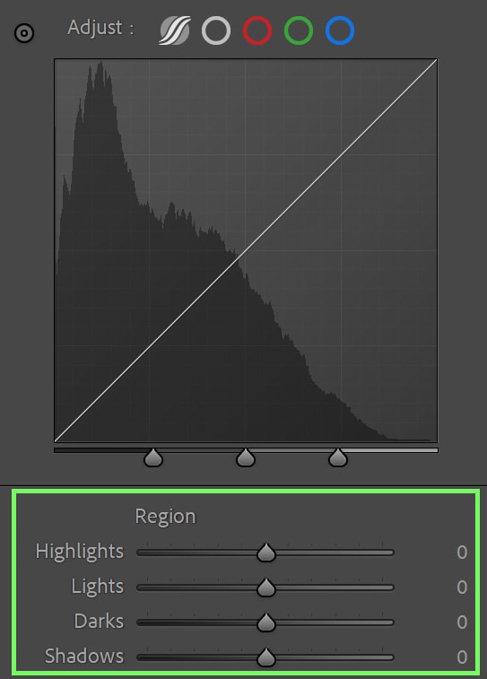
When you move any of the sliders in the Region box, the diagonal line adjusts as well to represent the change.
The Region Curve is best used for beginners or those wanting a slightly more universal adjustment. The Region Curve limits how far the curve can be adjusted as well.
This helps steer you into a moderate exposure adjustment so you don’t go beyond bounds and over-adjust the image. Lightroom determines how far your curve can be moved to preserve the exposure tones when working in the Region Curve.
However, depending on your needs in an edit, this option may not allow you to add the adjustments you want. That means that the Point Curve is sure to do the trick instead.
Point Curve
A much more advanced version of the adjustment, the Point Curve, allows you to plot anchor points that you can then move around independently of the rest of the diagonal line.
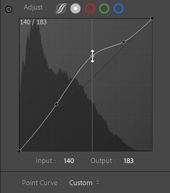
The Point Curve allows you to add anchor points by clicking various parts of the diagonal line and adding a point there. You can then move this point up and down. There is no limit to how much of the point you can move.
Dragging this curve up will brighten, while moving it down will darken your image. This helps make more advanced and targeted adjustments over the limited adjustments of the Region Curve.
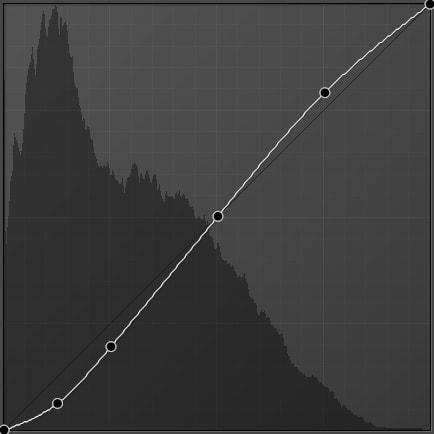
The Point Curve also has a few presets to help the adjustment process, which you can locate at the bottom of the graph. By selecting either the Medium Contrast or Strong Contrast, points are automatically plotted for you. Linear has no points plotted and is the default setting.
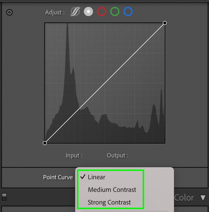
Strong Contrast
Medium Contrast
Linear
Both the Region Curve and the Point Curve have their benefits, and when it comes down to choosing which one to use, I keep in mind both my personal preferences and the goal of my edit. I generally lean toward using the Region Curve because of its ease and precision in creating adjustments to exposure and tone.
However, the Point Curve offers much more versatility when I want to give my photos something more. All in all, there is no right or wrong answer to this, but experiment with each to see which one you prefer. For most beginners, the Region Curve is a better place to start.
Red, Green, and Blue Tone Curve Channels Explained
Where the Region Curve and Point Curve target the tones of an image, the Red, Green, or Blue Tone Curve aims towards adjusting just one of those three color channels.
You can adjust the tones of the color channel by pulling the diagonal line either toward the color itself (upwards) or against that color to its complementary color (downwards). You can add points to the diagonal line, much like the Point Curve, to make your edits very targeted.
Keep in mind that just like with tonal adjustments, if you add a point to the shadow section and move that up or down, the effect will only apply to the color in the shadow region.
For example, pulling the Blue Curve up in the middle of the curve will add more blue to the overall image, including the highlights, midtones, and shadows, since the curve moves upward from the line in all the exposure ranges.
This is a great way to remove color casts, balance colors out, or add a moody feel to an image.
How To Edit The Tone Curve In Lightroom
Editing a photo using the Tone Curve can seem daunting, but it’s not! The easiest way to use this powerful editing tool is to remember that the histogram is divided into two sections: light and dark.
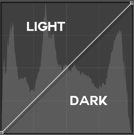
Pull up to lighten and down to darken.
If you want limited adjustments to your image so you don’t go beyond the integrity of your exposure, you can use the Region sliders.
If your image needs something more significant, use the Point Curve. Adding one point makes a more general adjustment while adding many points gets more specific. Generally, just two or three anchor points along a curve will get the job done, but the example below shows how you can go crazy with this.
How you use the Tone Curve and to what extent depends on the image you are editing and what you’re trying to achieve. Playing with the tool is the quickest way to learn it. Just remember that there does come the point where images begin looking over-edited, so try not to overdo it and lose quality.
Using The Tone Selector
For quick adjustments in a specific part of your photo, you can use the Tone Selector tool to target those specific tones. This is especially useful if you feel like you can’t quite target a section of your photograph that you need.
You can find the Tone Selector icon as a small dot to the very left part of the Tone Curve panel next to Adjust. Press this and then move your cursor to the photo you are editing.
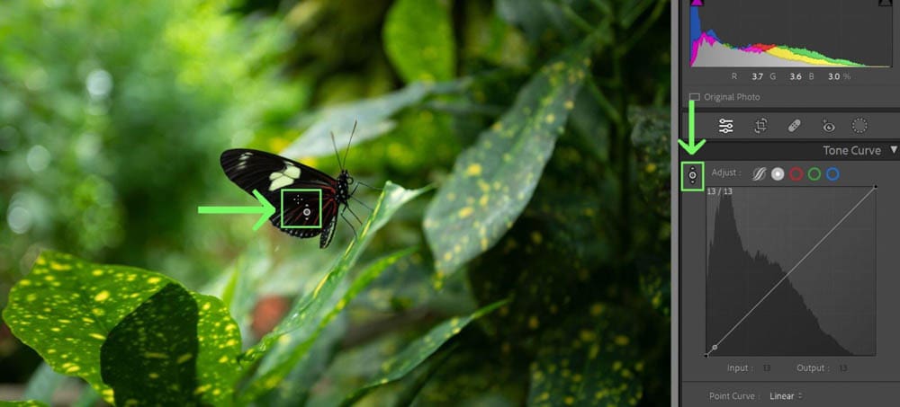
Once you’ve moved the cursor to the tone you wish to adjust, click and hold, then slide either up (to lighten) or down (to darken) that specific tone! Lightroom will automatically add an anchor point to the Tone Curve based on the exposure range that you sampled in your photo.
Tone Curve Editing Examples In Lightroom
Here are some very common use editing examples for the Tone Curve.
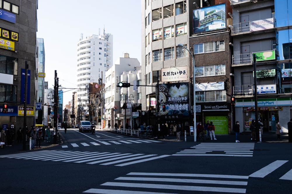
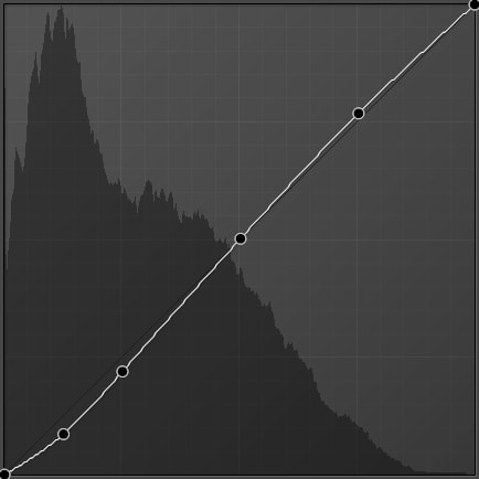
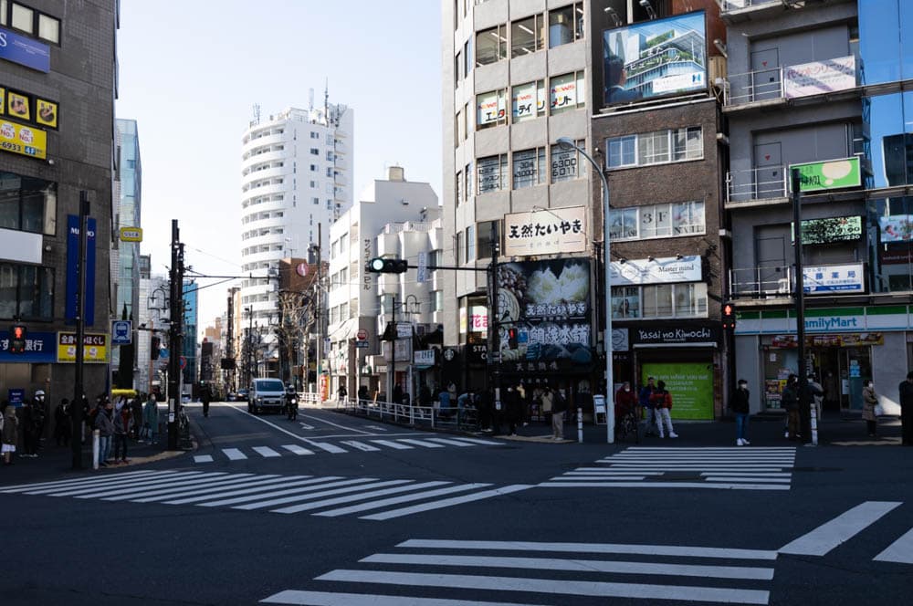
Matte Contrast
The matte look is trendy in the photography industry today. Essentially, matte photos have little contrast to them, appearing to almost have a texture spread across the frame. The idea of this type of editing came from matte prints in photography, in which the sheet is textured so the image itself does not have as much contrast on it when printed.
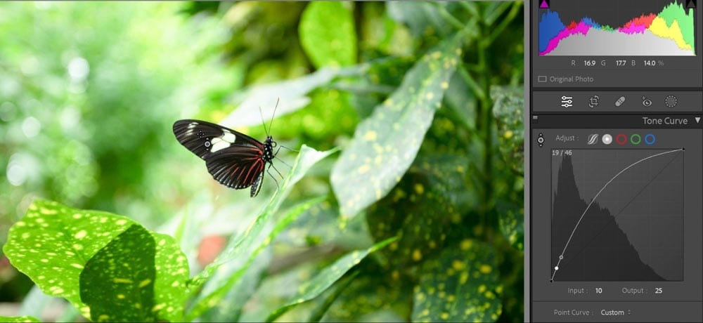
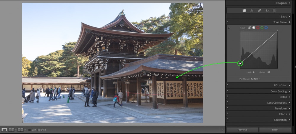
The key to matte contrast is to move the black point up to appear a more grey color rather than 100% black. Using the Point Curve, you can easily grab the black point and lift it to add matte contrast. This is because you are making the blackest parts of a photo suddenly appear brighter overall.
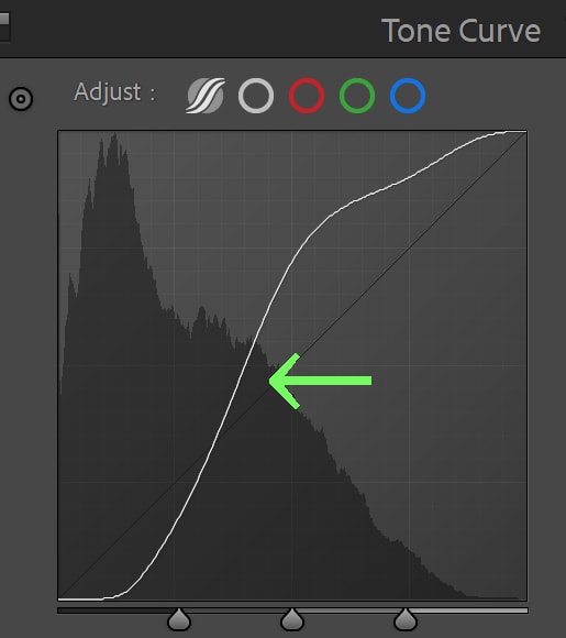
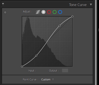
High Contrast (S Curve)
To create a high-contrast appearance, your Tone Curve will be reminiscent of the letter S.
If you grab your shadows and pull them down and then grab your highlights and pull them up, you’ll add contrast. The result will, as mentioned, look like the letter S. The more extreme you go (the closer to a true S your curve looks), the higher the contrast.


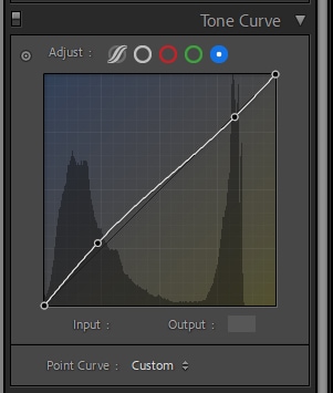
Soft Contrast + Color
Soft contrast is a slight S curve since you’re trying to keep the contrast relatively subtle. Grab your shadows and pull down slightly and then grab your highlights and pull them up slightly, creating a softer S curve.
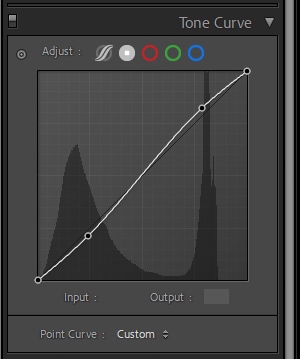
After doing so, you can switch to the color channels and make tweaks to balance the color. Since my image has a yellow tint, I can add more blue to the shadows. However, I want to keep some of the yellow tint in the highlights, so I’ll place a control point on the line at the top so the highlights aren’t affected.
Creating Tone Curve Presets In Lightroom
Likely the most popular feature in Adobe Lightroom is its ability to save settings as presets. But where most know presets to encompass the entire editing panel, the Tone Curve is unique in allowing its own type of preset to be saved. This preset applies exclusively to the Tone Curve and nothing else!
You can save Tone Curve presets when using the Point Curve option. When editing in the Point Curve, after adding the points and moving them up and down, the button beside where it reads ‘point curve’ will change to ‘custom.’
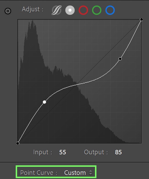
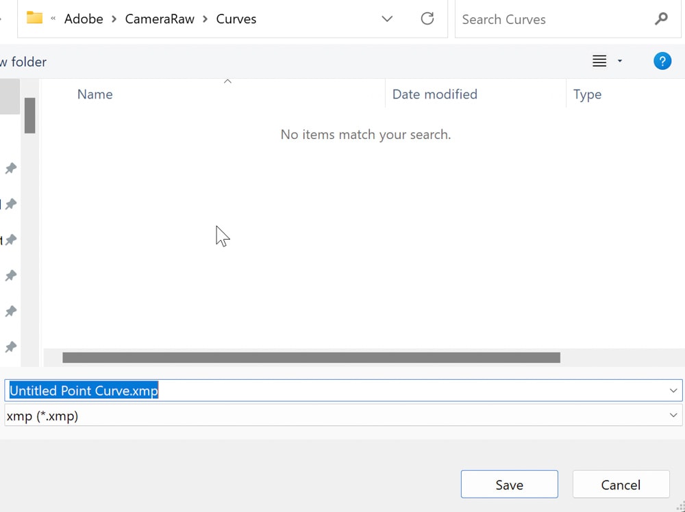
Click on Custom and then press Save, naming your preset to whatever you wish.
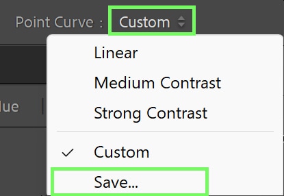
You can access this preset the next time you press the Point Curve dropdown menu.
The Tone Curve is a powerful tool to improve the exposure, contrast, and colors in your images in more creative ways than just the Basic Panel. It can seem a little confusing at first, but once you get the hang of it, it will be your new favorite tool in Lightroom!
