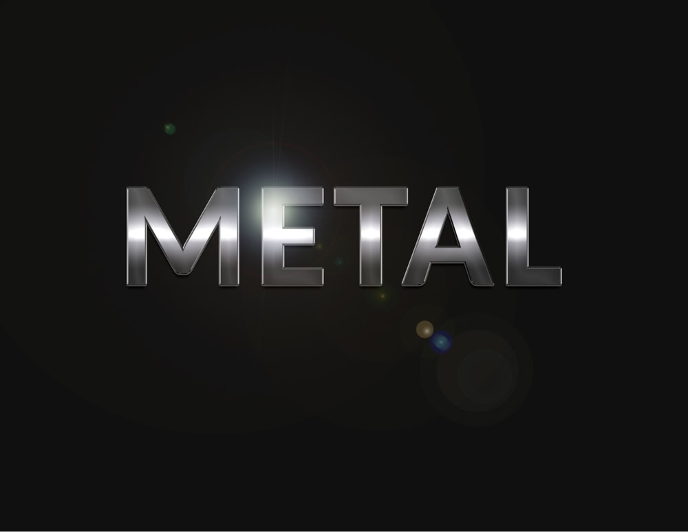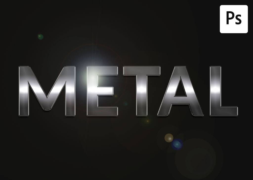

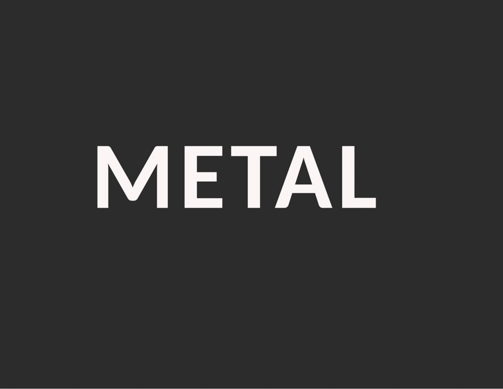
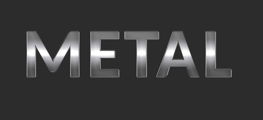
The metal text effect in Photoshop is pretty easy to create from scratch. The process comes down to applying multiple effects to text so it can resemble an actual piece of metal. Luckily, Photoshop has all you need to do this, so you won’t need to download any graphic resources.
Here is how to create a metal text effect in five steps.
How To Create Metal Text In Photoshop
Step 1: Add Text Using The Type Tool (T)
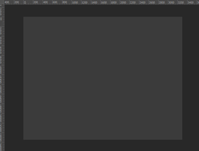
First, you need to add a text layer to the document. To make it easier to see the effects, you will apply them to the text and fill the background layer with a dark color. The color doesn’t have to be black, but try to avoid light colors.
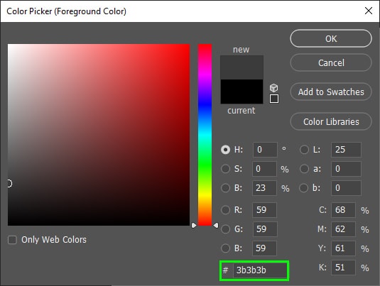
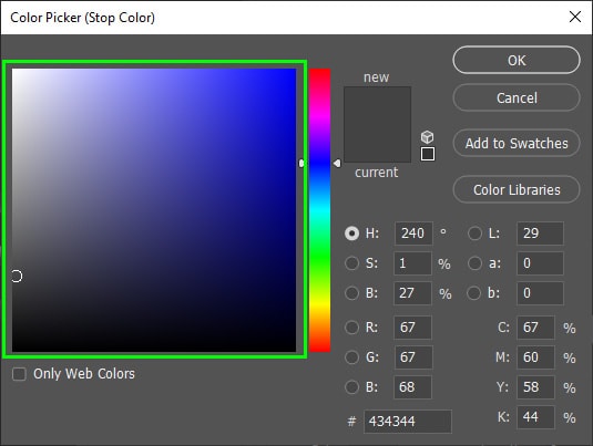
To fill your layer with a solid color, click the foreground/background swatch at the bottom of the Toolbar and choose any color you want from the Color Picker. In my case, I chose a dark gray (#3b3b3b).

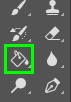
Next, select the Paint Bucket Tool (G) from the Toolbar.
Then, click on the canvas to fill the background layer with your chosen color.
It can also be a good idea to fill your background layer with a dark gradient or texture since these elements usually go well with metal texts.
After changing the color of your layer, grab the Type Tool (T) in the Toolbar.

Before creating the text, change the font color to white in the foreground swatch.
Finally, type your text on the canvas.
Step 2: Add A Gradient Overlay To Your Text
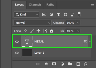
The key to the method to create the metal text you are about to learn is to apply effects to the text so it can look like actual metal material. Luckily, the Layer Styles Menu has all the effects you need to make it possible.
The Layer Styles Menu is located in the Layers panel and is represented by an ‘fx’ icon. You must access such a menu several times while creating your metal text.
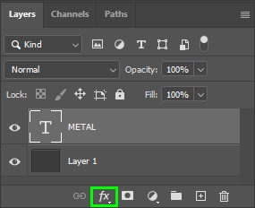
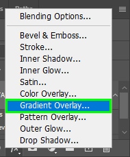
To access the gradient options, click the Layer Style icon, and choose Gradient Overlay.
The Gradient Overlay effect is the basis of the metal text effect. It makes the inner part of your text look like metal.
Once you select the Gradient Overlay option, the Layer Styles dialog pops up. The options appear in the middle of the panel with its settings set to default.
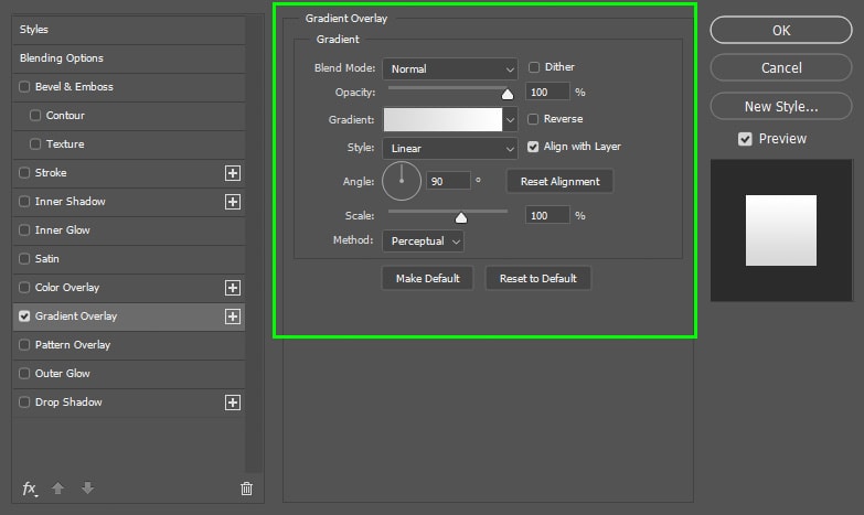
Here are the settings you need to adjust.
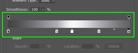
First, double-click the gradient bar to open the Gradient Editor. Then, locate the gradient bar in the panel.
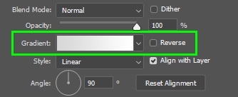
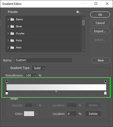
You must fill the gradient bar with colors resembling a real metal object. Thus, choose a color for the metal and some other colors for shadows and highlights.
I’ll tell you which colors to use but feel free to create your own color combinations, as long as you follow the formula mentioned above.
To change a gradient color, click the color stop corresponding to the color you want to change.
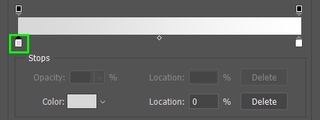
Then, click the Color swatch under the gradient bar.
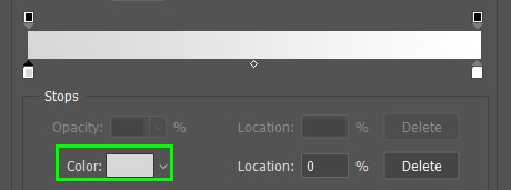
Next, pick a color from the Color Picker that pops up.
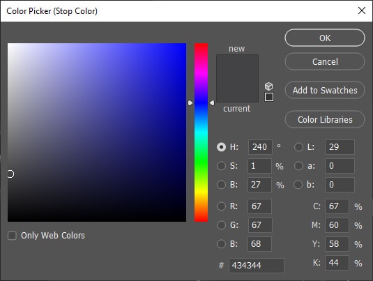
You can click on the color display to select a color.
Or you can type in a hexadecimal code in the code box.
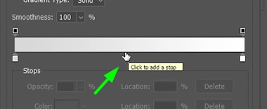
If you want to add a new color stop to the gradient bar, click the part of the gradient bar you wish to add the color stop.
When the new color stop appears, change its color as you learned above. You can control the location of the color stop in the Location box. You can enter values from 0% to 100% for the color location.
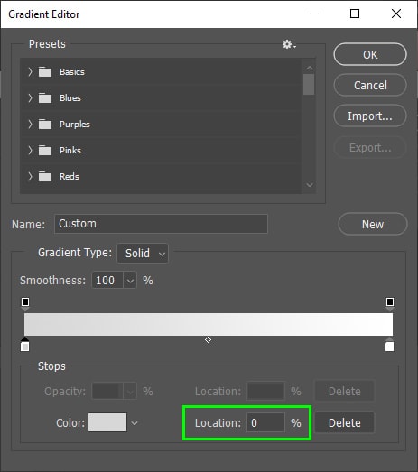
0% corresponds to the color on the gradient bar’s bottom left edge. 100% corresponds to the color on the right edge of the same bar.
Here are the required hexadecimal colors to create a metal gradient and corresponding positions.
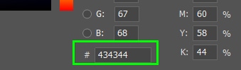
- Color 1: #434344, Location: 0%
- Color 2: #adacb2, Location: 40%
- Color 3: #f7f7f7, Location: 53%
- Color 4: #adacb2, Location: 75%
- Color 5: #626263, Location: 100%
After changing the gradient colors, your gradient bar should look like this.
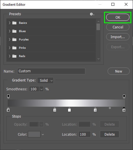
Click OK when you’re finished choosing your gradient colors.
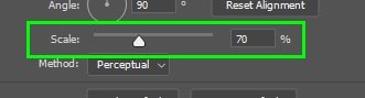
Back in the Gradient Overlay Menu, change the gradient Scale to 70%, making the transition between the gradient colors look smoother.
You don’t need to alter the other Gradient Overlay settings, so keep all of them as default.

Step 3: Add A Bevel And Emboss Effect To The Text
The Bevel And Emboss effect makes your text appear to have a bevel, which is common in metal objects since they get a bevel when cut.
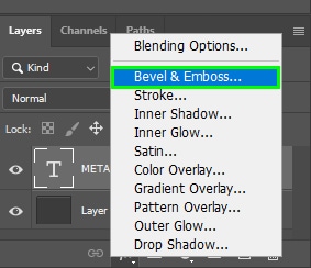
To access Bevel And Emboss, click the ‘fx’ icon and choose Bevel & Emboss.
This opens the Bevel & Emboss options.
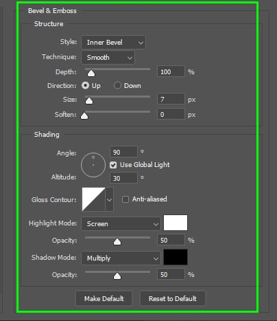
Here are the settings you need to change.
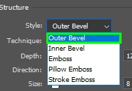
Set Style to Outer Bevel.
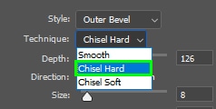
Set Technique to Chisel Hard for a more evident effect.
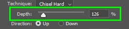
Set Depth to 126%.
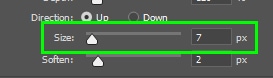
Set Size to 7.
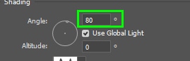
Set Angle to 80 degrees.
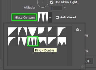
Select Ring – Double from the Glass Contour drop-down menu.
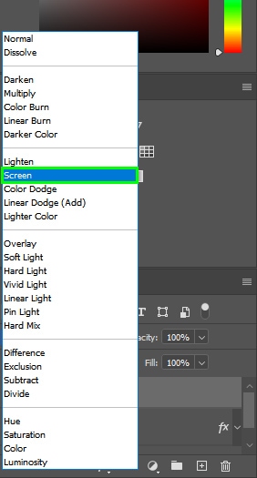
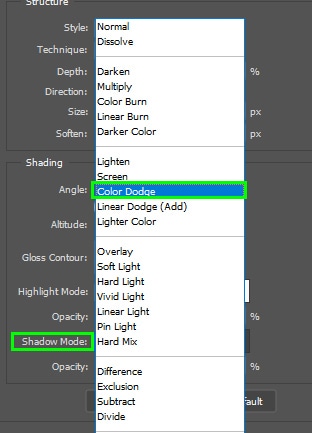
Set the Highlight Mode to Color Dodge. You can also play around with the other blend modes from the lighten group, such as Lighten or Screen.
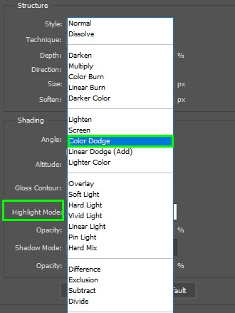
Set Shadow Mode to Color Dodge as well.
Leave the other settings as they are.
Step 4: Add A Satin Effect To The Text
Adding a subtle Satin effect to your text can make it appear as if it reflects light in multiple locations. Satin is included in the Layer Style Menu.
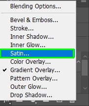
Once you select Satin, its options appear within the Layer Styles dialog.
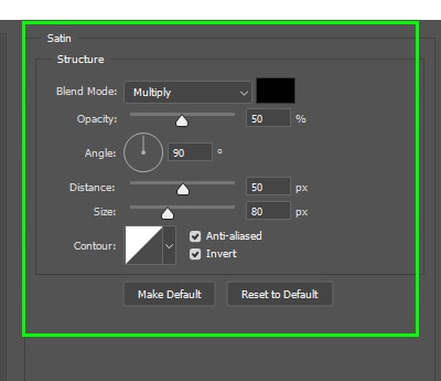
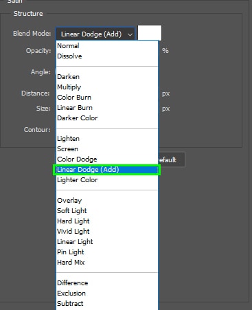
Here, you must set Blend Mode to Linear Dodge.
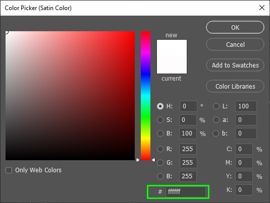
Change the Blend Mode color to white. To do this, click the color swatch next to the Blend Mode option and enter #ffffff in the Color Picker panel.
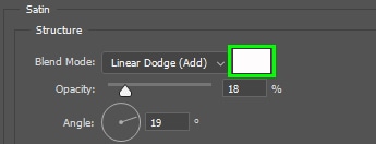
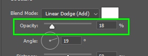
Set Opacity to 18%.
Set Angle to 19 degrees.
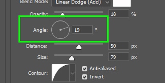
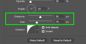
Set Distance to 50% and Size to 79%.
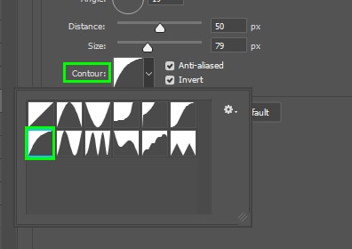
Choose Half Round from the Contour drop-down menu.
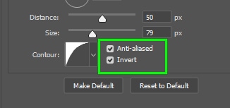
Mark the Anti-aliases and Invert checkboxes.
Step 5: Add A Drop Shadow To Your Text
The Drop Shadow effect makes your text look detached from the background. That gives the impression that the text is placed on a natural surface.
You can find the Drop Shadow effect within the Layer Styles Menu.
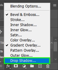
Selecting the effect will open the Drop Shadow options.
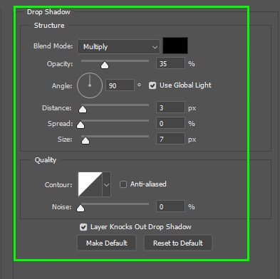
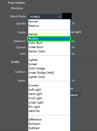
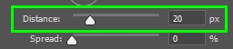
Change the following Drop Shadow settings. Set Blend Mode to Multiply.
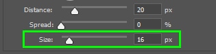
Set Distance to 20 px and Size to 16 px.
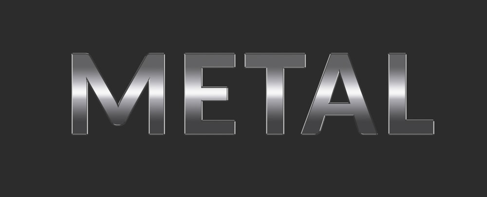
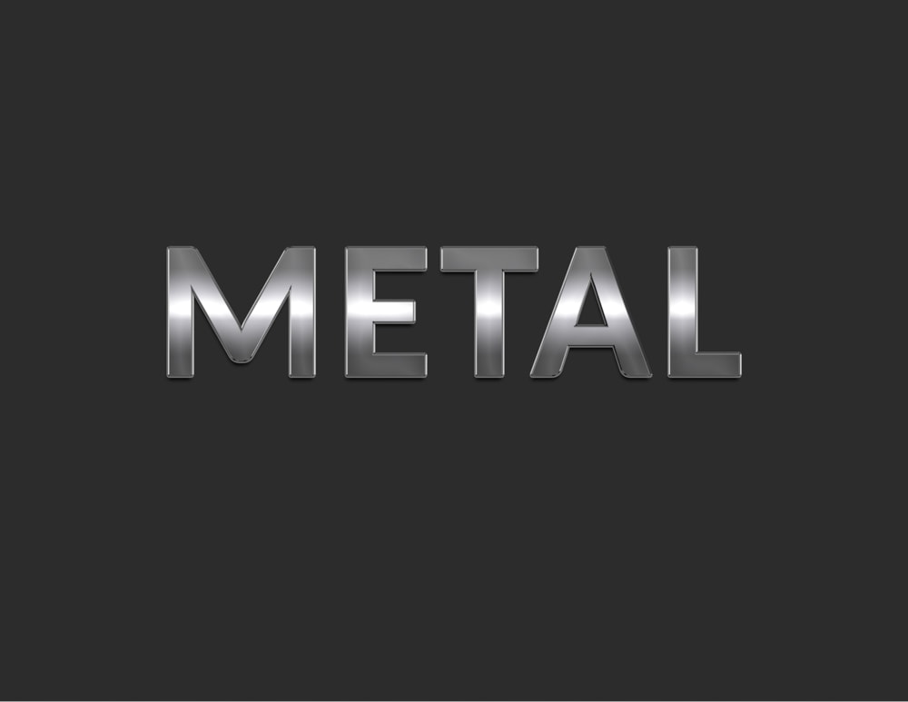
You don’t need to change the other settings. Click OK in the Layer Styles dialog box when you are finished making the edits. Your text now has a metallic effect.
After creating your metallic text, you can finalize the effect in various creative ways. For example, you can apply a texture to it if the metal you want to mimic has texture. You can also add a lens flare to the text to give it a glow effect since metals shine when hit by light.
How To Add Texture To Your Metallic Text
Adding texture to your metallic text can make the metal effect look more realistic. You can find the free pavement texture I used for my example from Pexels.
After creating your metallic text, keep its layer active.
Then, go to File > Place Embedded.
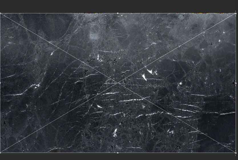
Next, locate the texture file on your computer and bring it to Photoshop. The texture will cover your text.
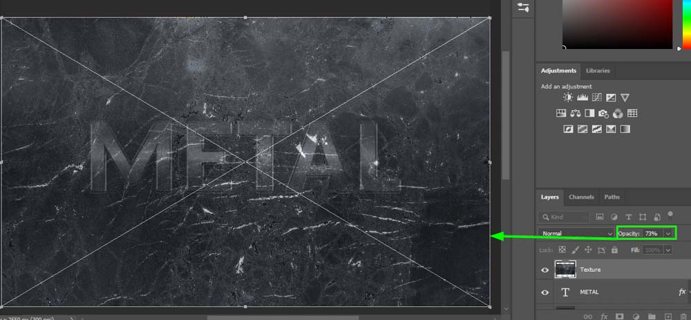
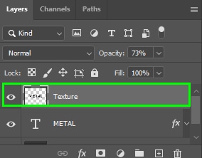
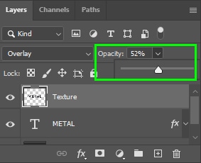
Now, go to the Layers panel and reduce the texture layer’s Opacity until you can see the text. Something around 70% is enough.
Once you can see the text, rescale the texture layer until it fits the text well. To do this, pull one of the handles around the texture layer outward to expand it.
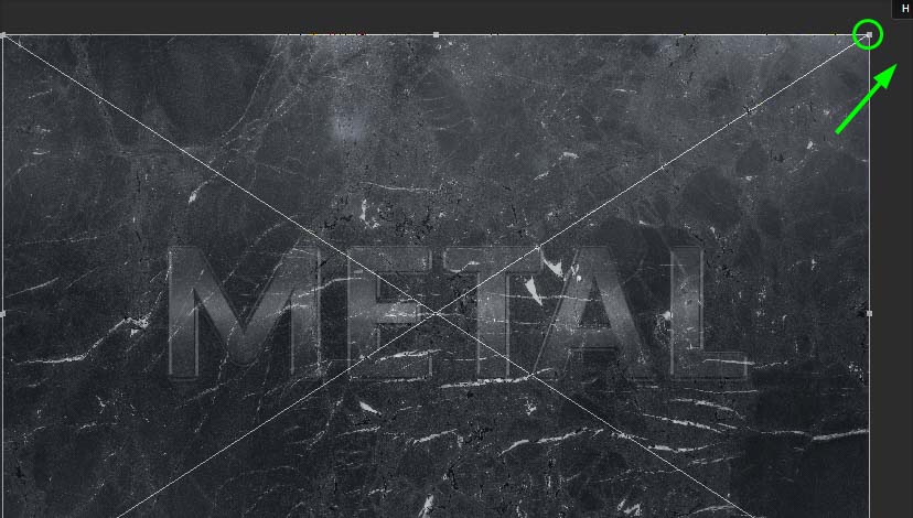
Or inward to shrink it.
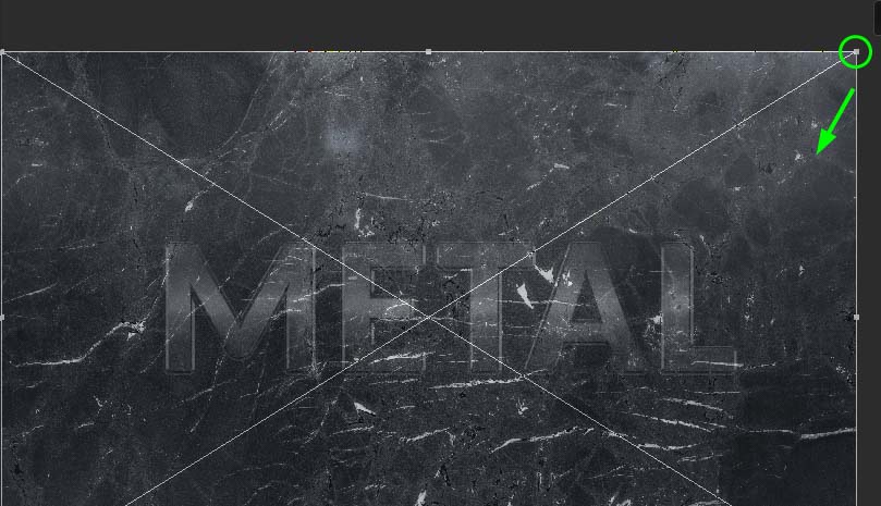
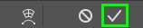
When you are happy with the proportions, press Enter on your keyboard or click the checkmark in the Options bar to confirm the actions.
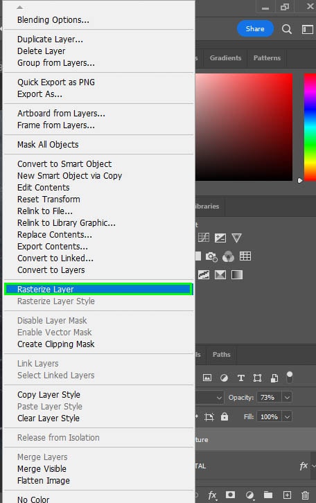
Next, right-click the texture layer and choose Rasterize Layer to make it editable.
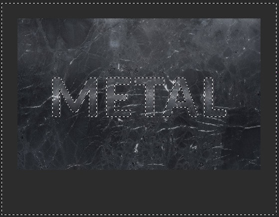
Then, hold Control (Win) or Command (Mac) and click the text layer. This creates a selection around the text.
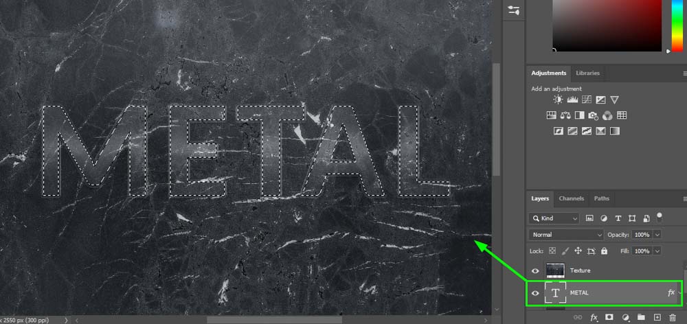
Now, press Control + Shift + I (Win) or Command + Shift + I (Mac) to invert the selection.
After that, keep the texture layer selected. Then position your cursor on the external area of the text. Your cursor will turn into a scissor icon.
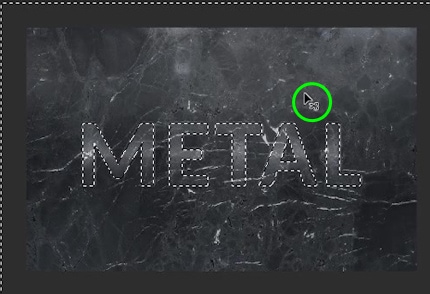
When that happens, click Delete on your keyboard. The texture now only appears inside the text.
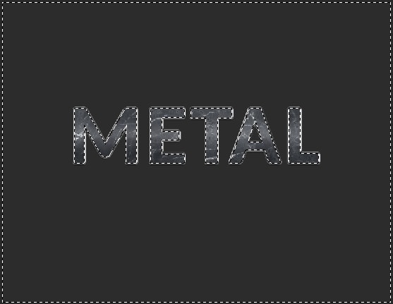
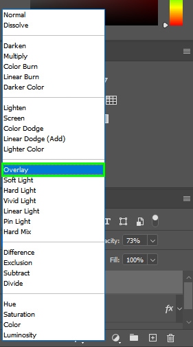
Now, press Control + D (Win) or Command + D (Mac) to deselect the text. After that, keep the texture layer selected and change the Blend Mode to Overlay.
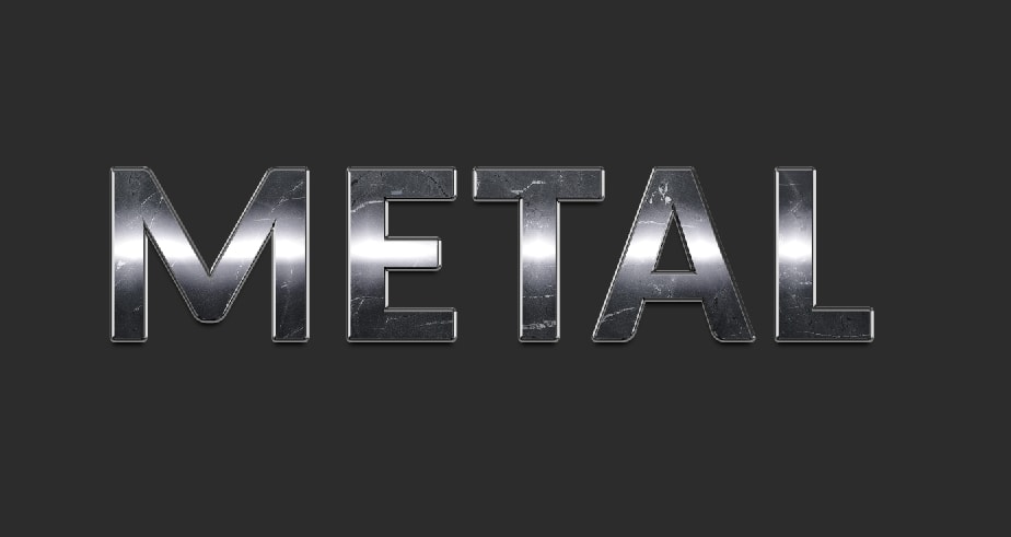
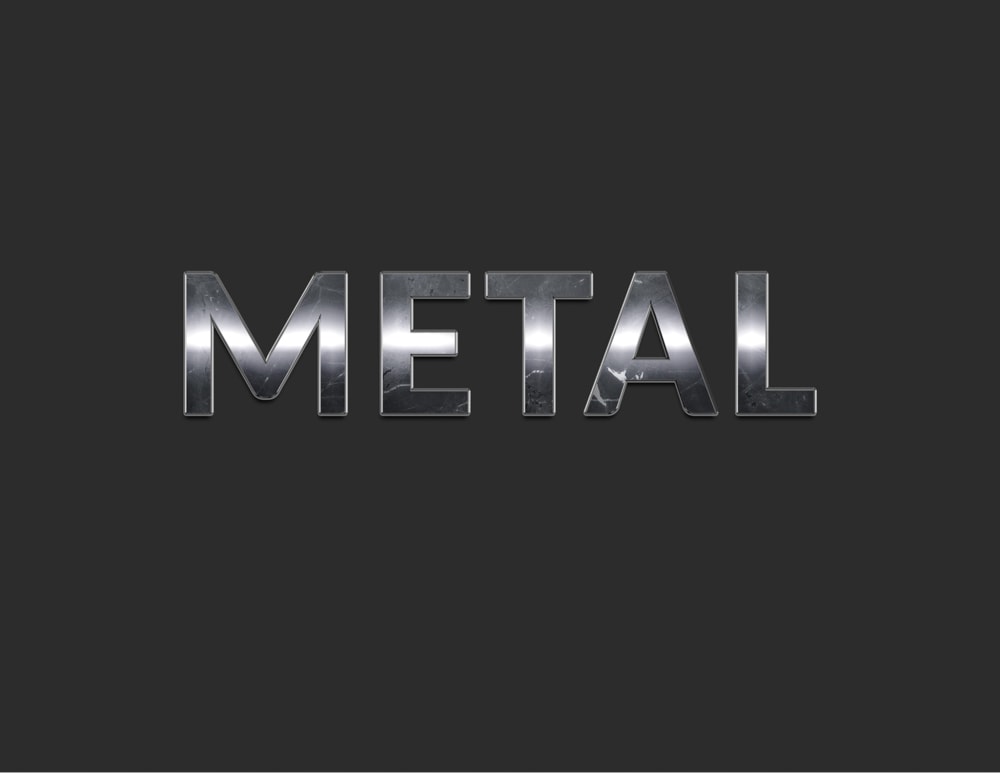
The texture and the text blend smoothly.
If you think the effect is too harsh, reduce the texture’s Opacity by adjusting the Opacity slider in the Layers panel.
How To Add A Lens Flare Effect To Your Metallic Text
Adding a lens flare effect to your metallic text makes it look like it’s hit directly by a light source, giving it a nice appearance.
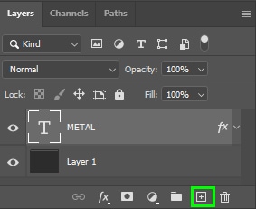
After creating your metallic text, go to the Layers panel and create a new layer by clicking the plus sign icon at the bottom of the panel.
Then, select the Paint Bucket Tool (G) in the Toolbar.
Next, ensure the foreground color is set to black in the Toolbar.
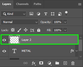
Now, click on the canvas to fill the new layer with black.
After that, go to Filter > Render > Lens Flare.
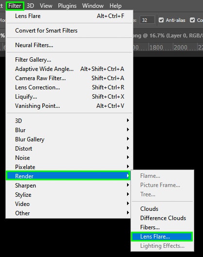
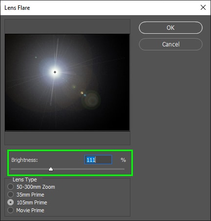
Choose the lens flare effect you like the most in Lens Type from the Lens Flare dialog. In my case, that was the 105mm Prime option.
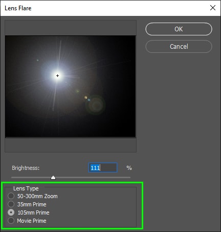
You can control the brightness of the effect by moving the Brightness slider to the left or the right.
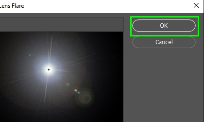
Click OK when you’re finished.
The lens flare appears on the black layer.
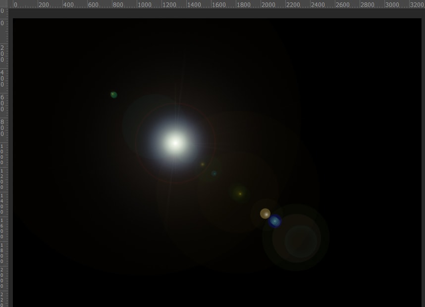
To make the text visible again and blend the lens flare with it, go to the Layers panel and change the Blend Mode to Screen.