

The Color Grading Tool in Lightroom is one of the most effective ways of adding stylized colors to your images. But, that is if you know how to use it properly! When I first started using this tool, I honestly felt confused by exactly what adjustments it was making to my photos. Sure it was adding some colors, but how could I use this tool to give my photos a more epic color graded look?
If you feel the same way as I once did, this tutorial will make everything about Color Grading in Lightroom a lot more clear. Let’s first talk about what color grading actually can do to your photos.
What Does The Color Grading Tool Do In Lightroom?
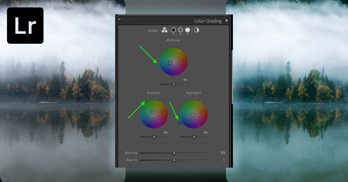
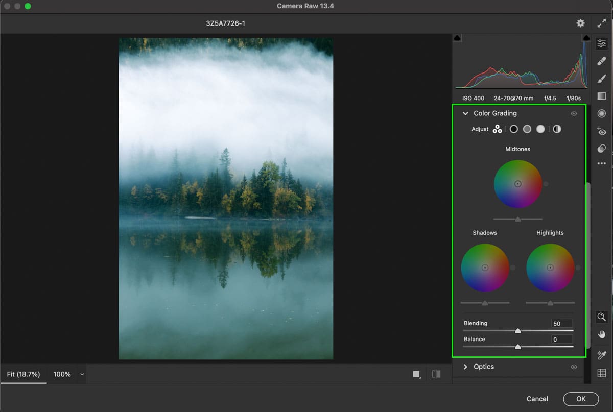
The Color Grading Tool in Lightroom allows you to add specific color hues to the Shadow, Mid-Tone, or Highlight exposure ranges using any of the three color wheels. Choosing a hue within the color wheels will apply that color to the respective exposure range.
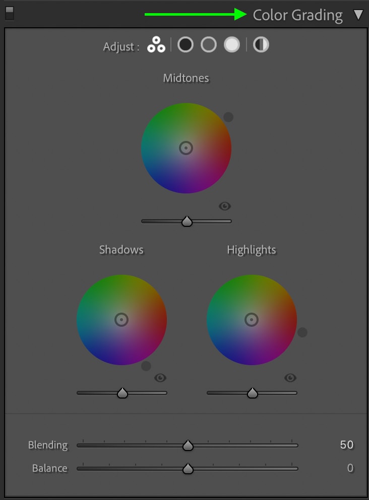
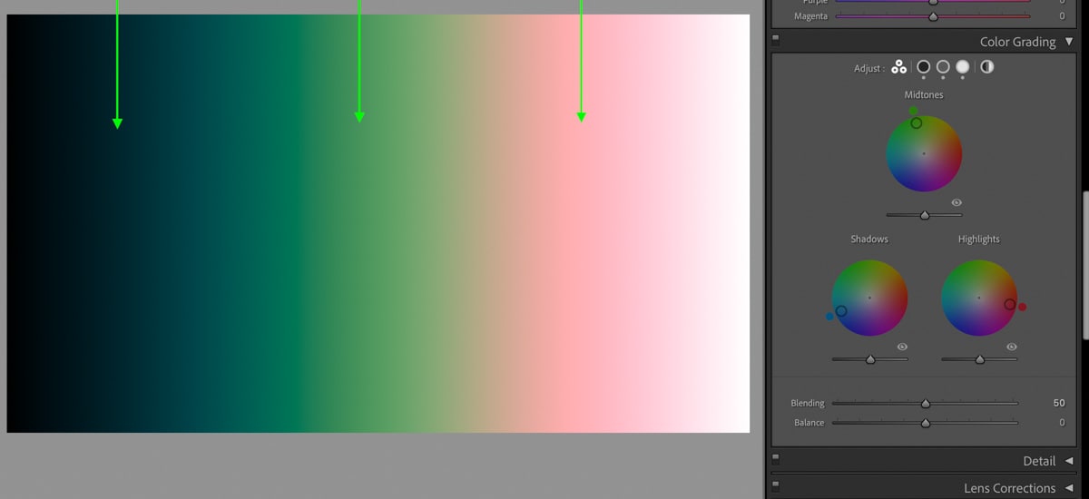
This tool is found within the Develop Module of Lightroom under the Color Grading Panel. Inside you can choose between a variety of color wheel views, but I’ll touch more on that later. For now, let’s focus on how this tool actually edits your images. The best way to understand this is by using a black and white gradient.
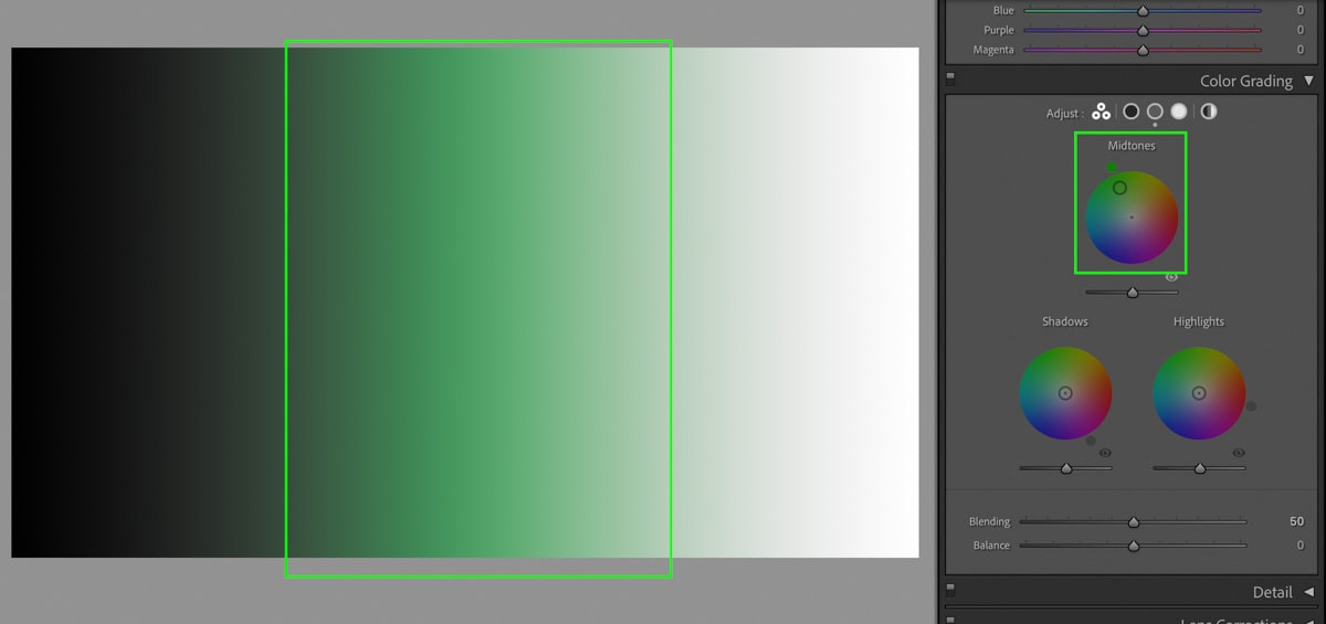
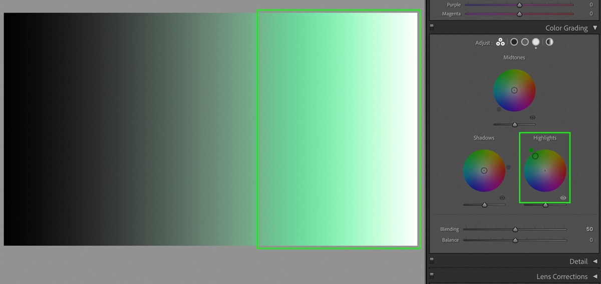
In this gradient, I have every exposure range possible in a photo. Everything from the shadows (100% black) to the highlights (100% white) and all the shades of grey (mid-tones) in between. When I add a color to a specific color wheel, like the mid-tones, I will apply that color to only the mid-tones exposure range. In the gradient, you can see how I edited the middle grey colors while the highlights and shadows were left untouched.
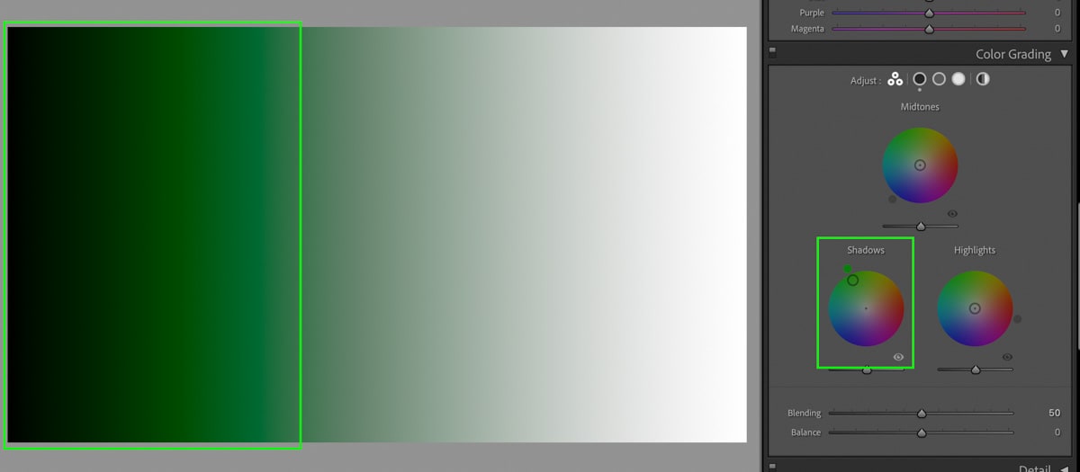
When I reset the mid-tones and only edit the shadows color wheel, the color is only added to the shadow (darkest) exposure ranges.
The same thing happens when I apply a color to the highlight color wheel.
So with this basic premise in mind, you now know that each color wheel only targets a specific exposure range in your photos. By adding colors to each of these color wheels, you will have a variety of new color hues throughout the entire image.
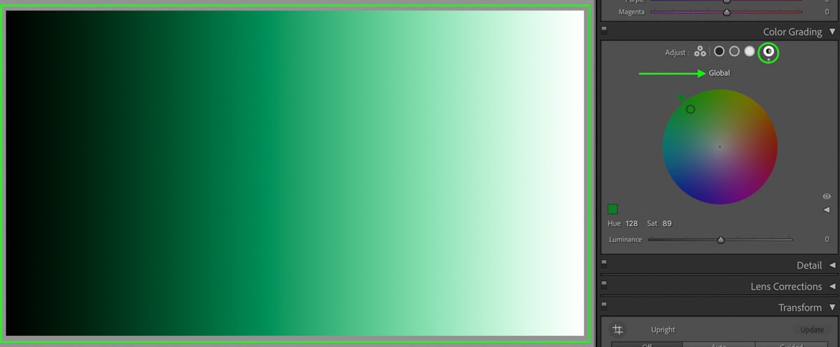
Then if you want to add a single color to all of your exposure ranges, you can select the Global color wheel to apply a certain hue.
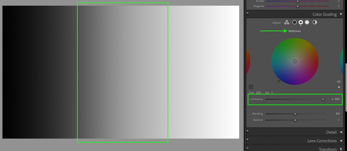
The Luminance Sliders
Beneath each of the color grading wheels are sliders that control the luminance of your exposure range. Luminance is essentially a brightness setting and can help to make your images pop. For example, if I increase the mid-tone luminance slider, the mid-tone exposure will get brighter in my photo.
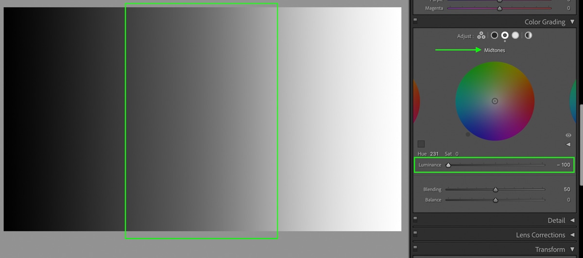
A practical example of this would be to reduce the luminance of your shadow’s color wheel to add a deeper contrast to your image.
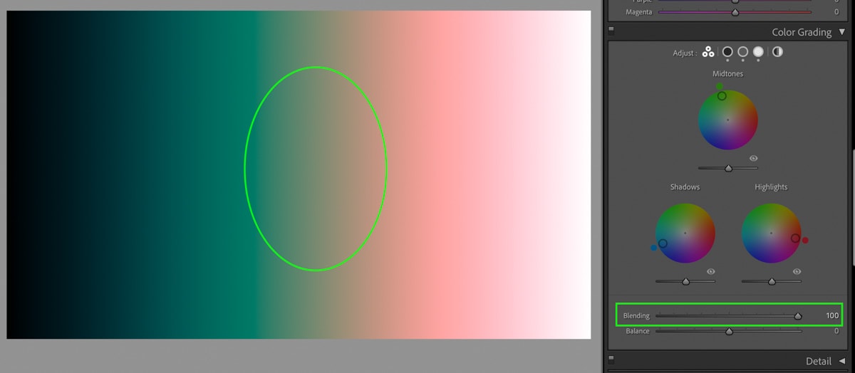
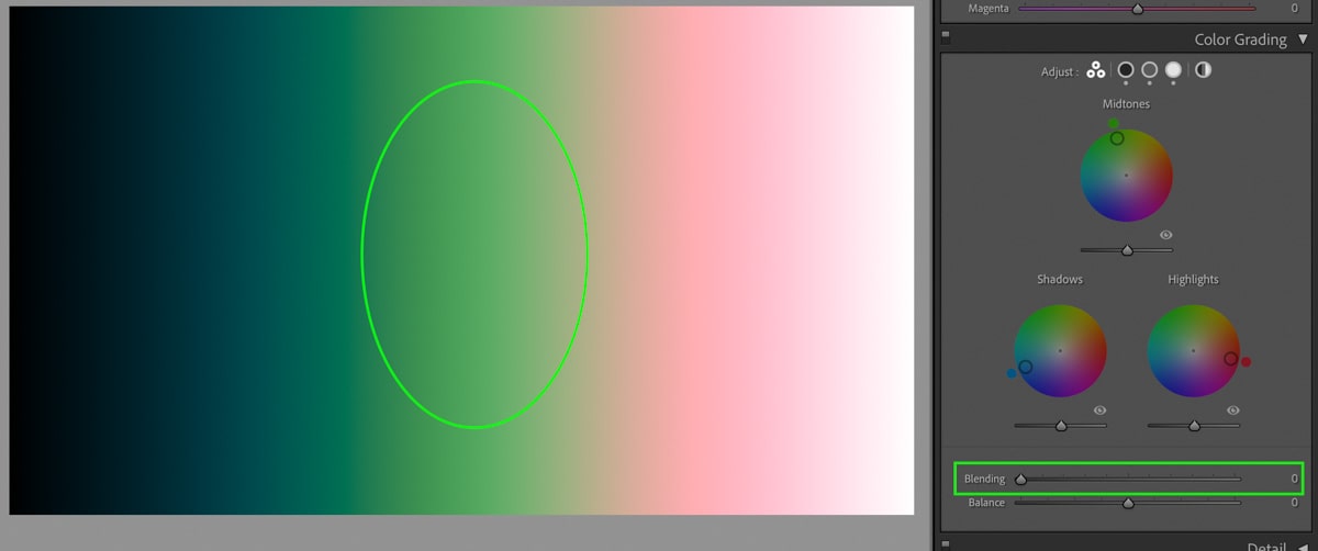
Balance Vs Blending In Lightroom
In the Lightroom Color Grading Tool, the Balance slider controls the dominance of the highlights compared to the shadows. By decreasing the balance, the highlight hue becomes more dominant. The Blending slider then controls how blended the mid-tone hue appears between the highlights and shadows.
To give you a more practical example of this, I have added three very different colors to the shadow, mid-tone, and highlight color wheels. In the gradient, you can see how each of those colors currently blends softly.
By adjusting the blending slider, notice how the mid-tone color hue disappears when the blending is increased. There is a higher blending setting, therefore giving more significance to the highlight and shadows hues.
Then decreasing the blending adjustment, the mid-tone hue becomes more dominant, while the transition between each color is more abrupt. In short, the blending adjustment controls how your mid-tone hue transitions into the shadows and highlights.
Now the Balance slider controls the dominance of the highlight or shadows color hue. By moving this slider to the right, the highlight color hue will start to take over the mid-tones and part of the shadows.
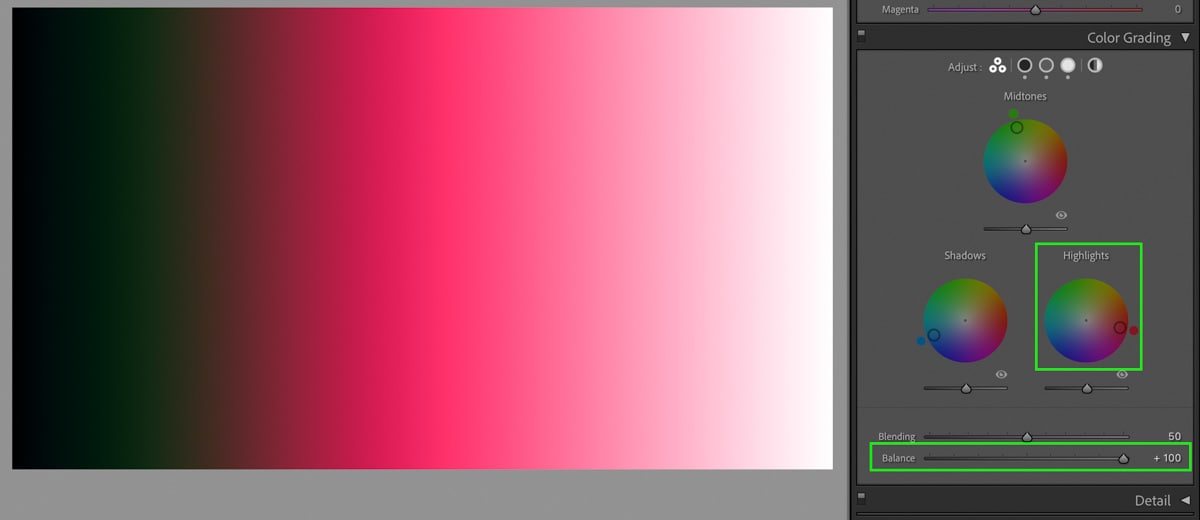
Then moving the Balance slider to the left will do the opposite, giving more importance to the shadow’s color hue.
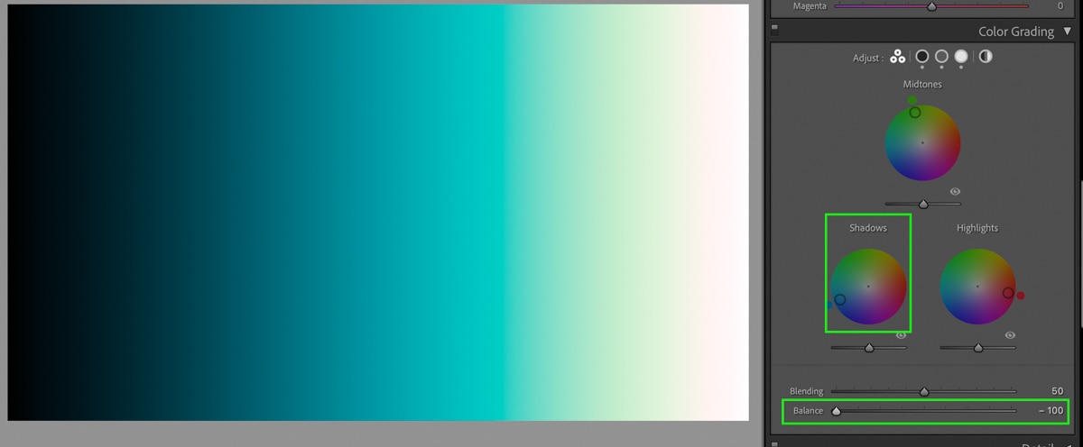
The Balance slider offers you an easy way to make certain color tones appear more dominant in your edits, depending on the style you want.
Is Split Toning The Same As Color Grading?
The color grading tool has come in as a replacement to the old split toning tool in Lightroom. Luckily the color grading tool far exceeds the capabilities of split toning.
With the split toning tool, you would only have two sliders to edit the highlights or shadows. With color grading, you can also add a third color to edit the mid-tones as well.
Another difference is that split toning only had a balance slider to control the dominance of the highlight or shadow color hue. In the color grading tool, you have balance and blending for even more control of the colors in your photo.
So although both color grading and split toning have similarities, it’s easy to see that the color grading tool offers a lot more value. It might take some getting used to if you are more familiar with split toning, but you’ll soon realize how much more control you have with color grading.
How To Use The Color Grading Tool In Lightroom
To use the Color Grading Tool in Lightroom, click one of the color wheels to add a hue to the respective color range. The closer the color picker is to the outside of the color wheel, the more saturated the color will look. To finish the adjustment, use the balance and blending sliders.
Now let’s break that down more in-depth.
First, you will need to access the Develop Module and scroll down to the Color Grading Panel.

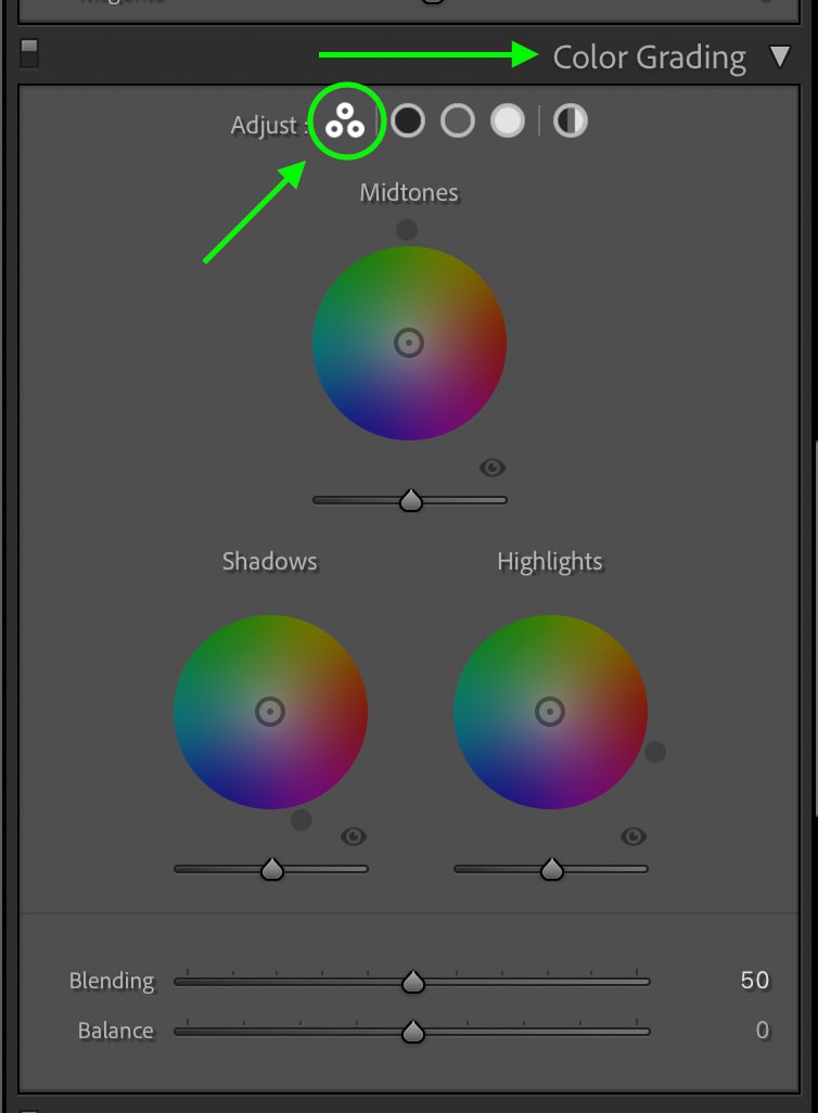
In this panel, there are a few different view options depending on your preference. For example, you can display all three colors together by clicking the three circles icon or view each color wheel independently by clicking on the different exposure range options.
I tend to use the three-way color view since it involves less clicking.
With a view selected, click anywhere on your color wheels to begin adding colors. A lot of this comes down to experimenting with the hues to see what effects come about. A good rule of thumb is to work with complementary colors between the highlights and shadows, for example, orange and teal.
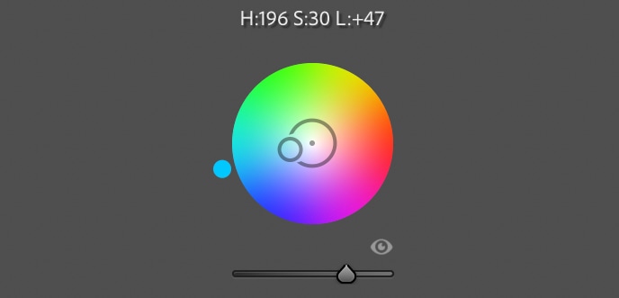
The outlined circle color picker represents the color you choose for each color wheel. The closer this color picker is to the edge of the color wheel, the more saturated it will appear. Therefore, if you want a more subtle color grading adjustment, make sure to keep this color picker close to the center.
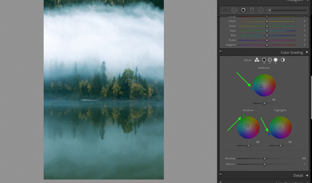
After all of the color hues are chosen, consider adjusting the luminance sliders found beneath each color wheel. If you wanted a specific part of your image to pop, adjusting these sliders can help a lot! For my image, I will boost the mid-tone luminance and reduce the shadows. This will add some nice contrast to the photo.
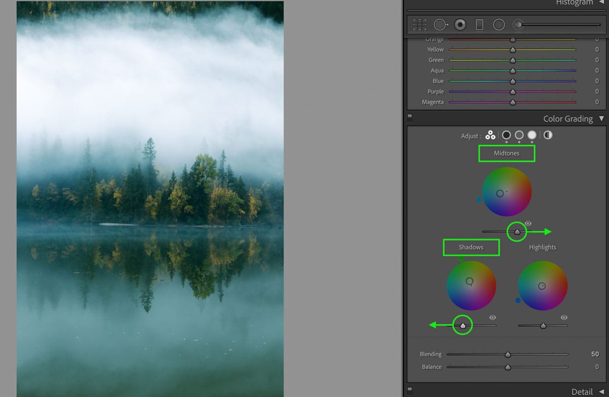
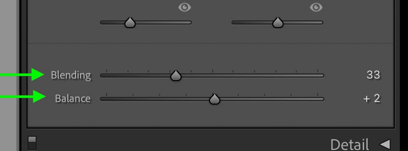
The final step is the edit the balance and blending sliders. This step isn’t always needed, but it’s helpful to at least give it a try to see what happens. Remember, the balance slider controls the dominance of the highlight or shadow hues, while the blending controls how visible the mid-tone color hue appears!
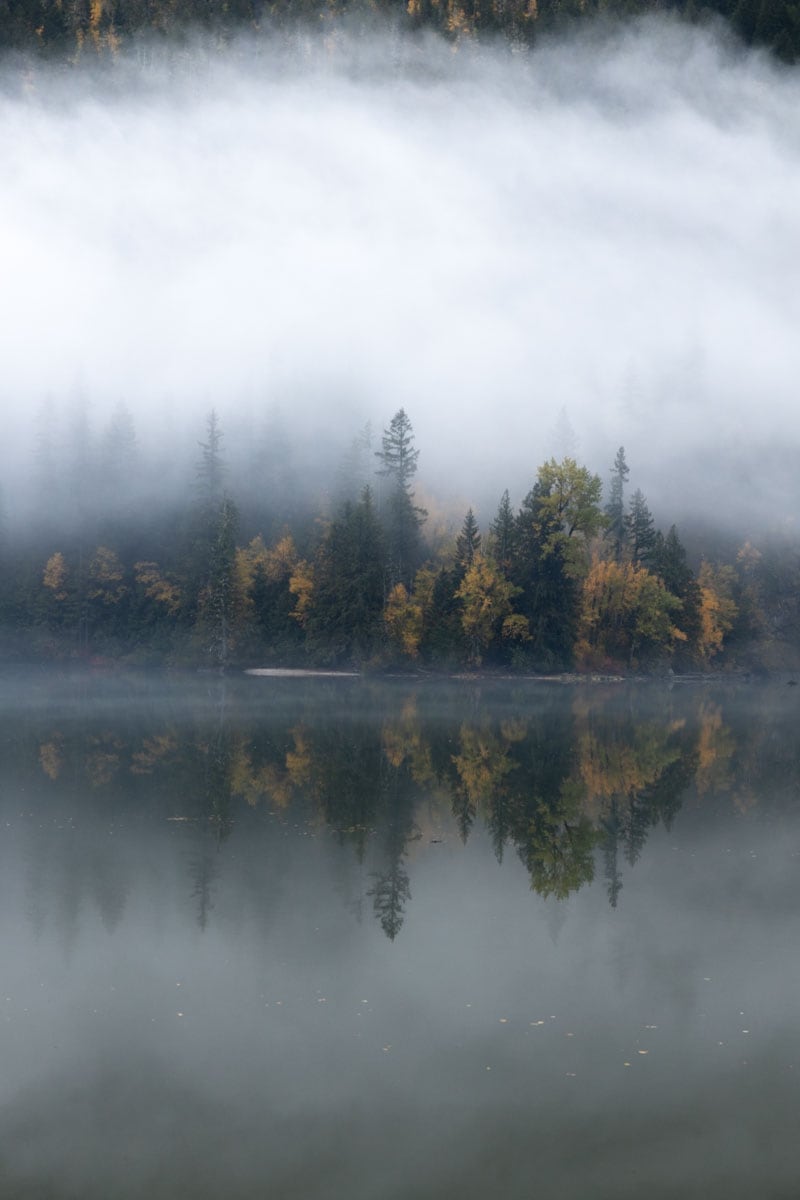
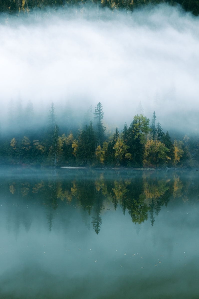
Now looking at my before and after, this quick color grading adjustment helps to add a bit more life and style to my photo!
Helpful Tips For Using The Color Grading Tool
To make using the color grading tool even easier, there are three cheeky tricks you should know about.
The first one is holding the Shift key while choosing a color in the color wheel. This creates a fixed line on your color wheel for the color picker to follow. So if you have a certain hue that you love but just want to edit the saturation, this keyboard shortcut allows you to do that!
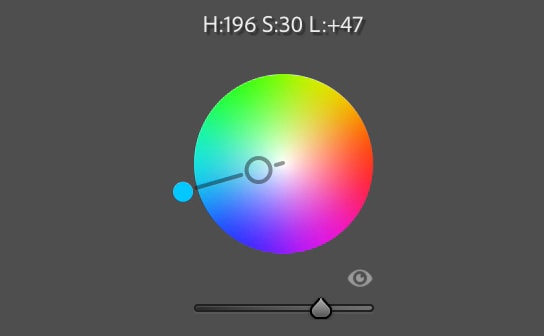
The second tip is holding the Alt (PC) or Option (Mac) key and clicking on your color picker. This time a ring will appear around the color wheel for the color picker to follow. This lets you keep the same saturation value while freely editing the hue.
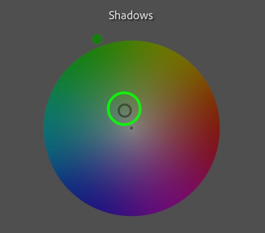
The final tip comes down to resetting any of the color wheels and sliders. By double-clicking on a color wheel or a slider, it will be reset to its default state. This way, you can experiment with these adjustments freely without the worry of messing something up!
Using The Color Grading Tool In Photoshop
If you’re like me, you probably use Lightroom and Photoshop together in your editing workflow. In that case, it’s worth noting that the color grading tool is also available in Photoshop!
This adjustment is found within Camera Raw, which you can access by selecting your image layer and going to Filter > Camera Raw Filter.
Alternatively, if you open a RAW image directly into the program, Camera Raw will automatically appear.
Within the adjustment bar, look for the Color Grading panel. Here you will notice all the same options as the color grading tool in Lightroom has. In fact, it operates the exact same way. So with the skills you learned throughout this post, you can easily take advantage of this tool in Photoshop as well!
Learning how to use the color grading tool in Lightroom is an important step for any photographer. This tool helps to add stylized looks and also improves the colors in your image. Since you can go wild with new hues or enhance the natural hues already in your photo, the options with this tool are endless. Now, if you want an excuse to start using this tool, check out this next tutorial on how to edit brown tones in Lightroom, which relies heavily on the color grading adjustment!
Happy editing!
Brendan 🙂
