


You know the importance of capturing stunning shots as a photographer, but editing your photos can be equally crucial. To help you get more creative in the photo editing phase of the process, I’ve compiled a list of the top ten ways to edit your photos better in Lightroom!
With Adobe Lightroom’s vast array of editing tools, post-processing on photographs has become more advanced than ever. While these tools certainly open the door to many editing possibilities, they can also make editing much more complex.
10 Ways To Edit Better Photos In Lightroom
Although playing around with the Basic sliders is a great way to start, maximizing on Lightroom’s other tools is the real key to success. From using AI technology to mask your subject to various visual tools to help navigate the editing landscape, taking advantage of Lightroom’s other features can improve your workflow significantly.
1. Use The White Balance Selector
When it concerns photo editing mishaps, white balance tends to be the biggest culprit. An improper white balance can cause a trickle effect of insufficient or incorrect coloring, making photo editing a bigger hassle than needed. Using Lightroom’s White Balance Selector can help resolve this.
The White Balance Selector takes the guesswork out of choosing a white balance – simply use the tool to select the “white” you want the entire image’s whites based on. Lightroom will then correct the image to remove color casts based on the selected area.
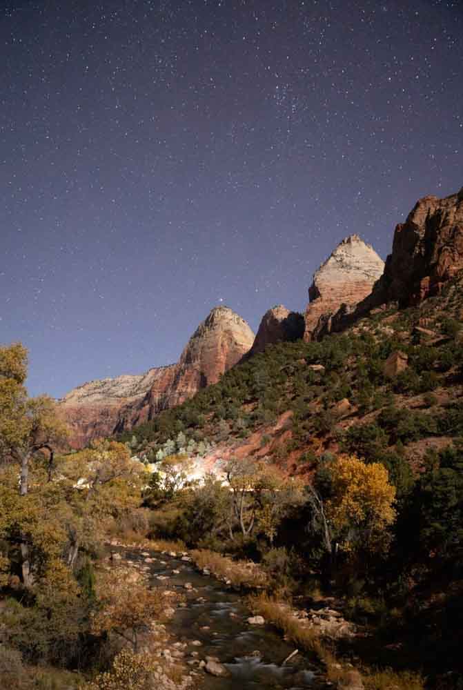
This nighttime photo is a great example of using the White Balance Selector to correct unnatural colors. As you can see, the original image contains warm tones, the sky is purple, and the mountains are too red – which isn’t something you’d ideally want to see in a nightscape shot:
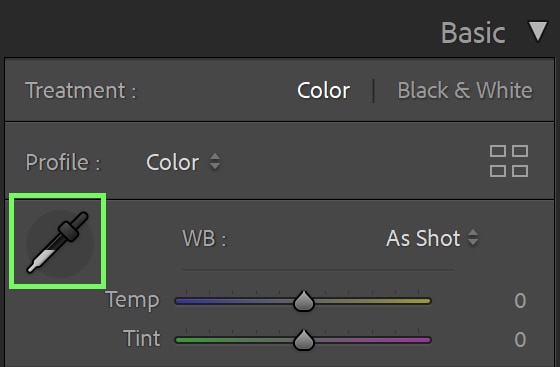
The White Balance Selector can be found in the Basic tab of the Develop window. It’s the eyedropper icon.
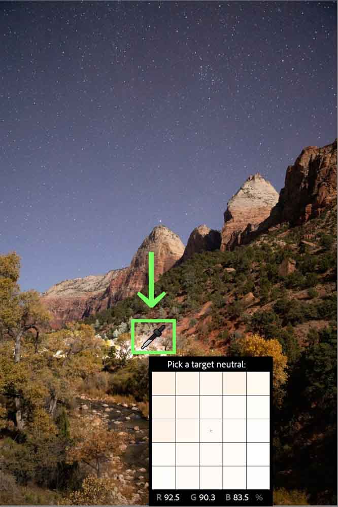
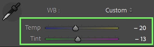
Click the icon and then click on the whitest part of your image. In my case, the whites are located in the lights in the middle of the composition.
Once I clicked on the whitest part of the image, my photo changed to this:
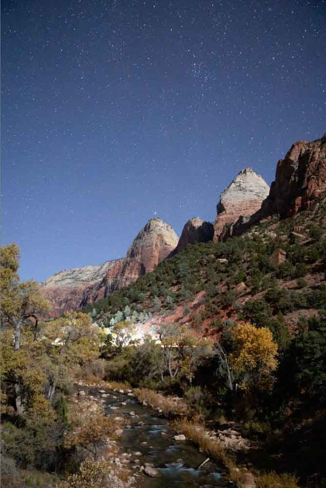
A much better white balance. The yellow color cast has been removed. Of course, this tool doesn’t work perfectly all of the time – just go ahead and play with the Temp slider and Tint slider in the Basic panel to adjust to a white balance of your liking. You can also try sampling a few different areas of your photo until you are happy with the result.
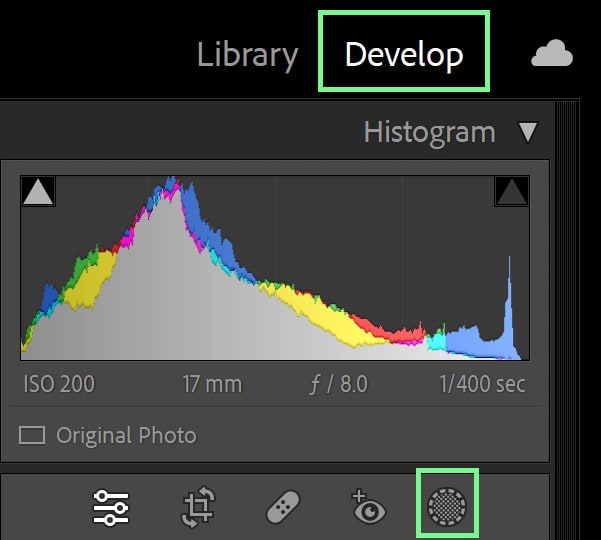
2. Enable Clipping Warnings Within The Histogram
Clipping is when information or detail is lost on the extreme end of the shadow spectrum and/or the highlight spectrum.
Clipping doesn’t always happen exclusively when you take a photo – you can also cause clipping by editing too much. Unless you’re attempting something very stylized, images tend to look best when you can see detail in the entire range of tones, from the darkest to the lightest.
Enabling clipping warnings in the histogram helps you see where parts of your image are clipped in the original picture. It also helps you keep an eye on your editing to ensure clipping doesn’t occur during the adjustment process. Although there are certain images in which clipping is unavoidable (such as clipped highlights during a sunset). Ideally, you want as little clipped parts in the photo as possible.
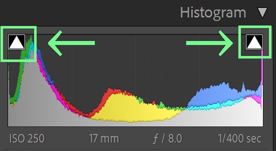
You can enable clipping warnings by pressing the two boxes in either corner of your histogram. The left-hand box is your shadows, while the right-hand box is your highlights. If you hover over either of these boxes, you’ll see where the clipping occurs.
Press on either (or both) of the boxes, and the clipping warning will remain active in your photo. You can tell the clipping warning is active because the box has a small white outline.
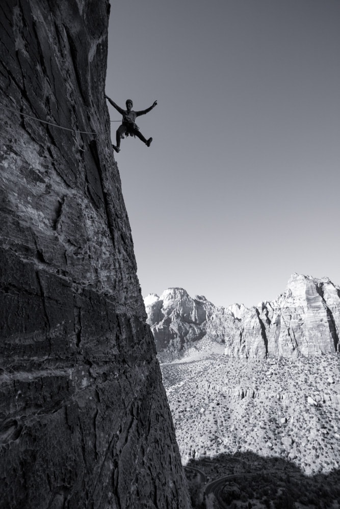
Clipped shadows are represented with the color blue, while clipped highlights are represented with red. Parts of the sky are overexposed in the highlights, and parts of the climbing rock are underexposed in the shadows.
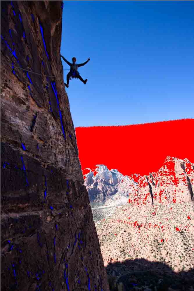
Use the clipping warnings to make informed decisions about your shadows, highlights, blacks, and whites. The warnings help moderate your adjustments. Based on where the clipping warnings are visible, you can use the exposure sliders in the Basic Panel to refine the overall exposure.
To turn clipping warnings off, just click on either square once more. You can tell the clipping warning is inactive because the box no longer has a small white outline.
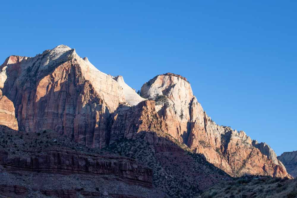
3. Use The Blacks Slider To Ensure Images Don’t Look Washed Out
If you have found yourself shooting during a difficult time of day, it can be easy to unintentionally wash out your image by only boosting your Shadows slider in the Basic tab. Images look washed out when their tones lack contrast with one another.
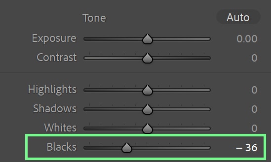
However, if you pull your shadow slider up and then pull your Blacks slider down a bit, you can add more contrast and tonality to your shadows (without darkening them too much). This helps rectify the issue of flat images after pulling the shadows up.
For example, see this image I shot at a relatively high sun time of day. The shadows were pulled up, which flattened the picture (because otherwise, the shadows were too dark):
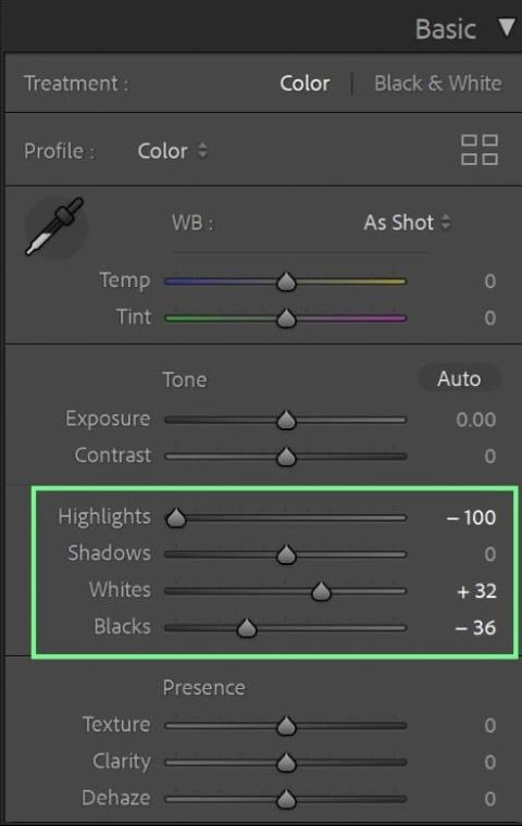
Now, I’ve added more depth to the shadows without losing their lightness or detail by just slightly pulling the Blacks slider down.
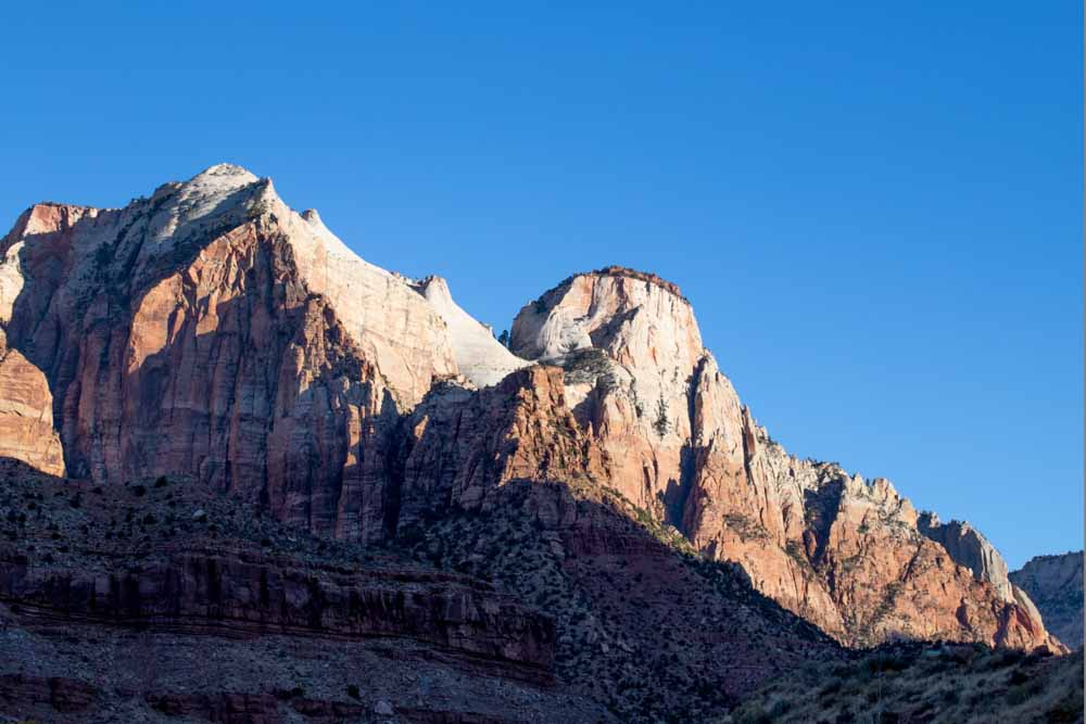
If you find that lowering your blacks slider impacts the other aspects of your image, such as the highlights, you can balance everything by lifting the Whites slider and adjusting the rest of the sliders in the Basic panel.
The main thing you want to avoid is having your images look too much like a bad HDR (high dynamic range), so use your better judgment not to overdo this edit. In this case, I pulled my Highlights down a bit and Whites up to balance out the darkest parts of the image.
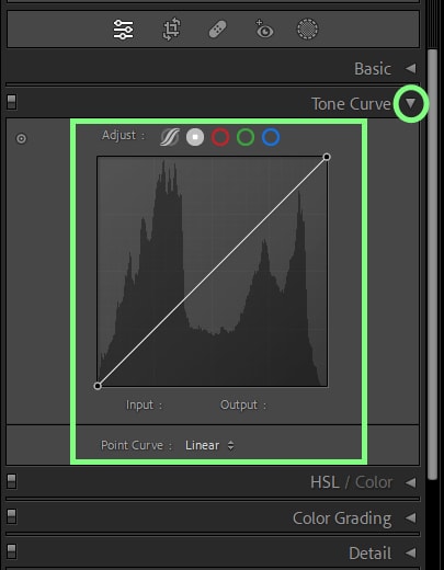
4. Utilize The Tone Curve For Creative Contrast
This leads me right to my next tip! Although using the various sliders in the Basic panel generally works fine, the Tone Curve can be useful for increasing contrast after you’ve made your basic adjustments.
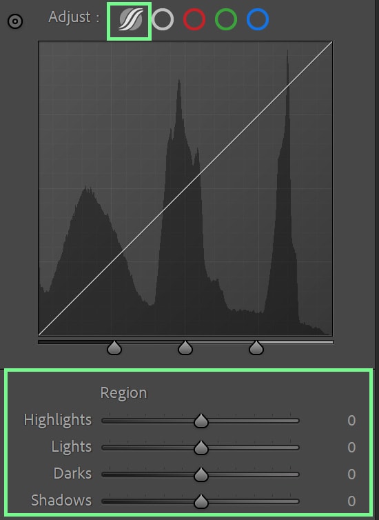
In simple terms, the Tone Curve in Lightroom helps editors target specific exposure ranges in a photo, add more color, and create interesting creative looks. As such, your adjustments tend to be more precise or more extreme, depending on how you use the tool.
I suggest using the Parametric Curve and Region sliders to add more contrast to your photos. The Region slider section appears whenever the Parametric Curve is selected.
Part of the reason I lean towards this is that this setting doesn’t allow you to go overboard; the Parametric Curve is capped at the spot where the image starts to fall apart if you go too far.
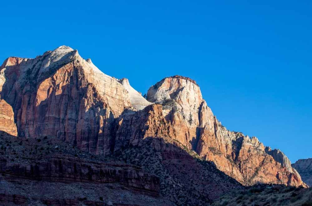
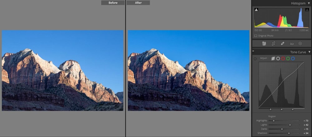
To continue with editing the above landscape photo I took, you can use the sliders to add a bit of “spice” to your shot – refine the contrast to your liking and make it more interesting than before. All of these adjustments make a difference in the final image.
For even further creative edits, you can select any color channels and refine them using the Tone Curve. For example, my shadows are looking too blue.
To fix this, I can select the Blue Curve, go to the shadow section of the curve, and pull the diagonal line down towards the yellow to neutralize my blue.
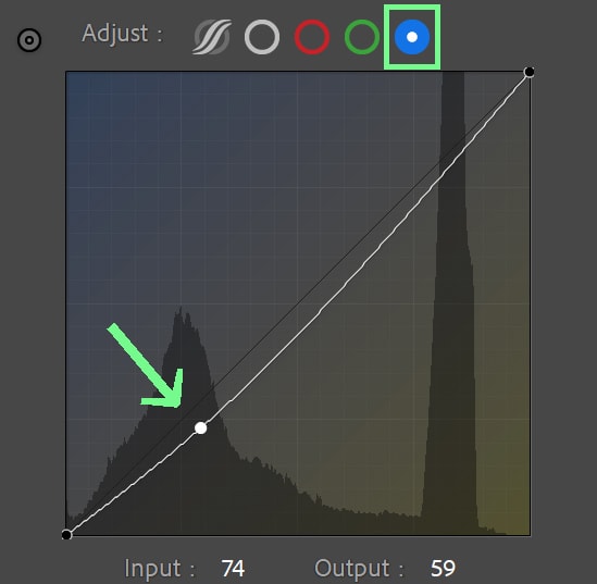
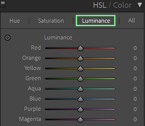
5. Recover Details In The Sky Using The Luminance Sliders
Nothing is more frustrating to a photographer than a blown-out sky – and fixing this problem can sometimes be challenging. A lesser-known editing tip is that you can use the Luminance sliders to recover details in your sky.
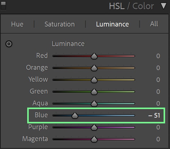
When adjusting your highlights and whites aren’t working, changing the luminance of the Blue and/or Aqua channels can help. The luminance refers to how bright or dark a color is. Pulling the Blue and/or Aqua channels to the left to darken them can recover lost details in the sky.
You can find the Luminance sliders in the HSL / Color tab on the right side of your screen.
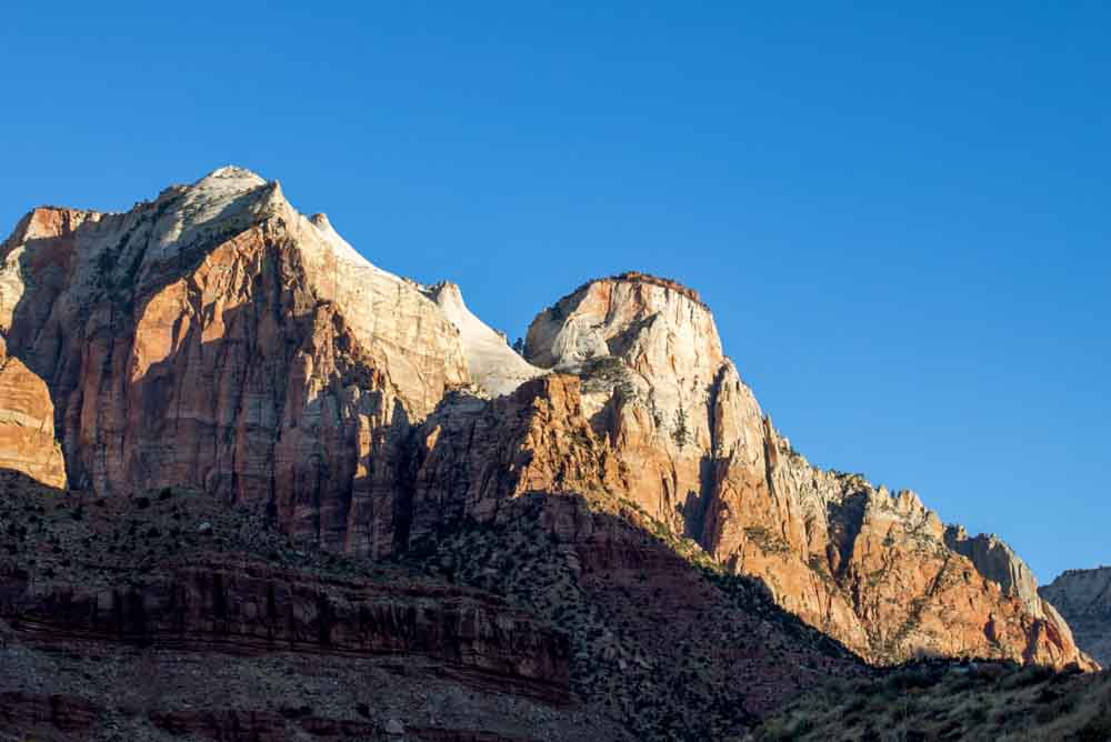
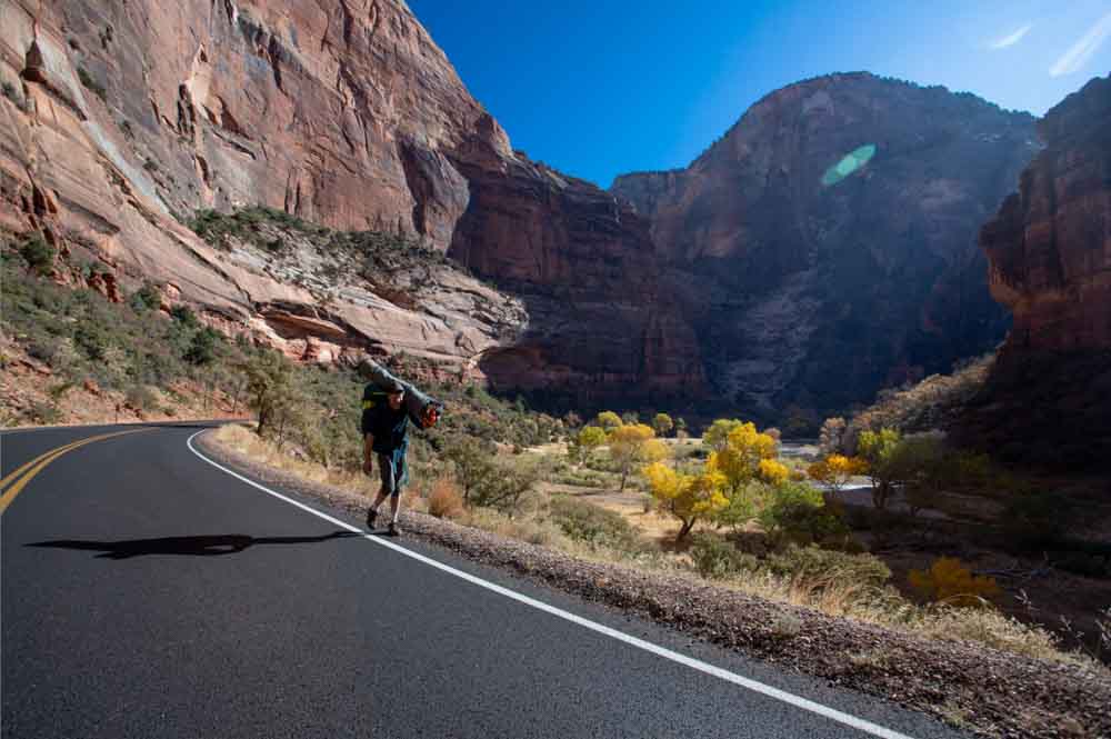
Let’s take this photo, for example. The right side of the sky is somewhat blown out.:
By sliding the Blue Luminance slider to the left, more details appear in the sky. I have gone a little overboard in this example to make the adjustment obvious, but of course choose a setting that looks best for you.
As with any edit, apply this in moderation. Going to dark can cause noise to come out, image fragments and aberrations to appear, and weird artifacts.
6. Take Advantage Of The Auto Masking Tools In Lightroom
Gone are the days of having to select subjects by hand, and photographers worldwide cheered as a result! So if you aren’t currently taking advantage of the various auto-masking tools available, you’re surely missing out on a genius advancement.
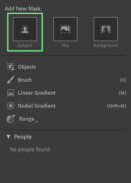
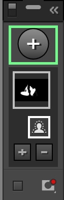
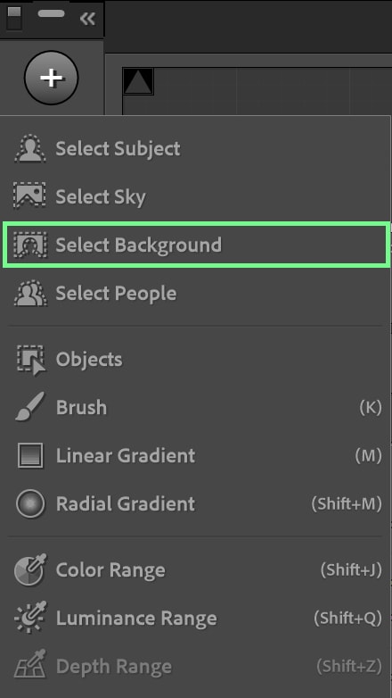
Located in the Develop tab, click the Mask icon to open a menu of auto-masking tools.
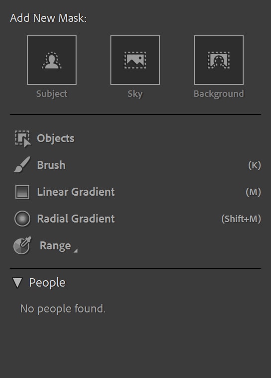
Alongside the traditional Mask tools, such as using the brush to make selective adjustments, you can also have the program automatically select your subject, the sky, or the background. This becomes invaluable to a photo editor when you want to only adjust the background or only adjust the subject – which often happens when photographing during more challenging lighting conditions.
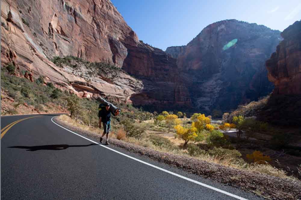
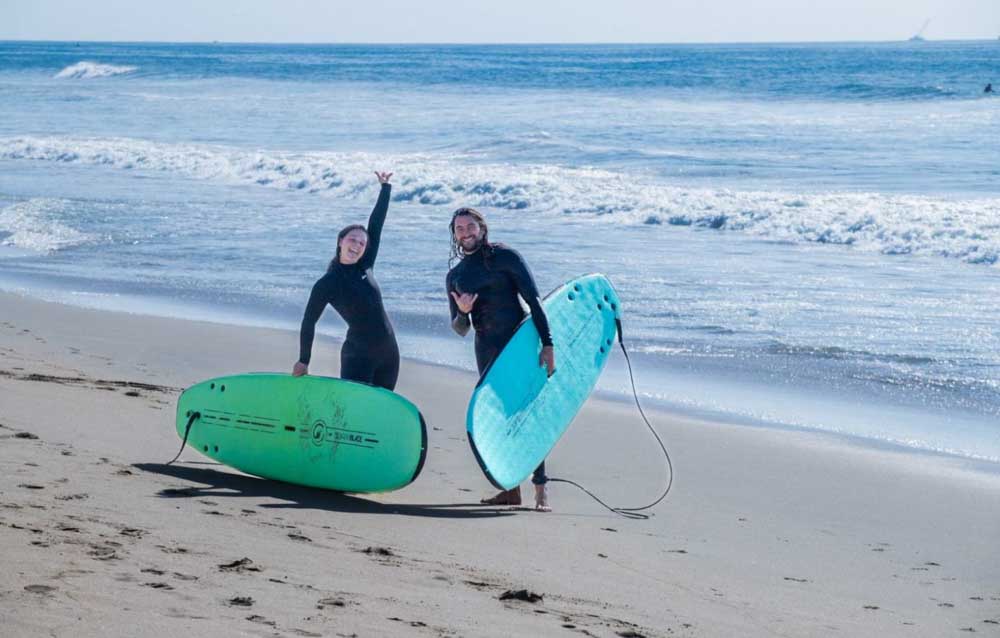
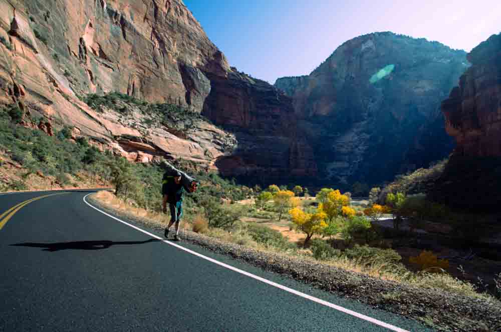
For example, in this photograph of mine, the background is quite bright, and the subjects are relatively dark because they were shot against the light.
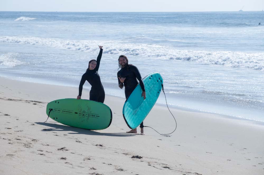
I can use the Select Subject mask to select the two people quickly.
Once selected, you can see the mask in the small tab at the right of the photo. The mask is also represented by the color red in your image.
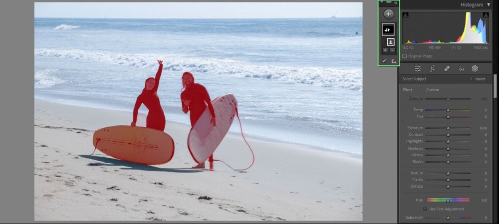
Your right-side editing panel now changes to the familiar Basic sliders, but these sliders only apply to the mask! In this case, I went ahead and brightened my subjects up a bit.
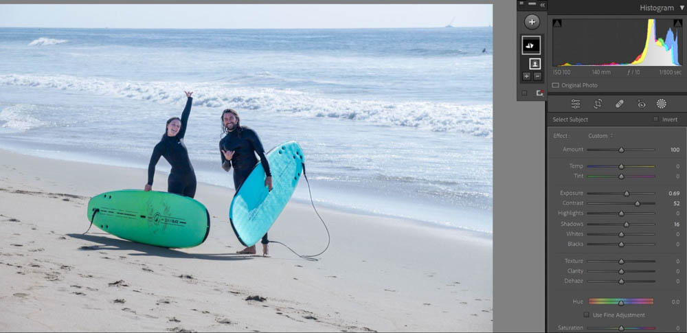
You can add multiple auto-computed masks to the same image. My next course of action is darkening the background. I pressed the plus icon above the mask tab and chose Select Background.
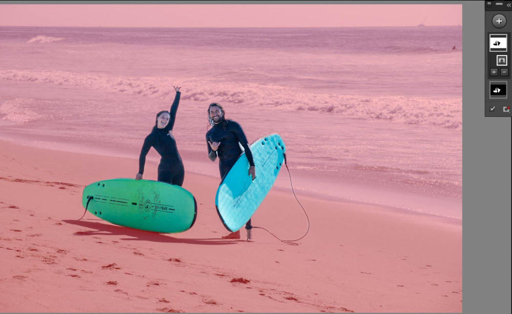
With the background selected, I made adjustments to only that part of the image.
7. Enable Transform Adjustments
For photographers who capture architecture, interiors, and other subjects with straight lines. This tip is for you.
The lenses used for such photo niches tend to have some optical distortion to them, which often causes skew lines. If you try to manually adjust the crop for building shots, things may remain skew when you want them to look straight. Lightroom has an easy fix for this rather frustrating issue.
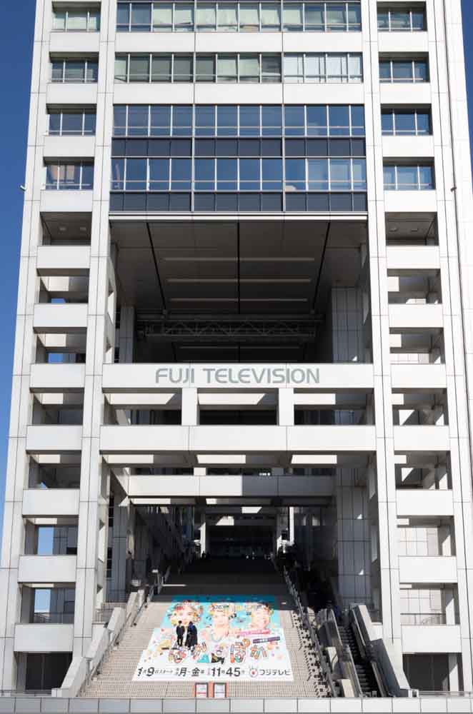
Let’s take this photo I took in Japan for example:
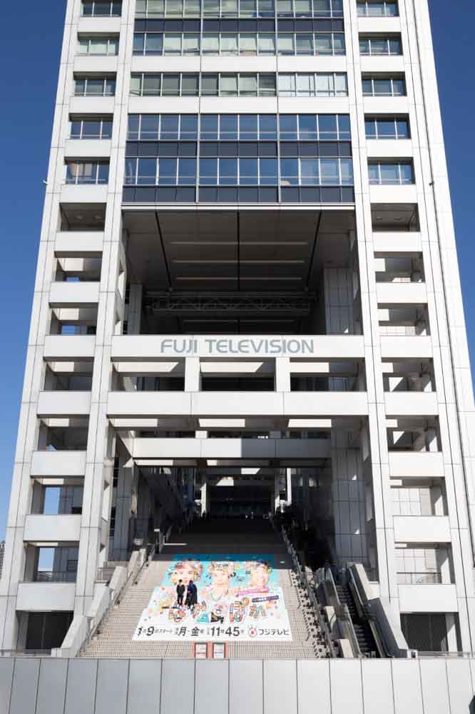
If you look at the edges of the building, you can see that the lines aren’t perfectly straight, as the image is angled backward. If I try to straighten using the crop tool, I won’t fix the distortion.
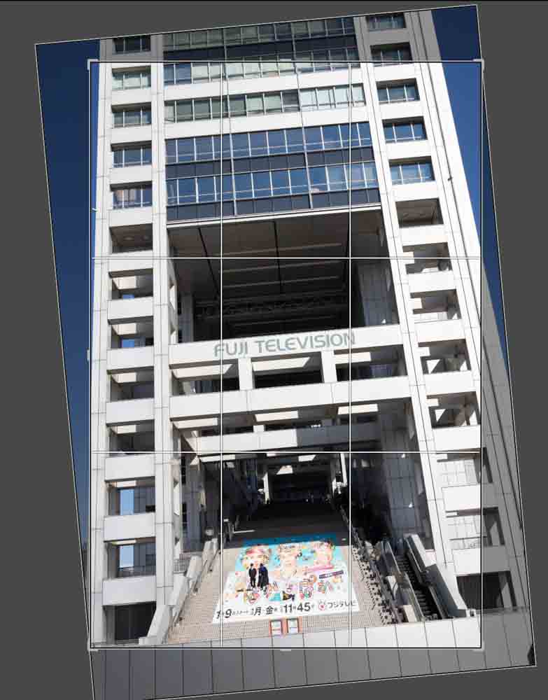
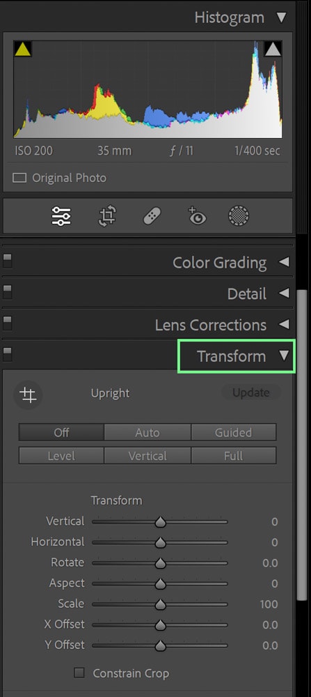
Lightroom’s Transform panel was designed specifically for circumstances such as this! On the right-hand side of the screen, in the Develop tab, you can scroll down to the Transform tab (located under Lens Corrections).
From here, you’ll find various options that crop and remedy image distortions in one go. For this image, I will enable Transform adjustments by clicking Auto and ensuring the Constrain Crop option is selected (so that I don’t get white out-of-bounds edges appearing).
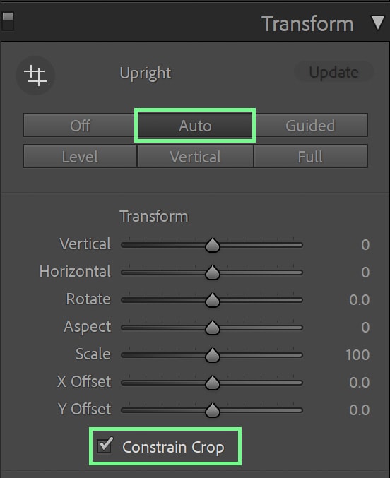
The program will then automatically fix my architecture shot, making the image look more professional with minimal effort on my part.
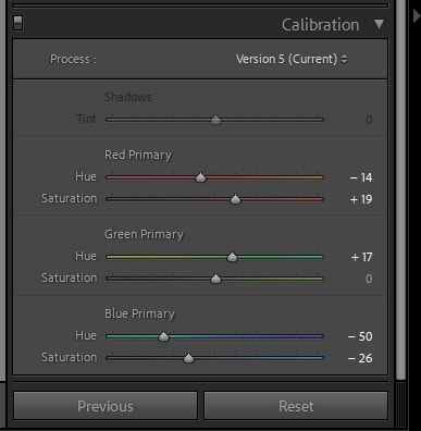
8. Experiment With The Calibration Sliders
An underrated panel in the Develop window is the Calibration sliders, which adjust the hue and colors of the image you are working on. You can find the Calibration panel on the right-hand side of the Develop window, right under Effects.
Although this is possible through the Hue, Saturation, and Luminance (HSL) panel, the Calibration panel goes beyond this to adjust your photo’s RGB (Red, Green, Blue) channels.
The Calibration sliders target a broader range of color rather than the HSL, which targets specific color families, so your adjustments tend to be more universal.
You can use the Calibration sliders to add further creative adjustments to your photo.
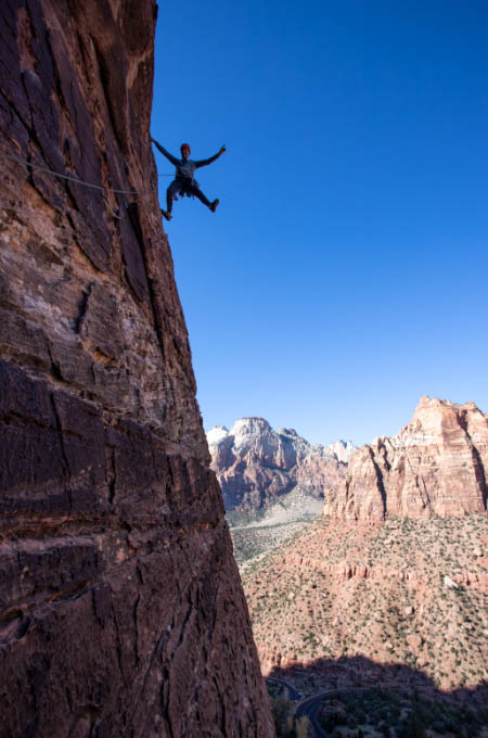
For example, let’s return to this photo of the rock climber. By using the Calibration sliders, I can further play around with the colors of this image to make it more interesting. In this case, I turned the colors a bit more ‘retro’.
9. Add Hints Of Color To Your Black & White Edits In Lightroom
When an image is turned black and white, by default, it becomes entirely grayscale with no hints of color. You can add a bit more visual interest (and stylization) to a black-and-white photo by adding a slight touch of color to it. This is a little-known fact that many professional photographers use to attract more interest to their black-and-white images.
In Lightroom, when turning your image black and white by clicking the Black & White option in the Treatment section of the Basic panel, you’ll see options to adjust the strengths of the different hues in the picture. These sliders don’t add color but rather intensify or lessen the areas where those colors were present in the original image.
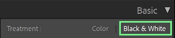
To add some color, scroll down to the Tone Curve. In the Tone Curve, select any color channel (in my case, I’ll select the Blue Curve). You can then pull the line up or down to add a hint of color to your black and white. For me, I added a bit of blue.
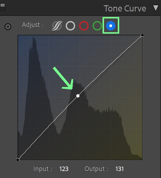
You can clearly see the difference when looking at the before and after! The black and white are now slightly cooled down with a hint of blue.
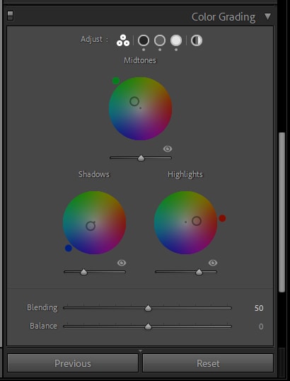
10. Use The Color Grading Adjustment For Stylized Edits
The term color grading can sound daunting on its own, but Lightroom makes adjusting or adding colors much simpler than the name implies.
Although you can adjust color through the Hue, Saturation, and Luminance (HSL) panel and Calibration panel, the dedicated Color Grading panel can help you alter colors even further. The Color Grading panel lets you add subtle (or bold) hints of color throughout your photo’s various exposure ranges (shadows, highlights, and midtones).
Located conveniently right under the HSL panel on the right side of the Develop window, the Color Grading panel presents options for adjusting colors.
I like to keep it on the default of showing the color wheels for Shadows, Highlights, and Midtones at once – but you can select to have the panel show each exposure range independently or make a global adjustment if you need.
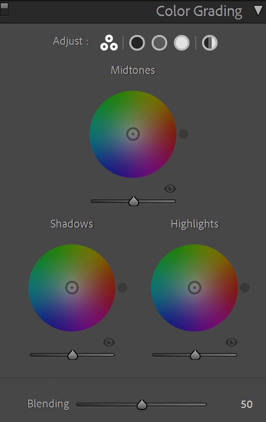
To further break down the Color Grading panel, each exposure range has a wheel from which you select the color you want to add.
Underneath each wheel you can see a slider bar that goes from a dark gray on the left side to a white on the right side: this adjusts how bright or dark that exposure range is (for example, for Shadows, you can brighten the shadow by moving the slider to the right).
For this photo of mine, I decided to stylize in a more far out way for creative purposes by adding a bit of green to the Midtones, blue to the Shadows, and red to the Highlights – resulting in this
As with all things in Lightroom, it will take some practice for all of these adjustments to stick in your head. But take a few minutes to work through all the tips listed here and watch how much your images and overall workflow will improve!
Happy Editing!
