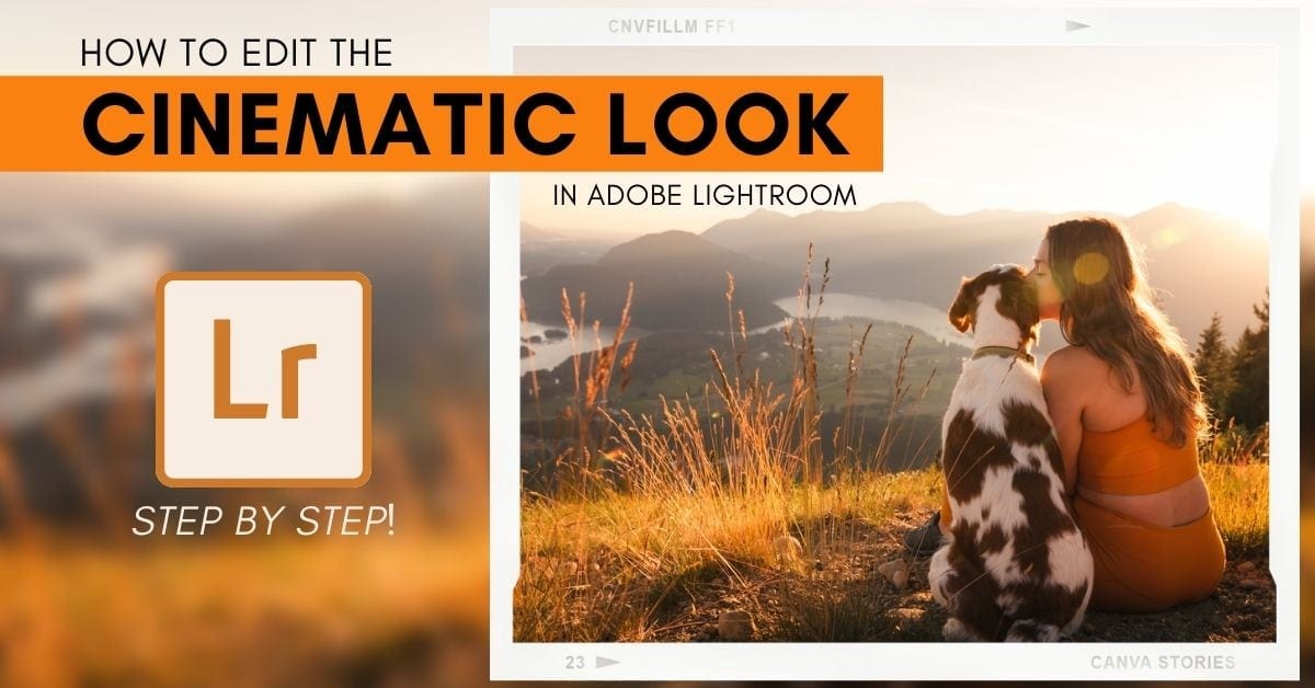

To give your photos a cinematic look, Lightroom has some of the best tools for the job. With a few adjustment sliders and spot adjustments, you can make your images appear rich and film-like in no time.
Here are the steps to make photos look cinematic in Lightroom:
- Create a balanced exposure in the photo.
- Use the Tone Curve to add matte contrast.
- Adjust the HSL for a refined color palette.
- Edit the color grading to add new color hues.
- Sharpen & denoise the image
- Enable profile corrections
- Add a vignette with a radial gradient
- Touch up the photo with spot adjustments.
- You’re done!
Now, this is a general outline of what you can expect, but I’ll get into the nitty-gritty of everything throughout this post. Let’s get started!
What Is “Cinematic” Photo Editing?
Cinematic photo editing is to make a photo share similar characteristics to images found in modern-day cinema. The colors, contrast, and mood of the edit are influenced by the color grading style from particular movies.
With that said, you don’t need to have a particular movie in mind to create this style. Sure, inspiration helps, but it’s not always needed. That’s because the cinematic editing style as a whole holds a few similar traits no matter the photo.
These traits include deep contrast, a slightly matte appearance, rich vibrant colors, a darker exposure favoring glowy highlights, and more. All of these general cinematic style characteristics can be applied to any photo with the help of Lightroom.
And that’s exactly what you’re going to learn in the next section.
How To Make Photos Look Cinematic In Lightroom – Step By Step
Since every photo will require slightly different adjustment values, I won’t be listing the exact setting needed for every adjustment. Instead, these steps provide a framework to follow to achieve a cinematic look in your photos.
Step 1: Create A Balanced Exposure
A balanced exposure simply means that your photo isn’t too bright, it’s not too dark, it’s juuuust right. This is an important first step since you’ll be adding more selective contrast later on in the process.

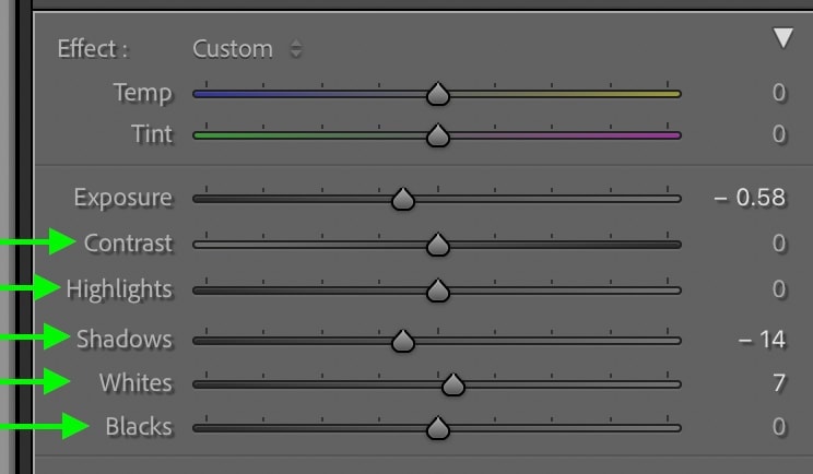
Inside the Develop Module is the Basic panel. This is home to all your general exposure adjustments such as exposure, contrast, highlights, shadows, whites, and blacks settings. To correct your exposure, work through each of these sliders until you’ve evened everything out.
For example, if you have a really bright sky and a darker foreground, you could bring down the whites and highlights sliders while lifting the shadows and blacks.
Then to help ensure your image doesn’t look too “flat,” add some contrast with the contrast slider.
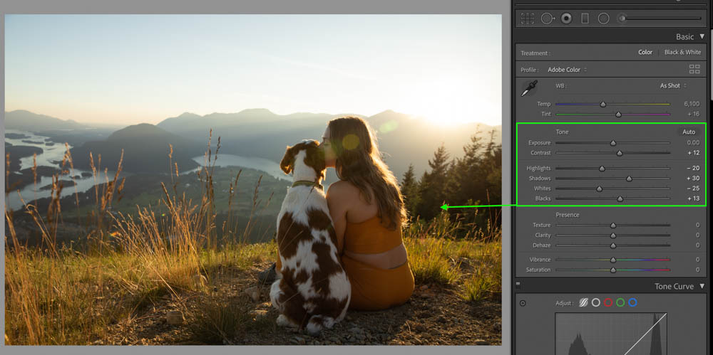
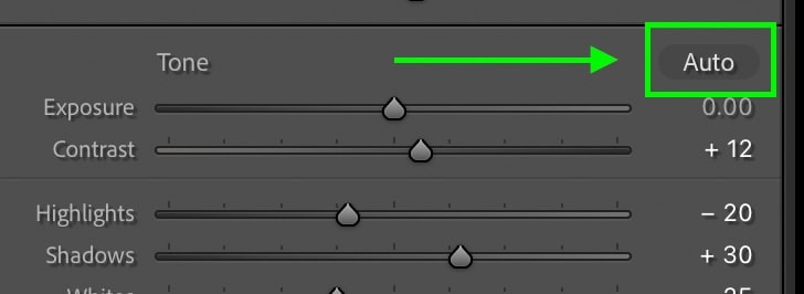
If you aren’t sure what settings to make, a surprisingly great starting place is the auto exposure setting. Clicking on the Auto button above the exposure slider will automatically correct your exposure.
In some cases, Lightroom will make your photo slightly too dark or too bright, but that can be quickly fixed with the exposure slider. By dragging this slider up, you will brighten your photo, while darkening by dragging it down.
Now your photo should look a bit less contrasty as the shadows and highlights have been balanced out. This is the perfect starting point for your edit!

Step 2: Choose A White Balance
Your white balance setting is an important part of the cinematic editing style. Before you go any further, consider whether you want your image to favor a warmer (yellow) or cool (blue) hue. Depending on your white balance setting, it will affect how your color adjustments appear later on.
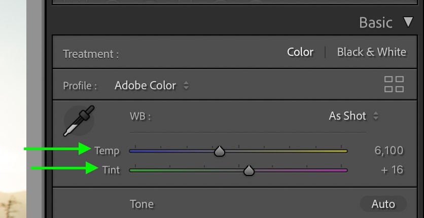
If you aren’t sure, consider how you want your photo to feel. For example, warmer hues often feel more inviting, while cool blue hues can make a photo feel cold, gritty, and more intense.
For this image, I will favor a warmer hue.
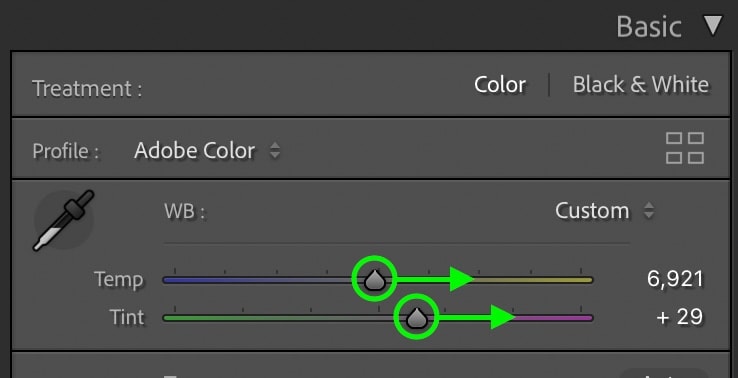
You can add more yellow or blue hues to the image by dragging the Temperature Slider up or down. For even more white balance effects, adjust the Tint Slider to add magenta or green instead. Using each of these sliders together can help to correct any weird colors in your photo or add a stylized look before any advanced color adjustments.
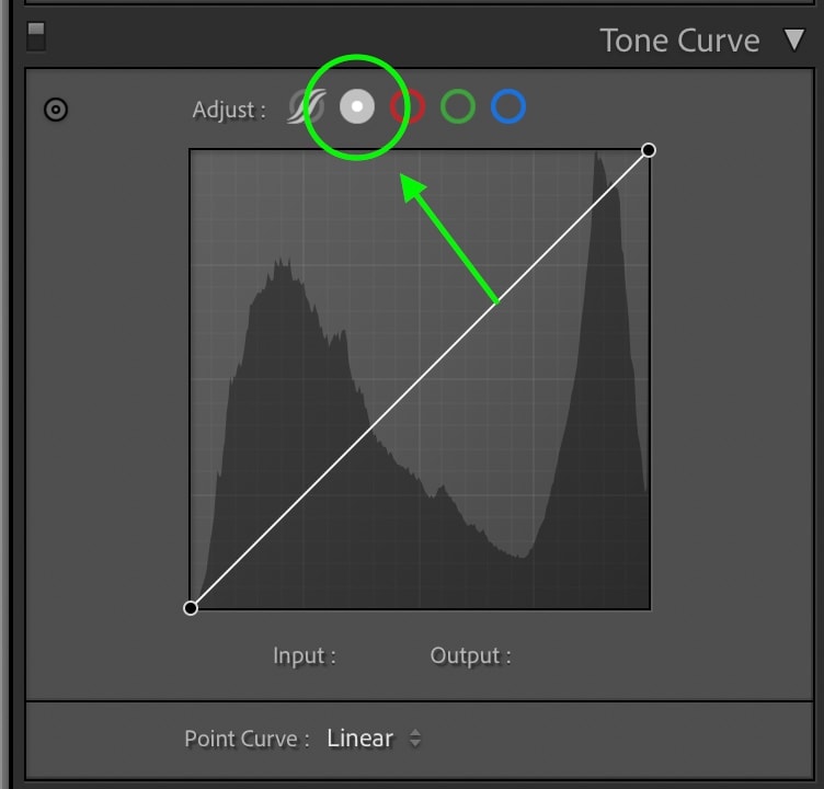
Step 3: Add Creative Contrast With The Tone Curve
Now that you’ve created a more balanced exposure and have chosen a white balance let’s start adding some creative contrast. The Tone Curve offers an effective way to brighten or darken different exposure ranges selectively.
Start by selecting the Point Curve option. This version allows you to manually place anchor points rather than having each exposure region broken up for you. You can learn more about how this works here.
For a cinematic look, you’ll want to add a slightly matte appearance to your shadows. By clicking on the shadow’s base point and dragging it up, you can quickly add that look.
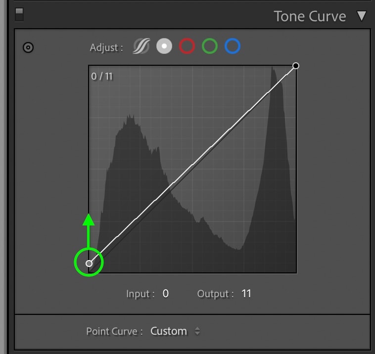
Just remember, the more you drag up, the stronger the matte look will be. So for this editing style, try to keep it relatively subtle.
Now it’s time to add back some contrast. First, click on the shadows region to add an anchor point, then drag it down to darken the shadows.
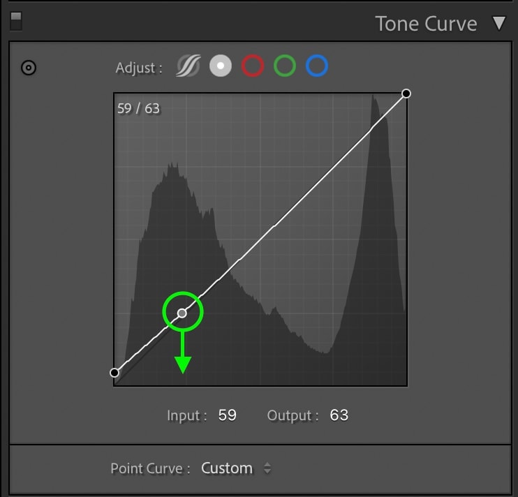
Then go to your mid-tones, click to add an anchor point, and drag up to brighten.
Finally, go to the highlights range, add an anchor point, then drag up again to brighten the highlights. For this adjustment, you may need to be sparing depending on how much of your photo is affected by this adjustment. You still want to see details in the highlights, so just make them slightly brighter!
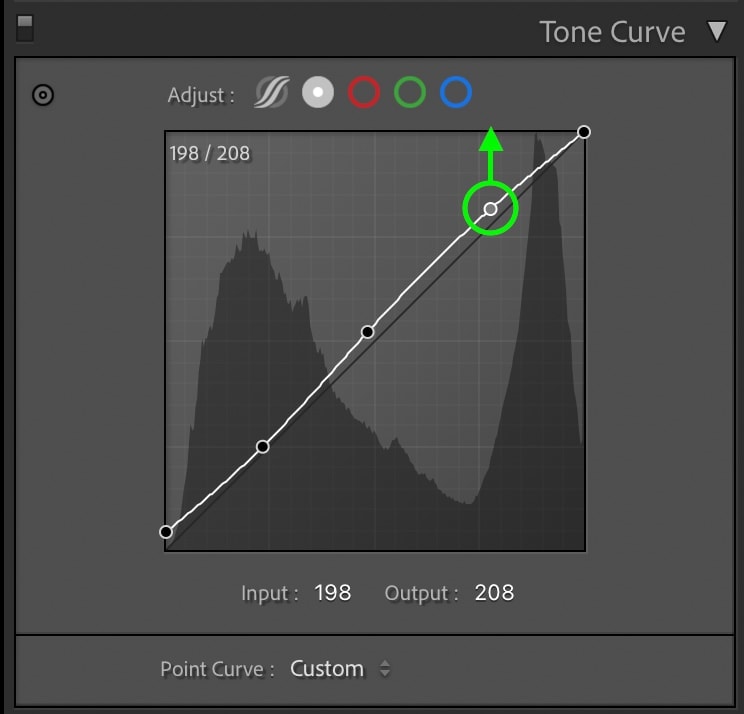
After you’ve gone through and added all your anchor points, go back and evaluate what could be improved. Ask yourself things like:
- Can I still see details in the shadows?
- Are there details in the highlights?
- Does the matte appearance feel overwhelming?
You want to have a good amount of contrast for this cinematic look without crushing the highlights or shadows. If needed, rework your tone curve settings until your happy with the look.
Here’s how my image is looking so far after the tone curve adjustment:

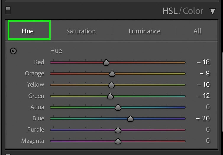
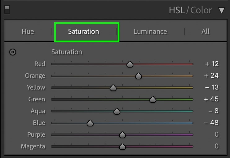
Step 4: Adjust The HSL For A New Look
Moving down the adjustment bar to the HSL, this is where the fun begins. The HSL adjustment lets you edit the hue, saturation, and luminance of all the colors in your photo. This helps to completely change the look and feel of your image or even add in complementary colors such as orange and teal.
If you aren’t sure exactly what you want your colors to look like, simply play around with the different sliders to see their results. This can be a lot of fun and often provides new ideas for where you want to take the image.
I like to work through these sliders in order, starting with the hue adjustments.
Clicking on the hue setting, work through the different sliders to adjust the color hues in your photo.
Next, click on the saturation setting and begin to go through each slider once again. For this cinematic look, you want to pick one or two dominant colors in your photo while desaturating the rest. For example, you could choose to keep blue and yellow saturated while desaturating the rest. You don’t want to go overboard with the desaturation, but just enough to mute down some of the less dominant colors.
Finally, move onto the luminance setting, which controls the brightness of your colors. By brightening any of the colors you previously desaturated, you’ll end up with a pretty awesome look in your photo. Once again, experiment with each of these sliders until you’re happy with the appearance.
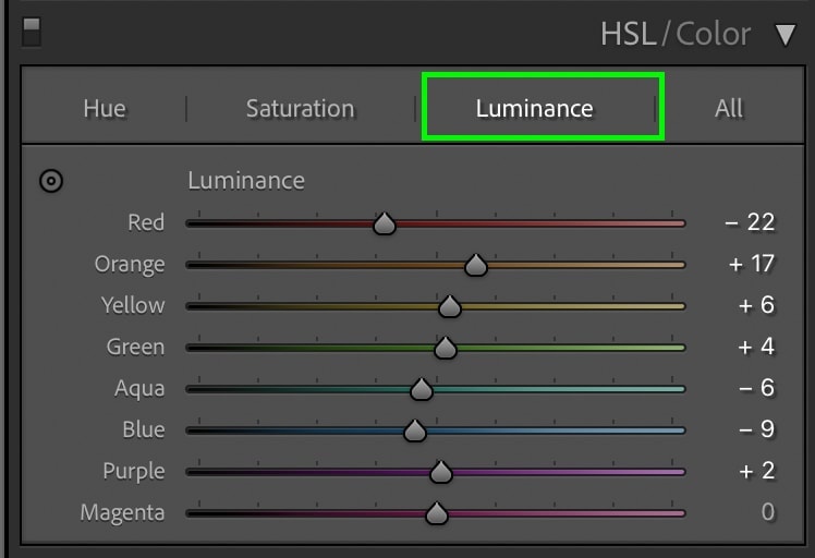
Here’s how my image looks after the HSL adjustments:
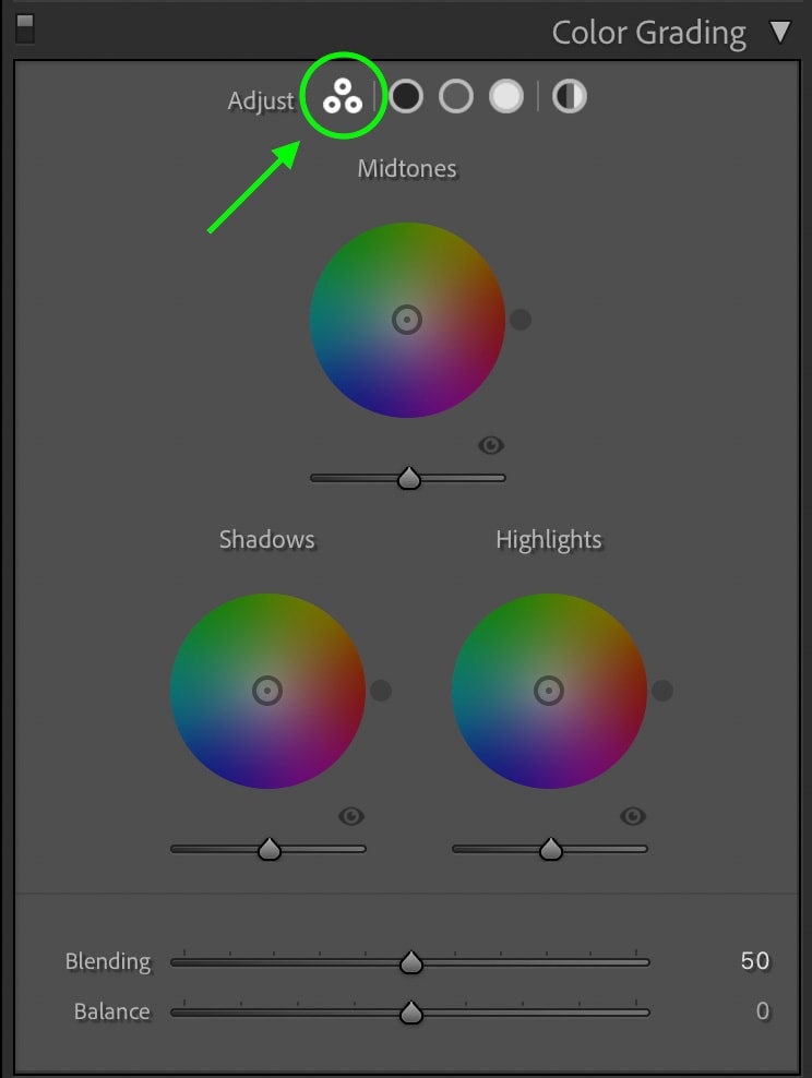
Step 5: Use Color Grading To Stylize Your Edit
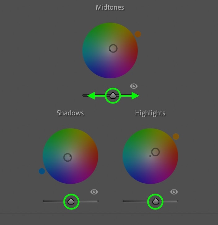
The color grading tool in Lightroom offers an advanced way to add certain color hues to your images. For the cinematic editing style, this is one of the most important steps in the process. Depending on which types of colors you want your photo to favor, you can quickly add them via the three color wheels available in this tool.
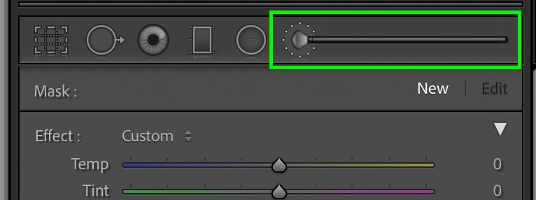
I prefer using the three-way view for this to see all my adjustments in one place. You can access this view by clicking on the icon with three circles.
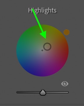
First, let’s add color to the mid-tones range. This will apply a color hue to the middle exposures in your photo. Clicking anywhere on the color wheel, you can select your desired hue.
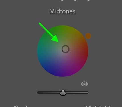
Just remember that the further to the outside of the circle you go, the more saturated your color. So for a subtle color effect, choose a hue relatively close to the center of the color wheel, as it will be more desaturated.
Now go to the shadows and repeat this same process, adding a color hue to the darkest exposures in your photo.
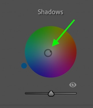
Finally, select a color for your highlights color wheel to apply a hue to the brightest areas of the photo. If you aren’t sure which to pick, selecting a complementary color to your shadow’s hue often looks really nice—for example, blue shadows and yellow highlights.
With your colors chosen, adjust the balance and blending sliders to refine your color hues.
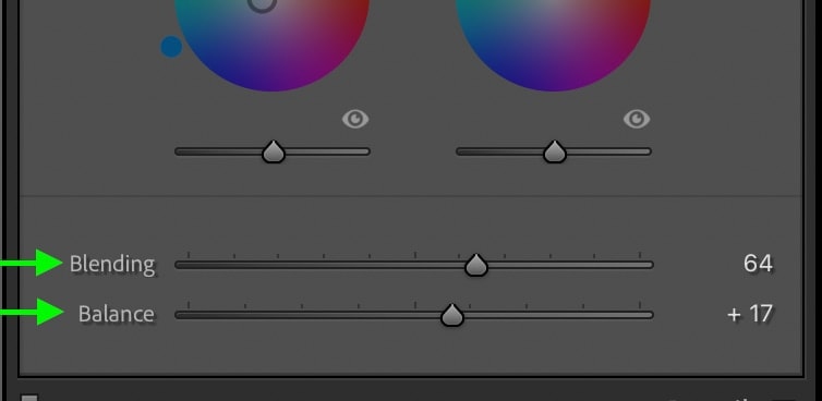
The balance slider allows you to control whether the highlight or shadow hue is more dominant in your photo.
The blending slider will dictate how hard of a transition lies between the shadows, mid-tone, and highlight hues. For example, with a high blending setting, the mid-tones hue becomes nearly unnoticeable.
Your color grading adjustments should look complete at this point, but if any exposure range appears a bit too bright or dark, you can adjust the luminance sliders to fix this. Found beneath each of the color wheels, moving these sliders left will darken that exposure range while moving right will brighten.
Here are the results after the color grading adjustments:
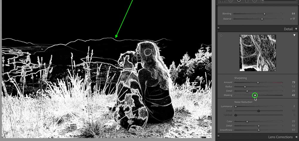
Step 6: Sharpen & Denoise Your Photo
Going to the Detail panel, let’s increase the sharpness and denoise the photo if necessary.
I like to increase the sharpening slider a few points until the edges pop a little more in my photo. You can easily see this happening in real-time via the live preview window.
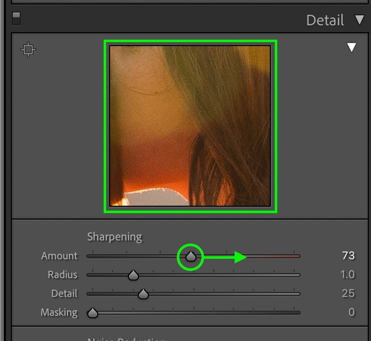
As an optional sharpening technique, go to the masking slider and drag it upwards while holding the Alt or Option key. This will give you a preview of your sharpening mask as you tell Lightroom exactly what you want to be sharpened.
This mask similar to a layer mask in Photoshop. Everything white will be sharpened, while everything black will not. By increasing the masking slider, you will tell Lightroom to refine the sharpening adjustments to only the dominant edges in your photo. This works well if you want a higher sharpening value without giving in to more grain.
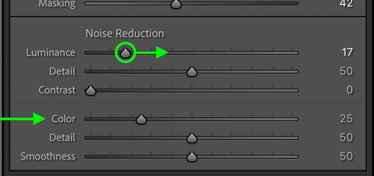
Once you’re sharpening is complete, go to the Luminance Denoise slider and drag that up slightly to soften out any noticeable grain in your photo. As for the Color noise slider, the default value often works wonders, so I’ll leave it untouched in this case.
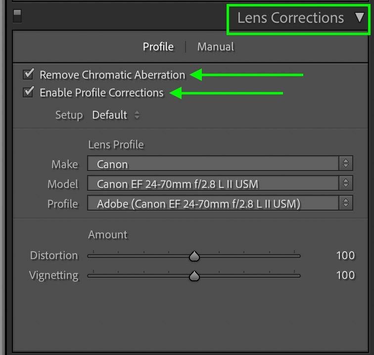
Step 7: Enable Profile Corrections
For good measure, check the Profile Corrections and Remove Chromatic Aberration. This will help improve the quality of your photo further and get rid of any discoloration around the edges of your frame.
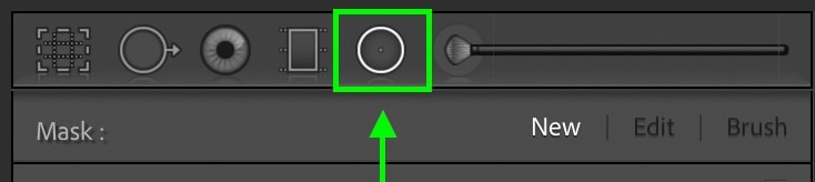
Step 8: Add A Vignette With A Radial Filter
Now the general adjustments are complete, and it’s time to start getting more selective. For the cinematic look in Lightroom, a vignette is the first order of business. A vignette simply darkens the edges of your photo to draw your eye to the center of your frame. This is a great trick to use to make your subject stand out like never before in your photo!
Although there is a vignette slider in Lightroom, I opt to use the radial filter to get a lot more versatility. If you wish to use the vignette slider, that will work too, but I’ll use the Radial Filter for this example.
Start by selecting the Radial Filter and click and drag it out on your image to create a new adjustment. The goal here is to position it in a way that it’s surrounding your subject. Remember that everything outside of this filter will be getting darkened!
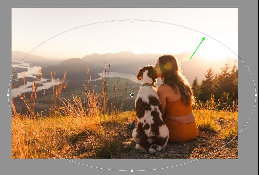
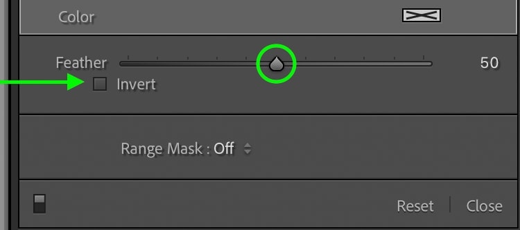
Now make sure the invert option is unchecked and your feather is set somewhere between 50 and 100. This will ensure your vignette blends nicely into the rest of the photo.
Once the filter is in place, click and drag down the exposure slider to create a vignette. I want this vignette to be quite subtle, so I won’t bring down this slider too much. A little bit goes a long way!
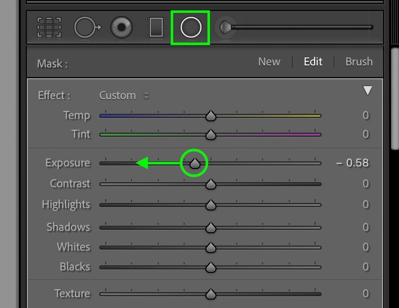
If you want to refine your vignette further, you can also go through the contrast, highlights, shadows, whites, and blacks sliders for a more customized look.
Step 9: Selectively Lighten Or Darken Your Photo
To finish off this cinematic edit, you’ll need to make some selective exposure adjustments.
Start by selecting the Selective Adjustment Brush and paint over any area of your photo you want to adjust.
Then work through the exposure sliders to selectively brighten or darken your active selected area. I break down this process more in-depth in my guide to selective adjustments in Lightroom.
For the cinematic look in Lightroom, a more important process is using the Selective Adjustment Brush to dodge and burn the photo. This allows you to add more subtle lightening and darkening adjustments to your image that really make it come to life. If you want to learn how to dodge and burn in a video format, see this tutorial.
Now let’s start with dodging.
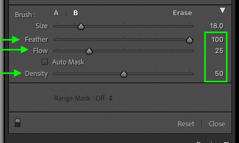
With the adjustment brush still selected, go to your brush settings and set the feather to 100, the flow to 25, and the density to 50. This will make your brush strokes less noticeable as you paint.
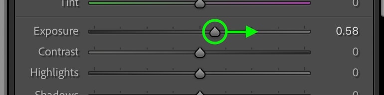
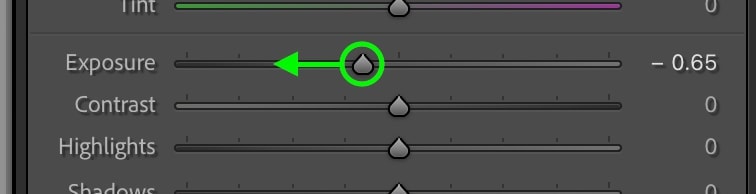
Now go to the exposure slider and drag it up slightly so you will paint brightening adjustments.
Begin painting over any parts of your photo that you want to draw more attention to. By painting over the same area multiple times, you’ll add a stronger brightening adjustment. That’s the beauty of the low flow and density settings you created earlier!
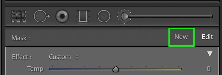
Once you’re done with the dodging adjustments, click the “New” button above your adjustment panel to create a new brush. This time you will burn (aka darken) your image selectively.
Leaving the brush settings as is, move your exposure slider to the left to darken your exposure. Now begin painting over the areas of your photo you want to darken. I often like to further darken the shadows in my photo or darken around the edges of the frame for this cinematic look.
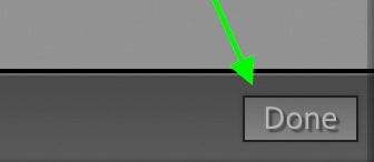
While you’re dodging and burning, you may paint over an area you don’t want to affect anymore. By holding the Alt or Option key while using the Adjustment Brush, you’ll switch to the eraser brush allowing you to delete any unwanted dodge and burn adjustments.
Once you’re happy with all your selective adjustments, click Done.
Step 10: Export The Photo From Lightroom!
Wowza, after all that work, you have a smokin’ hot cinematic edit that you’re ready to share with the world. To do that, you need to export your photo!
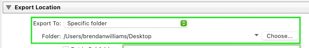
With your image selected, go up to File > Export.
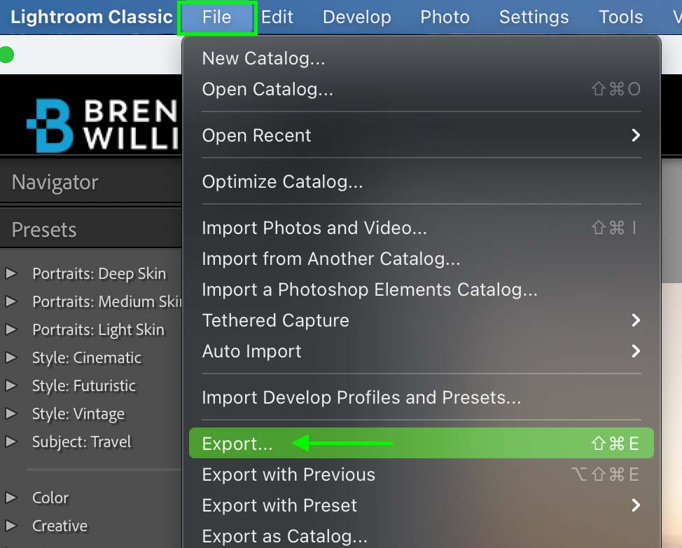
Choose a destination on your computer for your photo to export to.
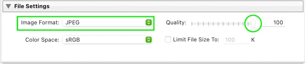
Then set your format to JPEG and the quality to 100.
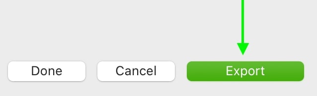
Then click Export to save your photo!
If you’re new to exporting your images from Lightroom, I highly recommend reading this post on the best export settings to use.
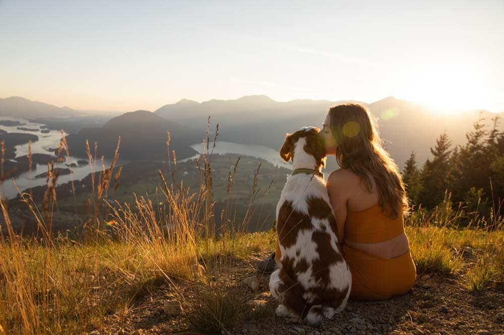
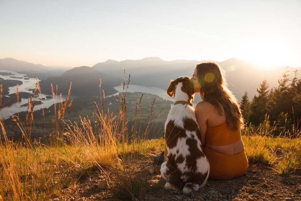
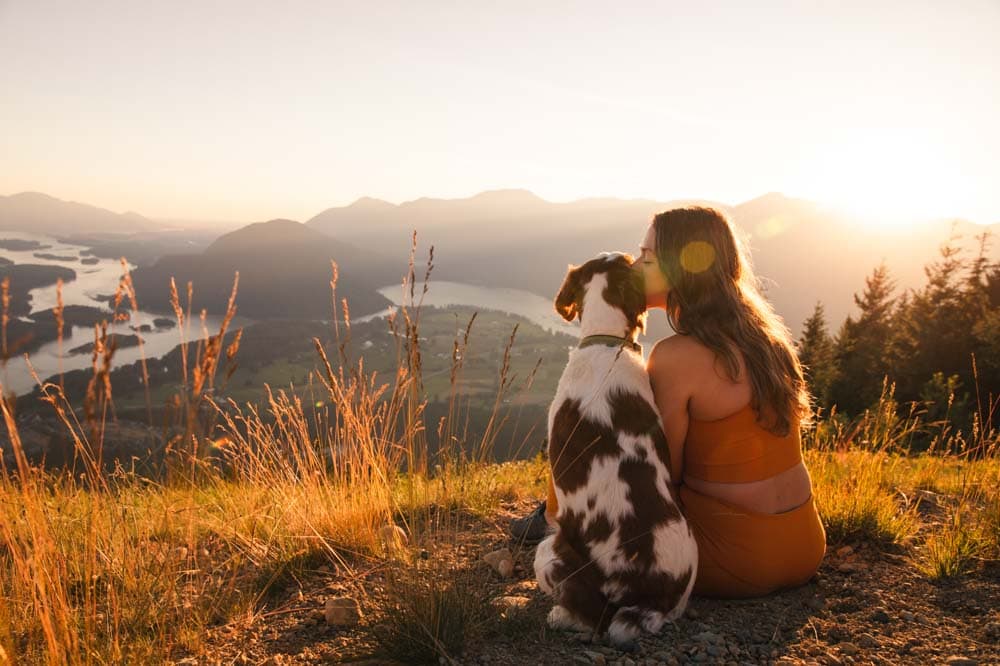
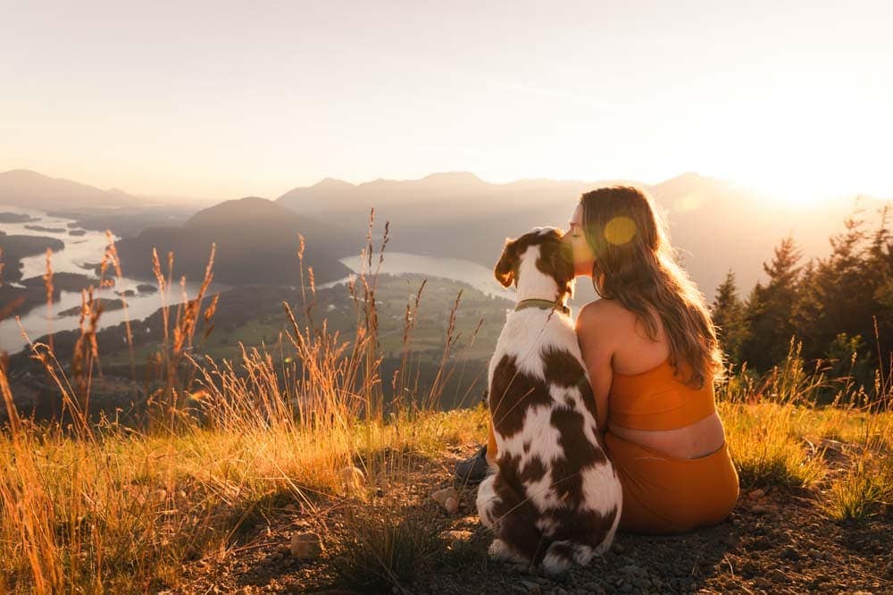
Cinematic Look – Before & After
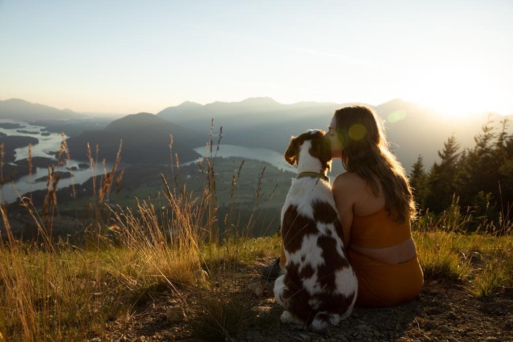
Now comes the big reveal. Nothing’s more satisfying than looking at the before and after of your image with your final edit. Here’s how the image turned out after following the 10 steps outlined above:
Happy Editing!
Brendan 🙂