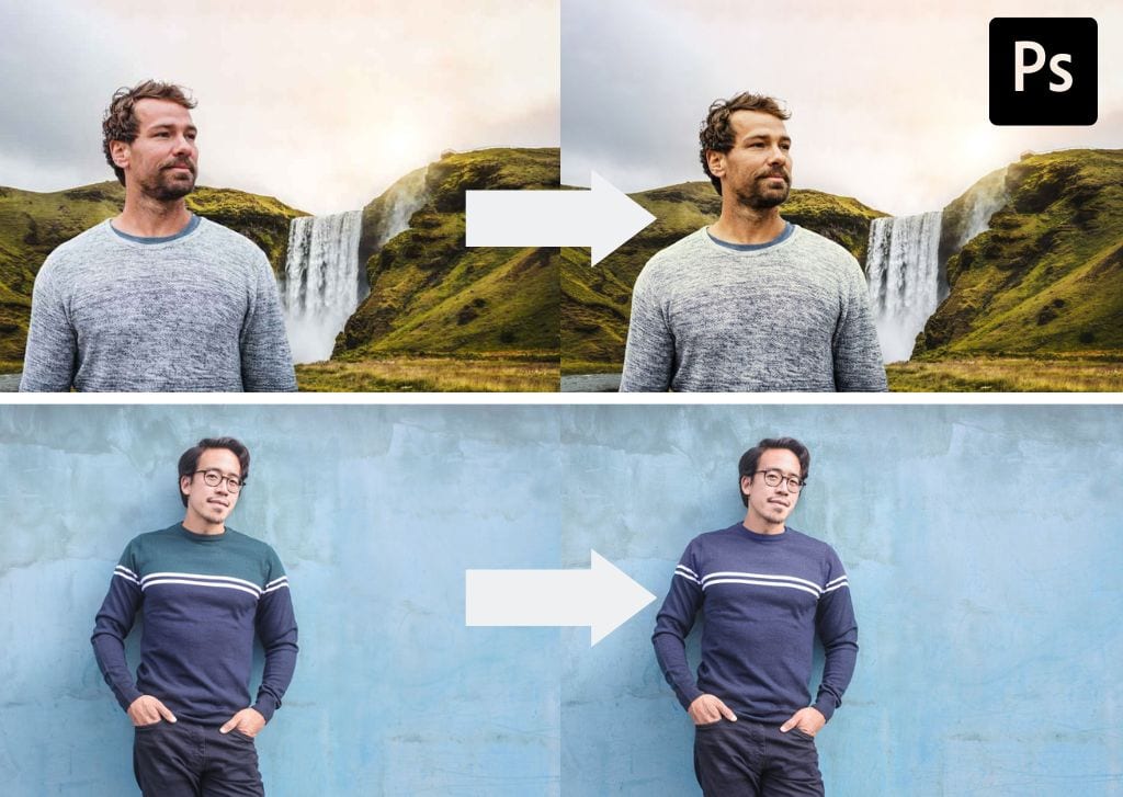

Whenever you are placing a subject against a new background or creating composite images in Photoshop, learning how to blend and match colors is an essential skill. In this guide, I’ll show you two easy ways to do this: using the Match Color adjustment or manually filling an area with a new color.
How To Match Colors Between Layers In Photoshop
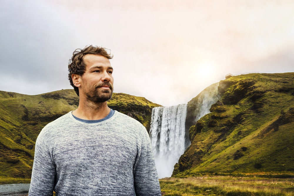
This is the best method to use when combining multiple images into one. For this example, I’ll place a cut-out of the subject from one image into the background of another image, then match the colors so that the final image appears more realistic.
You can use this same method whenever you want the colors in two separate layers to match better.
Step 1: Remove The Background From The Subject Image
First, I’ll cut out the subject of the first image using the Object Selection Tool (W).

In the Options Bar, I’ll choose Select Subject.

After a moment, Photoshop will automatically select my subject.
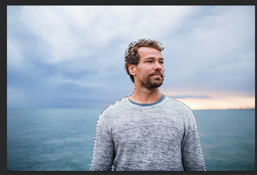
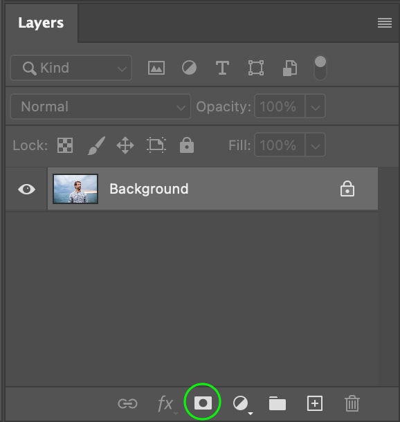
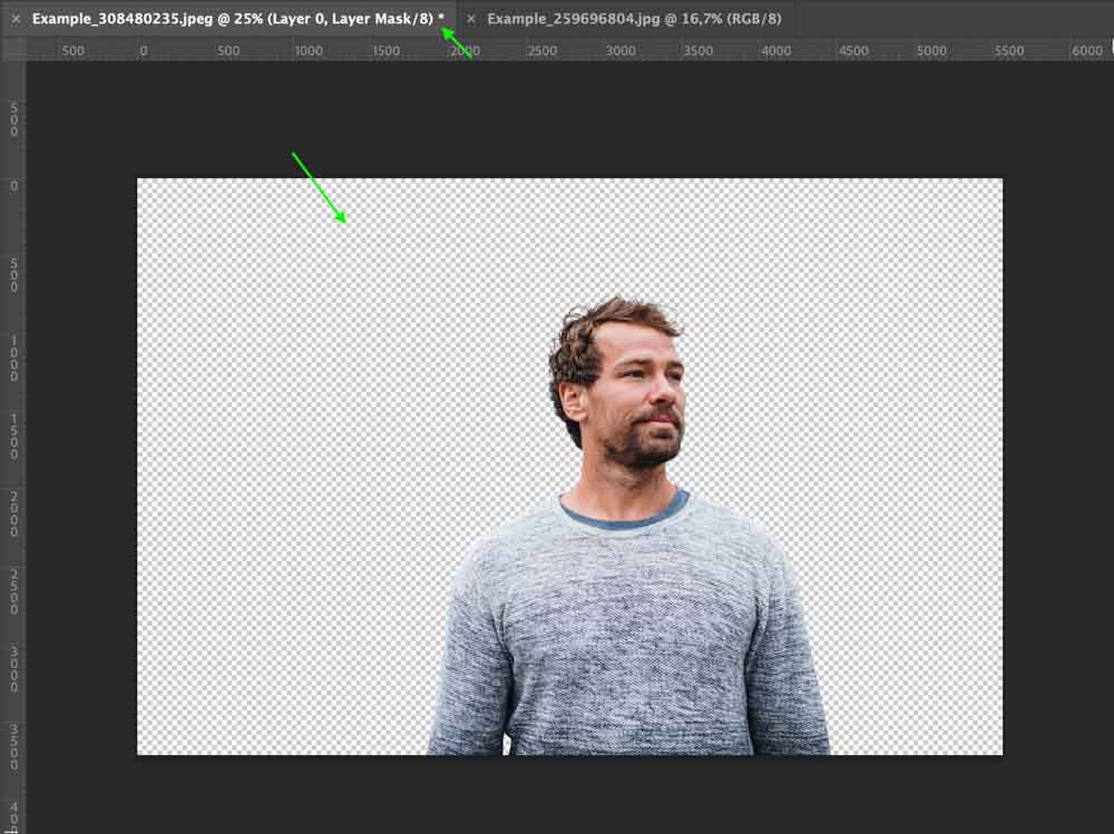
Then, I’ll head to the Layers Panel and click the Layer Mask icon at the bottom to add a layer mask, removing the background from the image and leaving the subject.
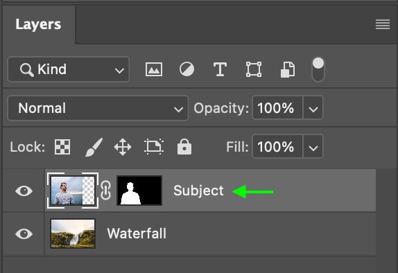
In the Layers Panel, the layer mask appears beside the Image Layer.

Step 2: Add The Second Image
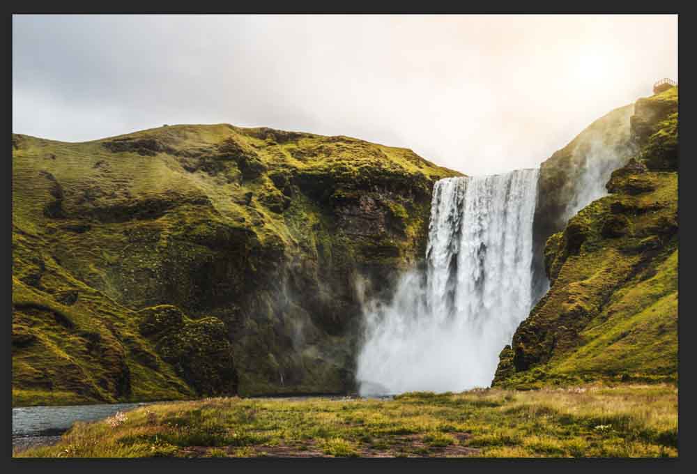
Now, I’ll head to File > Open and select the image from my files, where I’ll place the subject of the first photo.
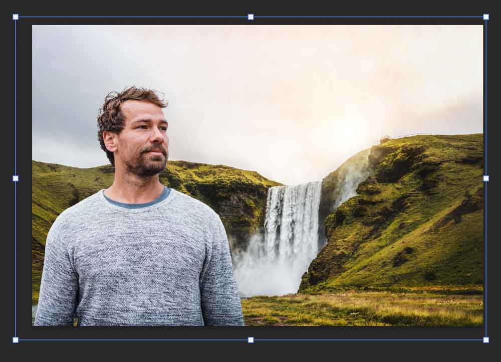
The image will appear in a new tab beside the first.
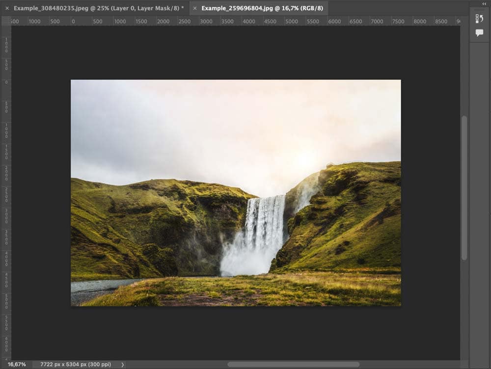
You can then head to the Layers Panel and drag the image layer to the first tab, then drop it on top of the document.
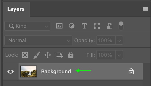
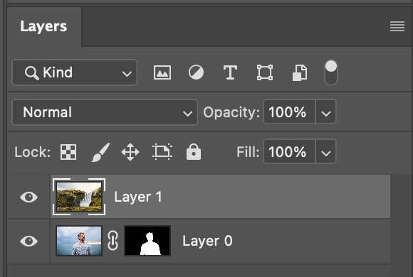
In the Layers Panel, you’ll see the new image layer on top of the original image to which you applied the layer mask.
Step 3: Move And Scale The New Image Layer
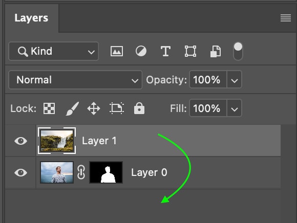
When the image is placed on the document, it will appear on top of the subject.
In the Layers Panel, the image will sit on top of the subject. Click and drag the layer for this image to sit below your subject. This will place the background behind your subject.
You can then select the Move Tool (V) and click to move the subject layer where you’d like it to be. You can also scale the images by selecting one in the Layers Panel and toggling Control + T (Win) or Command + T (Mac), then dragging the toggles around the images.

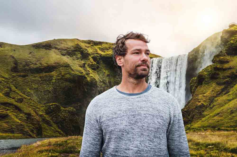
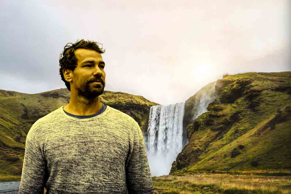
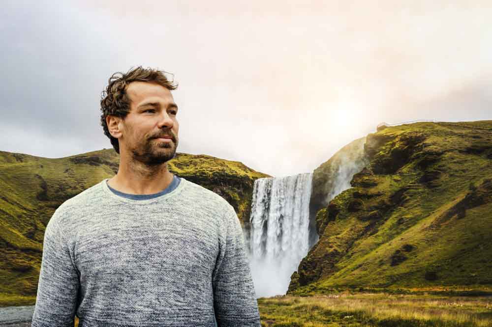
This is how my final placement looks.
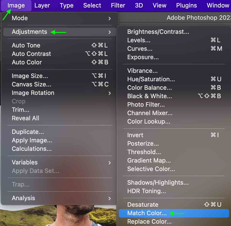
Step 4: Match The Colors
Now, make sure the subject layer is selected in the Layers Panel. I’ve changed the names of my layers to better keep track of the subject and the waterfall background.
Head to Image > Adjustments > Match Color.
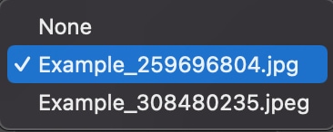
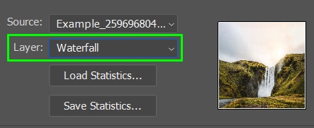
The Match Color window will appear. In the Source section, click to select the source file, and make sure you select the file that has both the subject and the waterfall included. Then, select the Waterfall layer under the Layer option.
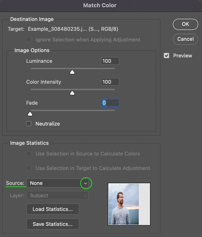
This will apply the color-match effect to the subject. Keep the window open for now. You’ll notice the effect is quite strong, but we can tone it down in the next step.
Step 5: Reduce The Intensity
You can now use the Luminance, Color Intensity, and Fade sliders to reduce the intensity of the match color effect until it looks more realistic. The Luminance reduces the brightness of the color, Color Intensity will bring down the overall saturation, and the Fade slider will fade the color match effect.
Each image may require slightly different adjustments, but generally, it is best to leave the Color Intensity and Luminance around 100 and work mainly in the Fade slider. For my example, the green and yellow color in the subject is so intense that it looks unnatural.
Therefore, I’ll use the Fade slider and bring it to the very top, removing all the color, then pull it down to add a bit of the color back into the image. And, because the image’s subject is a bit brighter than the background, I’ll also decrease the Luminance slider just a bit to darken the subject.
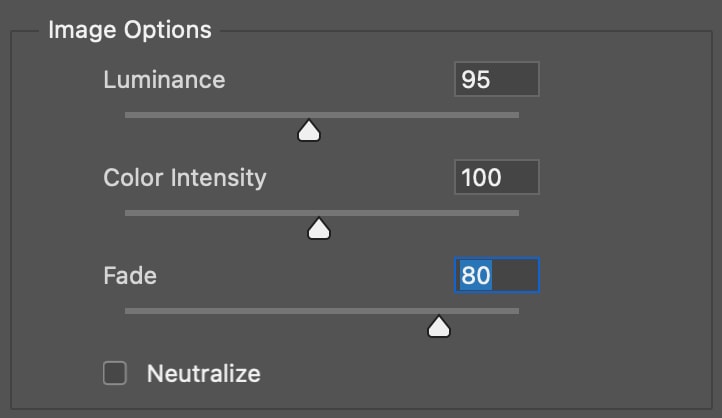
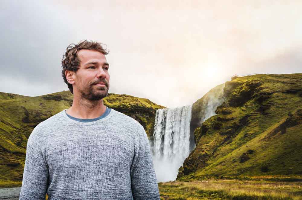
Click OK when you’re done, and this will create a much more realistic appearance in the overall image.

Step 6: Adjust The Photo’s Lighting
While the image looks much better than it did at first, there are still a few ways to make it look more realistic. Because a lot of light is coming in from the background, I’ll add a layer mask with a light effect appearing on the side of my subject where the light is strongest.
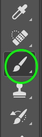
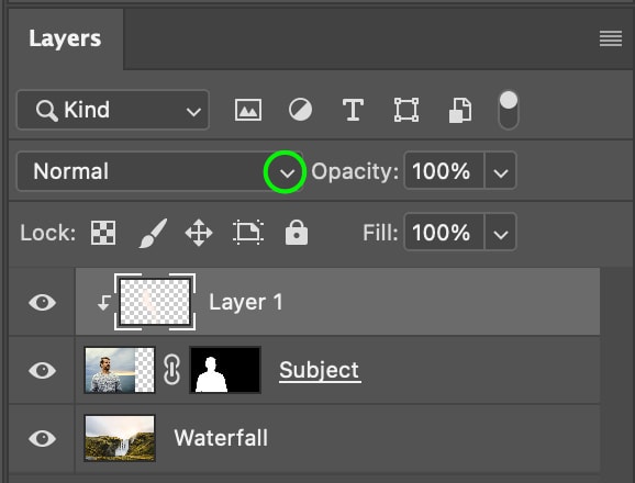
To start, I’ll click the Brush Tool (B) from the Toolbar.
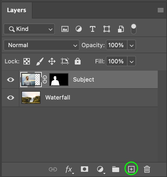
Then, I’ll click the New Layer icon in the Layers Panel to create a new layer.
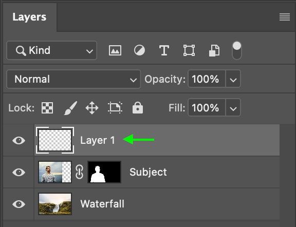
Now, hold Alt (Win) or Option (Mac) to toggle the eyedropper tool and click an area of light in the image to sample that area.
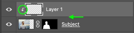
Next, add a clipping mask by holding Alt (Win) or Option (Mac) and clicking the line between the new layer and the subject layer. The clipping mask icon appears to the left of the new layer.
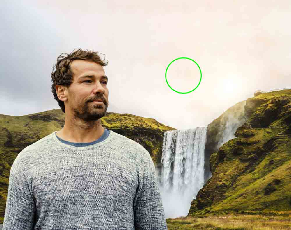
Now, I’ll paint just along the edge where the light would naturally hit the subject in the image. It may be a bit too bright at first, but you can change this in a moment.
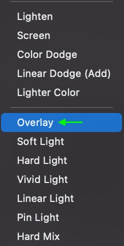
Now, in the Layers Panel, click the drop-down for the blend mode and select Overlay.
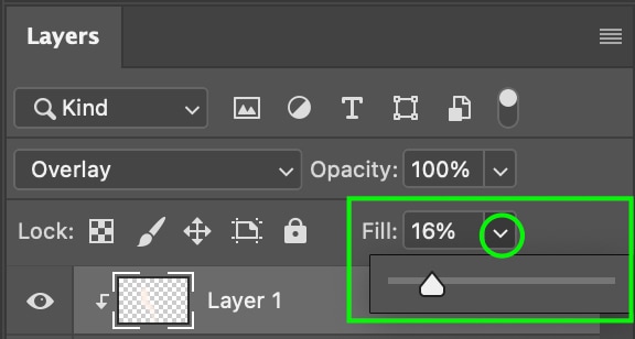
The effect may still be intense, so I’ll head to the Fill slider in the Layers Panel and bring it down to between 15% and 20% to add a subtle lighting effect.
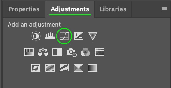
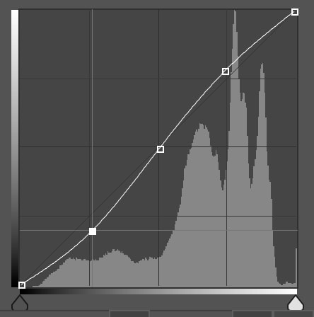
Step 7: Add A Curves Adjustment Layer
Now, we can further refine the exposure and contrast of the subject so that it blends better with the background. To do this, add a curves adjustment layer by heading to the Adjustments Panel and clicking the Curves Adjustment.
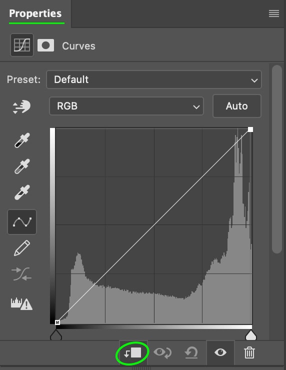
In the Properties Panel, you’ll see the Curve appear. At the bottom of the panel, click the Clipping Mask icon to add a clipping mask that only applies to the subject layer.
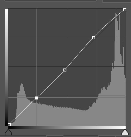
Now you can adjust the subject layer so that the contrast and exposure better match the background layer. The adjustments will likely be subtle but will match the subject to the background better.
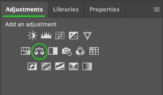
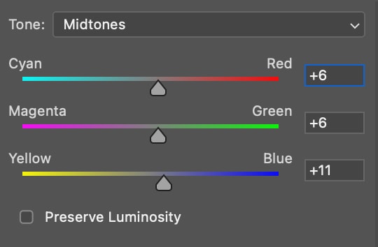
Step 8: Add A Final Color Balance Layer
The final touch you can add to the project is a color balance layer that will apply a color balance to the whole project so that the colors look more uniform overall.
You can do this by heading to the Adjustments Panel again and selecting a Color Balance Layer.
In the Properties Panel, the color balance adjustment sliders appear.
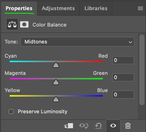
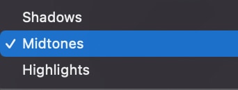
Make any edits necessary to the color balance, and feel free to switch between the Midtones, Shadows, and Highlights as needed.
Once you finish, the photo will be complete!
How To Match Colors Of Objects & Clothing In Photoshop
You can’t use the Match Colors adjustment with a single image, so the next method will allow you to match the colors within a single photo; for instance, changing the color of an object or item of clothing to match a different color in the image.
Step 1: Select The Color You’d Like To Sample
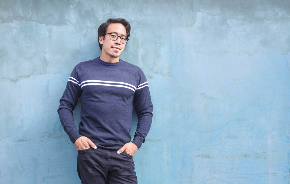
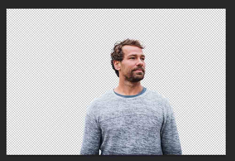
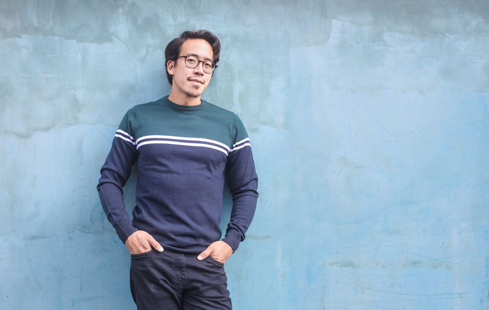
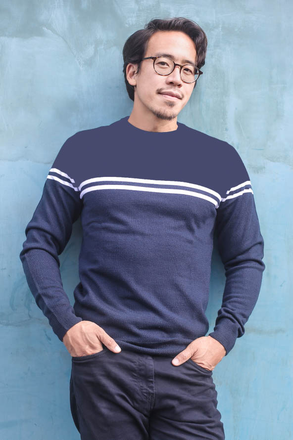
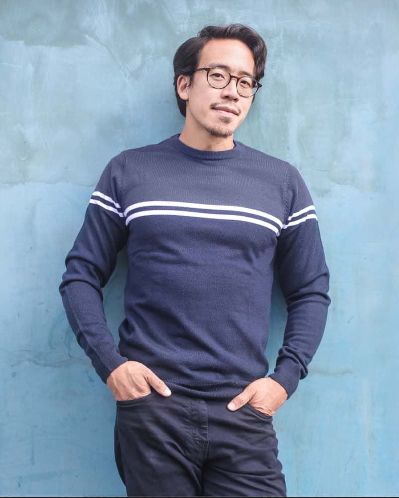
The color I’ll replace from my image is the top color of the man’s shirt. The goal is to have it match the bottom color of his shirt instead.
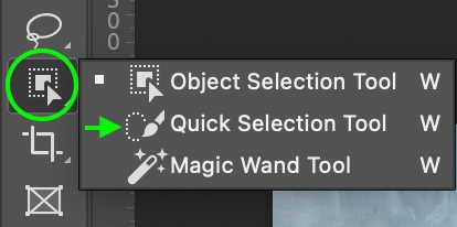
To select the color, head to the Quick Selection Tool (W). You can find it by clicking and holding the Object Selection Tool or the Magic Wand Tool if you don’t see it.
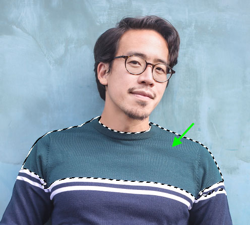
Then, click and drag around the area with the color you’d like to replace so that the tool creates an active selection around the area.
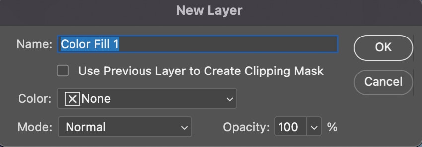
Step 2: Add A New Color Fill Layer
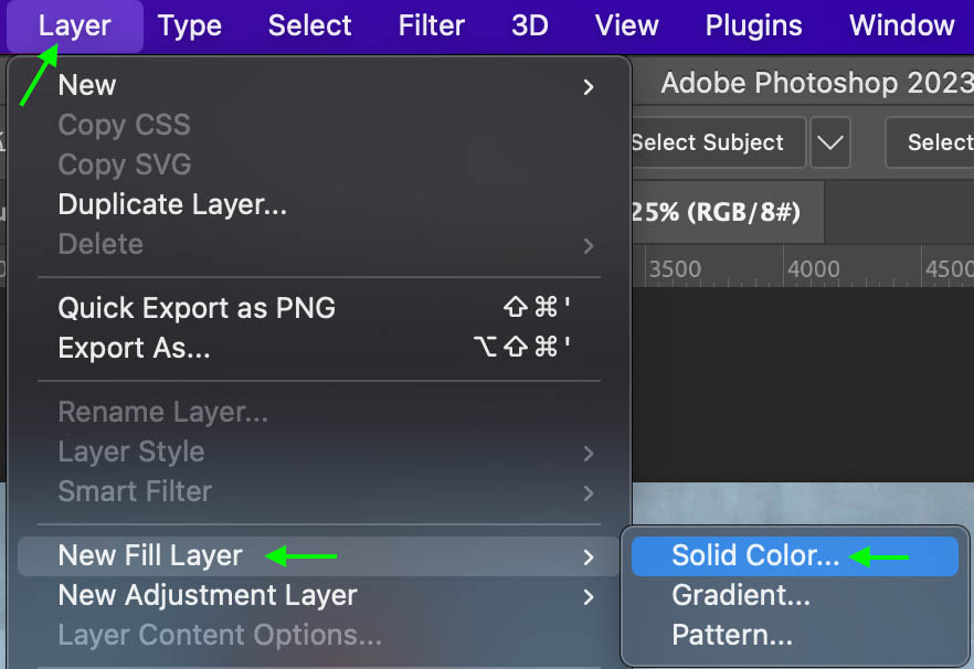
Now, head to Layer > New Fill Layer > Solid Color.
Name your layer if you’d like, and click OK.
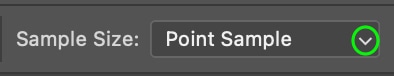
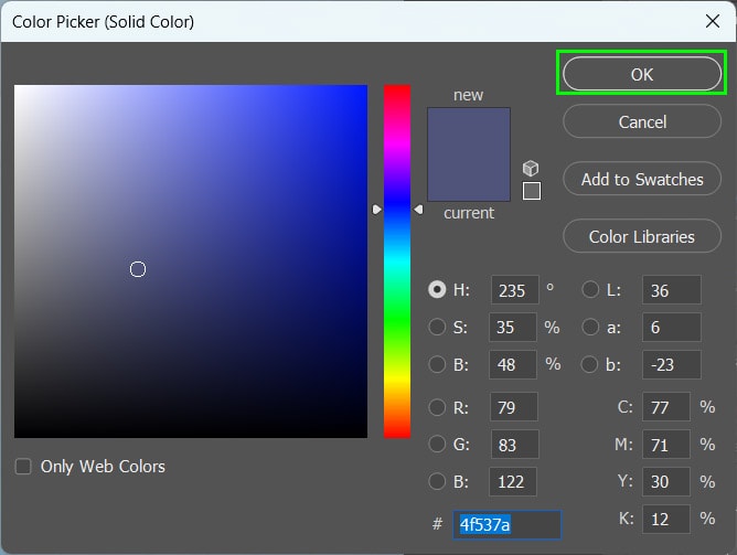
Step 3: Set The Sample Size
The Color Picker window appears. Leave it open and look at the Options Bar.
In the Options bar, make sure the Sample Size is set to 31 by 31 or 51 by 51 Average, as these options will average out the color of a broader sample size rather than only matching the color to the single pixel that you clicked (which may appear less accurate).
Step 4: Sample The Area
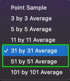
Then, click the area of the image you’d like to sample the color from. For my example, I’ll sample the navy half of the man’s shirt.
The top half of the shirt will then change to match the top. It won’t look realistic yet, but we’ll fix that in the next step.
Click OK in the Color Picker window.
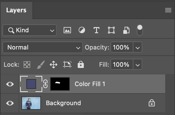
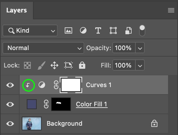
You’ll see the new Color Fill Layer above the image in the Layers Panel.
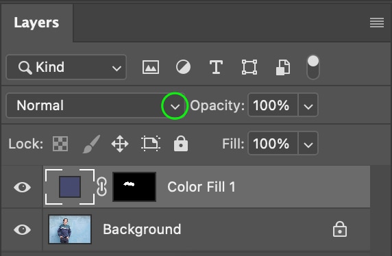
Step 5: Set The Layer Blending Mode
Now, click the blending mode drop-down menu in the Layers Panel, scroll to the bottom, and select Color.
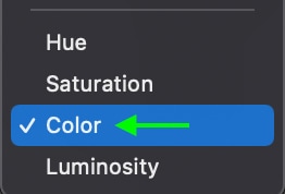
The appearance of the color will change to match the texture of the original area.
(Optional) Step 6: Add Curves Adjustment Layer
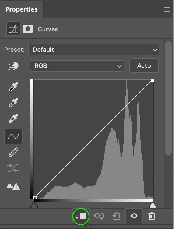
To further adjust the color to appear the same as the sample area, you can add a Curves Adjustment Layer by clicking the Curves icon in the Adjustment Panel.
In the Properties Panel, you’ll see the Curve. Click the icon on the bottom of the panel to add a Clipping Mask so that the curve adjustments are only applied to the area you edited with the Color Fill.
In the Layers Panel, you’ll see the icon showing the clipping mask pointing down from the Curves Layer to the Fill Layer.
You can then adjust the curves to match the original color further.
This results in a slightly more similar match to the sample color.