
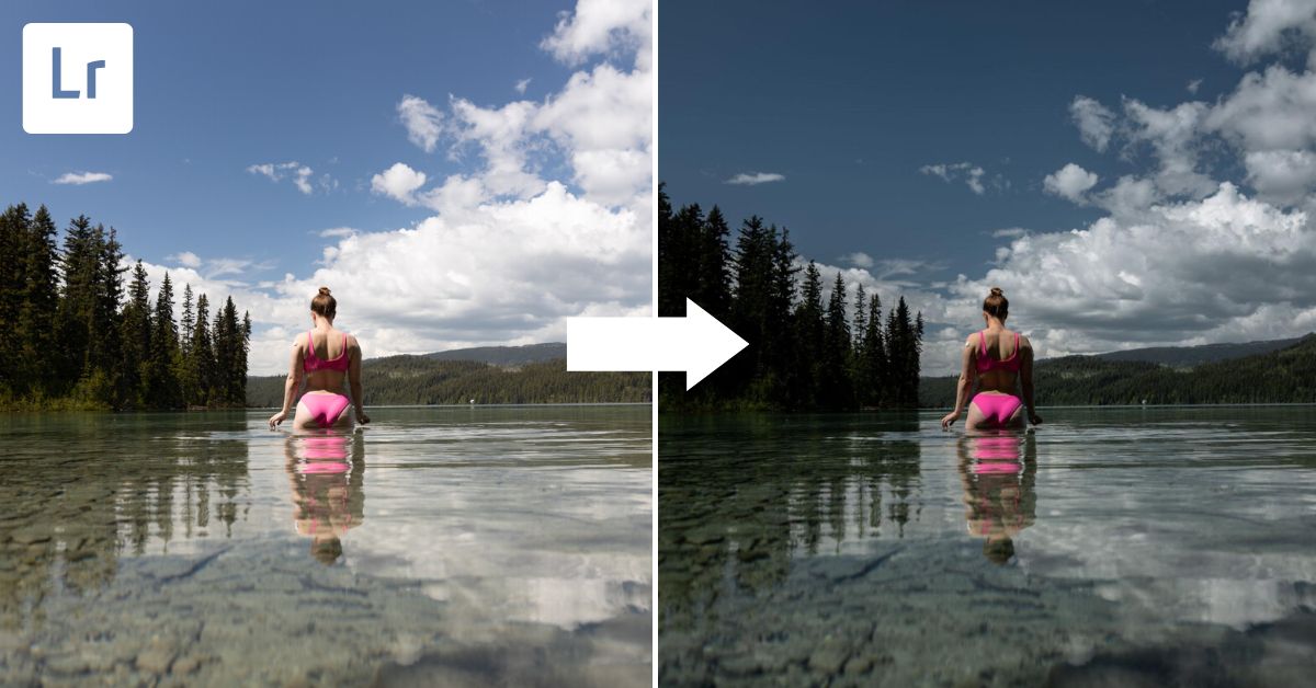

Some photographs work best with some darkness, so knowing how to create a dark and moody look in Lightroom becomes pretty important! The dark and moody look relies on properly adjusting your photo’s whites, blacks, highlights, shadows, and overall exposure. Once that is done, you will want to adjust the hue, saturation, and luminance panel to make sure your photo’s colors align with this moody look.
So, open your desired image, and let’s get to work!


Video Tutorial
How To Make An Image Dark And Moody In Lightroom
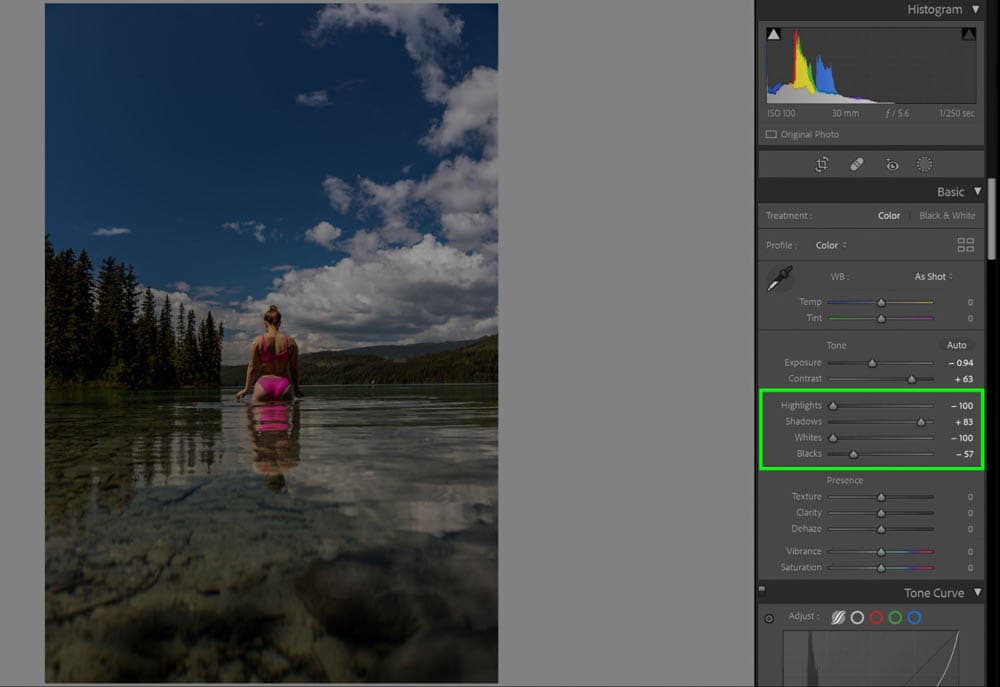
Step 1: Pull Down The Highlights And Whites Sliders To -100 To Mute The Whites
When in the Develop module, first mute your whites. In the Basic panel, locate the Highlights and Whites sliders and pull them down to -100. This ensures that the brightest part of your image does not contrast with the darkest parts.
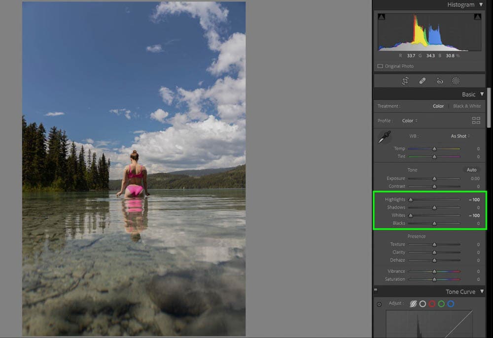
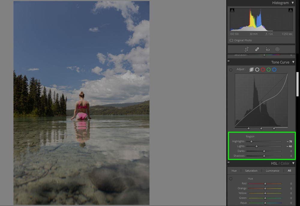
If you find that there are still some bright spots left in your image, you can scroll down to the Tone Curve panel. In the Tone Curve, locate the Highlights and Lights sliders and start pulling them down. Although you can grab the Tone Curve chart and play with the diagonal line, using the sliders is much easier.
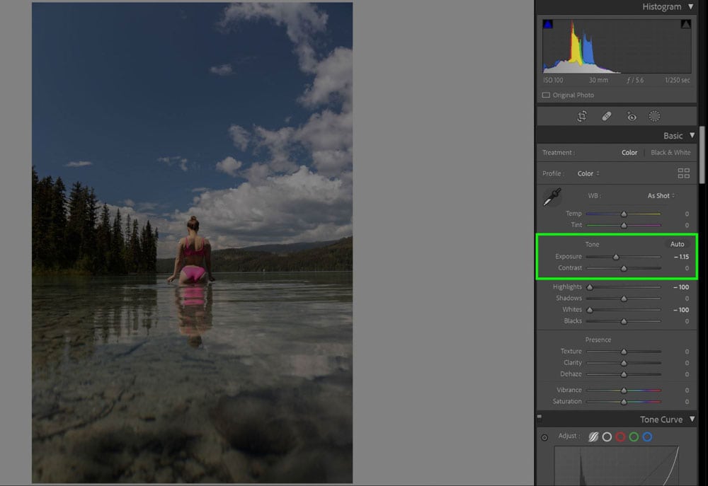
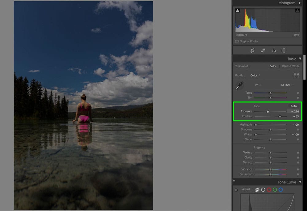
Step 2: Pull The Exposure Slider To The Left To Darken
Grab the Exposure slider in the Basics panel and start darkening the image. I suggest doing this after adjusting the whites so you don’t over-darken the image. You want to be left with an image in which you can still see all of the details of the shot, but it is overall much darker in appearance.
Step 3: Move The Contrast Slider To The Right To Add More Contrast
Much of the dark and moody look is due to how contrasted the blacks in the image are. I pulled the Contrast slider to the right, adding more contrast. In doing so, my image got a little too dark, so I jumped back to the Exposure slider and pulled it to the right (lightening the image) just slightly to balance.
Step 4: Pull The Blacks Slider To The Left And The Shadows Slider To The Right
Take your Blacks slider and pull to the left. In doing so, I am losing some of the detail in the trees on the left-hand side of the screen. If this happens to you, you can remedy this by taking your Shadows slider and pulling it to the right, making your shadows lighter.
Step 5: Add A Cooler Color Temperature (Optional)
For the dark and moody look, your white balance needs to be cold. If needed, take the Temperature slider and cool the image off by moving it left.

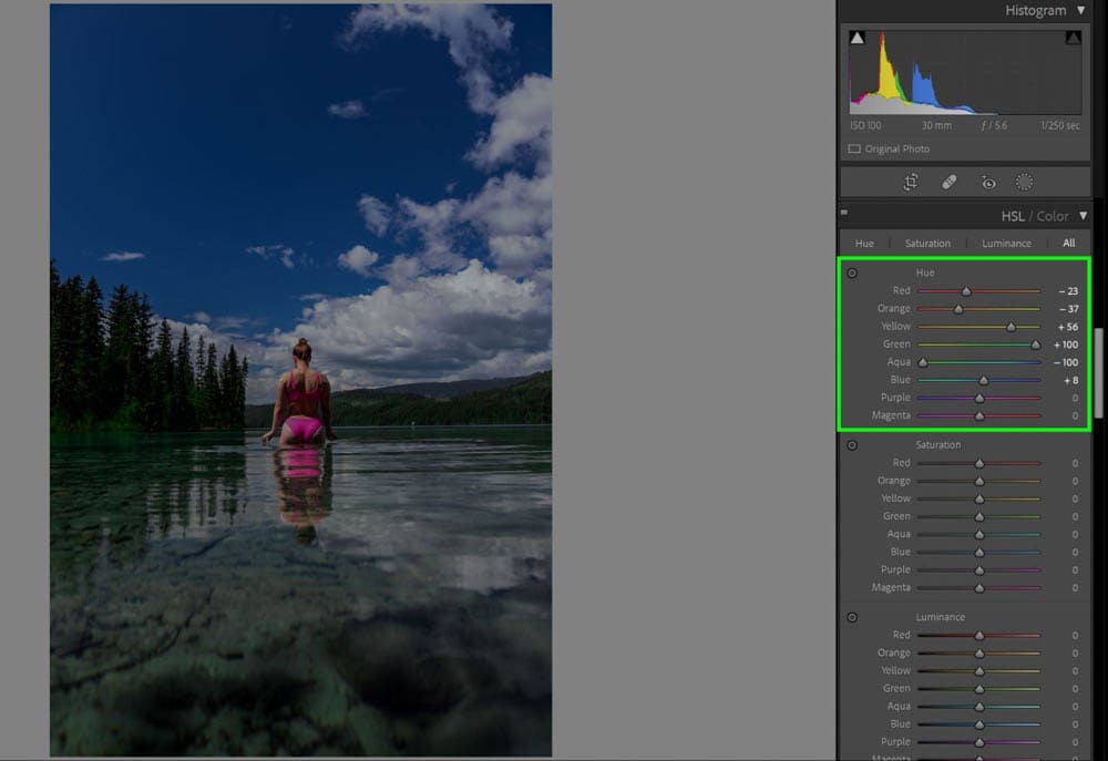
Step 6: Make Adjustments In The HSL Color Panel
Your most significant changes will be noticeable after playing with the Hue / Saturation / Luminance (HSL) Color Panel. Every color in your image will be isolated and fully adjustable via their sliders independent of one another.
– Hue
Hue refers to how the colors themselves look. For my image here, I’m trying to make sure the colors are as deep in their true color as possible. As such, the Green slider is pulled all the way to the right to become a deeper green, the Blue slider is made to be a richer blue, and the Orange slider is much more orange. Because the program picked up yellows in the trees, I took the Yellow slider to the right to make the trees even greener.
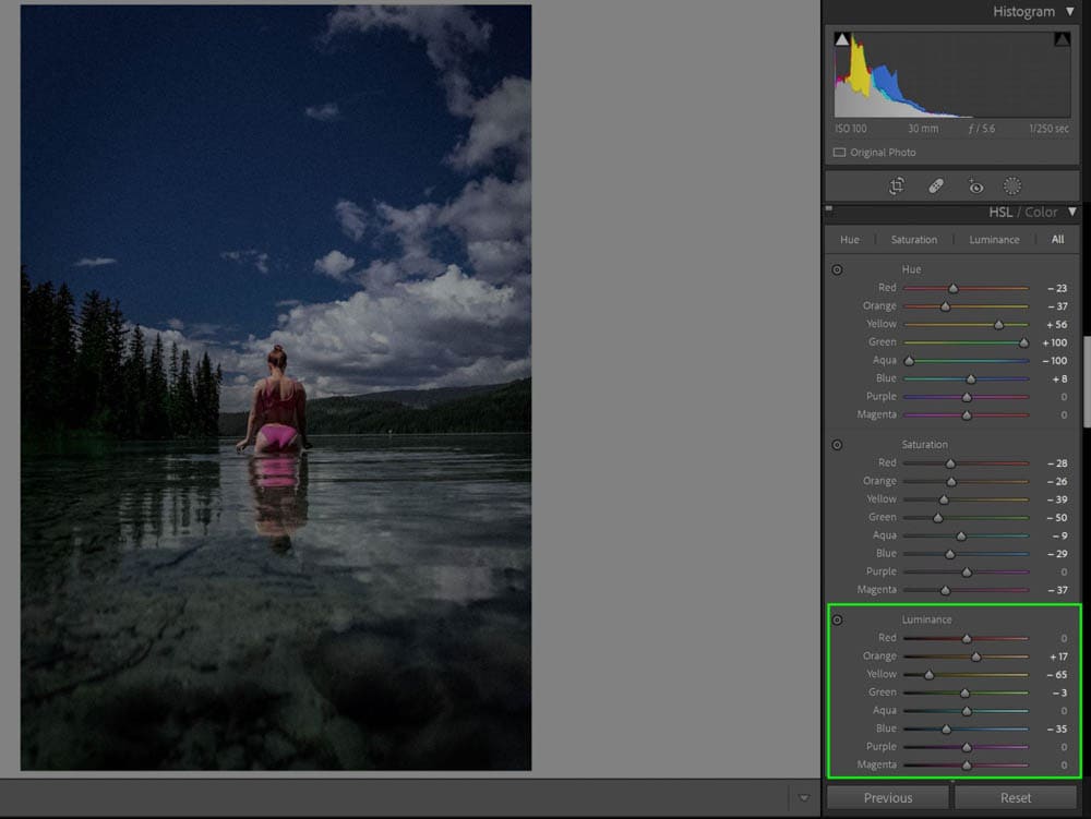
– Saturation
Saturation is how pure a color is. I suggest looking at your image and picking out the colors that stand out the most as super vibrant and lower their saturation.

– Luminance
Luminance is how dark or light an individual color is. In this case, I pulled the Yellow and Blue down because they were way too bright and stood out too much.
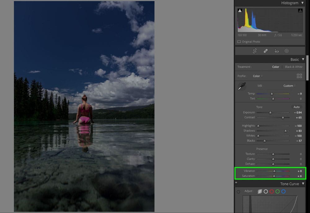
Step 7: Adjust Saturation And Vibrance (Optional)
If you feel the image is still too muted or not muted enough, you can pull the overall Vibrance and Saturation sliders in the Basic Panel to impact the image globally.
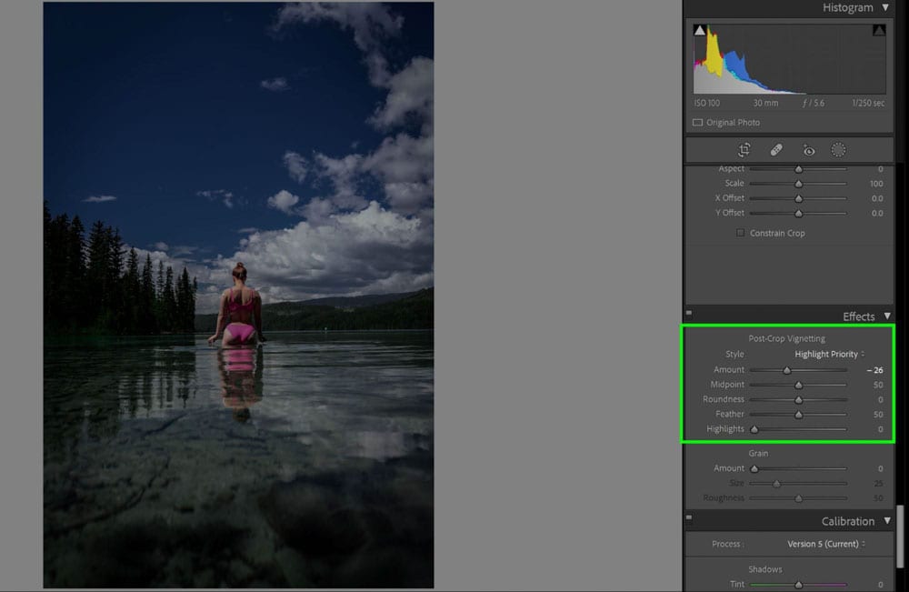
Step 8: Add Vignette In The Effects Panel (Optional)
If you have a more centered composition, using a vignette can help bring attention to the center of the image. Pull the Vignette slider to the left in the Effects panel to darken your edges with black.
A dark and moody look definitely makes your images feel mysterious and intriguing, and as you can see, it’s not difficult to achieve!
