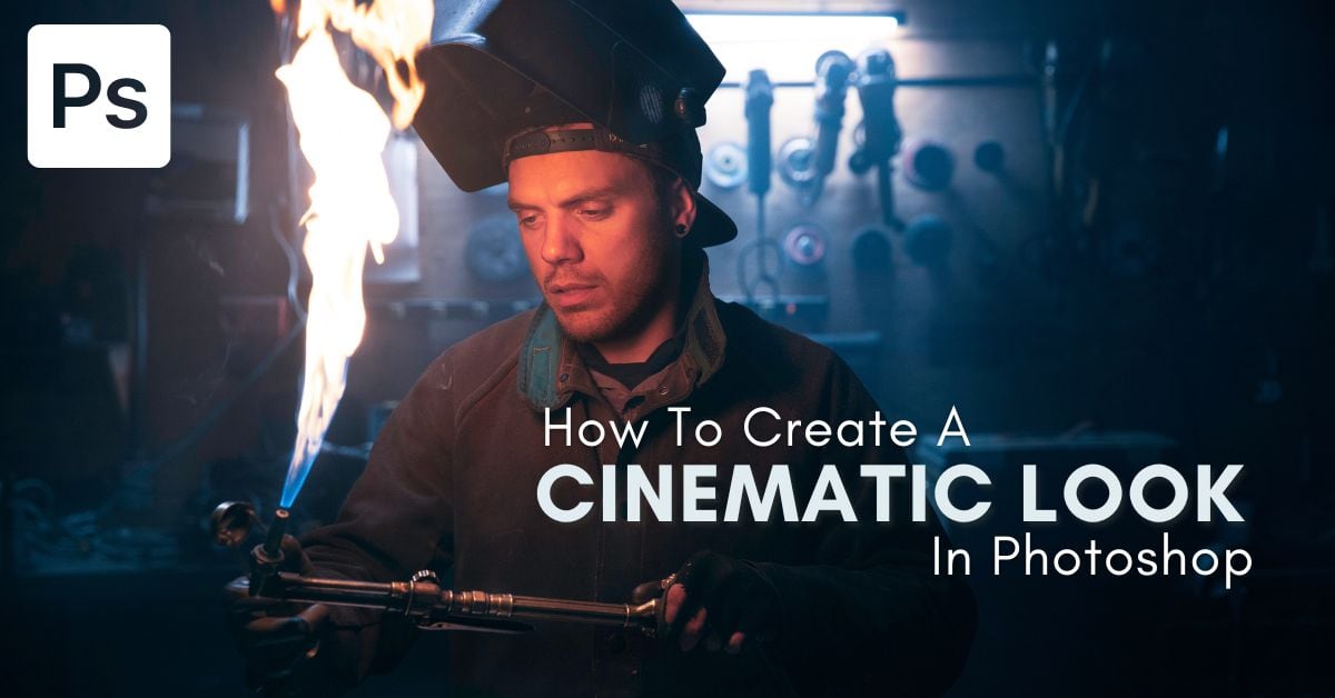

If you want your images to have the rich colors and contrast of your favorite blockbuster movies, the cinematic editing style will do just the trick. In Photoshop, there are a few simple color grading tools to create this effect that make the process both simple and highly customizable. Whether you want a classic blue and teal look like Michael Bay, or want a more blended cinematic look, it’s possible with the following adjustments.
For this example, I want to create a classic blue and yellow color grading style. However, if you are looking for a different color grading effect, follow the same steps except adjust the sliders to suit your preferred colors instead.
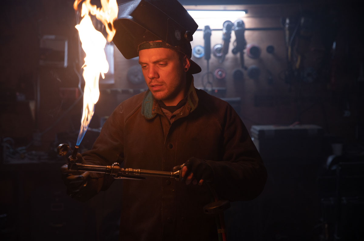
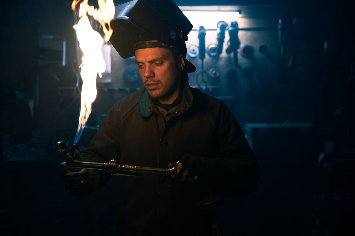
Here’s the image I will be working with for this example:
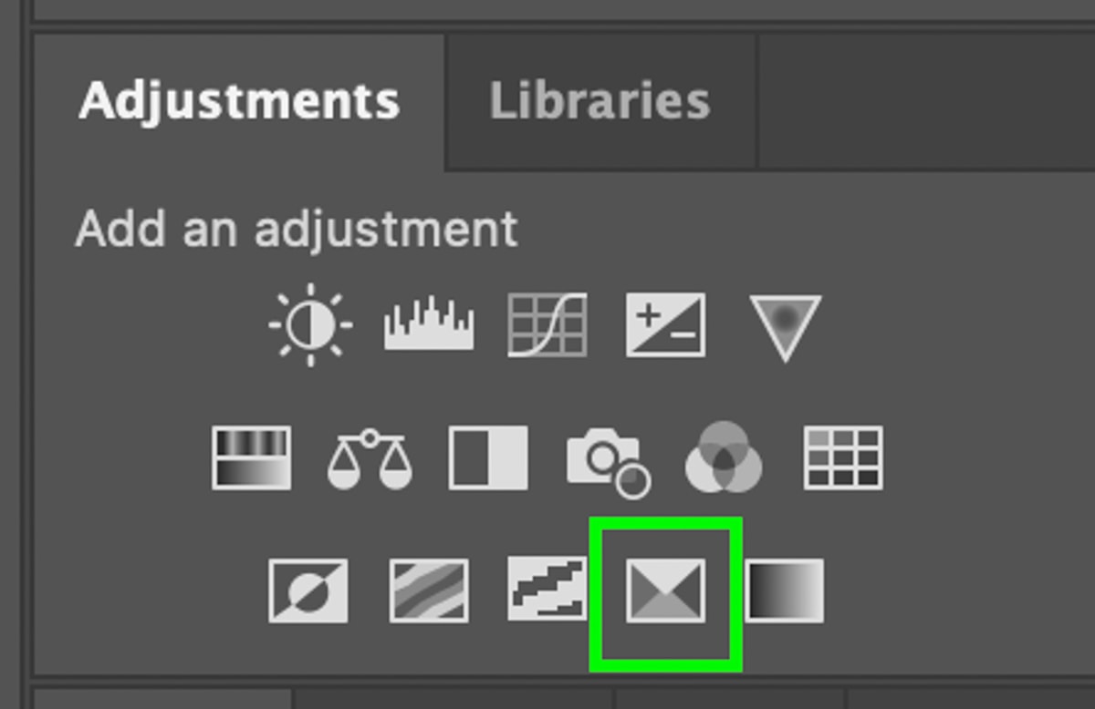
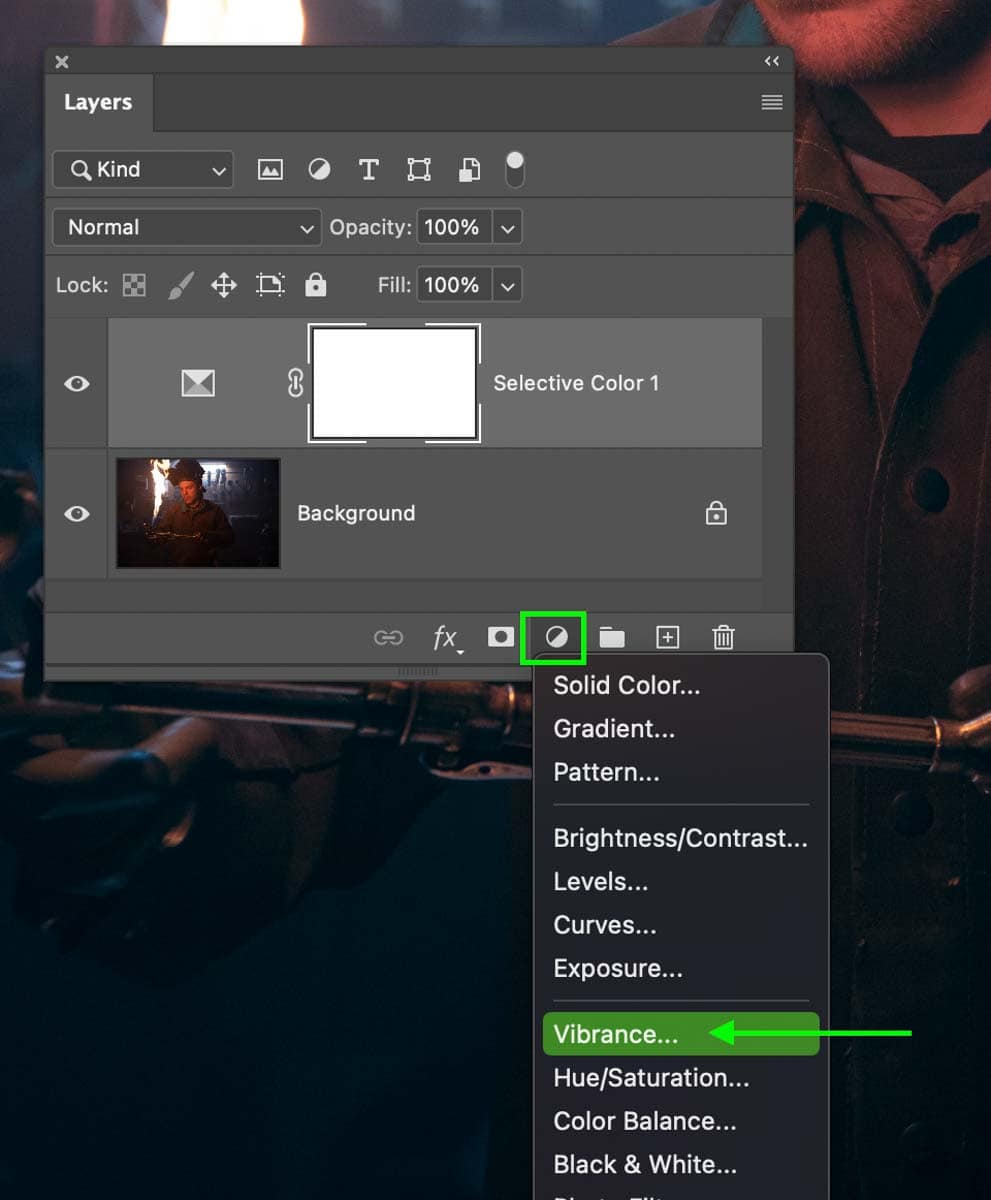
Step 1: Create A Selective Color Adjustment Layer
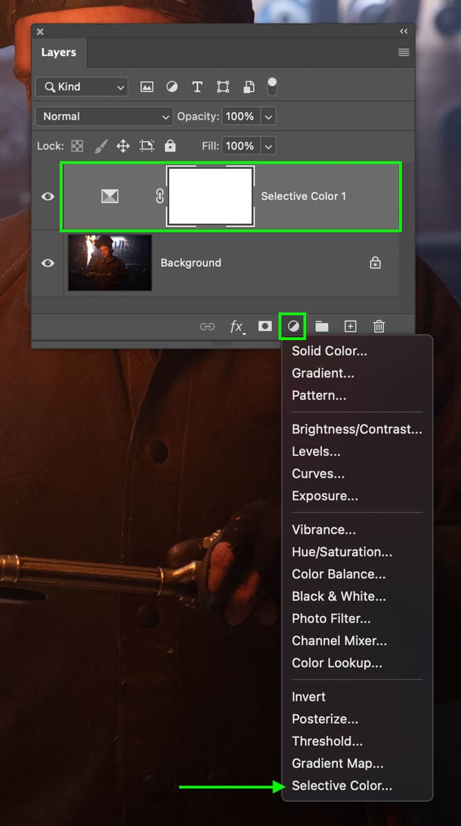
Once your image is opened in Photoshop, create a new Selective Color adjustment layer. You can do this via the Adjustments Panel or by clicking and holding on the adjustment layer icon at the bottom of the Layers panel.
This adjustment layer is great for adding specific color hues to different tonal ranges in your photo. Unlike other adjustments like Curves, Levels, or Hue Saturation, this adjustment is far easier to control for this type of editing style.
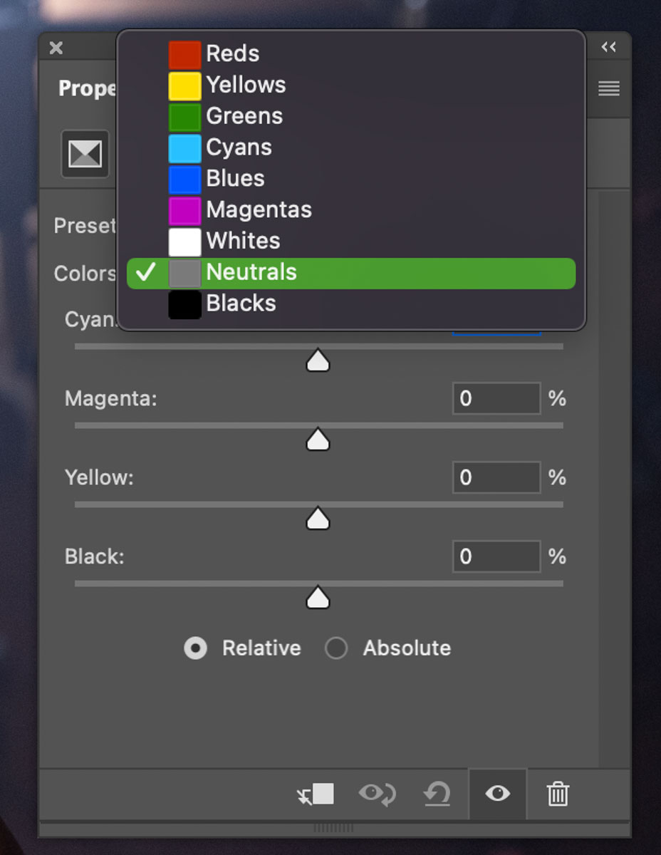
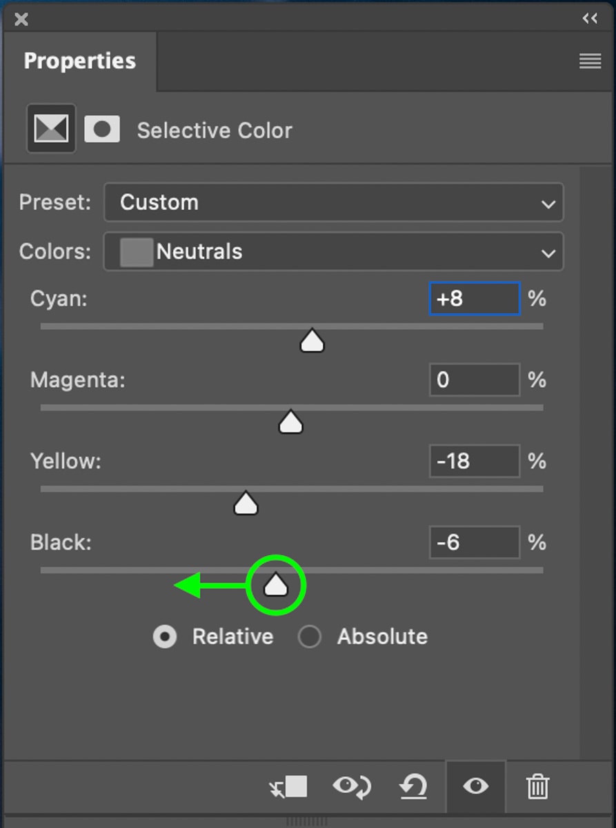
Step 2: Adjust The Neutrals To Favor A Blue Hue
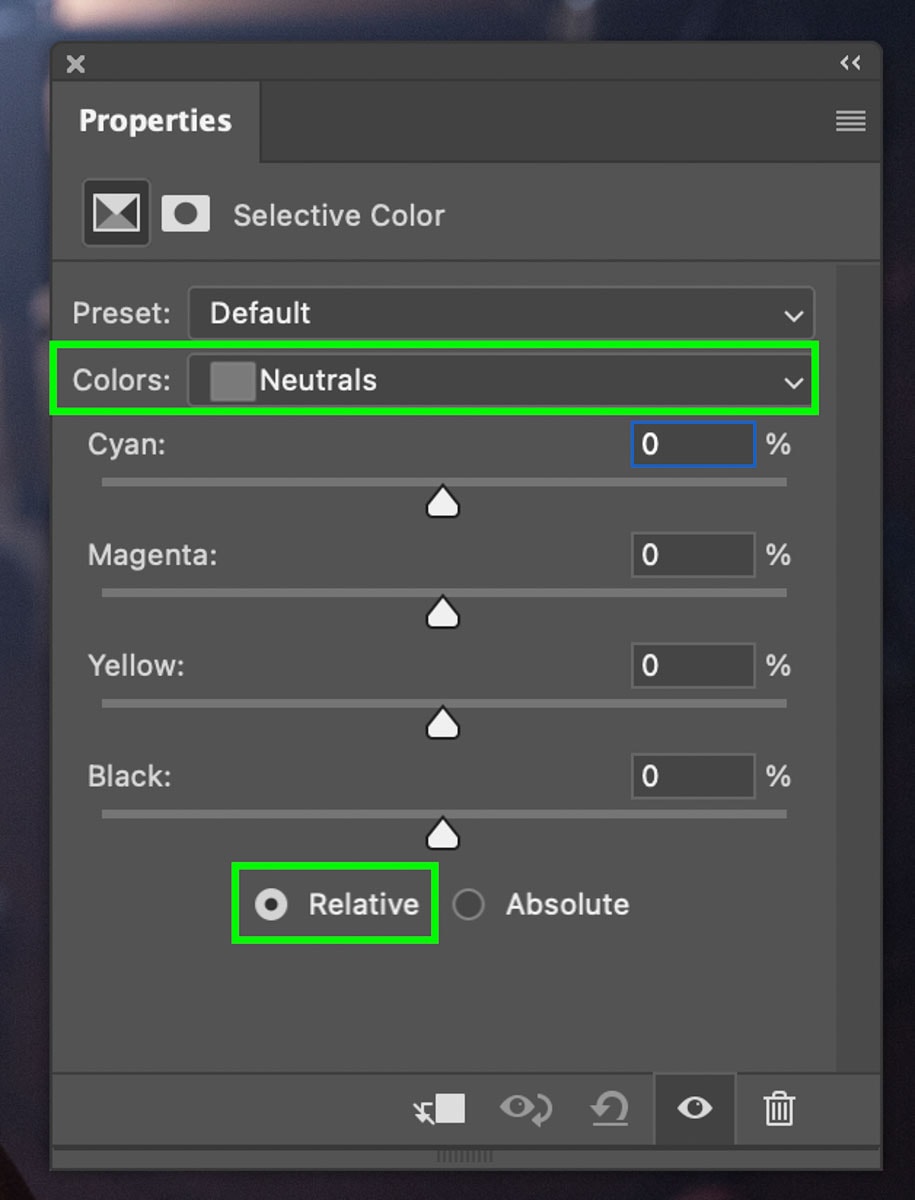
Within the Selective Color’s properties panel, click on the color channel and set this to Neutral. This color channel is the best starting point since it adds a more even color grade to all the exposure ranges. Once this is set, it’s easier to touch up the blacks and whites color channels to refine the look. Be sure Relative is also selected to make your color adjustments blend better.
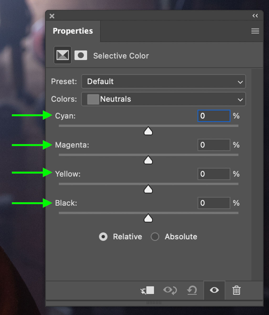
Once selected, you will notice four sliders called Cyan, Magenta, Yellow, and Black. Moving these sliders right will add the color that the slider is named. For example, moving the Cyan slider right will add more cyan to your image.
Now when you move the slider left, it will add the opposite color. To make this easy, let’s break it down based on which way you move the slider:
- Cyan (right), red (left)
- Magenta (right), green (left)
- Yellow (right), blue (left)
- Black (right), white (left)
With this in mind, you can better tell which colors are being applied to the image as you move each slider left or right. As for the Blacks slider, increasing the blacks will make the image appear darker while reducing the blacks will lighten the selected color channel.
Since I want this image to have the blue and yellow color grading, I will start by decreasing the yellows and increasing the cyan slider. This will add more blue and cyan into the image to reduce the overly warm look the image started with.
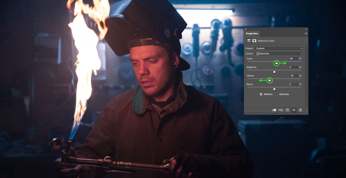
You can then reduce the Blacks slider slightly to create a subtle matte look that’s commonly seen with cinematic color grading styles.
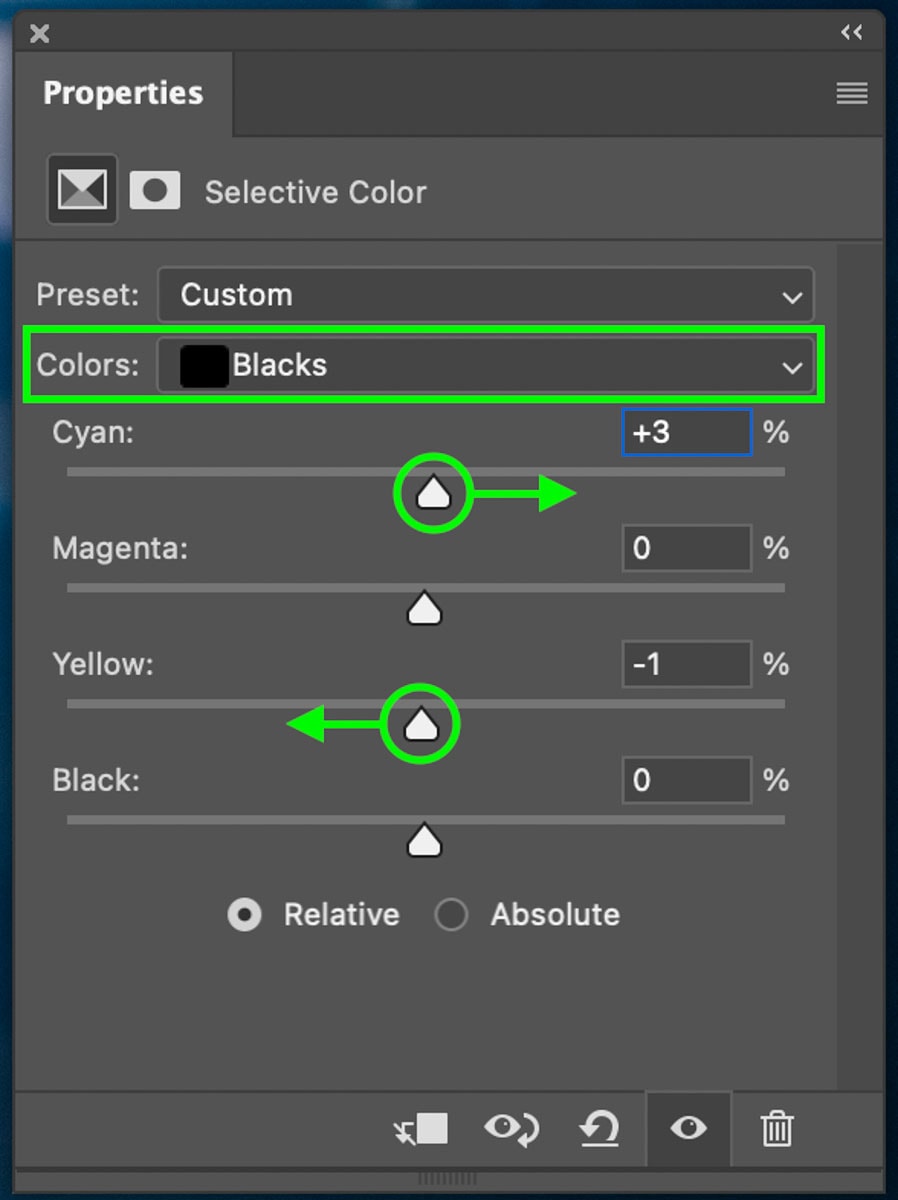
Step 3: Adjust The Blacks To Favor A Cyan Hue
At this point, the majority of the blue has been added, but you can improve it further within the Blacks color channel.
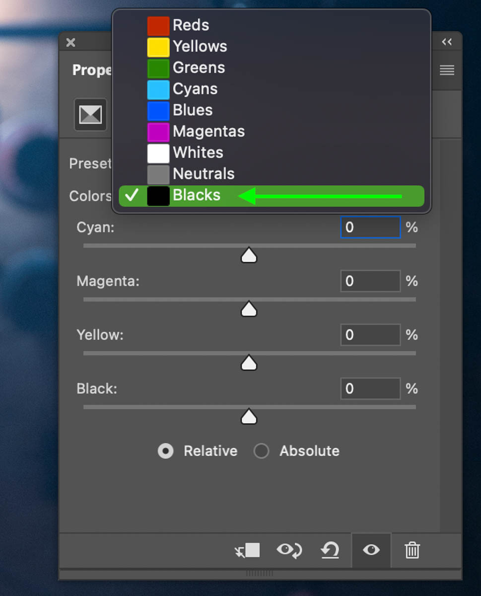
Once the Blacks color channel is selected, decrease the yellows slider slightly while increasing the cyan slightly too. This will give your colors a more rich appearance to enhance the adjustments made in the previous step.
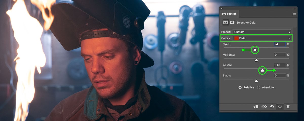
Step 4: Correct The Skin Tones With The Red & Yellow Channels
After adding the main color to your photo (in this case, blue), it’s not uncommon for the skin tones to appear washed out or discolored. Luckily you can fix that by switching to the Reds and Yellow color channels.
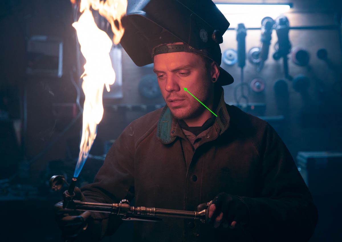
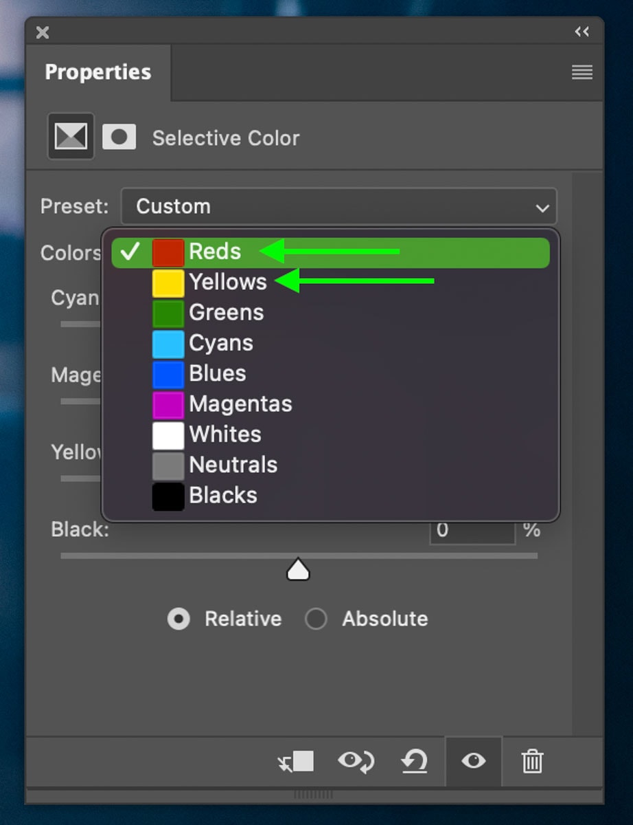
Starting in the Reds channel, add yellow by increasing the yellows slider. Then add a hint of red by decreasing the cyan slider.
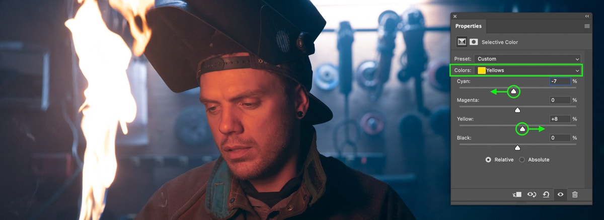
Now that there’s a bit more color added back to the subject’s skin let’s move on to the Yellows channel.
Similar to before, but now in the Yellows channel, add yellow and red as needed to restore the skin color of your subject. The amounts you use will depend on the lighting in your scene. Since my subject is near a flame, his skin tone will naturally be more red than normal due to him being lit by the flame.
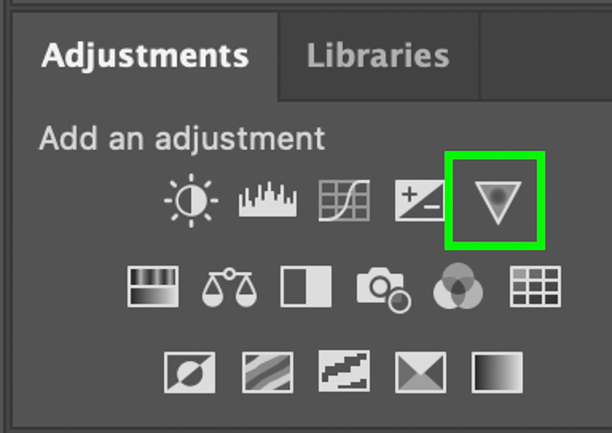
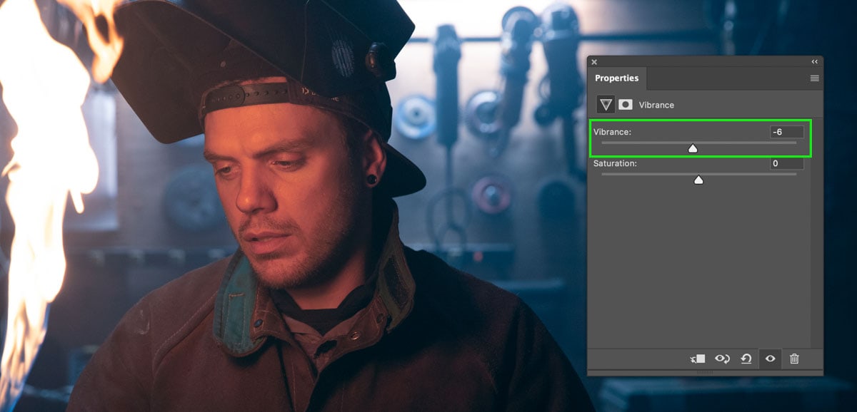
Step 5: Increase Vibrance With A Vibrance Adjustment Layer
Now the primary color grading adjustments are complete for this cinematic look. However, you can take it one step further using a Vibrance adjustment layer.
You can create a Vibrance adjustment layer via the Adjustments Panel or by selecting the adjustments icon at the bottom of the Layers panel.
Once created, increase the vibrance slider to your desired amount to make the colors appear richer. Of course, if you find your colors looking too intense after the previous adjustments, you could also decrease the vibrance to suit your preferred style. In my example, I slightly decreased the vibrance.
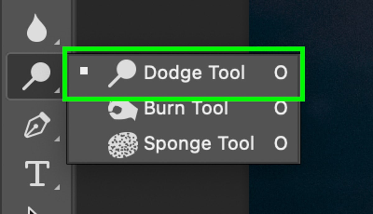
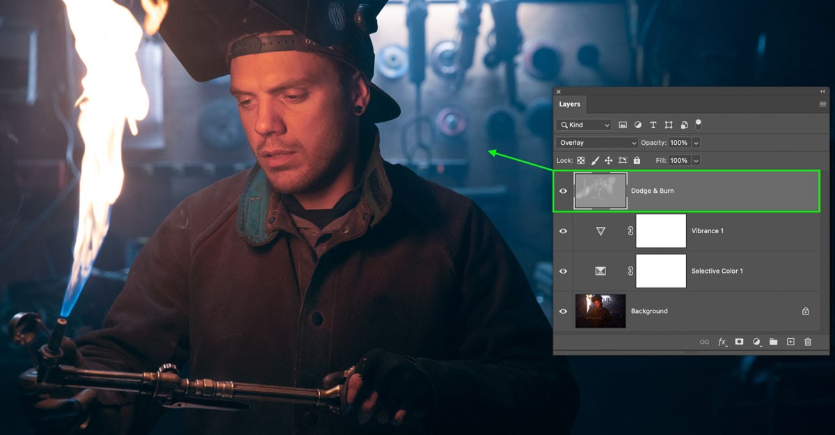
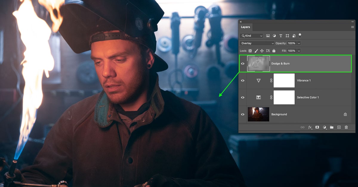
Step 6: Dodge & Burn To Finalize The Cinematic Look
To finish your cinematic edit in Photoshop, dodging and burning helps to add more drama to the image and make certain elements pop. Let’s start by selecting the Dodge Tool (O) to lighten parts of the image selectively.
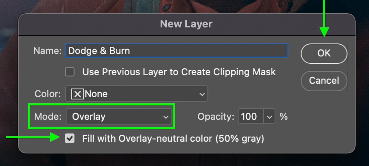
To dodge and burn the photo non-destructively, you need to create a 50% gray layer. To do this, press Command + Shift + N (Mac) or Control + Shift + N (Win) to open the new layer dialogue box. Now set the Mode to Overlay and check the box saying overlay-neutral color, and click OK to create the 50% gray layer.
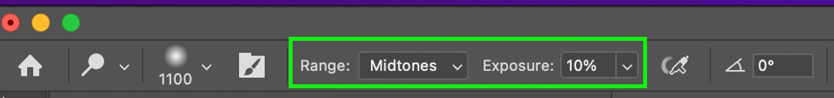
Now with your 50% gray layer selected, you need to adjust your tool settings. Set the Range to Midtones and the Exposure to 10% to begin. I would also suggest using a soft brush at 100% feather for the most blended dodging results.
With everything in order, begin painting over the areas you wish to brighten. I like to dodge any areas that mark a point of interest or are key areas around my subject. In this case, I will dodge the torch, his color, hat clasp, and some of the background tools.
If the effect is too subtle, you can paint over the same area multiple times to enhance the adjustment.
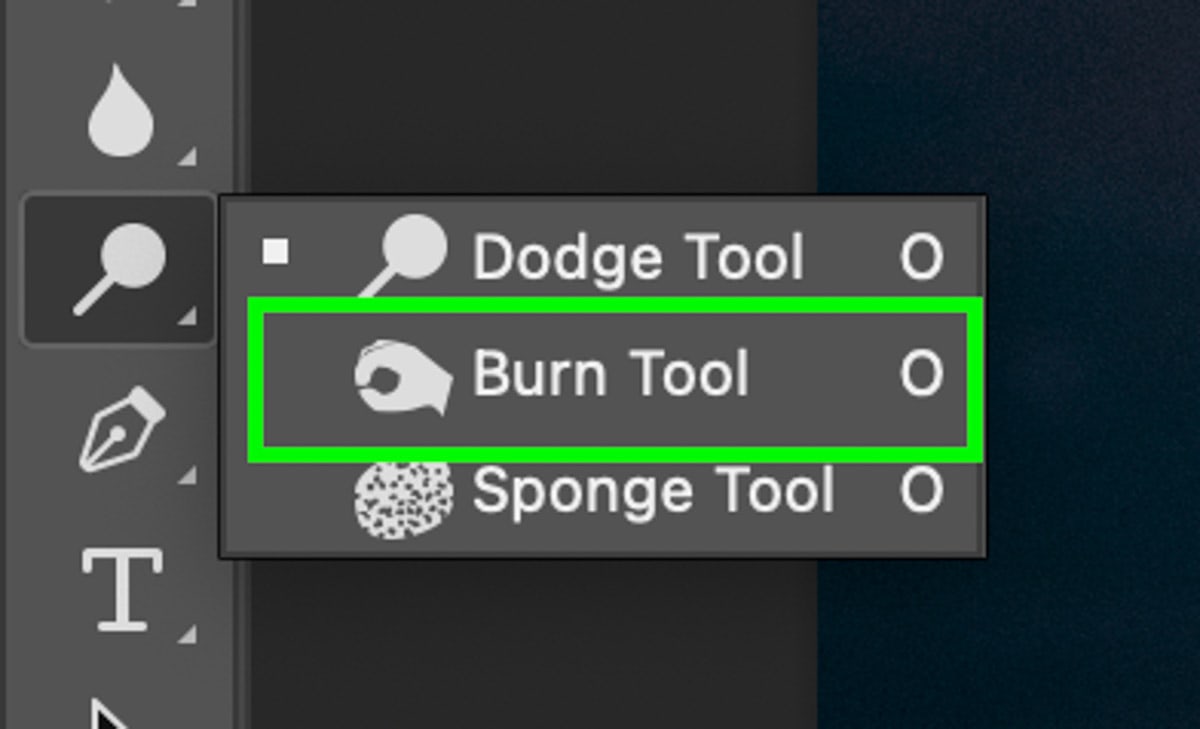
Once the dodging is complete, select the Burn Tool by clicking and holding on the Dodge Tool icon. Select the Burn Tool from the fly-out tool menu that appears.
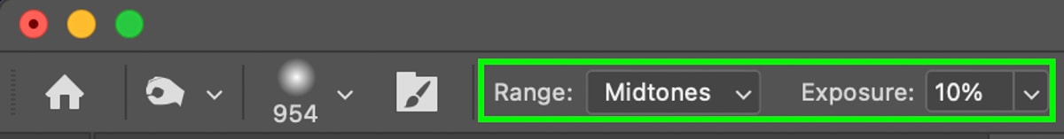
Similar to before, set the Range to Midtones and the Exposure to 10%. You can also keep the same soft brush settings used previously.
Now with your 50% gray layer still selected, paint around the edges of the image to create a subtle vignette look. Then paint around any areas you recently dodged to make the dodging effects pop even more.
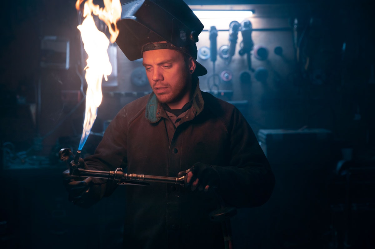
After your dodging and burning edits are complete, you are left with an awesome cinematic color grading effect done completely in Photoshop!
The Result
An Additional Way Of Creating Cinematic Color In Photoshop
The previous techniques are a great go-to method that doesn’t require much effort beyond moving a few sliders. However, there is a slightly more advanced way to create (or add to) a cinematic editing style called Gradient Maps.
Gradient maps apply specific color hues of your choosing to the shadows, mid-tones, and highlights. This makes it easy to get specific color grading looks simply by using the specific color values you choose.
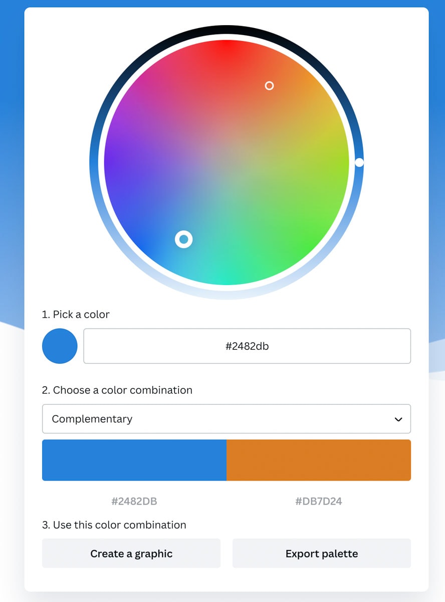
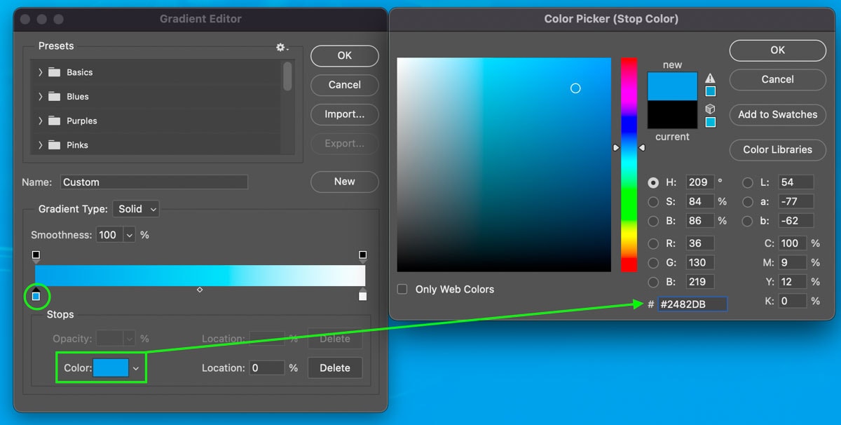
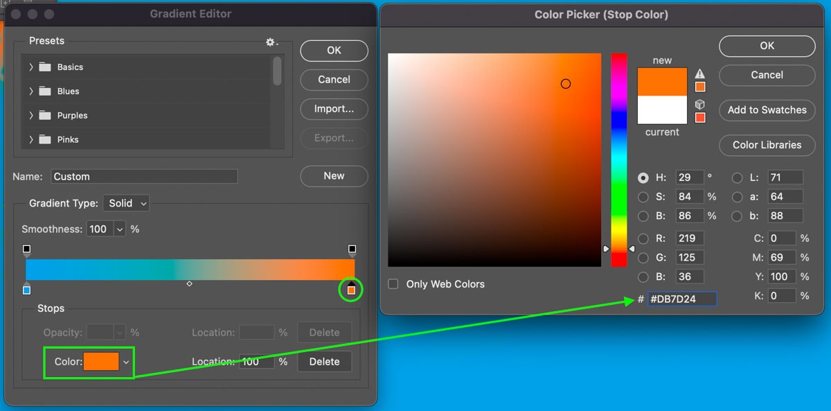
Now to get these color values, you can sample them from your favorite movie or use a complementary color wheel. I suggest the Canva Color Wheel with the mode set complimentary. This will give you two color swatches that complement one another to use in your gradient map.
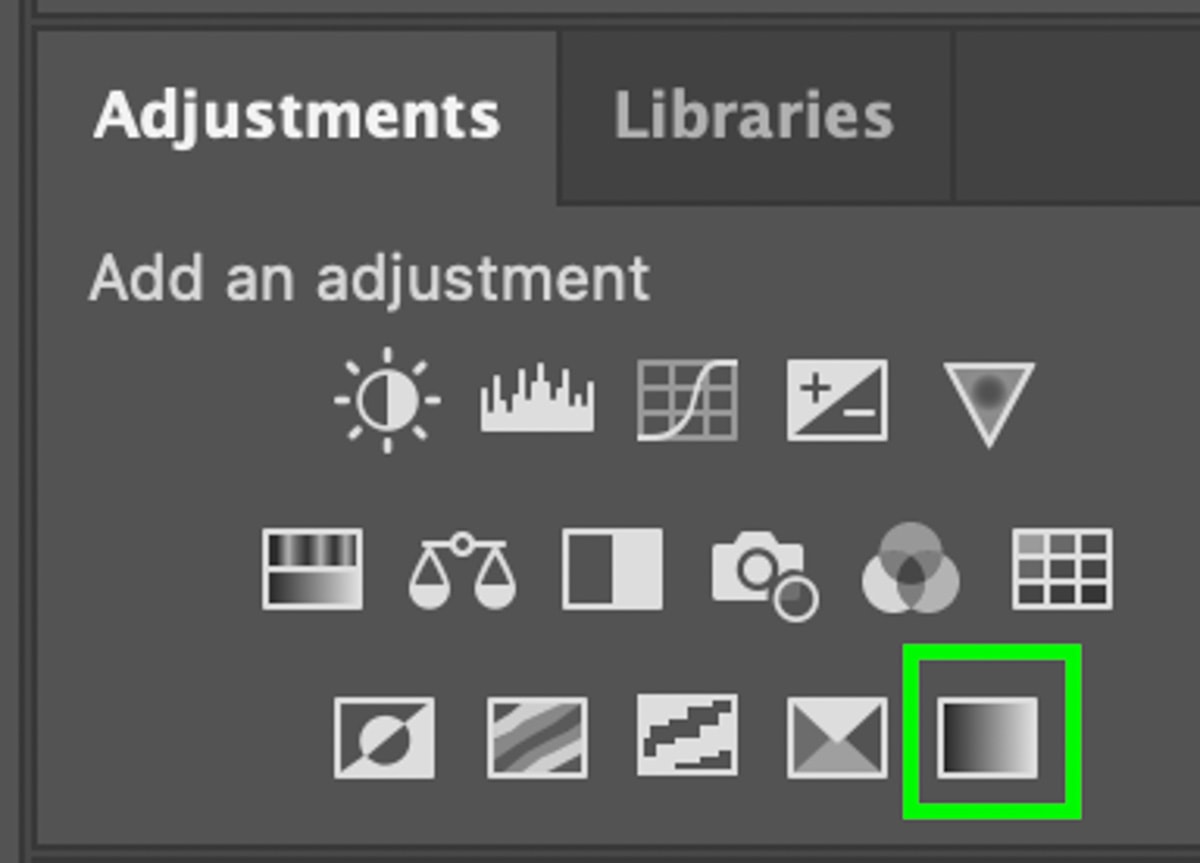
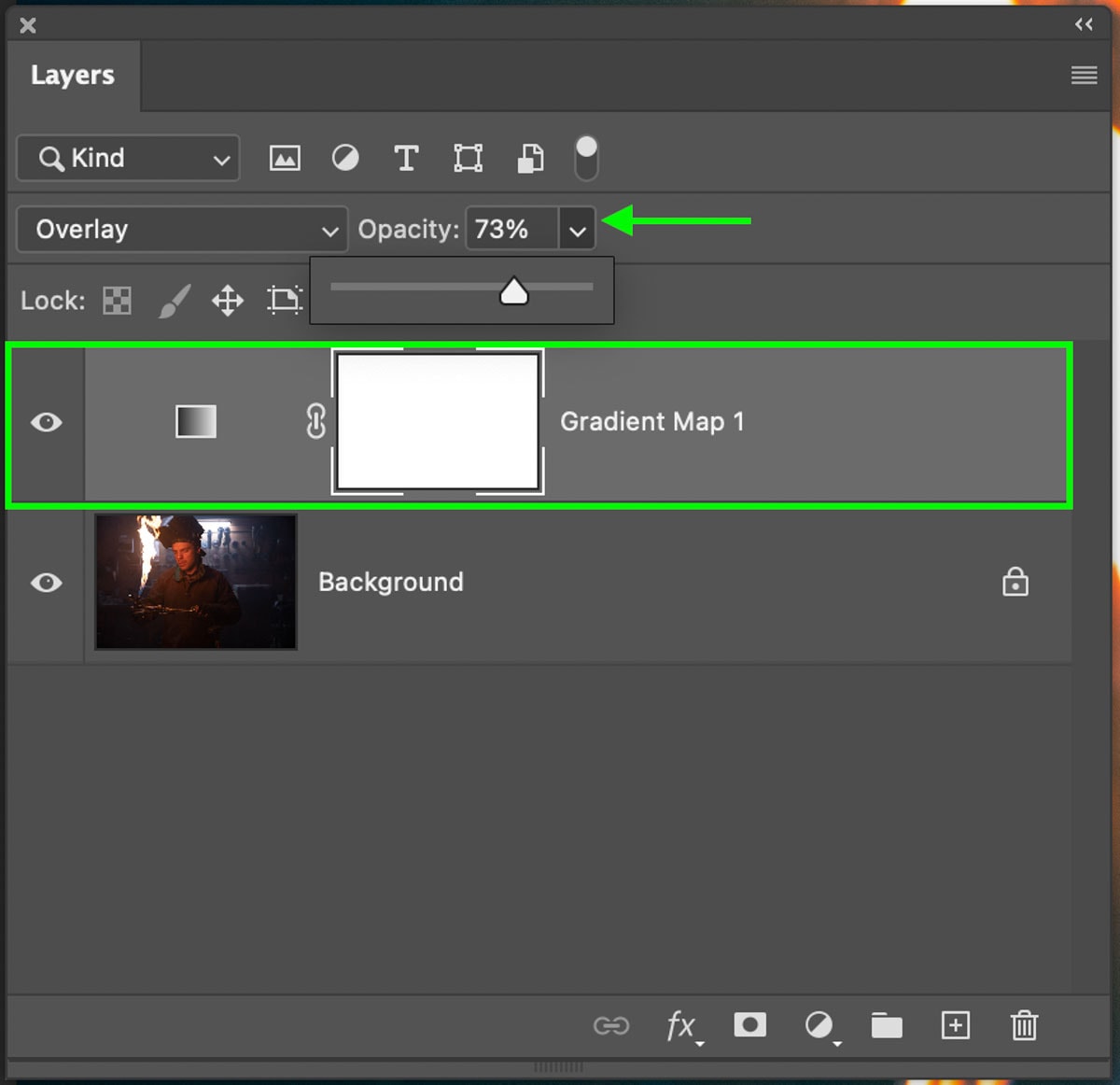
With your colors chosen, create a new Gradient Map adjustment layer via the Adjustments Panel or at the bottom of the Layers panel.
Then click on the gradient to open the gradient editor. I won’t be diving much into the details of the gradient editor in this tutorial, but if you are unsure how it works, check out my other tutorial on creating gradients in Photoshop.
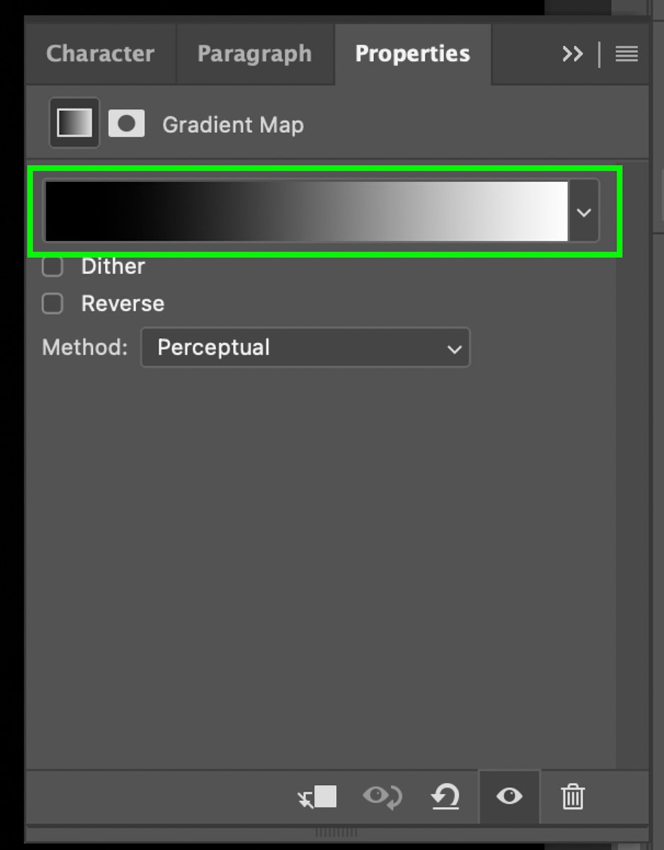
But in a nutshell, you just need to click on the color swatches in your gradient and add the sampled color from your color wheel into the HEX code of the color picker.
Once complete, select the Gradient Map adjustment layer and set the blend mode from Normal to Overlay.
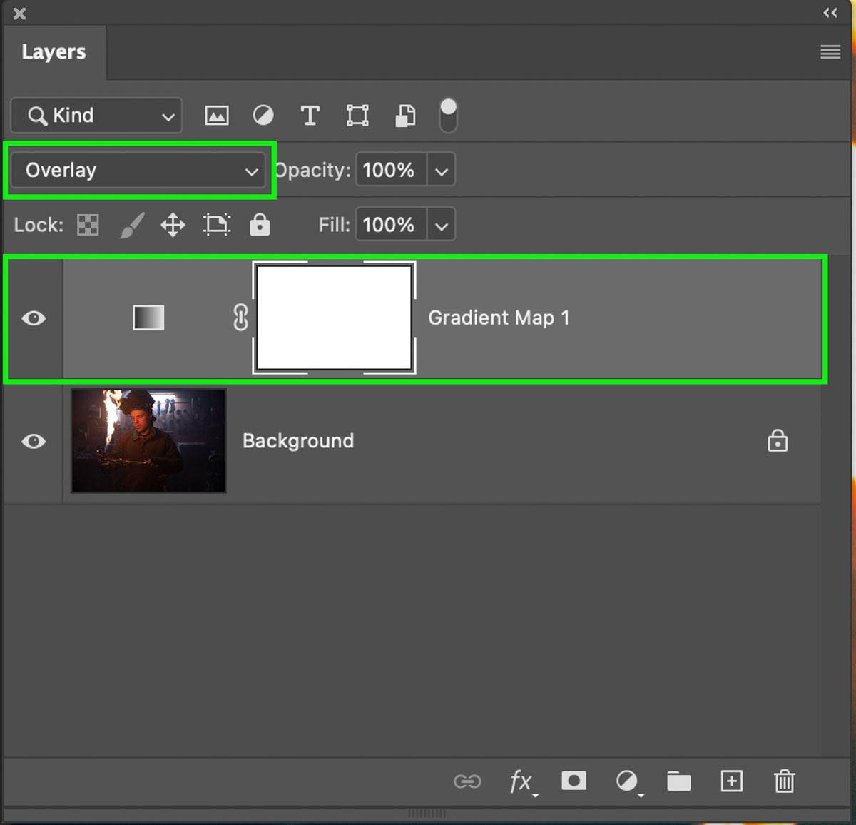
If the effect is too intense, you can reduce the opacity of the adjustment layer within the Layers panel.
However, if the colors are too overwhelming, I would suggest reopening the gradient editor and desaturating your selected colors. Often time a more desaturated color will give you the cinematic color grade effect you’re looking for without totally overwhelming your image.
This is a great additional technique that can be used on its own or alongside the previous steps outlined earlier in this tutorial. It just ultimately depends on how intense you want your cinematic color effect to appear in your final edit!
Still Feeling Confused By Photoshop?
If you’re new to Photoshop or have just started to edit your photos in the program, it can feel pretty overwhelming. After a decade of using Photoshop myself in photography and design work, I realized there are six essential skills everyone should know about in the program. So to help you feel more confident in the program, I outline these six techniques in my free ebook called the Photoshop Blueprint. You can click here to access it or click the button below!