
Gradient maps change the colors of images in various creative ways. In this article, you will learn how this adjustment layer works and how to use gradient maps in Photoshop correctly. The key to creating a good gradient map is blending the colors into the image using opacity and blend modes. Luckily, it’s all very simple to do!
Video Tutorial
How To Create A New Gradient Map In Photoshop
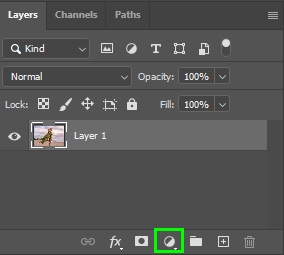
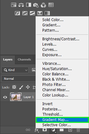
You can find the Gradient Map Adjustment Layer within the Adjustment Layers options at the bottom of the Layers Panel.
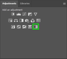
Gradient Maps also appear in the Adjustments Panel, represented by a gradient icon.
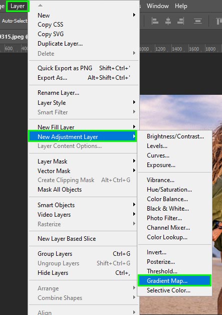
Alternatively, activate the Gradient Map Layer via Layer > New Adjustment Layer > Gradient Map.
How To Use Gradient Maps In Photoshop For Color Grading
Now that you know how to add a gradient map, I will show you how to color grade your photos in a few simple steps.
Step 1: Add A Gradient Map Adjustment Layer
When adding a gradient map, the first step is to add the adjustment layer to your image. To do this, click the Gradient Map icon in the Adjustments Panel.
Step 2: Change The Gradient Map Colors
When you add the adjustment layer, the Properties Panel pops up, containing a gradient map bar.
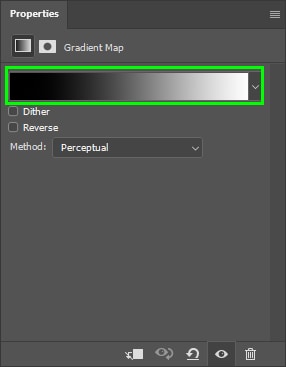
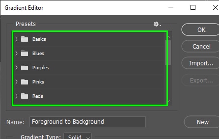
Click the gradient map bar twice to select new colors. You can find several gradient map presets within the Gradient Editor panel.
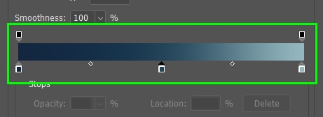
You can also create your own gradients using the gradient map bar.
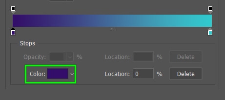
The little boxes at the bottom of the gradient bar represent the gradient colors. You can change any color by clicking its corresponding box (color stop).
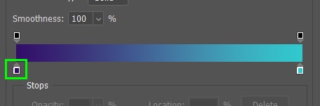
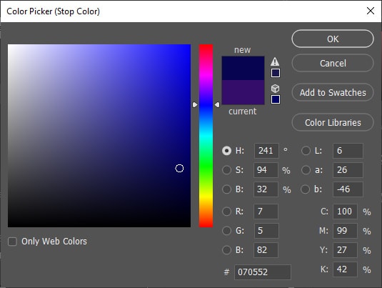
Once you click the color stop, the color swatch is enabled. You can click the swatch to open the color picker and choose any color you want for the color stop.
When choosing colors for the gradient map, opt for colors that go well together, such as complementary colors. If you can’t think of good color combinations, use an online color palette generator, such as Adobe Color.
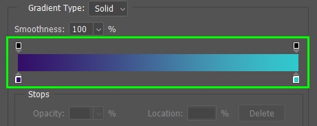
To add more colors to your gradient, click the part of the gradient to which you want to add colors. This will create a new stop.
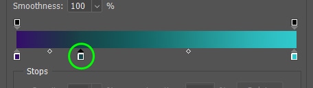
You can add as many colors as you want to your gradient map.
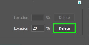
To delete a stop, select it and then click Delete at the bottom of the Gradient Editor panel.
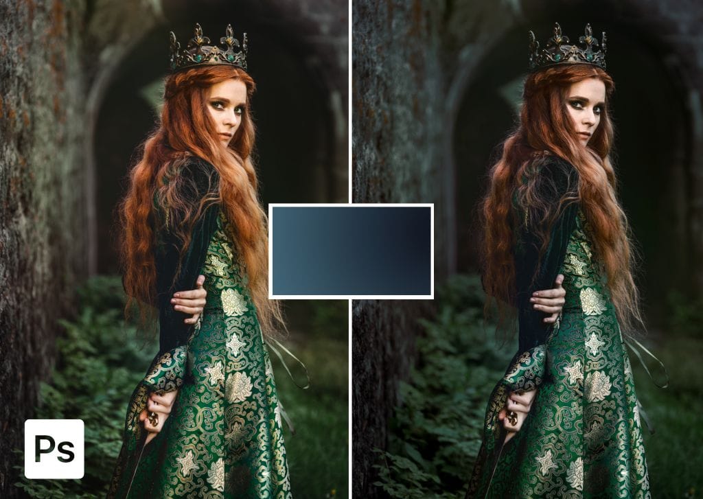
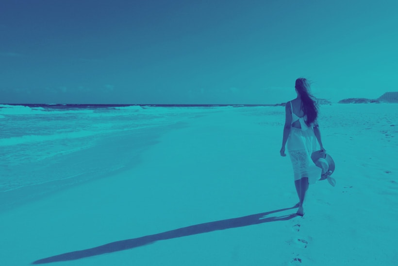
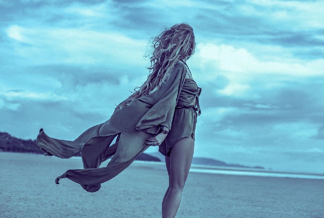
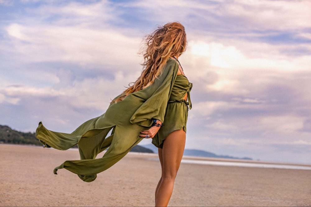
In my case, I filled the gradient bar with three colors.
In the shadows (left side), I put a darker blue tone (#122640). In the mid-tones, I put a grayish blue (#234459), and in the highlights, I put a light shade of blue (#95b8bf).
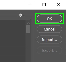
When you are done choosing your gradient colors, click OK.
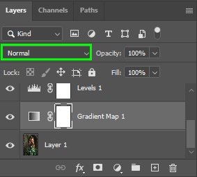
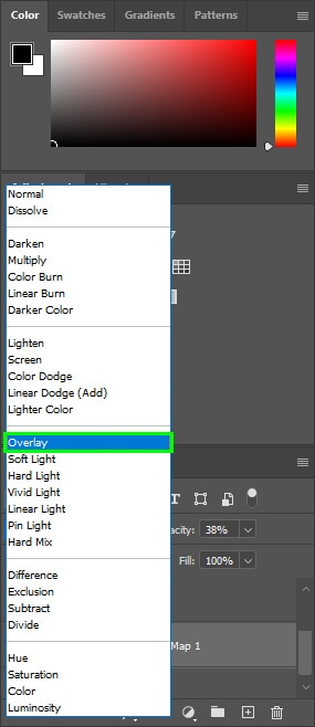
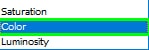
Step 3: Change The Blend Mode Of The Adjustment Layer
Now, choose a blend mode for your gradient map. To do this, select one of the options available in the Blend Mode drop-down menu. In my case, I chose Overlay.
I detail the best blend modes for Gradient Maps in the last section, but briefly, the best options are:
- Normal allows the gradient map to determine the luminance values of the map
- Color preserves your image’s luminance values
- Overlay darkens the dark areas and lightens the light areas
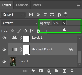
Step 4: Adjust The Opacity Of The Adjustment Layer
Finally, adjust the opacity of the gradient map layer to lessen the effect of the colors and create a more realistic result.
The lower the opacity, the more the original layer colors appear, and the gradient will be more blended with the image. I set mine to 50%.
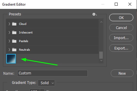
How To Save Gradient Map Presets
After creating your gradient map, it’s a good idea to save it for later use. To do this, keep the Gradient Editor panel open after creating your gradient. Then click on New.
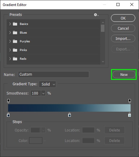
Your new gradient preset will be saved successfully and appear at the bottom of the gradient map presets. The new preset will be there when you open the Gradient Editor panel.
What Are Gradient Maps For In Photoshop?
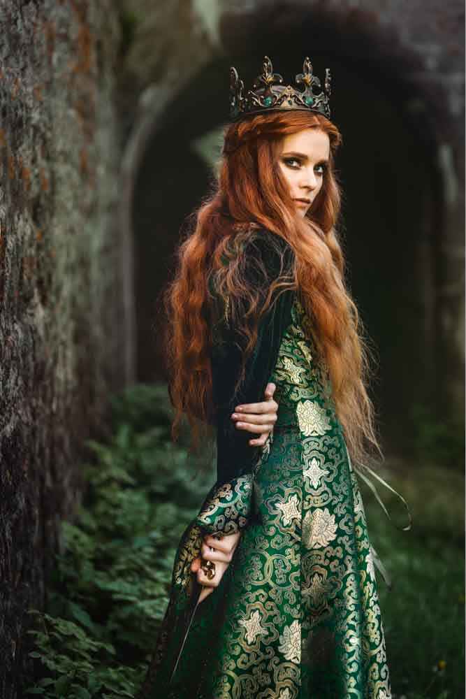
In simple terms, a gradient map is composed of two or more colors that replace an image’s original colors. The gradient map tracks the luminance values of an image and determines what gradient color each area will receive. For example, color A fills shadows, whereas color B fills highlights.
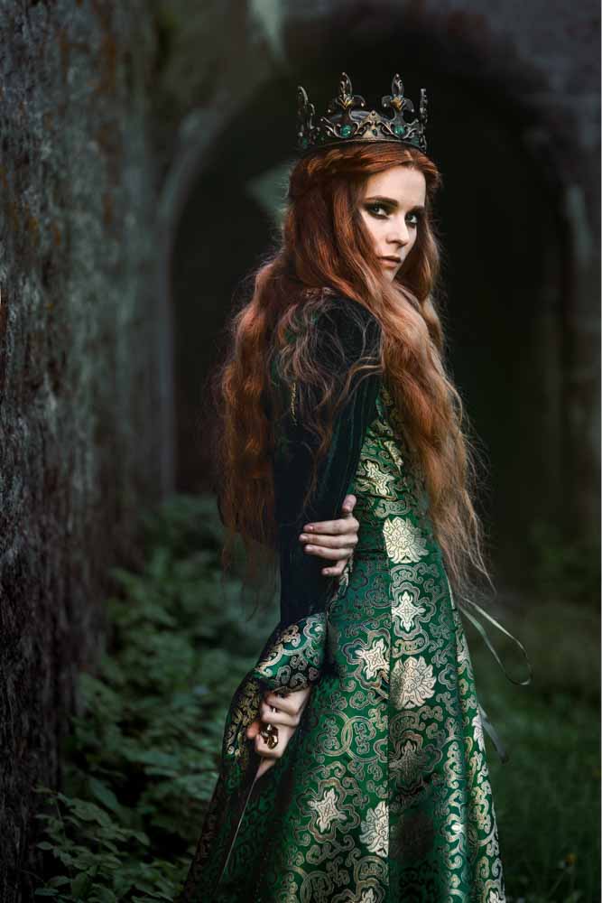
For example, the darker shade of blue filled the shadows in the image below, while the lighter blue filled the highlights.
You can’t achieve such effects using the Gradient Fill Layer option since it doesn’t consider an image’s luminance values. Instead, it just applies gradients in a linear or radial direction.
Here are some things you can do with gradient maps:
1. Create black-and-white images: gradient maps allow you to create high-quality black-and-white photos because you can precisely control where the whites, blacks, and grays go.
2. Creatively color-grade photos: you can use gradient maps to create various color effects, including cinematic effects.
3. Change the mood of your photos: you can completely change the vibe of your image using gradient maps. For example, you can turn a lively photo with warmer tones into an image with a more gloomy feel.
4. Make the existing colors of an image stand out: If your photo has a sunset, for example, you can enhance its yellow and orange tones using gradient maps.
The Importance Of Blend Modes And Layer Opacity For Gradient Maps
Changing blend modes and adjusting layer opacity make gradient colors blend nicely with your image.
Blending modes blend pixels of two layers, controlling where there is more or less light. Thus, your image can look brighter or darker, depending on your selected blend mode. This allows you to bring attention to different areas of your image.
Some blend modes usually work well with gradient maps.
For instance, choose the Color blend mode to preserve your image’s original luminance values.
To let the gradient map determine your gradient’s luminance values, choose Normal.
Although the gradient map uses your image as a reference for luminance, the outcome is usually slightly different from the original luminance values of your image.
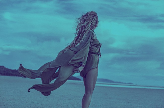
For an image with more contrast, use Overlay. This blend mode lightens bright areas and darkens dark areas.
Changing the opacity of layers is also essential when applying gradient maps. This is because you can soften the effect by decreasing the opacity of the gradient map layer.
The Opacity slider is located in the top right corner of the Layers Panel. To decrease a layer’s opacity, drag the opacity slider to the left.
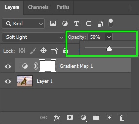
Half of the original layer colors are kept by lowering the opacity to 50%, and 50% of the gradient map colors appear.
Ultimately, gradient maps are a great way to color-grade images in Photoshop with extreme control over the color. Then, with the help of blending modes and opacity settings, you can refine your gradient maps to blend more realistically into your photos!
Happy Editing!